
“A confused customer buys nothing.” This old marketing maxim holds true in the data: when people are overwhelmed or confused by too many options, they often make no choice at all.
In marketing psychology, this is known as choice overload or the paradox of choice. The human brain has a limited capacity for decision-making, and too many options create friction leading the potential buyer to abandon the decision.
In practical terms, simplifying your offerings and messaging can dramatically improve customer response.
Too Many Options, No Decision (The Paradox of Choice)
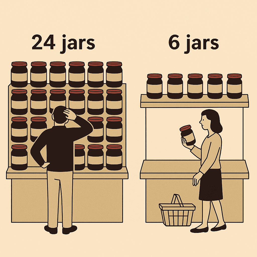
One of the most famous demonstrations of choice overload is the jam experiment by psychologist Sheena Iyengar. In a gourmet market, Iyengar set up a tasting booth that offered 24 flavors of jam on some days and only 6 flavors on other days. The results were striking: the larger 24-jam display attracted more browsers, but only 3% of those who stopped by ended up buying any jam. In contrast, the smaller 6-jam display led to purchases from 30% of tasters. In other words, shoppers were 10× more likely to buy when only six choices were available, compared to when they had two dozen options. This counterintuitive result – more choice yielding fewer sales – is a classic example of the paradox of choice in action.
This effect isn’t limited to trivial decisions like jam flavors. Even high-stakes choices can suffer from over-choice. A study of nearly 800,000 employees’ retirement plans found that the more investment fund options a 401(k) plan offered, the lower the employee participation rate overall. Plans offering just a “handful” of funds had significantly higher enrollment, whereas plans with 10 or more options saw participation drop sharply. In fact, as the number of fund choices in the plan went up, employees increasingly failed to choose any – a classic analysis paralysis that left many not enrolling at all. These findings underscore a key point: when faced with excessive complexity or too many alternatives, people often default to the status quo (choosing nothing) because it feels safer than making a “wrong” choice.
Real-World Examples: Less Choice, More Sales
Smart companies have learned that simplifying choice can boost sales and customer satisfaction. Retailers and product brands have seen tangible gains from pruning their offerings:
- Wal-Mart’s discovery: “Folks can get overwhelmed with too much variety. With too many choices, they actually don’t buy,” observed Duncan MacNaughton, a Wal-Mart merchandising executive. After the 2008 recession, many retailers (including Wal-Mart) reduced their assortment of products, finding that trimming slow-moving items made shopping less confusing and actually increased sales in those categories. Fewer products on the shelf meant customers could find what they wanted faster, leading to higher conversion rates.
- Procter & Gamble’s shampoo simplification: P&G famously cut its Head & Shoulders shampoo line from 26 different variants down to 15. The result? Sales jumped by 10% for the streamlined product line. By eliminating nearly half of the choices (many of which were redundant or low-sellers), P&G made the purchase decision easier for shoppers, and more people ended up buying the shampoo.
- Cutting to profitability: In another case, a pet products company (“Golden Cat”) axed its 10 poorest-performing cat litter products. Freed from the clutter of too many similar choices, customers gravitated to the remaining options and the company’s profits surged 87% after the cutback. Similarly, warehouse retailer Costco carries a deliberately limited selection in each category, and has seen higher per-product sales by focusing customers on a few quality options. These examples show that reducing choice can eliminate buyer confusion and directly drive up revenue.
The takeaway for marketers is clear: offering every possible flavor, feature, or configuration might seem customer-friendly, but it can backfire if the customer gets overwhelmed. Often, it’s better to curate your offerings – focus on the most valuable and distinct choices – rather than bombard customers with an over-assortment that dilutes their ability to decide.
The 3-Option Rule in Pricing Pages (Finding the Sweet Spot)
Nowhere is the “less is more” principle more evident than in SaaS pricing web pages. If you’ve noticed, many software companies present exactly three pricing plans (e.g. Basic, Pro, Enterprise) side by side. This is by design. Presenting three options hits a psychological sweet spot: it’s enough variety to cater to different needs, but not so many as to overwhelm. In fact, multiple studies have confirmed that three is often the magic number for pricing tiers:
- Price Intelligently study: In an analysis of 512 SaaS companies, those with 3 pricing tiers achieved about 30% higher average revenue per user than companies that offered 4 or more tiers. More tiers did not mean more revenue – instead, having too many plans tended to confuse customers and dilute the impact of each option.
- ConversionXL A/B test: Reducing the number of pricing options can boost conversion rates substantially. One study found that when SaaS companies moved from 4 price tiers down to 3, their conversion rates increased by an average of 27%. Removing that fourth option helped more buyers pull the trigger, rather than freezing up over analysis of four different plans.
- HubSpot benchmark data: Broad industry data backs this up. Companies with three pricing plans have roughly 40% higher conversion rates on their pricing pages compared to those offering five or more choices. Beyond three options, every additional plan tends to add more friction than benefit.
Why do three-tier structures perform so well? Psychologically, they create a clear “good-better-best” comparison that humans can process intuitively. With three choices, many customers will gravitate to the middle option (a well-known compromise effect), or confidently choose the tier that best fits their needs. In contrast, five or six pricing options can create analysis paralysis. The differences blur together and the effort to compare them feels daunting, increasing the odds that the customer gives up. One well-known SaaS company, Intercom, discovered this the hard way: after years of adding more and more plans for different use cases, their sign-ups were stalling. When Intercom consolidated from six pricing tiers down to three, they saw an immediate 17% jump in conversions on their website. Simplifying the choice made it much easier for customers to decide, “Yes, I’ll go with this plan,” instead of bouncing away to think it over.
The lesson for pricing (and product packaging in general) is that you should prioritize clarity over quantity. Offer enough choices to segment your audience, but not so many that the differences become confusing. Three well-differentiated options (often labeled in a way that highlights a “most popular” or recommended choice) tend to maximize conversion efficiency in many markets. As one SaaS pricing report put it succinctly: more tiers often create a “paralyzing paradox of choice” that sends potential customers running for the exit.
Keep It Simple in Calls-to-Action and Messaging
Choice overload isn’t just about product options or pricing plans – it also applies to your marketing messages and calls-to-action (CTAs). If your web page or email presents multiple competing actions for the user (“Download our whitepaper! Check out our blog! Sign up for a demo!” all at once), you risk confusing and losing them. The same principle of focus yields better results in communication.
Consider email marketing: Having one clear CTA in an email tends to dramatically outperform emails with several different links or buttons. According to Campaign Monitor data, emails limited to a single call-to-action got up to 371% more clicks than emails that crowded in multiple CTAs. That’s an astonishing lift in engagement simply by not distracting the reader with too many choices of where to click. It appears that when readers see just one prominent action to take, they’re far more likely to take it, whereas multiple buttons or links lead them to hesitate or ignore them all. This aligns perfectly with the adage we started with: if you confuse them, you lose them. Each additional choice or piece of information in a marketing message is another chance to lose the customer’s attention or sow doubt.
The key for any marketing communication – whether it’s a landing page, an advertisement, or a sales email – is to decide what you want the customer to do most, and focus them like a laser on that. Trim away extraneous offers and secondary options that might pull them off the path. In web design, this might mean featuring one primary button (e.g. “Start Your Free Trial”) in a bold color and removing other lesser links or menu items on that page. In copywriting, it means crafting a single, crystal-clear value proposition rather than dumping every feature and detail at once. By reducing cognitive load and guiding the customer’s eyes and mind to one focal point, you make it easy for them to act.
Conclusion: Simplify to Amplify
From consumer products to SaaS software to email campaigns, the pattern is consistent: simplicity sells. When in doubt, cut the clutter – be it trimming down a product lineup or streamlining the choices in a marketing offer. The data and examples above show that a well-curated set of options outperforms an abundance of options. Customers feel more confident in their decision when they aren’t bogged down comparing dozens of alternatives or wading through complicated messaging. As Sheena Iyengar advised after studying choice overload for years: “Less is more.” Companies that embrace this mantra have seen higher conversions, higher sales, and happier customers.
In practical terms, take a hard look at your own marketing and product presentation:
- Are you giving your audience just enough options to find a fit, but not so many that they freeze up?
- Is your pricing page clean and limited to a few plans that are easy to compare?
- Does each campaign or page have one primary CTA that stands out, or are you asking the customer to consider multiple actions at once?
By focusing your offerings and communications, you respect your customer’s time and mental energy. You make their decision simple. And a simpler decision is a faster decision – one that is more likely to end in a “yes, I’ll buy”. In the end, reducing choice reduces confusion, and reducing confusion increases conversions. The confused customer buys nothing, but the confident, unconfused customer is far more likely to buy something. Keep it concise, keep it clear, and watch your marketing metrics climb.
Bottom line: When it comes to guiding customer decisions, less truly can be more – more sales, more sign-ups, and more satisfied customers with less mental friction in getting there. By strategically limiting choices and simplifying your message, you make it easy for customers to choose you.
Sources
- Iyengar, Sheena. The Art of Choosing (TED Talk) – Research on choice overload and its effects on consumer decision-making.
- Schwartz, Barry. The Paradox of Choice – Psychology of why too many options can lead to decision paralysis.
- MarketingProfs (2010): “Don’t Confuse the Customer: Limit Choices, Make More Sales” – Wal-Mart merchandising insights on reducing product variety to boost sales.
- Inc.com (2018): Examples of P&G and others cutting product lines resulting in higher sales/profits.
- SaaStock (2023): “The SaaS Pricing Trap: When Too Many Tiers Kill Conversions” – Data showing optimal three-tier pricing (Price Intelligently, ConversionXL, HubSpot benchmarks) and case studies like Intercom.
- Campaign Monitor via Amra & Elma (2025): Statistic on single-CTA emails getting 3× higher click rates than multi-CTA emails.
- Intradiem Blog (2014): “A confused customer buys nothing” – on the importance of clarity in customer experience.