
Marketers are flooded with metrics: campaign performance, customer data, A/B test results, and more. But what happens when you dig beyond averages? The five-number summary is a statistical tool that gives you a deeper view of your data’s distribution—allowing you to spot outliers, skew, and hidden patterns that averages alone miss. I covered having these five metrics on a box plot chart if interested.
In this post, we’ll break down the five-number summary, walk through a marketing-focused example, and show you exactly how to use it to improve decision-making and communication with stakeholders.
What Is the Five-Number Summary?
The five-number summary consists of:
- Minimum – The smallest data point
- Q1 (First Quartile) – 25% of the data falls below this point
- Median (Q2) – The midpoint (50th percentile)
- Q3 (Third Quartile) – 75% of the data falls below this point
- Maximum – The largest data point
This summary is the basis for box plots, a visualization method that marketers can use to compare campaign performance, user behavior, or segment-specific metrics.
Why Marketers Should Care
1. Averages Lie
If you report an average email open rate of 23%, is that good? Not necessarily.
- What if 80% of your emails perform at 15% or lower, but one high-performing campaign skews the average?
- The five-number summary exposes this variability by showing how spread out the data really is.
2. Spotting Segmentation Opportunities
Let’s say you’re analyzing customer lifetime value (CLV) across a dataset of 1,000 customers. A five-number summary might look like:
- Min: $35
- Q1: $120
- Median: $180
- Q3: $290
- Max: $1,850
That range between Q3 and Max suggests a high-value segment that’s well outside the norm. These aren’t just “top spenders”—they may require their own marketing strategy, loyalty program, or targeted messaging.
3. Diagnosing Performance Spread in A/B Tests
Suppose you ran 20 variations of a Facebook ad. Instead of reporting the average cost per click (CPC), you calculate a five-number summary:
- Min: $0.42
- Q1: $0.63
- Median: $0.78
- Q3: $0.94
- Max: $1.53
Insight:
- Ads in the Q1 range ($0.63 or below) could be scaled.
- Ads above Q3 may need optimization or retirement.
- Outliers (Max = $1.53) deserve investigation—was the targeting wrong? Did the creative flop?
This approach helps you move beyond binary “winner/loser” language and think in gradients of performance.
How to Calculate It
If you’re dealing with a spreadsheet:
- Sort your data in ascending order.
- Identify:
- Minimum = first value
- Maximum = last value
- Median = middle value
- Q1 = median of the lower half
- Q3 = median of the upper half
Using tools:
- Python (pandas):
df['metric'].describe() - Excel: Use
MIN(),QUARTILE.INC(range,1),MEDIAN(), etc.
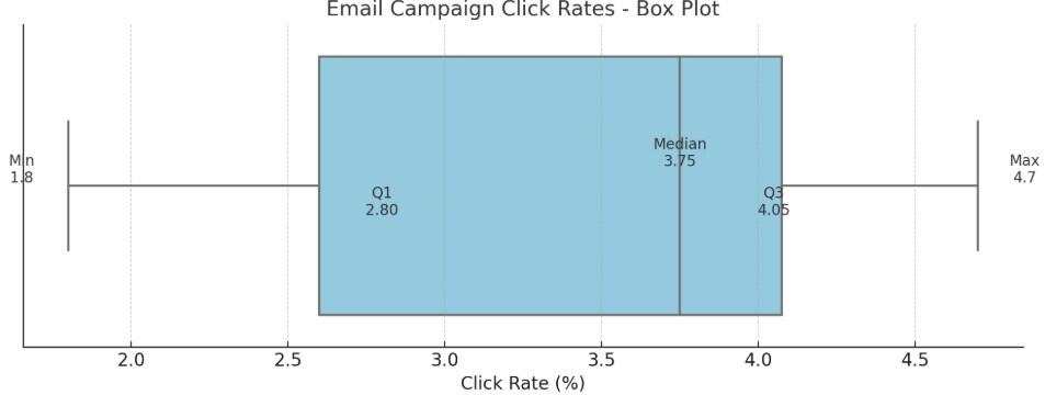
Example: Email Campaign Click Rates
| Campaign | Click Rate (%) |
|---|---|
| A | 1.8 |
| B | 2.1 |
| C | 2.4 |
| D | 3.2 |
| E | 3.6 |
| F | 3.9 |
| G | 4.0 |
| H | 4.1 |
| I | 4.3 |
| J | 4.7 |
Sorted Click Rates: 1.8, 2.1, 2.4, 3.2, 3.6, 3.9, 4.0, 4.1, 4.3, 4.7
- Min = 1.8
- Q1 = (2.4 + 3.2)/2 = 2.8 (Q1 is the median of the lower half of data: 1.8, 2.1, 2.4, 3.2, 3.6)
- Median = (3.6 + 3.9)/2 = 3.75
- Q3 = (4.0 + 4.1)/2 = 4.05 (Q3 is the median of the upper half of data: 3.9, 4.0, 4.1, 4.3, 4.7)
- Max = 4.7
Insight: Most campaigns cluster between 2.8% and 4.05%. Campaign A is clearly underperforming. Campaign J might be worth studying to replicate success.
Going Further: Box Plots
You can visualize the five-number summary using a box plot, a compact chart that quickly communicates the spread and shape of your data.
- The box spans from Q1 to Q3, covering the middle 50% of the data (the interquartile range).
- A line inside the box shows the median, highlighting the central tendency.
- Whiskers extend to the minimum and maximum values within 1.5x the interquartile range.
- Outliers beyond the whiskers are plotted as individual points, making them easy to spot.
Why it matters: Box plots convey spread, skew, and outliers far more efficiently than bar or line charts. For marketers, they’re ideal for comparing campaign results, ad performance, or audience segments across multiple datasets.
Tools to create them:
- Excel (with custom chart types)
- Tableau
- Python (matplotlib or seaborn)
- Google Sheets (with add-ons or workarounds)
Who Came Up With It?
The five-number summary was introduced by statistician John Tukey in the 1970s as part of his foundational work in exploratory data analysis (EDA).
Final Thoughts
The five-number summary isn’t just for statisticians. It’s a practical, underused tool for marketers who want to:
- Evaluate performance distributions
- Identify segmentation insights
- Optimize creative or media buys
- Communicate data nuance to non-technical stakeholders
Don’t just look at averages—look at the spread. You’ll find better strategies hiding in your data.