
Box plots (also called box-and-whisker plots) are powerful tools for visualizing distributions, spotting outliers, and quickly understanding how your data is spread. Here’s how to decode one.
Invented by statistician John Tukey in the 1970s, box plots — also known as box-and-whisker plots — offer a compact way to visualize the distribution of data. Whether you are analyzing website behavior, survey results, or scientific measurements, a box plot helps you quickly see the center, spread, and any unusual values in your dataset.
In this post, we will walk you through how to read a box plot step-by-step using real sample data, and explain what each component — from the box to the whiskers to the outliers — really means.
What Is a Box Plot?
A box plot summarizes five key numbers, sometimes called the five-number summary from a dataset:
1. Minimum
2. First Quartile (Q1)
3. Median (Q2)
4. Third Quartile (Q3)
5. Maximum
It also highlights outliers — extreme values that fall far outside the typical range.
Why Use It?
Box plots are useful because they:
• Show the spread and central tendency of data
• Reveal outliers that could skew averages
• Let you compare distributions across groups at a glance
Reading a Box Plot Example
The graph below is based on how much time each customer spent browsing on the Acme Inc website. There are 50 customers represented in the dataset.
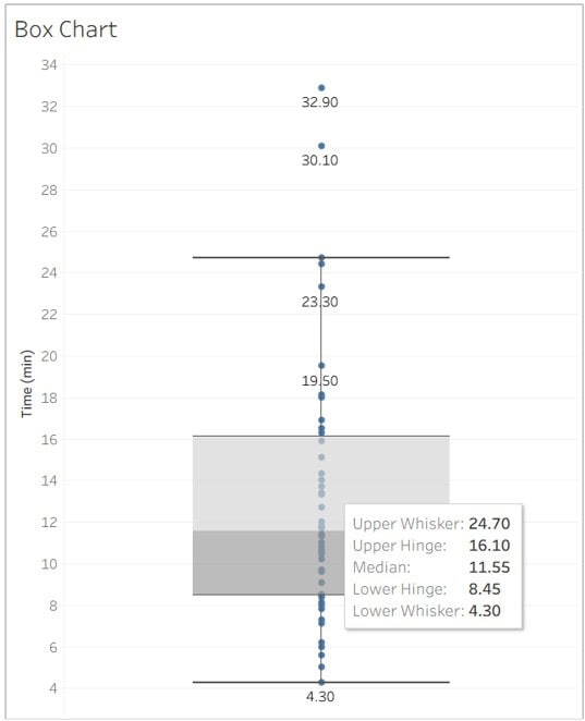
The Box (Middle 50 Percent): The shaded box spans from Q1 = 8.45 minutes to Q3 = 16.10 minutes. This means half of all shoppers spent between 8.45 and 16.10 minutes browsing.
The Line Inside the Box (Median): The horizontal line within the box is the median value (Q2). In this case, the median is 11.55 minutes — half of all observations fall below this value, and half above it.
The Whiskers: The lines extending from either side of the box are called whiskers. These represent the range of data that falls within 1.5 times the interquartile range (IQR). The lower whisker reaches down to 4.3 minutes, and the upper whisker stretches to 24.7 minutes.
The Outliers: Any values beyond the whiskers are plotted as individual points. In this dataset, two customers spent an unusually long time on the site — 30.1 and 32.9 minutes — and are considered outliers.
How Were the Outliers Calculated?
To find outliers and build a box plot, we first need the IQR (interquartile range):
IQR = Q3 – Q1 = 16.10 – 8.45 = 7.65
Upper fence = Q3 + 1.5 * IQR = 16.10 + (1.5 × 7.65) = 27.575
Lower fence = Q1 – 1.5 * IQR = 8.45 – (1.5 × 7.65) = -3.025
Any values above 27.575 or below -3.025 are considered outliers. Since two customers spent 30.1 and 32.9 minutes on the site — well above the upper fence — they are flagged as outliers.
What This Tells Us
The box plot reveals several key insights:
• Most customers spend between 8 and 16 minutes browsing.
• The typical session length (median) is 11.5 minutes.
• A small number of users spent over 30 minutes on the site — well beyond normal behavior.
This visual summary is far more powerful than a simple average. It helps marketers and analysts quickly spot patterns, design better experiences, and make data-driven decisions.
Final Thoughts
Box plots may look simple, but they tell a rich story. Whether you are in marketing, UX, analytics, or research — being able to read a box plot gives you a clear edge. It is a fast way to summarize large datasets and zoom in on what really matters: the center, the spread, and the surprises.