
Customer satisfaction surveys are only as valuable as the insights you extract from them. While raw response data offers a starting point, visualizing that data—especially when segmented by customer type—can reveal patterns, pain points, and opportunities that might otherwise go unnoticed. In this post, I’ll walk through a series of sample survey questions using fictitious data to demonstrate how visual analysis helps uncover deeper insights.
In a previous blog post, I shared the nine best questions to include in your customer satisfaction survey. While three of those questions are open-ended and provide valuable qualitative insights, they aren’t ideal for traditional charts.
However, one effective and visually engaging way to represent this type of feedback is by using a word cloud generator. Word clouds highlight frequently used words or phrases by scaling them in size based on how often they appear—offering a quick, compelling snapshot of recurring themes.
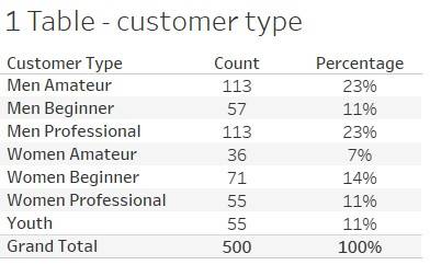
Question 1: Customer Type
The first question asks, “Please select your customer type from the list below.” While this fictitious data may not be particularly insightful on its own, its true value emerges when combined with responses to other survey questions. The table below shows the count and percentage breakdown for each customer type.
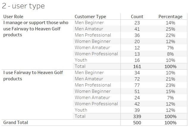
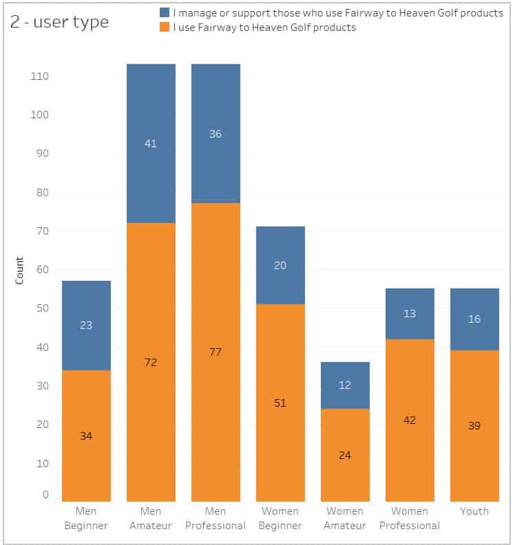
Question 2: User vs. Manager/Support Role
The second question asks, “Which of the following best describes you?” with response options such as “I use X products” or “I manage or support those who use X products.” The graph below presents the results for this question, segmented by the customer types from the previous question. A stacked bar chart (shown below the table) is likely the preferred format, as it clearly illustrates how each customer type breaks down across the two roles. Notably, both Men Amateur and Men Professional include a significant portion of respondents who don’t directly use golf equipment but represent a valuable, distinct segment—one that warrants personalized targeting due to their influence and unique needs.
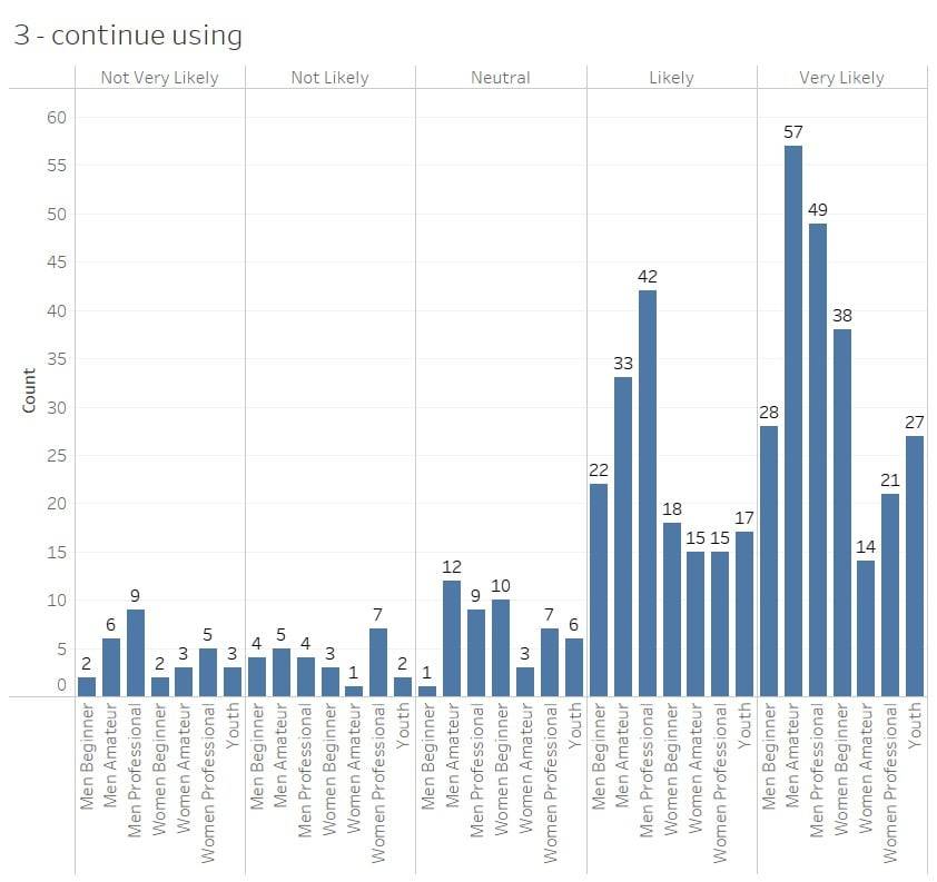
Question 3: Likelihood to Continue
The third question asks, “How likely are you to continue using our products and services?” In our example data, the Men Amateur segment stands out—they are both the largest group selecting Very Likely to continue and the largest group choosing Not Very Likely, Not Likely, and Neutral. While this is only sample data, it illustrates how this type of chart can surface important patterns and contradictions within segments—offering deeper insights than overall averages alone.
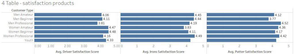
Question 4: Product Satisfaction
The fourth question asks, “Overall, how satisfied are you with the following [company] products?” Responses were captured on a five-point satisfaction scale. To support analysis, we translated these into a numeric scale, assigning 5 to Very Satisfied and 1 to Not Very Satisfied. This approach makes it easy to identify patterns—such as the Men Professional segment showing the lowest satisfaction scores for drivers. This could indicate the equipment isn’t meeting their performance expectations, perhaps lacking the stiffness or control they require. Either way, it’s a signal worth investigating further.
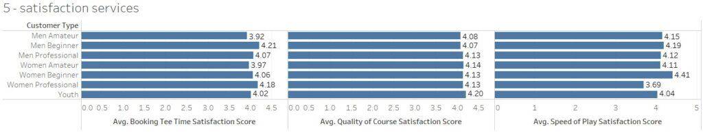
Question 5: Service Satisfaction
The fifth question, similar to the previous one, shifts the focus from products to services and asks, “Overall, how satisfied are you with the following [company] services?” As before, responses were converted to a numeric scale ranging from 1 (Not Very Satisfied) to 5 (Very Satisfied). In this example, the Women Professional segment reports the lowest satisfaction with speed of play. One possible explanation is that this group, likely teeing off from the forward (red) tees, may still have to wait for the group ahead to clear out of their driving range—leading to delays that impact their overall experience. This insight suggests an opportunity to explore pace-of-play improvements or better course flow accommodations for this segment.
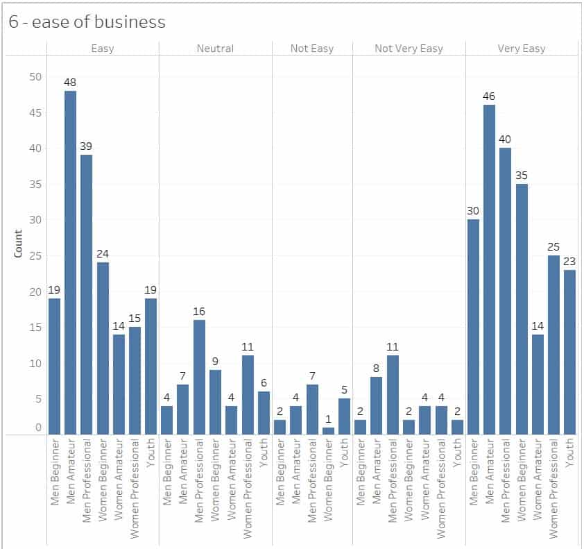
Question 6: Ease of Doing Business
The sixth and final question asks, “Overall, how easy is it to do business with [company]?” The Men Professional segment stands out, with the highest number of responses in the Not Very Easy, Not Easy, and Neutral categories. This suggests that, for this group, the customer experience may be falling short.
Conclusion: Turning Visual Insights Into Action
Visualizing your customer satisfaction survey data is more than a reporting exercise—it’s a critical step toward understanding your audience, segmenting with intent, and prioritizing actions that improve loyalty and retention. From identifying product dissatisfaction among advanced users to uncovering hidden friction points in the customer journey, these visualizations offer strategic leverage.
As you review your own survey data, segment by customer type, look for outliers, and focus on translating findings into experiments. What can you fix, enhance, or personalize? That’s where the real value of survey data lies—not in collecting it, but in acting on it.