
In the world of data visualization, no chart type has endured more ridicule than the pie chart. “Hate” might sound extreme, but not when you’ve seen pie charts with legends longer than your arm. The human brain struggles to compare slices, especially when there are more than five. And no, turning your pie chart into a donut doesn’t solve the problem.
As a quick aside, I’d argue there’s one chart worse than the pie: the 3D chart. Thankfully, they’ve mostly faded from use. When they do appear, Excel is usually the culprit, since most modern BI tools have banned this visual crime. The 3D chart feels like a relic of the ‘80s, when we thought holograms were the future (remember Jem and the Holograms?). Not everyone has moved on.
But there’s another chart type that deserves scrutiny—and it’s not even a chart.
Enter: the snapshot.
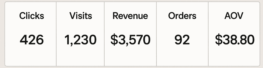
You’ve seen them. A single number in a tidy little box: Clicks. Revenue. Orders. AOV. Just a figure, standing alone like it says everything. But numbers without context don’t tell the full story. In fact, they can mislead.
Let me explain with a personal story.
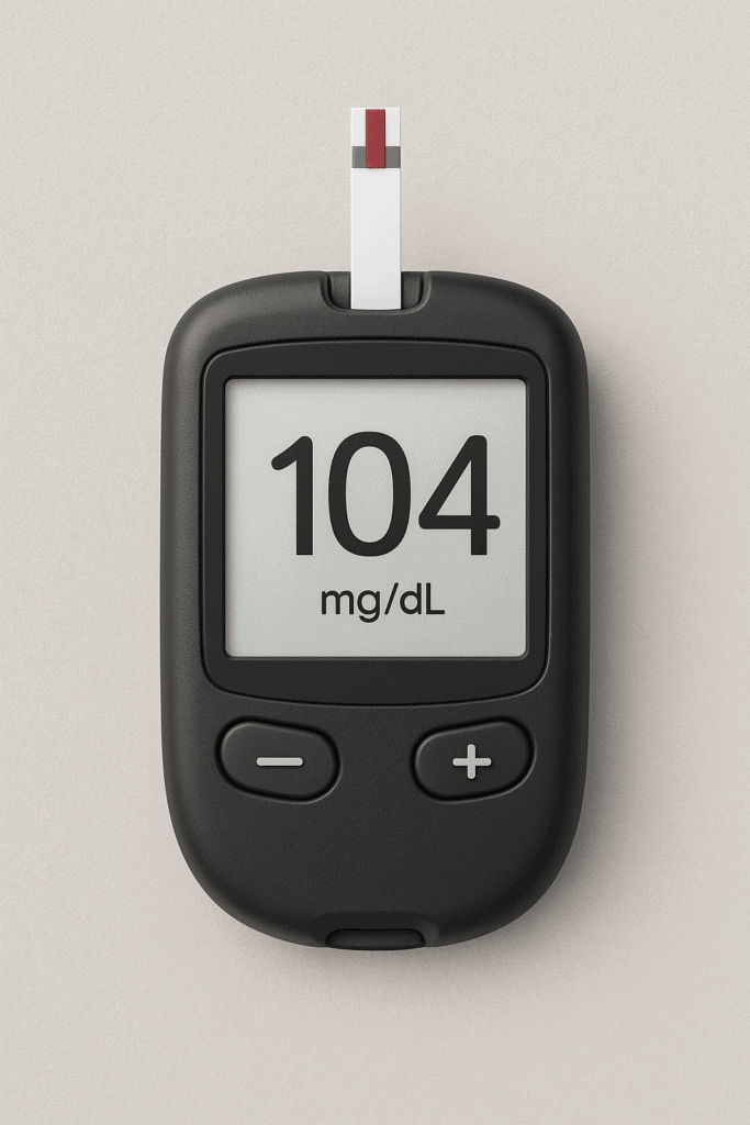
My oldest daughter was diagnosed with type 1 diabetes at just 15 months old. Overnight, our lives changed. At that time, the only way to monitor her blood sugar was through a finger poke. The meter might read “104,” which sounds great. But without context, that number raised more questions than answers. Was she rising fast or crashing hard? Had the insulin taken effect, or was the food still digesting?
Back then, we didn’t have the continuous feedback loop a Dexcom now provides. Just snapshots. Her mom would check her repeatedly throughout the night to avoid dangerous highs or the terrifying lows that once led to a seizure. We had numbers—but not the story behind them.
That’s the danger with snapshots in dashboards, too.
The most common question they provoke: “Is that good or bad?”
If your dashboard is for an audience deeply familiar with the data, a snapshot might work. But if you’re building for an executive team—or anyone less immersed—you need more context. What’s normal? What’s the trend? Are we up, down, or flat?
Dashboards often sacrifice depth for space, so these horizontal bars of data seem efficient. I’ve created plenty myself. But just like that blood sugar reading, the number alone isn’t enough.
You need the story.