Analytics

google analytics data display events

How to Review and Improve Your Google Analytics Data Display Events

Reading Time: 3 minutes

The Data Display Events page within the Settings > Property Settings of Google Analytics is a powerful feature often overlooked. It’s essential to review it regularly, ideally every six months, to ensure your data is accurate and comprehensive.

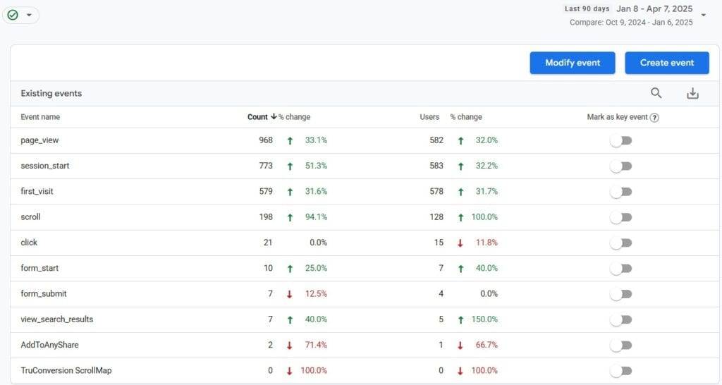
Below is an example of the events setup on my Google Analytics account, which are largely default events. I’ve used a 90-day comparison, sorting them in descending order by event count for clarity. It’s important to note that Google Analytics does not allow you to rename or delete events once they’ve been created, so setting them up correctly from the beginning is critical.
Why Event Tracking Setup is Crucial

Since Google Analytics event tracking is not retroactive, the sooner you get it right, the better. While BigQuery offers more control over data modification, it’s not ideal to be repeatedly answering management’s questions about misspelled events or improperly tracked data. You want a clean, well-organized event setup right from the start.

5 Questions to Ask When Reviewing Your Events Page

Here are the key questions to ask when reviewing the events page in Google Analytics:

1. Are all event names following the proper naming convention?

Event names should be lowercase with underscores separating words for readability. Consistency is crucial—although dashes are also used by some, underscores are generally preferred for compatibility.

Tip: Use a naming convention checklist and stick to it across your entire event tracking setup. For example, you can establish a format and progression tracking for custom events using vip_insiders_ask, vip_insiders_consider, and vip_insiders_transact.

2. Are there any duplicate events that should be removed?

It’s easy to end up with duplicate events if naming conventions aren’t followed. For example, you might have both a custom “Click” event and the default “click” event, leading to confusion and data inconsistencies.

Tip: Regularly audit your event list for duplicates and remove or merge them as needed to prevent clutter and confusion in your reports.

3. Are there events not getting any data?

Events that aren’t receiving data could be a sign of broken tracking or that the event is no longer relevant (e.g., tied to an expired marketing campaign). Removing outdated or broken events helps keep your setup clean and efficient.

Tip: Set up periodic checks to ensure events are firing correctly. Google Tag Assistant and GA Debugger are helpful tools for testing.

4. What are we not tracking?

As your website evolves, your analytics setup may lag behind. Review the customer journey and consider new interactions that need tracking. Whether it’s a new form submission, video play, or specific CTA, ensure your tracking is aligned with the most important actions on your site.

Tip: List key actions users take on your site and make sure you’re tracking them. New product launches or feature updates are great opportunities to reassess your tracking strategy.

5. What are our trends telling us?

Not all events are of equal value. Look at trends in event data, such as spikes or drops, and investigate any outliers. These trends can provide valuable insights into user behavior, helping you identify areas for optimization.

Tip: Analyze the relationship between event trends and conversion data. For example, if increased video views correlate with higher conversions, consider optimizing video content.

Additional Considerations:

  • Event Categorization: Group your events logically (e.g., “Clicks,” “Form Submissions,” “Video Plays”) to make reporting easier.
  • Custom Dimensions and Metrics: If you need deeper insights, use custom dimensions and metrics in your event tracking to capture additional data points.
  • Custom Alerts: Set up custom alerts in Google Analytics to notify you when specific events trigger, especially for critical actions.

Conclusion

Regularly auditing and optimizing your Google Analytics events is key to ensuring your tracking is accurate and aligned with your business goals. By addressing these questions, you can streamline your event setup, avoid common pitfalls, and make sure your data tells a meaningful story.

How to Review and Improve Your Google Analytics Data Display Events Read More »

channel session tracking 6

Website Analytics Simplified: The Power of Channel Session Tracking

Reading Time: 4 minutes

In my page session tracking post, I covered what I consider the most important website analytics report: page sessions. Now, I want to cover what I believe is the second most valuable report—sessions by channel.

While my site is still early in its growth, the channel data is already enough to illustrate why this report matters. I also don’t have any Paid Search or Email traffic yet, which are common channels for most websites.

Historically, businesses focused on a single channel. That expanded into multi-channel marketing, and today, omnichannel is the goal. Success in all your channels requires regularly evaluating each channel’s performance.

When assessing traffic, keep these key factors, listed in least to most important, in mind:

  • Impressions – An indicator of your content being viewed (where available, such as in search or advertising reports) and a basic verification that data collection is functioning.
  • Visits – Shows that people are clicking and arriving at your site.
  • The Right Visitors – Not just any traffic, but those that fit your target audience.
  • Conversions – Typically a form submission, purchase, or engagement with key content like a video or PDF.

General Questions to Ask About Your Channel Data

Before diving into individual channels, consider these broader questions:

  • Does anything look inaccurate? Look for anomalies that might indicate tracking issues.
  • Are there seasonal trends? Does traffic spike around holidays, industry events, or specific times of the year like when school is/isn’t in session?
  • Can traffic spikes be linked to marketing campaigns, news, or other activities?
  • Which channels drive the highest engagement and conversions? High traffic doesn’t always mean high value.
  • Are your investments (time and money) in each channel yielding proportional returns?
  • Are there underperforming channels that need attention? Weak performance could signal issues with visibility, messaging, or targeting.

Industry Benchmarks for Channel Traffic

While every website’s traffic distribution varies based on industry, audience, and strategy, here are some commonly cited directional benchmarks:

  • Direct Traffic: ~15% (often influenced by brand recognition and offline marketing).
  • Organic Search: ~27% of total traffic (varies widely based on SEO efforts).
  • Paid Search Traffic: ~10% (varies based on ad spend and campaign strategy).
  • Referral Traffic: ~16% (depends on partnerships, PR, and external links).
  • Email Traffic: ~6% (highly dependent on list quality and campaign effectiveness).
  • Social Media Traffic: ~5% (higher for industries with strong social engagement).

These averages can fluctuate significantly:

  • B2B websites tend to rely more on direct and referral traffic.
  • eCommerce often sees more paid search and social traffic.
  • Media and entertainment benefit from increased social and referral traffic.

Ultimately, the best benchmark is your own historical data. Google Analytics’ Benchmarking Reports can provide industry-specific comparisons, but tracking your own trends over time is the best way to measure success.

Channel-Specific Insights and Questions

Direct Traffic

Visitors who type your URL directly or use bookmarks.

Industry Benchmark: ~15% of traffic.

  • Potential Issues: Can be inflated by tracking errors (e.g., missing UTM parameters in emails or incorrect redirects).
  • Key Insights: A high direct traffic percentage often indicates strong brand awareness. However, if it’s unusually high, check for tracking gaps.

Organic Traffic

Visitors from unpaid search engines like Google, Bing, and Yahoo!

Industry Benchmark: ~27% of traffic.

  • Key Insights: Monitor keyword rankings, clickthrough rate, and organic conversion rates.

Paid Traffic

Paid traffic from Google Ads, Bing Ads, etc.; Paid social includes Facebook, LinkedIn, etc.; Paid video includes YouTube, TikTok, etc.

Industry Benchmark: ~10% of traffic.

  • Key Insights: Keyword performance is crucial; high cost per click’s may indicate a need for better targeting.

Referral Traffic

Visitors from external websites.

Industry Benchmark: ~16% of traffic.

  • Key Insights: Monitor where your referral traffic originates. High-quality backlinks improve both referral traffic and SEO.

Email Traffic

Visitors from email or newsletter campaigns.

Industry Benchmark: ~6% of traffic.

  • Key Insights: Email UTM tracking is essential; missing tags can cause traffic to be misclassified as direct.

Other Traffic Sources

Affiliates

  • Key Insights: Strong for eCommerce; track partner performance.

Audio Ads

  • Key Insights: Emerging channel with varying engagement levels.

SMS & Push Notifications

  • Key Insights: Highly dependent on user opt-in rates.

Unassigned Traffic

One channel worth calling out explicitly, especially given recent changes in how people discover content, is Unassigned traffic. Historically, unassigned traffic was often treated as a red flag, typically caused by broken tracking, missing UTM parameters, or bot activity. While those issues still exist, unassigned traffic today can also include legitimate sessions that analytics platforms do not yet know how to classify.

An increasingly common example is traffic from AI and LLM tools such as ChatGPT and other conversational interfaces. These sessions can arrive with valid referrers, strong engagement, and clear user intent, yet still fall into Unassigned due to limitations in GA4’s default channel model.

If unassigned traffic is significant, do not assume it is invalid. Evaluate engagement metrics such as engagement rate, events per session, and time on site. High-quality behavior may indicate emerging acquisition channels rather than tracking errors. In some GA4 properties, custom channel group editing can address this. In others, that feature is not yet available, leaving analysts to rely on exploratory analysis or external reporting until the channel model evolves.

Final Thoughts

Analyzing traffic by channel is not just about where visitors come from. It is about understanding intent, engagement, and return on effort.

Channel reporting frameworks need to evolve as user behavior evolves. Discovery is no longer limited to search engines, social platforms, and traditional referrals. AI-driven tools are becoming a real top-of-funnel source, and analytics platforms are still catching up.

Use benchmarks as a reference, but prioritize your own historical trends and engagement quality. When traffic does not fit cleanly into existing channels, the answer is not always better tagging. Sometimes it is acknowledging that the channel model itself is lagging reality.

Consistently reviewing channel performance with this context in mind helps avoid false conclusions and supports better decisions, even when the analytics tooling is imperfect or lagging reality.

Website Analytics Simplified: The Power of Channel Session Tracking Read More »

What I Learned Posting on LinkedIn Every Day for a Month

Reading Time: 3 minutes

I set a simple goal to post on LinkedIn every business day in January—no expectations, just trying to share valuable digital marketing insights with every post. Now that January’s wrapped up, here’s how it went:

Key Metrics:

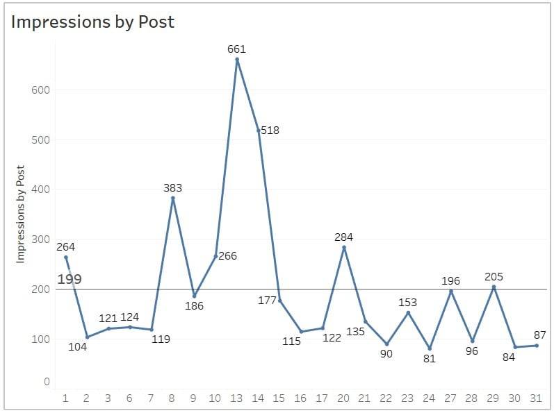
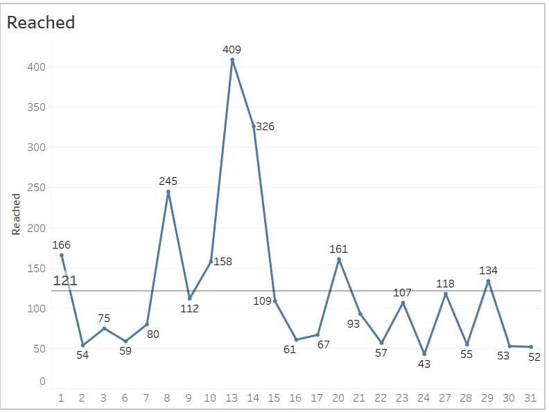
  • 4,716 impressions
  • 121 average impressions per post
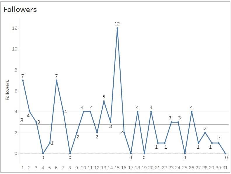
  • 85 new followers
  • 73 reactions
  • 25 comments
  • 14 reposts
  • Reach per post ranged from 52 to 409

Insight #1: Topics and Hashtags Matter Most

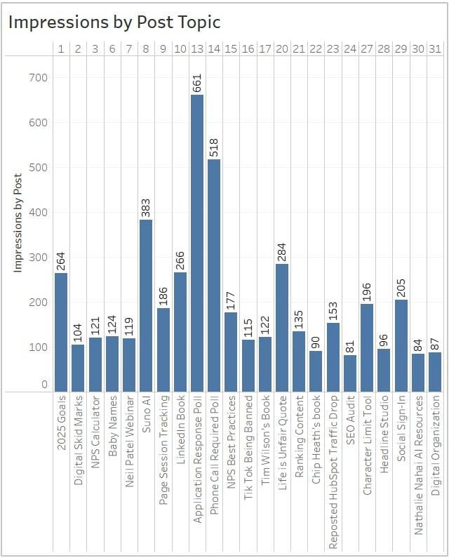
While I didn’t expect hockey stick growth for any metric, I did expect impressions to gradually increase over time, but the data told a different story. Impressions fluctuated based on the popularity of individual posts rather than building momentum. The hashtags used and post relevance seemed to be the real game-changers.

Insight #2: Don’t Forget the Weekends

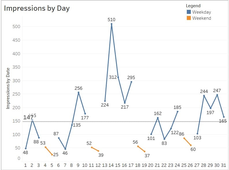
I expected low weekend traffic since I only posted Monday through Friday, but impressions remained consistent and even beating out some of my weaker posts. This shows LinkedIn content has a longer shelf life, and many professionals are active even on weekends, catching up or browsing casually. Posting on the weekend may be a worthwhile future test.

Insight #3: The Most Relevant Content Wins

LinkedIn is a website for professionals so it’s not a stretch to think content focused on professional growth, networking, and the job search process would perform best. My posts discussing if job applications should receive email responses and if phone calls should be required at certain interview stages significantly outperformed all others, proving that topics directly tied to career experiences resonate most with the audience.

Insight #4: Follower Growth Matches Impression Trend

Follower gains fluctuated daily, with noticeable spikes aligning with highly engaging content. The largest surge occurred on the 15th, suggesting that standout posts can significantly boost growth. Maintaining a regular posting schedule would likely help sustain a steady follower increases over time.

Insight #5: Engaging Content Expands Reach

Reach showed similar fluctuations to follower growth, with peaks corresponding to days when content resonated strongly with the audience. This pattern highlights that while consistency is key, creating posts that spark interest and interaction can significantly amplify visibility beyond your immediate network.

What I Learned Posting on LinkedIn Every Day for a Month Read More »

page session tracking by month 2024

Website Analytics Simplified: The Power of Page Session Tracking

Reading Time: 3 minutes

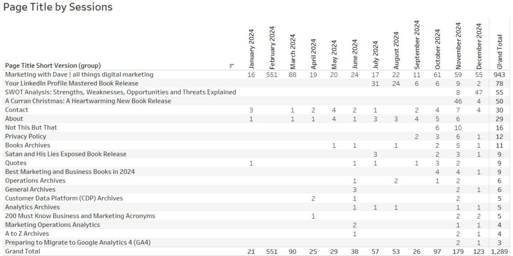
Remember the classic question: “What’s the one thing you’d bring with you if stranded on a desert island?” Let’s apply a similar thought experiment to website analytics. If you could only have one report to manage your website, what would it be? For me, it’s a trending report that shows page session tracking by month—as illustrated in the table below.

Why Sessions Is the Right Metric

In this scenario, we’re not dealing with an eCommerce website, so metrics like revenue, orders, or units don’t apply. I also wouldn’t choose user or visitor metrics because frequent cookie deletions make unique or returning user tracking unreliable.

The sessions metric stands out as the most reliable option. It aligns closely with a “jobs-to-be-done” analysis, helping us understand how visitors are using the site. A single visitor may have multiple reasons (or “jobs”) for visiting your website in a day, and sessions capture this behavior effectively.

Why Page Title Is the Right Dimension

Understanding how your content performs is critical, and the Page Title dimension offers two distinct advantages:

  • It helps you evaluate the SEO naming of your pages alongside performance metrics.
  • It’s more concise than using the full Page URL, making reports cleaner and easier to read.

For instance, in my reports, I’ve removed the “| Marketing with Dave” suffix from all non-homepage titles for clarity.

Insights from Page Sessions Data

While data tables may not be as visually appealing as charts or graphs, they often provide deeper insights. Below are five key takeaways from the data on my website, which I’ve recently started driving more traffic to:

  1. Unusual Traffic Spikes
    The anomaly of 551 sessions on the homepage in February—and a smaller spike in March—caught my attention. After investigation, I discovered it was caused by unwanted referral traffic from Poland, which affected many websites. While I’ve filtered this traffic out in my reports, I’m showing the raw data here for transparency.
  2. Steady Growth in Monthly Traffic
    The data reveals a slow but steady increase in monthly sessions, with notable growth starting in October. A closer look shows that in November, traffic was driven by my Christmas book promotion, and in December, a blog post on SWOT analysis gained traction. This suggests that I should build out more suporting content covering SWOT
  3. Home Page Dominance
    Approximately 73% of my website traffic lands on the homepage. However, this is somewhat misleading because my homepage features a pinned blog post. Recognizing this, I’ve decided to implement a dedicated home page (coming soon).
  4. Tracking New Page Performance
    My LinkedIn book page is a great example. The data shows when the page went live, how it performed in its first month, and how it has fared since. Promotions and marketing efforts have influenced traffic spikes, but this report helps identify when a page’s performance starts to decline, prompting decisions like optimizing existing content instead of creating new pages.
  5. SEO and Visitor Interest Opportunities
    Reviewing page titles alongside session data naturally leads me to consider whether page titles could be improved for SEO or to better capture visitor interest.

Why This Report Matters
By consistently monitoring page-level session data, you can make informed decisions about content creation, optimization, and overall website strategy. This single report combines quantity (total traffic) with quality (specific page performance), making it an invaluable tool for managing your website effectively. Another way to enhance this report is by including the Page Type dimension, which categorizes pages into types like blog posts, navigation pages, or the homepage. This addition provides deeper insights into which types of content are driving the most traffic and informs where to focus optimization efforts.

Website Analytics Simplified: The Power of Page Session Tracking Read More »

free and easy ways to export google analytics 4 data to excel or google sheets

Free and Easy Ways to Export Google Analytics 4 Data to Excel or Google Sheets

Reading Time: 2 minutes

Rarely do I want to keep my data inside the source where it originates. This is absolutely the case with my Google Analytics data. I needed a solution that met the following criteria:

  • No cost: Premium tools like Coupler were not an option.
  • Simplicity: I wanted to avoid working directly inside the Google Analytics platform and Looker Studio lacked the needed flexibility.
  • Automation: Each report needed to auto-refresh on the first day of every month.

After exploring multiple options, I discovered that Google Sheets, combined with the SyncWith extension, met my needs perfectly. SyncWith offers 35 monthly refreshes for free, which is more than sufficient for my requirements. Setting this up was fairly straightforward taking minutes, not hours. Here are the steps I took to get this implemented using the Google Analytics add-on in Google Sheets.

Why Export Data from Google Analytics 4?

Google Analytics 4 (GA4) is a powerful platform, but its interface can be overwhelming for non-technical users. Exporting your data to a familiar tool like Excel or Google Sheets offers several advantages:

  • Customization: Analyze and visualize data in a way that suits your needs.
  • Ease of Use: Simplify complex data for stakeholders.
  • Offline Access: Work with your data without relying on internet connectivity.

Step-by-Step Guide to Installing the Google Analytics Add-on in Google Sheets

Step 1: Open Google Sheets

Go to Google Sheets and open a new or existing spreadsheet.

Step 2: Access the Add-ons Menu

In the top menu, click on “Extensions”. Select “Add-ons” and then click “Get add-ons”.

Step 3: Search for the Google Analytics Add-on

In the Google Workspace Marketplace, type “Google Analytics” in the search bar.

Step 4: Install the Add-on

Click on the Google Analytics add-on in the search results. Click the “Install” button. I chose the SyncWith extension which has a higher rating and usage than the one from Google.

Step 5: Grant Permissions

You will be prompted to grant permissions for the add-on to access your Google Analytics account. Click “Continue”, sign in with your Google account, and allow the required permissions.

Step 6: Access Google Analytics in Google Sheets

Return to your Google Sheet. Click on “Extensions” and select “Google Analytics”. Choose “Create New Report” to start pulling data.

Step 7: Create a Report

Follow the prompts to set up a report by selecting your Google Analytics account, property, and view. Choose the metrics and dimensions you want to include. Click “Create Report” to generate the data in your Google Sheet.

Step 8: Export to Excel

Once the data is in Google Sheets, go to File > Download and choose Microsoft Excel (.xlsx) to export the data.

Final Thoughts

Finding the right solution for exporting GA4 data can take some trial and error. Whether you choose the Google Analytics add-on or SyncWith, both options are cost-effective and efficient. By sharing my experience, I hope to save you time and help you unlock the full potential of your Google Analytics data.

Free and Easy Ways to Export Google Analytics 4 Data to Excel or Google Sheets Read More »

audible hours listened books completed

Brag-Worthy Audible Listening Stats: A Case for Customer-Centric Metrics

Reading Time: 2 minutes

We all have those brands, products, and services we love so much that we naturally become advocates for them. These are the companies that deliver great value, excellent service, and memorable experiences. We don’t share because we have to—we share because we want others to enjoy what we’ve experienced.

For me, Audible is one of those brands. I’ve been a loyal customer since 2004, back when audio books were still niche and long before Amazon realized what an amazing acquisition they would be. For 10+ years I drove 3.5 hours each way over the weekend twice a month to spend time with my three daughters. I churned through a lot of audio books.

Every great company has one or two key metrics that measure customer commitment, usage, and loyalty. For hotels, it is nights stayed and for airlines, it is miles flown. For Audible, I suggest hours listened and books completed are important to both them and their listening audience.

Audible does show total listening time in their app, but here’s the problem: the information isn’t shareable, and it’s not easy for customers to digest or feel proud of. For instance, seeing 4 months, 20 days, 13 hours, and 20 minutes of listening time on my stats page doesn’t evoke any emotion. It’s too abstract, like trying to imagine what a trillion dollars looks like.

What if Audible transformed this into something simpler and more meaningful? An image like the one below could present the data in a way that feels personal, shareable, and impressive. Perhaps, I could even see how this compares to other Audible listeners. Similar to Spotify or Pocket letting you know you are in the 1% of listeners/readers. This easy-to-digest summary is something I would want to brag about and show it off.

Why This Matters
Giving customers a clear, visually engaging way to understand and celebrate their achievements builds loyalty and amplifies word-of-mouth marketing. When customers feel proud of their usage, they’re more likely to share it with others, introducing new audiences to the brand.

Audible, you’re already doing so many things great—now make it easier for us to brag about you.

Brag-Worthy Audible Listening Stats: A Case for Customer-Centric Metrics Read More »