Opticks is a traffic quality and click fraud prevention platform that helps marketers identify invalid traffic across paid, organic, referral, direct, and emerging AI-driven sources. I tested it on MarketingWithDave.com to see how useful the data and insights were in practice.
The short version: Opticks gave me more visibility into traffic quality than I expected. The biggest value was not simply seeing a fraud percentage. It was being able to break that traffic down by source, channel, and behavior so I could better understand where my website traffic was coming from and how much of it deserved a closer look.
Affiliate disclosure: If you purchase through my link, I may earn a small commission at no additional cost to you. I only share tools I have used myself.
The 30-Second Decision
Opticks is a strong fit for marketers, agencies, and business owners who want better visibility into traffic quality. If you are spending money on paid search or paid social, it can help you identify patterns that may be wasting budget. If you care about analytics accuracy, it can also help you understand how much questionable traffic may be influencing your reporting.
Opticks adds a traffic quality layer to your analytics and advertising data, helping you better understand which visits appear legitimate, suspicious, or potentially invalid.
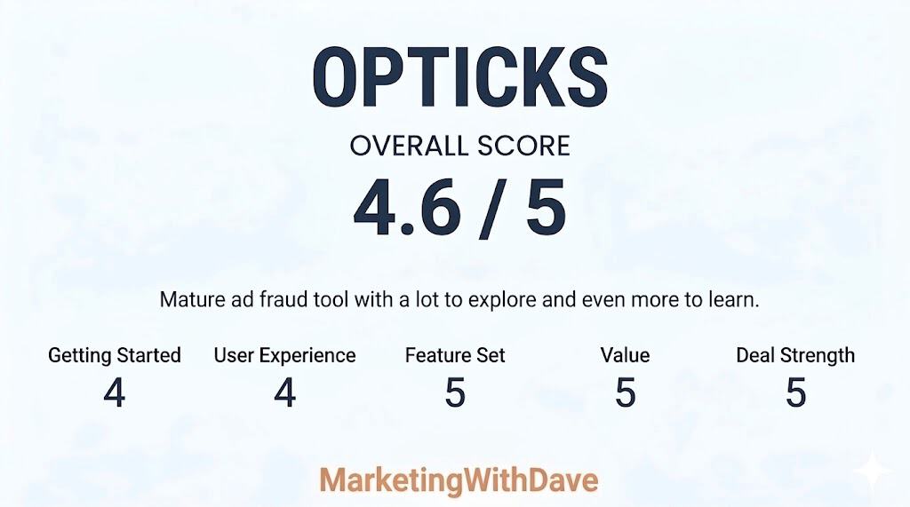
My Scorecard
Opticks earned high marks for feature depth, value, and overall maturity. Compared to many AppSumo launches that still feel early or experimental, this felt like a substantially more developed platform with meaningful analytics and investigation capabilities already in place.
The main reason this was not a perfect score comes down to onboarding and interpretation. Some workflows, classifications, and filtering options took real effort to fully understand, and additional getting started guidance or educational resources would make the platform more approachable for new users.
I have tested fraud prevention tools before, and one of the hard questions in this category is whether the ad platforms are already handling the problem. Google, for example, has its own invalid click detection and may issue credits when it identifies invalid activity. That matters.
But that still leaves a practical gap for advertisers. Even if some invalid activity is filtered or refunded later, marketers are often left with limited visibility into what happened, which channels were affected, and whether certain traffic sources deserve closer inspection.
That is what made Opticks interesting to me. I was less interested in a scary bot story and more interested in whether the tool could help me understand my own traffic better.
My Setup Experience
Setup was straightforward. Opticks can be installed manually or through Google Tag Manager, and I used Google Tag Manager because that fits how I manage most marketing and analytics tags.
Once installed, the platform began collecting traffic data quickly. I did not feel like I had to fight the setup process before getting value from the tool. That matters because traffic quality software can easily become something people buy, install halfway, and never fully use.
Note: Screenshots were captured during different stages of testing and may represent different date ranges. They are included to illustrate platform capabilities rather than compare identical datasets.
What Surprised Me Most
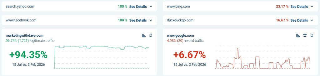
The first number that caught my attention was not tied to a paid campaign. It was the overall traffic quality view. In the screenshot I captured, Opticks showed 65.73% legitimate traffic and 31% invalid traffic.
That does not automatically mean 31% of my business opportunity was fake, and it does not mean every invalid visit requires immediate action. But it does change how you think about analytics. Even on a website that is not running large paid campaigns at the moment, there can still be a meaningful amount of traffic noise.
This is where Opticks became more useful than I expected. It was not just telling me that invalid traffic exists. It was helping me see where that traffic was showing up.
My Three Favorite Opticks Features
1. Traffic source visibility
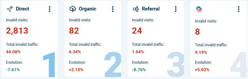
The most useful part of Opticks for me was the ability to look at invalid traffic by source and channel. In one view, I could see direct traffic, organic traffic, AI-related traffic, social sources, and other providers broken out separately.
This is also where judgment matters. A channel with one or two visits can show a dramatic percentage, but that does not mean you should immediately draw a big conclusion. A small sample size can make a number look more important than it is.
That is one of the things I appreciated about using Opticks. It gave me more visibility, but it also reminded me not to get emotional about every red number. The real value is in spotting patterns, then checking whether the volume and context support action.
2. Provider and channel filtering
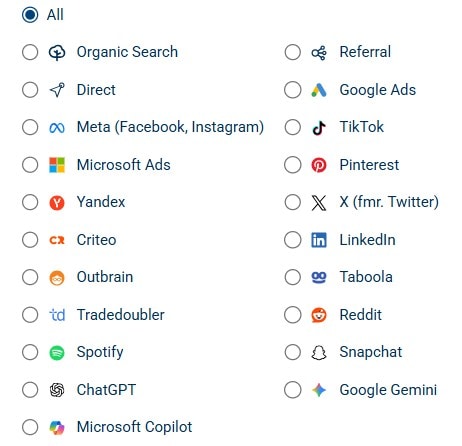
Opticks is not limited to one advertising platform. The provider filters include common paid media platforms, organic search, referral traffic, social networks, and newer AI-related sources like ChatGPT, Google Gemini, and Microsoft Copilot.
Beyond the high-level traffic summaries, Opticks also made it easy to investigate traffic patterns using a wide range of dimensions and filters. I could segment traffic by campaign, keyword, placement, traffic channel, referring source, and other variables depending on what I wanted to analyze.
That matters because traffic quality is no longer just a Google Ads problem. Marketers now get traffic from search, social, referral websites, AI tools, content platforms, and direct visits that may not be as clean as they appear in standard analytics reporting.
Seeing those sources side by side makes the platform more useful for modern traffic analysis. It helps answer a better question than “Do I have fake clicks?” The better question is, “Which sources deserve more trust, and which ones deserve a closer look?”
3. Segmentation that helps you investigate
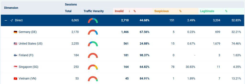
The referral breakdown was one of the clearest examples of why Opticks is useful. I could filter into referral traffic and see sessions, invalid visits, suspicious visits, legitimate visits, and web page views in the same table.
That is much more helpful than a single invalid traffic percentage. A top-level number tells you something may be happening. Segmentation helps you understand where it is happening.
For example, if a referral source consistently sends legitimate visits, that is useful to know. If another source sends mostly invalid or suspicious activity, that deserves investigation. This is where Opticks becomes practical instead of theoretical.
Opticks helped me separate traffic volume from traffic quality. Those are not the same thing.
Standard analytics tools are good at showing traffic totals, engagement, conversions, and attribution paths. But they do not always make it obvious whether part of that traffic should be trusted in the first place.
Opticks gave me another lens. Instead of only asking which channel brought traffic, I could also ask how much of that traffic appeared legitimate, suspicious, or invalid.
That may sound simple, but it changes how you evaluate marketing performance. A source that sends a lot of traffic is not automatically valuable. A source that sends less traffic but cleaner visits may be more useful than it first appears.
Where You Still Need Judgment
Opticks gives you better visibility, but it does not remove the need to interpret the data carefully.
Small sample sizes can distort percentages. A source with one or two visits can look alarming if all of them are flagged. That does not necessarily mean the channel is bad. It means you need more context before making a decision.
Bot and invalid traffic labels can also require interpretation. Some automated traffic is clearly unwanted. Other activity may come from tools, crawlers, or systems you recognize. The platform helps surface the signal, but the marketer still needs to decide what the signal means.
That is not a criticism of Opticks as much as it is a reality of this category. Traffic quality data is useful, but it should be used with context.
What Opticks Is Not
Opticks is not a Google Analytics replacement.
It is not a magic button that fixes weak campaigns.
It is not proof that every suspicious visit is costing you money.
It is not a reason to panic every time a source shows invalid traffic.
Opticks is best viewed as a traffic quality layer. It helps you identify where questionable traffic may be affecting your reporting, your paid campaigns, and your understanding of channel performance.
Who Opticks Is Best For
Opticks makes the most sense for businesses that are actively trying to understand and improve traffic quality.
It is especially relevant for advertisers running paid search, paid social, or lead generation campaigns where invalid traffic can quietly affect cost, conversion rates, and reporting confidence.
It is also useful for agencies that need a clearer way to monitor traffic quality across multiple sources. The ability to segment traffic by channel, provider, referral source, and campaign makes it easier to investigate patterns without relying only on ad platform reporting.
For a tiny website with very little traffic and no paid campaigns, Opticks may be more interesting than necessary. But for marketers spending meaningful money to acquire traffic, the visibility can be valuable quickly.
Pros and Cons
What I Liked
What to Keep in Mind
Setup through Google Tag Manager was straightforward.
The data still needs interpretation, especially with small sample sizes.
The dashboard made traffic quality easy to understand quickly.
Not every invalid or suspicious signal should trigger immediate action.
Provider and channel filters made the tool feel broader than paid search.
Some bot or source labels may require additional context before deciding what to do.
Referral and source breakdowns made the data more actionable.
This should complement your analytics and ad platform reporting, not replace it.
The product felt mature and practical rather than experimental.
The value increases as your traffic volume and paid media spend increase.
AppSumo Pricing
Opticks is currently available on AppSumo as a lifetime deal. Since AppSumo promotions are only available for a limited time and pricing or license tiers can change, I recommend checking the current listing before making a decision.
When evaluating the different license tiers, focus on your expected traffic volume, the number of websites you plan to monitor, and whether you’ll benefit from features such as lead protection, automated Google Ads IP exclusion, or advanced reporting. If you’re investing heavily in paid advertising or managing multiple websites, choosing the right tier upfront may save you from ne.eding to upgrade later.
Bottom Line
Opticks gave me a clearer view of traffic quality than I expected. The platform was easy to set up, and the dashboards were useful without being overwhelming, and the source-level breakdowns made the data feel practical.
The biggest takeaway from my testing was that invalid traffic is not only a paid search issue. Even direct, referral, organic, and newer AI-related sources can warrant a closer look. That does not mean every red number should cause panic. It means marketers need better visibility before making decisions.
For businesses spending meaningful money on traffic acquisition, Opticks is a strong addition to the marketing stack. It helps you ask better questions about your traffic, spot patterns you might otherwise miss, and understand which sources may deserve more trust.
This content is for educational purposes and reflects my experience, review of the product, and current publicly available deal information. Always evaluate tools based on your specific business needs, goals, and workflows before making a decision.
If you’ve ever wondered why a perfectly good piece of content falls flat, the answer is usually not the writing. It’s not the design, the headline, or the offer either. The real problem is a mismatch between what you’re saying and where your reader actually is.
That’s where the five awareness stages come in.
The framework traces back to Eugene M. Schwartz, whose 1966 book Breakthrough Advertising laid out a model for understanding your prospect’s state of awareness and then writing to that specific state. Schwartz was writing about direct-response advertising, but the logic applies just as well to blog content, email sequences, website pages, and social media today.
In this post, we’ll walk through each of the five stages, show you how to identify which stage your audience is in, connect the framework to modern SEO and search intent, and give you a practical content map for applying all of it across your website, email sequences, and content calendar, including a step-by-step process for auditing the content you already have. We’ll also bring in ideas from some of the best marketing thinkers of the past few decades, because Schwartz wasn’t writing alone into a vacuum. His framework holds up in part because smart marketers keep arriving at the same insight from different directions.
Where the Five Awareness Stages Actually Come From
Schwartz outlined his awareness framework in Chapter 2 of Breakthrough Advertising, under the heading “Your Prospect’s State of Awareness — How to Capitalize on It When You Write Your Headline.” The chapter begins on page 13 of the original Prentice-Hall edition.
His original section titles read differently from the shorthand most marketers use today. He wrote about “The Most Aware,” “The Customer Knows of the Product But Doesn’t Yet Want It,” “How to Introduce New Products,” “How to Introduce Products That Solve Needs,” and “How to Open Up a Completely Unaware Market.” The modern labels — Most Aware, Product Aware, Solution Aware, Problem Aware, Unaware — came later as practitioners simplified and popularized the framework.
It’s worth knowing that Schwartz wasn’t the only person thinking in stages. Philip Kotler taught buyer-readiness stages in his marketing textbooks. Robert Lavidge and Gary Steiner published a hierarchy-of-effects model in 1961. Russell Colley introduced the DAGMAR framework around the same time. These models all share the insight that buyers move through distinct mental states before purchase, and your message needs to meet them in the right state.
What makes Schwartz’s version especially useful for content marketers and copywriters is that it anchors each stage to a specific question: what does this person already know, and what does my message need to do first?
The Five Stages Explained
Stage 1: Unaware
The unaware prospect is not thinking about your product, your category, or even their own problem. They may have a latent need they haven’t consciously connected to yet. They’re not browsing for a solution because they don’t know they need one.
Schwartz’s instruction here is to lead with identity, aspiration, or hidden tension before you say anything about what you sell. You have to get the person to see themselves in your content before they’ll ever care about your offer.
Anne Handley has articulated this as well as anyone working in modern content marketing. Her core principle is to focus on your audience “relentlessly and with pathological empathy” to make the customer the hero of the story rather than your product. That’s the right posture for reaching unaware audiences. They’re not looking for you. You have to find them through content they actually want to consume.
Joe Pulizzi pushes the same idea from a content strategy angle. Before you create anything aimed at an unaware audience, he argues, you need a clear content mission, a statement of who you serve, what you publish, and why it matters beyond making a sale. Without that, content aimed at the unaware stage becomes noise.
What works at this stage:
Story-driven blog posts that don’t lead with a product
Editorial pieces on trends, ideas, or perspectives your audience cares about
Pinterest content and social posts that answer questions or spark curiosity
Email newsletter issues that read like a letter, not a promotion
Quizzes and assessments that surface a need the reader hadn’t named
Best CTA at this stage: Subscribe, save, or read more. A low-commitment conversion like a quiz or newsletter signup can absolutely work here. The key is not asking for too much too early.
Stage 2: Problem Aware
The problem-aware prospect knows something is off. They feel the friction, the inefficiency, the frustration. But they may not yet know that a solution exists or what category of product or service could help them.
Content at this stage earns trust by diagnosing well. Seth Godin’s contribution here is useful: he consistently argues that effective marketing means finding the smallest viable audience that is genuinely open and eager, and then delivering messages that feel relevant rather than broadcast. At the problem-aware stage, that means going deep on one specific pain cluster rather than trying to address every possible problem in the same piece.
Kotler described this stage as moving an audience from awareness to knowledge. The job of your content is not to pitch your solution yet. It’s to name the problem clearly, explain why it happens, and show the prospect that someone understands exactly what they’re going through. That builds the credibility you’ll need later.
What works at this stage:
Symptom checklists and self-assessment tools
Diagnostic blog posts that explain “why this happens”
Calculators that quantify the cost of the problem
Lead magnets built around a single, high-intent pain point
Educational webinars that focus on the problem space, not the solution
Best CTA at this stage: Download the checklist, take the assessment, watch the explainer. Free tools and calculators convert well here because they deliver immediate value without requiring a purchase commitment.
Stage 3: Solution Aware
The solution-aware prospect knows the kind of result they want and roughly what kind of tool or approach might get them there. They’re researching. They’re comparing. They don’t know your specific product yet, but they’re in the right category.
This is where David Ogilvy’s emphasis on research and substance becomes most relevant. Ogilvy’s argument was that advertising that sells starts with understanding the product and the prospect deeply, and then making a case grounded in specifics rather than creative flair. Solution-aware prospects are evaluating their options, and vague content won’t hold their attention.
Claude Hopkins’ Scientific Advertising is the older direct-response companion to this idea: give people reasons why. Explain the mechanism. Make measurable claims and back them up. Test what works.
Robert Cialdini’s research is especially applicable here. Solution-aware prospects are uncertain, and in conditions of uncertainty, social proof and authority carry disproportionate weight. Showing that credible people or organizations trust your approach can shift a prospect from passive research mode to genuine consideration.
What works at this stage:
Buyer’s guides and option comparisons
Category explainer pages (“How does X work?”)
Benchmark reports and methodology explainers
Expert-led webinars that orient the prospect in a solution space
FAQ pages that address the questions an informed buyer asks
Best CTA at this stage: Compare your options, see how it works, download the guide.
Stage 4: Product Aware
The product-aware prospect knows your brand or product. They’ve been to your site. They may be on your list. But they haven’t converted yet. Something is holding them back — a doubt, a competing option, or simply not enough proof that your offer is the right fit for their situation.
Kotler described this phase as moving from liking to preference to conviction. The job of your content and messaging here is not to educate from scratch. It’s to close the gap between “this seems interesting” and “I’m ready to move forward.”
Handley’s customer-hero perspective keeps this from becoming self-centered brand copy. The prospect still wants to see themselves in the outcome, not just a list of your features. Ogilvy adds the demand for specificity: proof needs to be concrete, not vague. Cialdini contributes the mechanics: case studies activate social proof, testimonials activate liking, limited availability activates scarcity. Godin’s “anticipated, personal, and relevant” standard also applies — product-aware audiences have already opted in at some level, so generic follow-up emails are a waste of that permission.
What works at this stage:
Case studies with specific, measurable results
Comparison pages (your product vs. alternatives)
Product demos and walkthroughs
Objection-handling email sequences
Migration or onboarding guides that reduce perceived switching costs
Testimonials organized by customer type or use case
Best CTA at this stage: Watch the demo, see customer results, book a consultation.
Stage 5: Most Aware
The most-aware prospect is ready. They know your product, they want it, and the only thing between them and conversion is friction or a final nudge. Schwartz’s instruction here is almost blunt: don’t overcomplicate the close. Give them a clear path, a compelling reason to act now, and remove anything that slows them down.
Cialdini’s scarcity and consistency principles are strongest at this stage because the person is already convinced. What they need is permission to act and a reason not to wait. Kotler’s later “5 A’s” model is a useful reminder that once someone converts, your job shifts toward advocacy, making the experience good enough that they refer others and return themselves.
Godin’s permission marketing logic also applies: an audience that is enrolled and eager wants direct, expected messages. That’s when a straightforward email with a clear offer outperforms a content piece designed to educate.
What works at this stage:
Pricing pages with clear, simple paths to purchase
“Start now” or deadline-driven offer emails
Retargeting ads for people who visited your pricing or checkout page
Cart abandonment or demo follow-up sequences
Live sales enablement for higher-ticket offers
Onboarding sequences immediately after purchase
Best CTA at this stage: Start now, claim the offer, book your call.
How to Identify Which Awareness Stage Your Audience Is In
Understanding the five stages is one thing. Knowing which stage a specific visitor, subscriber, or prospect is in is what makes this framework operational. Here are three reliable signals to read.
What They Search
Your website search queries are one of the clearest indicators of awareness level, because people tell you exactly what they know and what they’re looking for. You can use this to inform your keyword targeting, your content prioritization, and how you structure your site.
What They Search
Awareness Stage
“Why is my website traffic dropping?”
Problem Aware
“How to increase organic traffic”
Problem Aware / Solution Aware
“SEO vs PPC which is better”
Solution Aware
“Best SEO tools for small business”
Solution Aware
“Semrush review”
Product Aware
“Semrush vs Ahrefs”
Product Aware
“Semrush coupon” or “Semrush free trial”
Most Aware
Notice that the query gets more specific as the awareness level rises. Vague, problem-oriented searches signal early-stage awareness. Brand-specific or transactional searches signal late-stage awareness. When you look at which keywords are sending traffic to a page, you’re essentially reading the awareness level of the audience that page is attracting.
Where They Came From
Traffic source is a strong proxy for awareness stage. A visitor arriving from a Pinterest pin on a general marketing topic is almost certainly in the unaware or problem-aware category. A visitor arriving from a Google search for your brand name is already product aware. A visitor clicking through from a retargeting ad they saw after visiting your pricing page is most aware. If your analytics platform lets you segment by traffic source, you can use that to match your follow-up messaging to the likely awareness level of each segment.
What They Do on Your Site
Behavioral signals inside your site are the third indicator. Someone who reads three blog posts and bounces is likely unaware or problem aware — they’re in research and discovery mode. Someone who visits your pricing page multiple times without converting is product aware and has a specific hesitation worth addressing. Someone who starts a free trial and abandons midway through onboarding is most aware but has hit a friction point. Each behavioral pattern points to a different intervention.
The Five Awareness Stages and Search Intent
One of the most underused applications of Schwartz’s framework is mapping it to SEO and search intent. Most SEO guides talk about informational, navigational, commercial, and transactional intent. Those categories are useful, but they don’t connect as cleanly to messaging strategy as the awareness stages do.
When you map awareness to search intent, you get a more actionable picture of what kind of content to create and what job that content needs to do.
Stage / Search Intent
What the Searcher Wants
Content That Fits
Unaware Informational curiosity
Ideas, entertainment, perspective — not answers to a specific question yet
Trend pieces, editorial essays, “why X matters” posts, story-led content
Problem Aware Problem investigation
Understanding why something is happening and whether it’s a real concern
Diagnostic posts, symptom lists, “signs you have X” content, explainers
Solution Aware Comparative research
Options, categories, trade-offs — trying to understand the landscape
Buyer’s guides, comparison posts, category overviews, “best X for Y” lists
Product Aware Brand evaluation
Proof, specifics, credibility — trying to decide if this particular option is right
Reviews, case studies, demo content, testimonial pages, “vs.” articles
The practical implication for your content strategy is that you should be intentional about which stages you’re creating content for. Many sites accidentally create a lot of solution-aware content (comparison articles, best-of lists) while neglecting unaware and problem-aware content that builds an audience over time. Others publish plenty of top-of-funnel content but have no middle-of-funnel content to carry interested readers toward a decision.
Auditing your existing content against this table is a useful exercise. Group your posts by which awareness stage they’re addressing, and you’ll quickly see where you have gaps.
This also connects directly to topical authority. A site that has content at every awareness stage for a given topic signals depth and comprehensiveness to both readers and search engines. Your problem-aware diagnostic posts support your solution-aware comparison posts, which support your product-aware review content — and internal links between those layers make each one stronger.
Mapping the Five Stages to Your Website
The most immediate place to apply this framework is your website. Most small business sites are organized around what the owner wants to say rather than where the visitor is mentally. That mismatch shows up as high bounce rates, low engagement, and CTAs that don’t convert.
A better approach is to treat your website as a content map — a deliberate system where each asset serves a specific stage and passes visitors toward the next one. Many marketers create content without ever asking where it fits in the buyer journey. The result is a site that’s heavy in one or two stages and nearly empty in others. A content map built around awareness stages fixes that. It forces you to look at your full library as a progression rather than a pile of individual pieces.
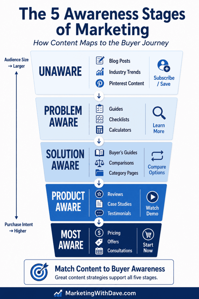
Here’s how the main content types on a typical marketing site map to the five stages:
Visually, this looks like a funnel where each stage narrows toward a conversion but also feeds back into content clusters that build topical authority across the full topic area:
A clean site architecture built around this framework typically groups into four zones:
Learn or Resources hub (unaware and problem-aware content)
Solutions section (solution-aware category pages)
Why Us or Proof section (product-aware evidence)
Pricing or consultation page (most-aware close)
The key discipline is matching your calls-to-action to the stage of the page, not the stage you wish the visitor was in. The real issue isn’t whether you use a conversion-oriented CTA on early-stage content — newsletter signups, free trials, calculators, and assessments can all convert well even on problem-aware pages. The issue is asking for too much commitment too early. A blog post on diagnosing a marketing problem can absolutely end with a free assessment CTA. It should not end with “Book a $500 strategy session.” The ask needs to match the readiness level of the audience.
Save the high-commitment CTAs for pages where the visitor’s behavior signals they’re already evaluating. Someone on your pricing page or comparison page isn’t in an educational mindset. Don’t slow them down with more content when what they need is a clear path forward.
How to Audit Your Existing Content Using the Five Stages
You don’t have to start from scratch to apply this framework. If you have an existing blog or content library, the most useful first step is a content audit. Assign each piece to an awareness stage and then look at the distribution.
Here’s a simple process you can run today:
Export all your blog URLs. Pull a list from your CMS, Google Search Console, or a site crawler. You just need URL and title to start.
Assign each article an awareness stage. Read the title and ask: who is this written for, and what do they already know when they arrive? A post titled “Why Your Traffic Dropped After a Google Update” is problem aware. A post titled “Semrush vs Ahrefs” is product aware. A post titled “How to Get Started With SEO” is solution aware. Work through your list and tag each one.
Count articles per stage. Tally up how many pieces you have at each level. Most sites discover they’re heavily weighted toward one or two stages and nearly empty in others. Solution-aware content (comparison posts, best-of lists) is the most common over-investment. Unaware and problem-aware content is the most common gap.
Identify the gaps. If you have very little unaware-stage content, you have limited ability to build a new audience through organic discovery. If you have very little product-aware content, you’re likely losing people who were close to a decision. The gaps are your content calendar for the next quarter.
Create internal links between adjacent stages. Once you’ve mapped your content, look for natural linking opportunities between pieces at neighboring stages. A problem-aware diagnostic post should link to your solution-aware buyer’s guide. Your buyer’s guide should link to your product-aware review or case study page. These links create a path through the funnel and strengthen topical authority across your content cluster — which is a signal search engines reward.
This exercise also surfaces content cannibalization risks — cases where you have multiple pieces competing for the same awareness-stage keyword without a clear hierarchy. If two posts are both targeting solution-aware searchers asking the same question, they’re splitting authority rather than building it. Identifying those overlaps is as valuable as finding the gaps.
The audit doesn’t have to be exhaustive to be useful. Even a quick pass through your top 20 or 30 posts by traffic will give you a clear picture of where your content is concentrated and where prospects are likely falling out of your funnel.
How to Structure an Email Nurture Sequence Around the Stages
Email is one of the best channels for walking prospects through all five stages over time, because you control the sequence and the pacing. Here’s a seven-email framework that covers the full ladder:
#
Stage
Purpose
Example Topic
1
Unaware
Open with identity or tension
“Why good content still fails to convert”
2
Problem Aware
Name and diagnose the problem
“Five signs your messaging is mismatched to where your buyer actually is”
3
Problem Aware
Deepen consequences and stakes
“What awareness mismatch costs in traffic, leads, and conversion friction”
4
Solution Aware
Introduce the solution category
“What changes when you build content around buyer awareness”
5
Product Aware
Show your specific approach
“How we map your website and email to the right awareness stage”
6
Product Aware
Add proof and specifics
“Case study: what happened when we matched content to stage”
7
Most Aware
Close with a clear offer
“Ready to map your funnel to the five stages? Here’s how to get started.”
One important nuance: not every subscriber enters your list at the same stage. Someone who found you through a broad editorial post is probably unaware or problem aware. Someone who found you through a product comparison article is already solution or product aware. If your email platform allows segmentation by entry source, route higher-intent subscribers into a shorter, more direct sequence rather than starting them at the beginning of an education track they’ve already passed through.
A Four-Week Content Campaign That Covers All Five Stages
If you want to move an audience through the full ladder with a focused campaign, you don’t need a massive volume of content. You need one strong anchor asset per week, remixed across formats and channels.
#
Stages Targeted
Anchor Asset
Supporting Assets
Primary CTA
1
Unaware + Problem Aware
Blog post on why messaging mismatch kills conversions
Pinterest pins, newsletter, self-check quiz, short social posts
Subscribe / take the quiz
2
Problem Aware + Solution Aware
Webinar or guide on awareness-based content strategy
Companion blog post, downloadable worksheet, resource hub page
Register / download
3
Solution Aware + Product Aware
Comparison article or framework overview page
Demo clip, FAQ email, case study excerpt, testimonial block
The One-Sentence Test for Any Piece of Content You Create
Before you publish anything, try this: write down, in one sentence, who this piece is for and what they already know when they arrive.
If you can’t answer that clearly, the content probably isn’t ready. The five awareness stages give you a simple vocabulary for making that call. You don’t need to label every piece formally — you just need to make a deliberate decision about where your reader is starting from, and then write to that starting point.
Schwartz’s core insight from 1966 still holds: the most important thing you can know about your prospect is what they already believe. Every other decision in your marketing — the headline, the CTA, the offer, the format — flows from that.
Key Takeaways
The five awareness stages trace back to Eugene Schwartz’s Breakthrough Advertising (1966). The modern labels are simplifications of his original section titles, added by later practitioners.
Each stage requires a different message. Blunt “buy now” language fails at the unaware and problem-aware stages. Educational content underperforms at the most-aware stage.
Search queries are one of the clearest signals of awareness level. Vague, problem-oriented queries signal early-stage awareness. Brand-specific or transactional queries signal late-stage awareness.
The awareness stages map directly to SEO search intent: informational curiosity, problem investigation, comparative research, brand evaluation, and transactional.
Treat your website as a content map, not a collection of random posts. Each asset should serve a specific stage and pass visitors toward the next one.
The issue with CTAs on early-stage content isn’t conversion — it’s asking for too much commitment too early. Low-friction offers like assessments, calculators, and newsletter signups can convert well at any stage.
A content audit is the fastest way to apply this framework to what you already have. Export your URLs, assign each a stage, count by stage, find the gaps, and add internal links between adjacent stages.
The audit also surfaces content cannibalization: pieces competing for the same awareness-stage keyword that are splitting authority rather than building it.
One of the easiest ways to hurt a Facebook ad campaign is to make changes before the campaign has gathered enough data to teach you anything useful. That is especially true for small local campaigns with limited budgets, tight geography, and simple goals like driving landing page visits and form submissions.
That was the lesson from a recent local business campaign. We were running ads in two neighboring cities, later preparing to expand into a third city, with the goal of getting local businesses to visit the website and reach out about being included in our welcome baskets. Because the website was on a Squarespace tier that does not support deeper tracking tools, landing page views became our best working proxy for intent.
That limitation forced a more disciplined approach. Instead of constantly tweaking the campaign, we had to define mileposts that would tell us when to leave things alone, when to test something new, and when there was finally enough signal to optimize with confidence.
Although the example in this article comes from a Facebook campaign, the discipline behind the milestone framework applies to almost any paid media platform. Google Ads, LinkedIn Ads, TikTok Ads, and other platforms all face the same fundamental challenge: marketers often make changes before the campaign has collected enough data to justify the decision. The milestones described here are less about Facebook itself and more about developing a structured approach to campaign learning.
Why landing page views mattered so much
In a perfect world, every campaign would optimize toward actual business outcomes like leads, calls, booked meetings, or purchases. In this case, those deeper signals were not fully available. That meant the cleanest measurement available was whether someone clicked through and actually loaded the web page.
In an ideal world, every campaign would optimize around the final business outcome: purchases, qualified leads, booked calls, or revenue. Unfortunately, many campaigns operate with incomplete measurement. Legacy websites, privacy restrictions, or platform limitations can make it difficult to track the exact action you care about.
That is why landing page views became the primary operating metric. It is not the final business outcome, but it is much better than relying on impressions, clicks, or generic engagement. A landing page view at least tells you the ad was compelling enough to earn a visit and the user stayed long enough for the web page to load.
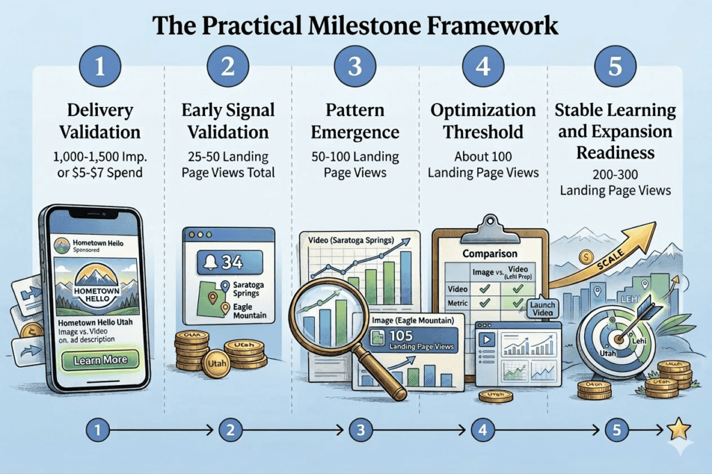
The practical milestone framework
The following framework is the one I would recommend for local advertisers running smaller campaigns with limited tracking. It is not built around theory alone. It reflects what happened in a real campaign and the points where the data was and was not trustworthy.
Milestone 1: Delivery validation
Do not touch anything until each ad set has either roughly 1,000 to 1,500 impressions or about $5 to $7 in spend. At this stage, the goal is not optimization. The goal is simply to confirm that the campaign can deliver.
This first milestone answers basic questions.
Is the audience too small?
Is the ad approved?
Are impressions coming in?
Is Meta serving the creative at all?
If the answer is yes, then the campaign has passed the first gate. At this stage, changing copy, turning placements on and off, or introducing new creative usually creates more confusion than insight.
Milestone 2: Early signal validation
Once the campaign reaches about 25 to 50 landing page views total, you can start to look for directional signals. This is still too early for strong conclusions, but it is enough to tell whether the campaign is fundamentally broken or viable.
This is where you look for things like whether landing page views are happening at all, whether one placement is consuming spend without results, and whether costs are wildly out of line. What you should not do yet is start making aggressive structural changes based on tiny differences.
This stage is about validating that the campaign deserves more time.
Milestone 3: Pattern emergence
At around 50 to 100 landing page views, repeatable patterns start to appear. This is the point where you can begin to see whether one city is stronger than another, whether one placement is consistently carrying the campaign, and whether one media type appears more promising.
This is also the earliest point where introducing a new creative format, such as video when you started with image only, becomes reasonable. The key is that the original campaign must first prove that it can generate real visits.
Before this point, adding more variables usually muddies the learning. After this point, adding one new variable can be productive.
Milestone 4: Optimization threshold
At around 100 landing page views, you finally have enough data to make modest optimizations with some confidence. This is where you can begin comparing image versus video, evaluating whether placements should be trimmed, and deciding whether a rising cost per landing page view is a real pattern or just normal noise.
If you started with image ads only, this is the point where it makes the most sense to launch a video version. If you already added video earlier as an observational test, this is the point where the comparison starts to become meaningful.
This is also the stage where dashboards become much more useful. Before this, they mostly confirm delivery. After this, they begin to reveal real trends.
Milestone 5: Stable learning and expansion readiness
Once a campaign reaches 200 to 300 landing page views, it moves from testing into stable pattern recognition. At this point, you can start making more meaningful decisions such as introducing new cities, testing a second wave of creatives, splitting image and video more intentionally, or increasing budgets gradually.
This is not the same as saying the campaign is fully mature. It simply means there is finally enough signal to make more than tiny changes without guessing.
What this looked like in a real campaign
In our campaign, image ads launched first. That was the right call because it simplified the initial learning. Once the campaign had enough landing page views to show the ads were viable, video was introduced. Over time, the data showed that video was competitive and in some cases more efficient than image, especially in certain cities.
At the same time, there were also signs that performance softened after the first month. Landing page views dropped in month two and three relative to spend. That did not automatically mean the campaign was broken. Frequency remained healthy, which suggested the issue was not simple audience saturation. The more likely explanations were a combination of creative fatigue, small-budget volatility, and Meta shifting spend toward placements that generated more impressions but less efficient traffic.
That is exactly why milestone-based decision making matters. Without those thresholds, it is too easy to panic after one bad week or overreact to one strong placement.
Best practices that matter more than people think
Use one primary metric for operating decisions
If you do not have backend conversion tracking, pick the best proxy and commit to it. In this case, landing page views were the right choice. Do not bounce between impressions one week, clicks the next, and vague “engagement” after that. That creates chaos.
Keep variables isolated whenever possible
If you want to know whether video works better than image, the cleanest answer comes from isolating format. If you change the media, the copy, the placements, and the geography all at once, you have not really run a test. You have just changed everything.
Do not trust low-volume placement results too quickly
A placement that produced one cheap landing page view is not automatically a winner. The campaign needs enough data to show a repeated pattern before you start trimming or expanding based on placements.
Use clear naming conventions for campaigns and creatives
One of the most useful discipline moves in this campaign was naming ads clearly by city, creative type, and version. That made reporting possible even when Meta’s own reporting labels were messy. Clean naming is not glamorous, but it is one of the easiest ways to keep future analysis honest.
Do not let Meta’s warnings bully you into bad placements
Meta often recommends enabling more placements. Sometimes that helps with delivery. Sometimes it just opens the door to cheaper but lower-quality inventory. The right response is not to ignore all recommendations or accept all of them. The right response is to compare the recommendation against actual campaign data.
Do not confuse low frequency with strong creative
A healthy frequency tells you you are probably not exhausting the audience yet. It does not prove the creative is still sharp. A campaign can still lose efficiency because the message is getting stale or because Meta is drifting into weaker delivery patterns.
When to refresh creative
Creative refreshes should be driven by pattern, not boredom. If frequency stays modest but cost per landing page view rises over several weeks, that is a strong signal that the creative may need fresh energy. That does not always require a complete reinvention. Sometimes it simply means introducing one new image ad and one new video ad while keeping the core offer and call to action consistent.
The safest practical workflow is to duplicate the current ad, replace only the media, rename it clearly, launch it, and then pause the old creative once the new one is live. That keeps reporting cleaner and prevents tiny budgets from being split across too many active creatives.
When to expand geography
New locations should usually be added only after the existing campaign has shown stable enough performance to justify expansion. In our case, city one and city two were kept separate because they are neighboring cities and overlapping targeting would have made the reporting much harder to trust. Adding the third city made sense only after the campaign had delivered enough traffic to show that the structure itself was viable.
If you expand into a new city too early, you risk multiplying uncertainty rather than scaling what works.
A simple way to think about the phases
There is a useful way to summarize the whole framework:
At around 50 landing page views, observe. At around 100 landing page views, optimize carefully. At around 200 to 300 landing page views, expand with more confidence.
That is not a law. It is a practical operating model that keeps advertisers from making emotional decisions too early.
Final takeaway
If a campaign is underperforming, the answer is not always to make changes immediately. Sometimes the smartest move is to leave the campaign alone until it has actually earned the right to be judged.
That discipline is especially important in local campaigns with limited budgets, smaller audiences, and imperfect tracking.
The most dangerous thing in paid social is not bad data. It is acting too confidently on too little of it.
If you can define clear milestones before you touch the campaign, you give yourself a far better chance of making decisions that improve performance instead of resetting learning over and over again.
The specific metric you use may vary — purchases, leads, or the best proxy metric available — but the discipline remains the same: wait until the campaign has gathered enough signal before making the next decision.
In the early 1990s, America’s dairy industry faced declining milk consumption despite decades of “good for you” advertising.
Enter “Got Milk?”, a 1993 ad campaign that flipped the script by humorously highlighting life without milk. The catchy Got Milk? slogan and milk-mustached celebrities became pop culture sensations, driving 90% awareness in California within two years.
However, while the campaign won awards and imitation everywhere, its impact on actually getting people to drink more milk was limited.
This case study explores how Got Milk? became a marketing phenomenon, what results it delivered (including a short-term sales bump), and what modern marketers can learn from its creative wins and strategic missteps.
Company Involved
The campaign was led by the California Milk Processor Board (CMPB), a state dairy trade group. They partnered with advertising agency Goodby, Silverstein and Partners to create Got Milk?. Later, the national Milk Processor Education Program (MilkPEP) adopted the slogan for nationwide use, extending the campaign’s reach.
Marketing Topic
Advertising
Branding
Consumer Behavior
Public Reaction or Consequences
The public’s reaction to Got Milk? was overwhelmingly positive. The ads struck a chord by humorously depicting people stuck with cookies or cereal and no milk, a “deprivation” strategy instantly relatable to millions. The 1993 “Aaron Burr” TV spot became an award-winning hit, and within months “Got Milk?” entered the cultural lexicon. By the mid-90s, 91% of U.S. adults recognized the campaign. The slogan spawned countless parodies (“Got [Anything]?”) and merchandise. Mattel even released a special-edition Got Milk? Barbie in 1995, reflecting how the campaign turned a humble beverage into a pop culture icon.
However, popularity didn’t immunize Got Milk? from criticism or unintended consequences. The California Milk Board occasionally pushed the edgy humor too far. In 2011, a spin-off campaign suggesting milk could relieve PMS symptoms (taglined “Everything I do is wrong”) backfired badly. It featured hapless men offering milk to irritable women and was widely slammed as sexist. The public outcry forced the ads to be pulled within weeks, and the Board issued apologies on a “Got Discussion?” site. Additionally, animal-rights groups like PETA lampooned Got Milk? with guerrilla spoofs (e.g. “Got Pus?”) to protest dairy, prompting CMPB to threaten legal action. These episodes showed that even beloved campaigns can misstep and face backlash when messaging misses the mark.
Most notably, despite Got Milk?’s fame, Americans didn’t significantly increase their milk intake in the long run. The campaign coincided with powerful shifts in consumer habits. The rise of soft drinks, juices, and later almond and oat milks cut into milk’s market. Through the 1990s and 2000s, per-capita milk consumption continued a decades-long slide. This disconnect between ad recognition and behavior ultimately led the industry to rethink its strategy.
Why It Matters Today
Power vs. Limits of Branding: Got Milk? proves a campaign can achieve viral cultural status and still struggle to change consumer behavior. Modern marketers must balance creative branding with strategies that drive actual usage or sales, especially when facing broader lifestyle trends.
Adapting to Consumer Trends: This case highlights the need to pivot messaging as consumer preferences evolve. Dairy promoters eventually shifted from whimsical deprivation ads to nutrition-focused appeals (the 2014 “Milk Life” protein campaign) and even TikTok challenges in 2020. Effective marketing today demands agility and awareness of health trends, social media, and new consumer values.
Brand Equity and Beyond: Got Milk? shows how a great slogan can transcend its original campaign. The tagline became a licensable asset, featured on Oreos, Barbies, and t-shirts, generating over $10 million in licensing revenue for the milk board. Marketers can learn to leverage intellectual property and partnerships to extend a campaign’s life and impact.
3 Takeaways
An Iconic Slogan Isn’t a Strategy: Catchy slogans and funny ads alone won’t guarantee sustained sales. Marketing must connect to product consumption (in this case, getting people to actually drink milk), not just win attention. Always tie campaign success metrics to real behavior change, not just awareness.
Adapt or Lose Relevance: Even legendary campaigns must evolve. Got Milk? thrived when it tapped cultural moments and consumer insights, but it faltered when it failed to address changing diets and attitudes. Marketers should continually monitor trends (health, convenience, social media) and update their messaging to stay relevant.
Build a Brand, Not Just an Ad: Got Milk? turned a commodity into a cultural talking point and even a brand in its own right. By co-branding with food partners and merchandising the slogan, the campaign added value beyond ads. The lesson: great marketing can create enduring brand assets, but those assets work best when leveraged alongside product innovation and customer experience improvements.
Notable Quotes and Data
“First sales increase in 10+ years:” In 1994, California’s milk sales increased for the first time in over a decade, reaching 755 million gallons sold (up from 740 million in 1993). The Got Milk? launch is credited with halting what had been a steady decline in milk demand.
Cultural saturation: By the mid-1990s, 91% of U.S. adults were familiar with the Got Milk? campaign, an astonishing level of awareness for a commodity product. More than 300 celebrities, from supermodels to cartoon characters, eventually donned the famous milk mustache in ads.
Consumption kept falling: “Got Milk?” didn’t actually get people to buy more milk. Per-capita milk consumption dropped from about 0.96 cups per day in 1970 to 0.59 cups by 2011. The ads were popular, but Americans kept reaching for soda, juice, and later soy and almond milk alternatives for various lifestyle reasons.
Full Case Narrative
Background: By 1993, milk was in crisis. For decades, U.S. dairy producers had poured money into generic “milk is good for you” advertising, only to watch consumers drift to Coca-Cola, Snapple, sports drinks and other beverages. In California, the nation’s #1 dairy state, per-capita milk consumption had plummeted from 29 gallons a year in 1980 to 23 gallons by 1993. Annual milk sales were declining 3 to 4% and the usual health-based ads weren’t working. The newly formed California Milk Processor Board (a consortium of dairy processors) realized they needed a bold new approach or risk “losing the farm.” Their goal was simple but daunting: stop the bleeding and get people drinking milk again.
The Big Idea: CMPB hired Jeff Manning as executive director and tapped Goodby, Silverstein and Partners, a creative San Francisco ad agency, to reimagine milk marketing. Through research, the team uncovered a key insight: nearly everyone already believed milk was healthy. The problem was they still weren’t drinking more. They noticed that milk is almost always consumed with foods (cereal, cookies, peanut butter and jelly), and people only really crave milk when they run out at the worst time. This led to the “milk deprivation” strategy: instead of extolling milk’s virtues, dramatize how awful life is without it.
The agency brainstormed a simple, cheeky question to capture that feeling: “Got Milk?”. In October 1993, the first Got Milk? TV commercial, “Aaron Burr,” aired in California. Directed by a young Michael Bay, the ad showed a history buff failing to answer a $10,000 trivia question on-air because a mouthful of peanut butter made him choke out “Aaron Burr” unintelligibly, and he has no milk to wash it down. The absurd humor and cinematic flair grabbed viewers’ attention. Got Milk? had entered the chat.
Marketing Blitz: The Aaron Burr ad was an instant hit, winning a Clio Award and rave reviews in early 1994. Building on that momentum, CMPB rolled out a blitz of “deprivation” scenarios in TV and print. One memorably dark-humored spot (“Heaven”) showed a man in a cookie-laden heaven that turns out to be hell because all the milk cartons are empty. Another parodied Citizen Kane with a tycoon desperately searching for an Oreo dunked in milk. Every ad ended with that stark “Got Milk?” on screen. Meanwhile, print ads simply showed enticing foods (cookies, cake, cereal) minus milk, letting viewers feel the thirst.
The Got Milk? team also measured everything. They set aside the usual “attitude awareness” surveys and instead tracked actual milk usage in thousands of households. By 1995, the data was promising: awareness of Got Milk? hit 90% in California, household milk-buying rates stopped falling, and people reported using milk more frequently. Indeed, 1994 milk sales ticked up in California for the first time in over ten years. The campaign appeared to be delivering on its objective of stabilizing demand, at least regionally.
Beyond sales, Got Milk? achieved marketing nirvana: it became cool. The slogan went viral (pre-social media) purely via news and word-of-mouth. Newspapers and TV shows talked about the clever ads. “Got milk?” turned into a catchphrase used and abused by anyone with something to sell, from bumper stickers to t-shirts. The California Milk Processor Board shrewdly capitalized on the craze by licensing the tagline. Starting in 1995, the national MilkPEP program put “Got Milk?” on its famous milk mustache print ads, recruiting over 300 celebrities (actors, athletes, even Kermit the Frog) to pose with milk moustaches in magazines. CMPB also cut licensing deals with food companies. Nabisco printed “Got Milk?” on Oreo packages, Nestlé put it on Nesquik bottles, and even Barbie dolls sported mini milk cartons with the slogan. By turning the campaign into a licensing brand, the milk board generated millions in extra revenue and kept Got Milk? in the public eye.
Results – Did It Work?: In terms of branding and buzz, Got Milk? was a grand-slam. It ran for over 20 years (1993 to 2014) and nabbed almost every advertising award in existence. The campaign is taught in marketing textbooks as an example of genius positioning, how a simple question made a mundane product culturally relevant. Importantly, Got Milk? did achieve its short-term goal in California: it stopped a freefall in milk sales. The first year, sales volume actually rose about 2%. Over the next several years, the decline in per-capita milk consumption flattened in California, saving an estimated $255 million in potential losses annually that might have occurred without the campaign. Jeff Manning referred to Got Milk? as “the Godfather” of marketing campaigns, one that “helped turn around milk sales” when it mattered.
Nationally, the picture was murkier. Got Milk? certainly boosted milk’s mindshare, by 1996, over 90% of Americans recognized the ads, and many states adopted the slogan through their dairy boards. Yet, actual U.S. milk consumption kept slipping in the long run. From the 1970s to 2010s, Americans steadily drank less milk each decade, due to diversifying beverage choices, rising concerns about calories, and changing breakfast habits. By one measure, per-capita milk intake fell about 25% from 1975 to 2012, despite two decades of Got Milk? advertising. Milk simply had entrenched challenges that witty ads alone couldn’t overcome: competition from colas and later energy drinks, the advent of bottled water and coffee chains, even the decline of breakfast cereal as people grabbed quicker options. In the 2000s, concerns about lactose intolerance and the rise of plant-based milks (soy, almond) further eroded milk’s edge. Thus, while Got Milk? prevented a sharper drop and gave milk a “cool factor” it never had, it ultimately could not reverse the long-term decline in consumption nationwide. As marketing analyst Kirk Kardashian quipped, “Got Milk? didn’t actually get people to buy more milk” in the end.
Keeping It Fresh: To its credit, the Got Milk? campaign continually evolved creatively. By the late ’90s, Goodby Silverstein worried the joke might wear thin if every ad was a predictable “out of milk” gag. They refreshed the approach with new angles. For example, a series set in a dystopian “Town Without Milk” (1997) imagined a bleak world where milk’s absence causes despair. They also targeted younger audiences, producing edgy teen-oriented spots. These ads tested well and kept the campaign feeling inventive. The team embraced co-branding as well. Milk ads started featuring cameos from Oreo cookies, cereal mascots, and even the Sesame Street Cookie Monster, emphasizing milk’s partners in crime. This partnership strategy was ahead of its time. It acknowledged that milk’s best hope was to hitch itself to foods people loved, rather than pretend people would chug plain milk for its own sake. The California board also smartly invested in multicultural marketing. Recognizing that Hispanic families were heavy milk consumers but didn’t relate to the quirky “Got Milk?” humor, they developed Spanish-language campaigns focusing on family and recipes (under slogans like “Familia, Amor y Leche”), which earned praise and bolstered milk usage in those communities.
Not every idea succeeded. Aside from the infamous 2011 PMS campaign debacle, another controversial moment came in 2005 when a Got Milk? ad parodying steroid use in baseball (implying a player’s secret strength was milk) upset Major League Baseball officials. But by and large, Got Milk? maintained a positive image and demonstrated remarkable longevity for a marketing campaign.
Transition – The End of “Got Milk?”: By 2013, after 20 years, milk consumption was still trending down and some in the industry felt Got Milk?, however clever, had run its course. Dairy farmers had actually stopped contributing to the national ad budget years prior, preferring to fund product innovations and partnerships (like putting milk in McDonald’s Happy Meals) that they felt had more direct impact. In early 2014, MilkPEP made a bold move: they retired “Got Milk?” as the national slogan, replacing it with a new campaign called “Milk Life”. The Milk Life ads emphasized milk’s protein and nutrients, showing everyday people powered by milk in energetic scenarios. This shift acknowledged a new reality. Consumers wanted functional benefits (protein for breakfast, etc.), and the milk industry needed to remind them of milk’s nutritional value to compete with protein shakes and plant milks. California, however, held onto Got Milk? for its local marketing, believing the brand equity was too strong to abandon. The original slogan remained active on the West Coast even as “Milk Life” took over nationwide.
Timeline
1993 (Oct): “Got Milk?” campaign launches in California with the famous Aaron Burr TV commercial. The tagline immediately resonates with consumers.
1994: Milk sales in California rise for the first time in over 10 years (up to 755 million gallons from 740 million in ’93). The campaign wins top advertising awards and becomes a pop culture phenomenon.
1995: MilkPEP licenses Got Milk? for a national milk mustache ad campaign. Celebrities from supermodels to athletes pose with milk mustaches in print ads, all bearing the “got milk?” logo. Got Milk? Barbie doll debuts, and the slogan is licensed for use on Oreo cookies and other products.
1997: Amid concerns of ad wear-out, the campaign tests new creative directions (e.g. the surreal “Town Without Milk” series) to keep consumers engaged. By now, Got Milk? is used by dairy boards across the U.S. via licensing.
2011: CMPB’s “Everything I do is wrong” PMS-themed ads spark a public backlash over sexist messaging. Within two weeks, the campaign is pulled and replaced with an apology website. This PR crisis shows the risks of straying off-tone.
2014: National retirement of Got Milk? – MilkPEP unveils the new “Milk Life” campaign focusing on protein and nutrition. The era of whimsical deprivation ads ends as the industry tries a more straightforward pitch to boost sales. California continues with Got Milk? locally.
2020: Got Milk? is resurrected by MilkPEP during the COVID-19 pandemic, as home-bound consumers bought more milk. A modern twist: the #GotMilkChallenge on TikTok invites users to show off tricks with milk, generating over 430 million views. The slogan is reintroduced to a new generation via social media and influencer content.
What Happened Next?
After pivoting to Milk Life, the dairy industry saw only modest impacts. Milk’s decline slowed but not dramatically reversed. The new ads reminded consumers that milk has 8g of protein per glass, aligning with the high-protein diet trend. Yet, competition from dairy-free alternatives intensified through the late 2010s. The conversation around health also shifted. Concerns about sugar (in flavored milks), animal welfare, and lactose intolerance grew louder, posing challenges that pure marketing couldn’t fix overnight.
By 2020, a surprising uptick in milk demand (thanks to pandemic stockpiling and more breakfasts at home) gave dairy marketers an opening. Seizing the moment, MilkPEP brought back “Got Milk?” for the social media age. The reboot didn’t rely on expensive celebrity magazine spreads, but on viral user-generated videos. One headline stunt featured swimmer Katie Ledecky swimming the length of a pool with a glass of chocolate milk balanced on her head, not spilling a drop. The accompanying #GotMilkChallenge exploded on TikTok, amassing hundreds of millions of views. Everyday people posted milk chugging tricks, mustache selfies, and creative recipes, all hashtagged with the iconic slogan. This campaign within a campaign showed how Got Milk? still had resonance and could be reinvented to spark engagement.
As of today, milk advertising continues to evolve. The dairy industry has embraced strategies beyond traditional ads, from partnering with fast-food chains to put milk in kids’ meals, to developing lactose-free milk and high-protein dairy drinks to meet consumer needs. Got Milk? remains active in California and in periodic national pushes, often with a nostalgic or retro appeal. Meanwhile, plant-based milks use marketing of their own (sometimes playfully riffing on “Got Milk?”, e.g. “Got Oat Milk?” slogans). The legacy of Got Milk? endures as a masterclass in branding, but also as a cautionary tale that even the catchiest slogan can’t single-handedly overcome broad societal shifts.
One Sentence Takeaway
A brilliant ad campaign can turn a product into a cultural icon, but lasting marketing success comes from converting cultural impact into sustained consumer action.
The 1987 PSA “This Is Your Brain on Drugs” (Partnership for a Drug-Free America) became an iconic anti-drug image. It was credited with raising teens’ perception of cocaine risk (from 78% to 88%), but later research found fear-based youth campaigns had little beneficial effect, and in some cases correlated with increased drug use.
The slogan and frying-egg imagery went viral in pop culture (even drawing an Egg Board protest, but experts (and Syracuse professor Robert Thompson) argue it was too “preachy” and may have backfired.
The concept was later updated in 1997 (a heroin-themed spot with Rachael Leigh Cook and 2017 (Cook again, this time condemning the “war on drugs”. Modern analyses suggest marketers today should balance emotional impact with audience research and relevance, learning both from the campaign’s iconic strengths and its shortcomings.
Background: Partnership for a Drug-Free America
Founded in 1986 by advertising and public health leaders (with $300,000 seed funding from the American Association of Advertising Agencies, the Partnership for a Drug-Free America (PDFA) was a nonprofit social-marketing coalition. Its strategy was to “treat [illicit drugs] like any other purchasing choice” – using marketing tactics to “un-sell” drugs rather than sell them. In practice, volunteer agencies created hard-hitting PSAs and donated airtime, aiming to influence teens as if they were consumers. The organization (now renamed the Partnership to End Addiction) applies research-backed tools to prevent youth substance abuse. In short, PDFA pioneered social marketing and public service advertising, applying commercial creativity to a public health cause.
Marketing Categories
Social Marketing / Public Service Advertising: The campaign is a classic PSA – no paid media, high-profile creative aimed at social good. It targeted youth with a stark visual metaphor, akin to marketing a product (but with a negative message).
Cause Branding / Coalition Marketing: PDFA became a brand. Dozens of big agencies (Saatchi & Saatchi, J. Walter Thompson, etc.) volunteered creative work, giving PDFA an industry gloss. The partnership leveraged celebrity culture (“Liken potential addicts to consumers… by celebrity endorsements…Then use those tricks not to sell the product, but to un-sell it” and claimed ~$1 million/day in donated media (over $2 billion total) to saturate TV and print.
Behavior Change Communication: It falls under health promotion campaigns. Its use of fear appeals (making the brain look fried) and repetition was designed to change teen attitudes and norms, following PDFA’s strategy of using “the best ad minds to denormalize drug use”.
The Original 1987 PSA (“Brain on Drugs”)
In 1987 PDFA aired a 30-second spot featuring actor John Roselius cracking an egg into a hot frying pan, declaring: “This is your brain… [sizzle] …This is drugs. This is your brain on drugs. Any questions?”. The simple, graphic metaphor and tagline made it instantly memorable. Paul Keye – a creative director involved – recalls the campaign was born from the ad industry’s eagerness to “un-sell” hard drugs during Nancy Reagan’s “Just Say No” era. Agencies convinced networks to donate airtime; Keye estimates over $300 million worth of free spots were aired. The PSA ran heavily for months. Audience research later claimed ~92% of teens saw it, and 88% reported believing even occasional cocaine use was dangerous (up from 78% before the ads). Dealers allegedly joked “Let’s go fry an egg” to mean using drugs, showing the line’s penetration into youth slang.
Timeline of Key Events
1987: Original “Brain on Drugs” PSA airs nationwide.
1989–90: PDFA continues high-profile anti-drug campaigns; by 1990 the Fried-Egg spot was ranked No. 11 on TV Guide’s Top 50 commercials.
1997: A new “Brain on Drugs” PSA debuts featuring Rachael Leigh Cook; in this spot her character smashes eggs and even a kitchen to dramatize heroin’s ravages.
2016: A third “Brain on Drugs” PSA (without Cook) is released, targeting teens.
2017: Cook stars in a remade PSA (released on 4/20/2017) with a twist: it critiques U.S. drug policy, noting that white users are unlikely to be arrested vs. people of color, and condemning the “war on drugs” as costly and ineffective.
2010s: PDFA rebrands (first as Partnership at DrugFree.org, then Partnership for Drug-Free Kids) and shifts to digital/parent-focused campaigns (e.g. the “Time to Talk” prescription-drug prevention initiative).
Public and Media Response
The Fried-Egg PSA struck a chord. It was widely cited as *“iconic”* in advertising lore (Time called it iconic in a top-10 PSA list and spawned countless parodies on TV, T-shirts, and the Web. Medill News notes it became “one of the most well-recognized… health campaign ads of all time, evoking parodies and drawing the ire of comedians and musicians”. The tagline “Any questions?” became a catchphrase. Even the American Egg Board complained that the ad unfairly linked their product with drugs. Over time, the image became a cultural shorthand: teen slang picked it up (“fry an egg” for using), and comedians joked about it. Critics, however, called it heavy-handed. Some students reported it felt more like a dare than a deterrent, while others said it truly scared them. Syracuse professor Robert Thompson quipped that he’d “ready to go score some cocaine… to spite the commercial… It was so irritatingly preachy and not effective”. In short, the spot was unforgettable, but it polarized audiences.
Effectiveness: What Really Happened?
Positive Indicators: PDFA cited surveys showing increased risk perception. For example, after the ads 88% of teenagers said even occasional cocaine was dangerous, up from 78% before. The campaign achieved enormous reach, and some analyses (like PDFA’s own press and a 1994 Johns Hopkins commentary) claimed it contributed to youth drug-use deterrence.
Critical Findings: Independent research painted a more nuanced picture. A 2008 *American Journal of Public Health* analysis found that, overall, the National Youth Anti-Drug Media Campaign (which included these PSAs) had no positive effect on teens, and in some cases higher exposure predicted *earlier* drug initiation. A Lancet review concluded drug prevention ads generally showed **“little effect”** on substance use (unlike anti-tobacco campaigns). Notably, a study cited by Prevention specialists observed that youths who saw the campaign were actually *more* likely to use drugs later. Qualitative feedback supports this skepticism: one teen said the ad “stirred my curiosity” and called it a dare, while another said it had genuinely scared her. These findings suggest that despite its fame, the PSA’s actual influence on behavior was limited or mixed. As analysts warn, a campaign that isn’t aligned with audience perceptions can even “move [the] target audience away” from desired change.
Relevance Today
For today’s audiences, the original PSA’s approach feels dated. Media consumption is fragmented (social media, streaming), and many young people distrust blunt scare tactics. Neuroscientific research implies that the best health ads are those that combine emotional engagement with clear rationale. For instance, one study found the most persuasive anti-drug PSAs evoked strong emotional brain responses while using *“less yelling”* – meaning they conveyed consequences in a compelling, nuanced way. This suggests modern campaigns should avoid just shouting warnings; they need narrative hooks or real stories. Cultural shifts also matter.
With increasing acceptance of marijuana and criticism of the War on Drugs, an ad showing a frying brain might lack credibility. The 2017 remake reflects current values: instead of scaring viewers, it used the egg to critique systemic injustice (“the war on drugs is ruining lives… it doesn’t work”. This aligns with today’s trend of addressing social context (racial disparity, policy) and health equity. Marketers now often blend digital outreach and peer-based messaging rather than relying solely on TV PSAs.
Finally, experts emphasize combining ads with broader measures: Wakefield’s Lancet review noted health campaigns work best when paired with policies or education (anti-tobacco ads succeeded when governments taxed and banned smoking). In short, the “brain on drugs” ad remains a powerful symbol, but effective drug prevention today requires data-driven, multi-channel strategies that fit modern culture and media.
3 Actionable Marketing Takeaways
Use audience research to target messaging: Don’t assume scare tactics work for all groups. Studies warned that a misalignment between the ad’s tone and teens’ own experiences can backfire, even “moving [them] away” from the goal. Test ads with focus groups and be ready to adjust your framing to what resonates with your audience’s knowledge and values.
Balance emotion with clarity: Impactful ads do not have to be preachy. A neuroscience-informed study found the most effective anti-drug ads triggered emotional engagement while still being understandable (they were “less yelling, but more compelling”. Aim for storytelling that connects with viewers emotionally but clearly illustrates consequences or solutions. Avoid oversimplification or heavy-handedness that might cause resistance.
Adapt to context and culture: Modern campaigns should incorporate current trends and media. For example, the 2017 PSA smartly re-used a classic image to address today’s issues. Similarly, align your message with popular platforms (social media, influencers) and broader initiatives (education programs, policy changes). Remember, combining marketing with systemic support (like in tobacco control) boosts effectiveness.
Single-Sentence Takeaway
An arresting slogan like “This Is Your Brain on Drugs” can build awareness, but truly effective campaigns require evidence-based, culturally relevant messaging tailored to the audience’s context.
Smokey Bear’s “Only you can prevent forest fires” campaign, later updated to “Only you can prevent wildfires,” is the longest running public service advertising campaign in United States history.
It uses a simple, personal call to action and a memorable character to change how Americans behave around fire and to reduce human caused wildfires over eight decades.
Company Involved
The campaign is led by the United States Department of Agriculture Forest Service, in partnership with the Ad Council and the National Association of State Foresters.
Primary marketing categories include public service advertising and social marketing, branding and character led storytelling, and behavior change and safety education.
Public Reaction or Consequences
Over time Smokey Bear became one of the most recognized characters in American public service communication, with high recognition rates among outdoor recreationists and broad awareness of the campaign’s public service announcements.
The campaign helped build a strong social norm around personal responsibility for preventing unwanted fires and became embedded in culture through posters, radio, television, school programs, toys, and music references.
Historical summaries credit the forest fire prevention effort associated with Smokey Bear with helping to reduce the number of acres lost to wildfires from tens of millions annually to significantly lower levels over the long term, even though modern climate pressures have increased recent averages.
Modern fire experts have noted that early interpretations sometimes encouraged a view that all fire was bad, which contributed to fuel buildup. That scientific context helped motivate the 2001 shift from “forest fires” to “wildfires” to clarify that the goal is to prevent unwanted human caused fires rather than all fire on the landscape.
Why It Matters Today
First, it shows how a clear, consistent message can anchor a campaign for generations without losing relevance.
Second, it demonstrates the power of a single character and slogan to create behavior change at national scale.
Third, it highlights the importance of updating messages as science, context, and public understanding evolve.
Fourth, it offers a model for modern cause based and safety campaigns that want to be recognizable and effective across many channels for years.
3 Takeaways
1. A simple, personal message delivered by a distinctive character can sustain attention and influence behavior far longer than most campaigns if it is consistently reinforced and culturally embedded.
2. Long running campaigns must periodically adjust their language and framing as context changes, as seen when the slogan evolved from forest fires to wildfires to reflect modern fire science and realities.
3. Behavior change marketing works best when people see themselves as the hero of the story, which Smokey achieves through the word “you” and creative that invites each viewer to take responsibility for everyday actions that prevent harm.
Notable Quotes and Data
The 1947 slogan “Remember…only YOU can prevent forest fires” became one of the most famous public service lines in American history and still anchors public memory of the campaign.
In 2001 the line was updated to “Only you can prevent wildfires” in order to acknowledge that destructive fires occur in many types of wildlands and to distinguish unwanted fires from beneficial prescribed burns.
Ad Council summaries and federal sources state that the forest fire prevention effort associated with Smokey Bear helped reduce average acres burned annually from roughly twenty two million to significantly lower levels over time, underscoring the potential impact of a sustained behavior change campaign.
Full Case Narrative
Smokey Bear emerged during World War Two when the United States Forest Service, concerned that both enemy action and human carelessness could destroy critical timber resources, launched a focused forest fire prevention initiative. The Cooperative Forest Fire Prevention program was established in 1942, and by 1944 officials chose a bear as the symbol that would carry the message to the public.
On August 9, 1944, Smokey Bear was officially authorized as the campaign mascot, and the first poster, painted by artist Albert Staehle, showed Smokey in a ranger style hat and jeans pouring water on a campfire with the tagline “Smokey says: Care will prevent 9 out of 10 forest fires.”
In 1947 the Wartime Advertising Council, which later became the Ad Council, introduced the slogan that would define the campaign for more than half a century: “Remember…only YOU can prevent forest fires.” The line made the message personal by addressing the viewer directly, framed fire prevention as a matter of responsibility rather than punishment, and was short enough to appear in many media formats without losing impact.
Smokey’s story broadened in the 1950s when a real bear cub rescued from a New Mexico wildfire became a living symbol of the campaign. The injured cub, later known as the real Smokey Bear, was rehabilitated and eventually lived at the National Zoo in Washington, D.C., where he received thousands of letters from children and reinforced the emotional connection between the character, wildlife, and the consequences of human carelessness.
Over the following decades Smokey appeared on radio programs, in comic books, on television, in school curricula, and on licensed merchandise. The campaign was so commercially and culturally successful that Congress passed the Smokey Bear Act in 1952, protecting the character and directing royalties to wildfire prevention education.
From a marketing perspective Smokey Bear is a strong example of long term brand building for a social cause. The brand assets are extremely consistent: Smokey’s hat, shovel, jeans, serious but approachable expression, and a direct tagline that tells people exactly what to do. The creative platform is flexible enough to adapt to new media and cultural trends, yet the core elements remain intact.
Recent reflections on the character’s eightieth anniversary emphasize how the campaign continues to refresh creative work, such as using modern humor and digital placements, while staying anchored to the same central promise about personal responsibility for preventing unwanted wildfires.
The campaign’s impact is visible in both quantitative and qualitative ways. Historical summaries credit the forest fire prevention campaign with helping to reduce average acres burned annually from tens of millions to lower levels over the long term, even though modern climate pressures have increased the severity and frequency of recent fires. Surveys continue to show high recognition of Smokey Bear among outdoor recreationists and the general public, suggesting that the character and message remain well known.
At the same time, modern fire science has prompted a more nuanced understanding of wildfire. Many ecologists and land managers now emphasize the importance of good fire, such as prescribed burns, for maintaining healthy forests. This scientific shift contributed to the 2001 wording change from “forest fires” to “wildfires” and ongoing efforts to clarify that the campaign targets unwanted, human caused fires rather than all fire on the landscape.
For marketers, the Smokey Bear story shows how a campaign can evolve without losing its core identity. The look and tagline have been refined, the media mix has expanded from print and radio to digital and social channels, and the underlying narrative has shifted toward a more specific focus on careless human behavior in wildlands. Yet the fundamental message remains that individual choices matter and can prevent harm on a massive scale.
Timeline (Optional)
1942: Cooperative Forest Fire Prevention program is created to reduce human caused forest fires.
1944: Smokey Bear is authorized as the campaign symbol and the first poster appears with “Care will prevent 9 out of 10 forest fires.”
1947: The slogan “Remember…only YOU can prevent forest fires” is introduced.
1950: A real Smokey Bear cub is rescued from a wildfire and becomes a living symbol at the National Zoo.
1952: The Smokey Bear Act is passed, protecting the character and dedicating royalties to wildfire prevention education.
2001: The slogan is updated to “Only you can prevent wildfires” to reflect broader wildland fire risk and evolving fire science.
2024: The campaign marks around eighty years and continues to operate as a central wildfire prevention effort.
What Happened Next?
Today Smokey Bear still anchors the national Wildfire Prevention campaign, with creative developed by the Ad Council and partners that combines classic imagery with updated spots, digital placements, and social content.
The modern campaign emphasizes that most wildfires are caused by humans, focuses on practical behaviors such as properly extinguishing campfires or securing trailer chains, and uses contemporary humor and formats to stay relevant for younger audiences while retaining Smokey’s established voice and authority.
From a marketing standpoint Smokey Bear now operates as an always on safety and behavior change brand: a consistent presence that appears where people are making decisions that affect wildfire risk and a model of how a public service character can remain current while staying visually familiar.
One Sentence Takeaway
A simple, character driven message that makes responsibility personal and stays consistent over decades can reshape everyday behavior at national scale, as long as the campaign continues to evolve with science and culture.