I’ll admit it. I was late to the Instagram party. I didn’t even start my @MarketingWithDave account until March 2025. Since then, I’ve posted every Tuesday and Thursday, sticking to a consistent rhythm. I focused only on regular posts until the end of May, when my wife (a legit micro-influencer who actually knows what she’s doing) said, “You need to be doing Reels.”
She was right.
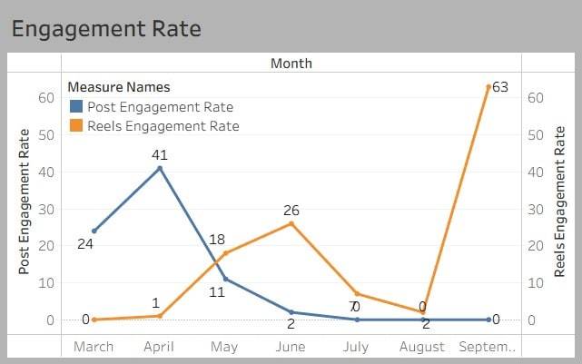
Even with just a sliver of data, it’s clear: Reels are outperforming regular posts, and quickly.
In March and April, I didn’t post a single Reel. But in May, after switching gears, my Reels engagement rate increased by over 1700%.
I manually tracked engagement metrics across starting in March. Yes, manually, because Instagram doesn’t make this easy. From what I can tell, very few people are reporting on Instagram analytics like this, because there’s no clean dashboard unless you’re exporting data via Meta’s API.
Here’s what I found:
Post engagement peaked in April, then dropped off hard in May.
Reels engagement shot up once I started posting them, despite only having a few Reel interactions to measure.
Reels + Stories = More Momentum
Starting at the end of May, every time I posted a Reel, I followed it up with an Instagram Story. I didn’t think much of it at the time, but looking back, this combo amplified results. Stories help remind followers your content exists and give Instagram another signal that you’re active and worth showing. It’s hard to separate their individual impact, but together, Reels and Stories feel like a smart move worth continuing.
A Few Takeaways
Reels clearly outshine Posts. Even just dipping my toe in brought more reach and interaction. The Instagram algorithm clearly favors them.
Manual tracking is a pain. Instagram’s insights are fragmented and there’s no easy export option. Unless you’re a spreadsheet nerd (guilty), most people won’t do this. But it’s worth doing if you’re trying to measure what’s actually working.
Post engagement isn’t dead, but it needs support. My posts still brought in likes and comments, but not at the same scale or consistency as Reels.
What’s Next?
I’m going to keep the Tuesday and Thursday cadence but mix in more Reels. I’ll keep tracking manually for now and continue updating these charts each month as better trending data becomes available.
Regardless of how you feel about certain content on your website, Google and other search engines will reward or penalize you based on how all of your content performs. As SEO expert Marie Haynes put it, “Google doesn’t hate your blog. It just doesn’t see a reason to crawl it again.”
That’s why it’s essential to either continue optimizing underperforming content or remove it when necessary. Even though there’s no universal benchmark, your best insight comes from trending your own data over time.
What Is the Indexed Pages Traffic Ratio?
The Indexed Pages Traffic Ratio is your answer to the following questions you should be asking every month:
What percentage of my indexed pages are getting any traffic (visits or views)?
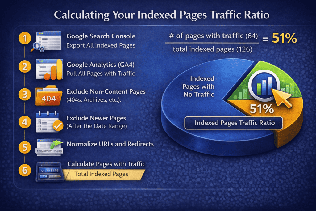
This is your Indexed Pages Traffic Ratio.
Google’s documentation on Crawl Budget and Indexing Best Practices emphasizes the importance of managing your website’s indexed content. Regularly auditing and optimizing your indexed pages ensures that search engines focus on your most valuable content, enhancing overall SEO performance.
Why Track Your Indexed Pages Traffic Ratio?
Tracking this metric helps you identify indexed content that may be:
Invisible to users (poor navigation or linking)
Underperforming (thin or outdated content)
Unintentionally indexed (search results, tag archives, etc.)
By surfacing pages that get no traffic, you can fix what matters and prune what doesn’t.
How to Calculate Your Indexed Pages Traffic Ratio
In Google Search Console, export all indexed pages.
In Google Analytics (GA4), pull a list of all pages that had traffic during your time range.
Remove any pages published after the date range you’re analyzing.
Normalize URLs if pages were renamed or redirected.
Divide the number of pages with traffic by total indexed pages.
Example: 64 / 126 = 51%
Here’s My Data for the Past Three Months
Date
Total Indexed Pages
Indexed Pages with Traffic
Indexed Pages Traffic Ratio
March 2025
97
39
40%
April 2025
112
48
43%
May 2025
126
64
51%
What’s Next?
While I don’t know how this compares to other websites, I do know it’s improving. I’ve been actively working on internal linking, navigation, and performance. I plan to continue monitoring to make sure more of my website is pulling its weight.
Tip: Set a monthly goal for your Indexed Pages Traffic Ratio and track your progress. It’s one of the clearest signs that your content is doing what it should – getting found and delivering value.
Understanding and tracking the right website analytics Key Performance Indicators (KPIs) is crucial for measuring online performance and guiding improvements. Below we compile 11 important KPIs that apply broadly across industries, with clear definitions, reasons they matter, and recent (2024 or later) benchmark figures for context.
Definition: Total Visits, or Sessions, counts the number of times your website is accessed in a given period. A session begins when a user arrives and ends after a period of inactivity or when they exit. Multiple page views and interactions can occur within one session.
Why it’s important: This metric indicates the overall traffic volume your site receives. It’s a top-level gauge of brand reach and marketing effectiveness – more sessions mean more opportunities for engagement or conversion. Tracking sessions over time shows growth trends and the impact of campaigns or seasonal fluctuations. It’s actionable because unusual spikes or drops in visits can prompt investigation into external factors (marketing campaigns, referrals, outages, etc.).
Benchmark: A 2024 analysis of Google Analytics data found a median of about 3,390 sessions per month across industries. What counts as “good” will depend on your context – a niche B2B site might thrive on 5,000 highly targeted monthly visits, while a broad B2C site might aim for hundreds of thousands.
2. Unique Visitors (Users)
Definition: Unique Visitors (Users) measures the number of distinct individuals who visit your site in a period. Unlike sessions, this counts each person only once. It’s usually determined by unique browser cookies or user IDs.
Why it’s important: Unique visitors reflect the reach of your website in terms of individual people. This KPI helps you understand your audience size. Growth in unique users means you’re attracting new people, expanding brand awareness.
Benchmark: A 2024 report found the median website received around 20,000 unique visitors per month.
3. Traffic Source Mix (Channels)
Definition: Traffic Source Mix shows the breakdown of your site’s visits by origin: organic search, direct URL access, referral links, social media, paid ads, etc.
Why it’s important: Knowing what channels drive your traffic helps refine strategy. You can identify top-performing sources and improve underperforming ones. A lopsided source mix can also reveal risk if you’re overly dependent on one source.
Benchmark: Industry data suggests about 33% of website traffic comes from organic search.
4. Bounce Rate (and Engagement Rate)
Definition: Bounce Rate is the percentage of visits where users view only one page and leave without interacting further. In GA4, a session is considered a bounce if it doesn’t last more than 10 seconds, doesn’t involve a second page view, or doesn’t trigger a conversion event. Engagement Rate is the inverse: the percentage of sessions considered engaged.
Why it’s important: Bounce Rate measures initial engagement and content relevance. A high bounce rate may suggest poor alignment between visitor intent and page content. Engagement Rate under GA4 gives a fuller picture of user activity beyond pageviews.
Benchmark: Median bounce rate across industries is about 44%, with an average Engagement Rate around 56%.
5. Pages per Session
Definition: Pages per Session indicates how many pages a visitor typically views during one visit to your site. It’s calculated by dividing total pageviews by the number of sessions.
Why it’s important: Higher values usually mean users are engaged and finding value. Lower values might suggest thin content, poor navigation, or mismatched expectations.
Benchmark: The average is around 3.4 pages for desktop users. Retail sites often exceed 5 pages/session, while service or consulting sites may be closer to 2.
6. Average Session Duration
Definition: Average Session Duration tracks the average time a user spends on your site during one session.
Why it’s important: Longer session durations generally reflect more engaged users. Short times may signal confusing content or unmet expectations.
Benchmark: The 2024 median was around 2 minutes and 38 seconds.
7. Average Time on Page
Definition: Average Time on Page measures the average time visitors spend viewing a particular page. It excludes exits or bounces on the last page of a session.
Why it’s important: It’s a page-specific engagement indicator. High times may reflect deep reading or video watching, while low times might suggest skimmed or irrelevant content.
Benchmark: About 1 minute and 31 seconds is the median across industries.
8. Conversion Rate
Definition: Conversion Rate is the percentage of visitors who complete a defined goal — such as a purchase, form submission, or signup.
Why it’s important: It’s one of the most actionable KPIs, directly tied to ROI. Improving conversion rates typically delivers high leverage business gains.
Benchmark: Average conversion rates hover around 3.3%, with e-commerce sites typically between 2.5% and 3%.
9. New vs. Returning Visitors
Definition: This metric shows the proportion of first-time users versus those returning to the site based on cookie tracking or user IDs.
Why it’s important: A healthy mix supports growth and retention. Too many new users might signal poor loyalty, while too many returning users could indicate a lack of reach.
Benchmark: A returning visitor rate between 30% and 50% is generally healthy.
10. Mobile Traffic Share
Definition: Mobile Traffic Share tracks what percentage of your traffic comes from mobile vs. desktop or tablet devices.
Why it’s important: Mobile-first usage affects everything from design to speed to conversion optimization. Knowing your share guides where to prioritize.
Benchmark: Between 65%–70% of web traffic now comes from mobile.
11. Page Load Time (Site Speed)
Definition: This KPI measures how quickly your site’s content loads and becomes interactive. It can be broken into desktop and mobile versions.
Why it’s important: Slow load times hurt UX, increase bounce, and reduce conversions. It’s also a ranking factor in search.
Benchmark: Around 2.5 seconds for desktop and 8.6 seconds for mobile is the current average. Aim for less than 3 seconds on mobile.
Why These KPIs Actually Matter
In the world of digital marketing, what gets measured is what gets managed. But not all metrics are created equal. These KPIs are more than just numbers on a dashboard, but they’re strategic signals that tell you where your traffic is coming from, how users engage with your site, and whether your digital experience is actually moving the needle. Too often teams chase vanity metrics and miss the bigger picture. Focus instead on the metrics that tie directly to behavior, intent, and conversion. Track them consistently, benchmark against your past performance (not just industry averages), and use the insights to take deliberate action. This is how you go from reporting data to actually improving results.
Most domain value calculators feel like guessing machines. You type in a domain, hit a button, and get a number with little explanation behind it.
That is why I like the Agent.AI’s Domain Value tool. Instead of just outputting a price, it shows the reasoning behind the estimate, including keyword value, brandability, length, demand signals, and marketplace context.
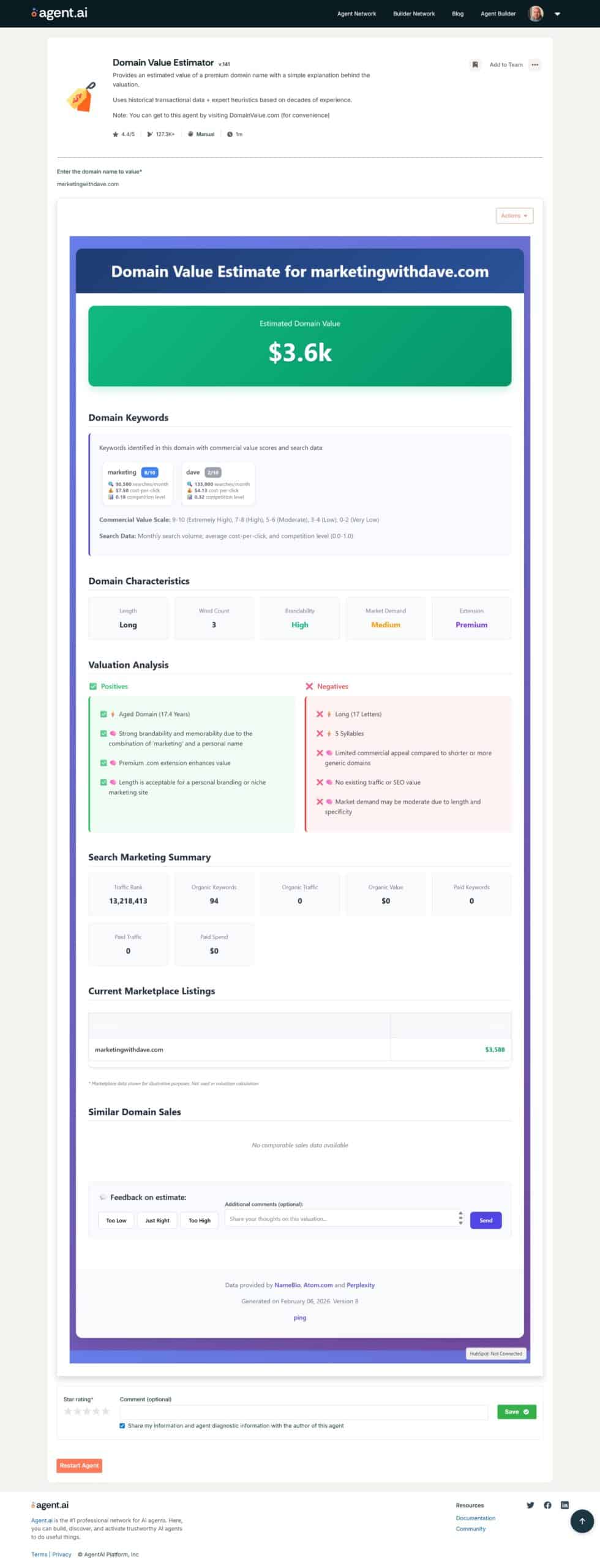
I recently reran my domain, marketingwithdave.com, through the updated estimator. This matters because I have a prior benchmark to compare against. When I originally ran the tool in May 2025, it valued the domain at $850. The newest report estimates the value at about $3,600, which gives me a helpful point of comparison as I track changes over time.
Current Estimated Value
The latest estimate places marketingwithdave.com at about $3,600 based on a mix of keyword data, domain structure, brand factors, and market signals. I am including the full report image below so you can see exactly how the tool breaks it down.
What the Updated Report Looks At
The current version of the estimator evaluates several practical factors instead of relying only on past sales comparisons.
Keyword signals It identifies commercially relevant keywords inside the domain and scores them based on search demand, cost per click, and competition. In this case, “marketing” carries strong commercial intent, which supports value.
Brandability and memorability The tool evaluates how readable and memorable the domain is. Combining a strong category term with a personal brand name can increase recognition, even if it narrows the buyer pool.
Domain characteristics Length, word count, syllables, and extension are all considered. A .com extension still receives a premium signal, while longer multi word domains get a small deduction.
Market demand and extension strength The report scores overall demand and treats .com as a premium extension with higher resale liquidity than most alternatives.
Age and history Older domains can receive positive signals. The report flags domain age and whether there is existing traffic or SEO value attached.
Search and traffic metrics The estimator also checks for organic keywords, traffic value, and paid search signals. If there is little or no measurable traffic yet, that limits the valuation upside.
What Changed From My Earlier Estimate
My earlier run of this tool leaned more heavily on comparable domain listings and produced a much lower estimate. The updated version leans more into structured scoring across keywords, brand traits, and demand indicators, and it shows those components directly in the report.
That transparency is the biggest win. Even if you disagree with the final number, you can see why it arrived there.
Reality Check on Domain Valuations
No automated tool can guarantee what a buyer will actually pay. A domain is worth what a willing buyer and seller agree on at a specific moment. Treat any estimate as directional, not definitive.
Still, as a benchmarking tool, this updated estimator is useful. It gives you a repeatable way to reassess your domains over time using consistent criteria.
If you own a few domains, it is worth rerunning them every 6 to 12 months and tracking how the signals change as your brand and content grow.
Personalization isn’t optional anymore — it’s expected. With today’s technology, customers anticipate that brands will know who they are, what they like, and how to speak to them personally.
So, why isn’t everyone doing it well? It’s not a lack of tools or even a lack of effort. Often, the real barrier is a lack of trust in the data. Some marketers don’t know better. Some don’t care. But most simply don’t trust that their data is accurate enough to personalize confidently.
How to Build Data Trust
Data Governance: Set clear policies on how data is collected, updated, and used across departments.
Regular Audits: Schedule quarterly database audits to check for missing, duplicate, or outdated records.
Transparency with Customers: Be open about what data you collect and why — builds long-term loyalty.
Internal Training: Educate your teams on the importance of good data practices to avoid accidental decay or misuse.
Level
Personalization Approach
Key Actions
KPIs to Watch
Common Pitfalls
Good
Use basic customer data like first names in communications.
Audit database accuracy
Use fallback values for missing data
Personalize subject lines and greetings
Email open rate increase (aim for 10–20% lift with basic personalization)
Leverage behavioral, demographic, and interest-based personalization.
Segment by behavior and demographics
Trigger communications based on actions
Test dynamic content in emails and web pages
CTR (Click-Through Rate) increase by 50–100% with segmented campaigns
Over-segmenting into too small groups, Assuming demographics alone predict intent
Best
Deliver true 1:1 personalization based on complete customer profiles and predictive modeling.
Integrate CRM/CDP to unify data
Use machine learning for recommendations
Automate real-time behavior-triggered messaging
20%+ increase in customer lifetime value through predictive personalization
Personalization that feels invasive (“creepy” factor), Failure to update models regularly
The good news? Personalization is a maturity journey — not a one-time switch you flip. In this post, we’ll walk through a simple Good, Better, Best framework to assess where you are today and what you can do to move forward.
Level 1: Good
At the most basic level, personalization means inserting simple information like a first name into your marketing communications. Think about emails that start with “Dear {First Name}” — you’ve probably received hundreds of them.
Is this really good personalization? Not quite. But if you’re doing it, you’re already on the right path. Using basic data like first names signals that you’re beginning to organize and structure your customer information in a usable way. It’s far better than no personalization at all — and it sets the foundation for deeper efforts later.
Actionable Tips for Good Personalization:
Audit your database for completeness and accuracy (especially first names).
Use fallback values for missing data (e.g., “Hi there” instead of “Hi {First Name}”).
Test placement of personalization — subject lines, greetings, or body copy — to see what resonates most.
Level 2: Better
The next level of personalization moves beyond surface details and taps into customer behaviors, interests, and demographic signals. Instead of only knowing who they are, you start using clues about what they want.
There’s no one perfect data point — the key is to experiment and learn what types of personalization resonate best with your audience.
Examples of Better Personalization:
Targeting based on generational cohorts (e.g., Millennials, Gen Z).
Triggering communications based on website behavior (e.g., downloaded a PDF, viewed a product).
Tailoring offers based on known interests (e.g., outdoor enthusiasts, tech lovers).
Actionable Tips for Better Personalization:
Use tracking tools (like Google Analytics events) to capture behavioral data.
Segment email lists by both demographic and behavioral traits.
Test dynamic content blocks in emails or on landing pages based on audience attributes.
Level 3: Best
At the highest level, personalization becomes truly individualized — delivering 1:1 experiences at scale. This isn’t a marketing unicorn anymore; it’s entirely achievable if you have trusted, integrated data systems and a commitment to customer-centric marketing.
True 1:1 personalization means that each customer receives content, offers, and messaging uniquely relevant to them based on a full view of their history, preferences, and behaviors.
Examples of Best Personalization:
Product recommendations based on purchase and browsing history.
Dynamic web experiences personalized to individual user profiles.
Automated lifecycle communications tied directly to individual behaviors (e.g., abandoned cart reminders customized by product category and past purchase behavior).
Actionable Tips for Best Personalization:
Invest in a robust CRM or CDP (Customer Data Platform) to unify data sources.
Use machine learning models to predict customer needs and automate recommendations.
Prioritize data quality initiatives to maintain trusted, actionable insights.
Set up triggered messaging workflows that respond to individual behaviors in real time.
Conclusion
Personalization isn’t about perfection — it’s about progress. Whether you’re just starting with basic details or you’re already tailoring full 1:1 experiences, each step forward builds stronger connections with your audience. Focus on moving from Good to Better to Best, and you’ll create marketing that feels less like noise — and more like a true conversation with your customers.
Marketers are flooded with metrics: campaign performance, customer data, A/B test results, and more.
But what happens when you dig beyond averages?
The five-number summary is a statistical tool that gives you a deeper view of your data’s distribution—allowing you to spot outliers, skew, and hidden patterns that averages alone miss. I covered having these five metrics on a box plot chart if interested.
In this post, we’ll break down the five-number summary, walk through a marketing-focused example, and show you exactly how to use it to improve decision-making and communication with stakeholders.
What Is the Five-Number Summary?
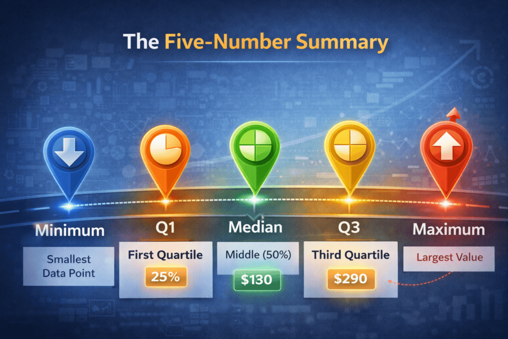
The five-number summary consists of:
Minimum – The smallest data point
Q1 (First Quartile) – 25% of the data falls below this point
Median (Q2) – The midpoint (50th percentile)
Q3 (Third Quartile) – 75% of the data falls below this point
Maximum – The largest data point
This summary is the basis for box plots, a visualization method that marketers can use to compare campaign performance, user behavior, or segment-specific metrics.
Why Marketers Should Care
1. Averages Lie
If you report an average email open rate of 23%, is that good? Not necessarily.
What if 80% of your emails perform at 15% or lower, but one high-performing campaign skews the average?
The five-number summary exposes this variability by showing how spread out the data really is.
2. Spotting Segmentation Opportunities
Let’s say you’re analyzing customer lifetime value (CLV) across a dataset of 1,000 customers. A five-number summary might look like:
Min: $35
Q1: $120
Median: $180
Q3: $290
Max: $1,850
That range between Q3 and Max suggests a high-value segment that’s well outside the norm. These aren’t just “top spenders”—they may require their own marketing strategy, loyalty program, or targeted messaging.
3. Diagnosing Performance Spread in A/B Tests
Suppose you ran 20 variations of a Facebook ad. Instead of reporting the average cost per click (CPC), you calculate a five-number summary:
Min: $0.42
Q1: $0.63
Median: $0.78
Q3: $0.94
Max: $1.53
Insight:
Ads in the Q1 range ($0.63 or below) could be scaled.
Ads above Q3 may need optimization or retirement.
Outliers (Max = $1.53) deserve investigation—was the targeting wrong? Did the creative flop?
This approach helps you move beyond binary “winner/loser” language and think in gradients of performance.
How to Calculate It
If you’re dealing with a spreadsheet:
Sort your data in ascending order.
Identify:
Minimum = first value
Maximum = last value
Median = middle value
Q1 = median of the lower half
Q3 = median of the upper half
Using tools:
Python (pandas):df['metric'].describe()
Excel: Use MIN(), QUARTILE.INC(range,1), MEDIAN(), etc.
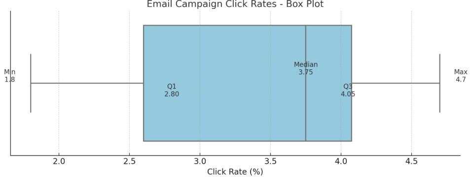
Q1 = (2.4 + 3.2)/2 = 2.8 (Q1 is the median of the lower half of data: 1.8, 2.1, 2.4, 3.2, 3.6)
Median = (3.6 + 3.9)/2 = 3.75
Q3 = (4.0 + 4.1)/2 = 4.05 (Q3 is the median of the upper half of data: 3.9, 4.0, 4.1, 4.3, 4.7)
Max = 4.7
Insight: Most campaigns cluster between 2.8% and 4.05%. Campaign A is clearly underperforming. Campaign J might be worth studying to replicate success.
Going Further: Box Plots
You can visualize the five-number summary using a box plot, a compact chart that quickly communicates the spread and shape of your data.
The box spans from Q1 to Q3, covering the middle 50% of the data (the interquartile range).
A line inside the box shows the median, highlighting the central tendency.
Whiskers extend to the minimum and maximum values within 1.5x the interquartile range.
Outliers beyond the whiskers are plotted as individual points, making them easy to spot.
Why it matters: Box plots convey spread, skew, and outliers far more efficiently than bar or line charts. For marketers, they’re ideal for comparing campaign results, ad performance, or audience segments across multiple datasets.
Tools to create them:
Excel (with custom chart types)
Tableau
Python (matplotlib or seaborn)
Google Sheets (with add-ons or workarounds)
Who Came Up With It?
The five-number summary was introduced by statistician John Tukey in the 1970s as part of his foundational work in exploratory data analysis (EDA).
Final Thoughts
The five-number summary isn’t just for statisticians. It’s a practical, underused tool for marketers who want to:
Evaluate performance distributions
Identify segmentation insights
Optimize creative or media buys
Communicate data nuance to non-technical stakeholders
Don’t just look at averages—look at the spread. You’ll find better strategies hiding in your data.