Still deleting spam comments and form submissions by hand? You’re wasting time.
I’ve burned too many hours cleaning spam out of comments and contact forms. It’s pure busywork. With SiteSqueeze launching, I need real registrations and inquiries—not bot noise. So I bought WP Captcha PRO on AppSumo.
I flipped on Cloudflare Turnstile, protected every supported form, and the spam stopped. No more manual cleanup.
Protect all of your forms, all of the time. That’s the goal. WP Captcha gets you most of the way there on standard WordPress forms. Custom setups take extra work.
WP Captcha Overall Score
Why 4.4/5? Universal Form Captcha needed real troubleshooting, and turning on AI monitoring on Tier 1 cut me down to one website.
Affiliate disclosure: If you purchase through my link, I may earn a small commission at no additional cost to you. I only share tools I have used myself.
The 30-Second Decision
Buy it if: You run WordPress, hate spam, and want one plugin that covers logins, comments, forms, and extra security—without another monthly bill.
Skip it if: Your site lives on custom forms and you need zero-config protection. Test yours first.
For most site owners, $49 lifetime is cheap insurance against endless spam cleanup.
What WP Captcha Does
WP Captcha PRO (WebFactory Ltd) packs CAPTCHA plus real security tools:
Enough to replace a few single-purpose plugins—if you need the extras.
What I Liked
1. Six CAPTCHA Methods in One Plugin
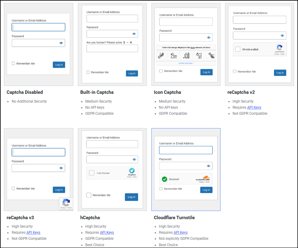
Pick one method and apply it across every form you’ve enabled. No juggling separate plugins. Built-in and Icon need no API keys. The rest (Google, hCaptcha, Turnstile) give you stronger options. I went with Turnstile.
2. Cloudflare Turnstile Protects Without Getting in the Way
Legitimate visitors barely notice it. No endless image puzzles. It just works. Since I turned it on, the spam that started this whole search has disappeared. That’s the win.
3. Activity Reporting Makes Protection Visible
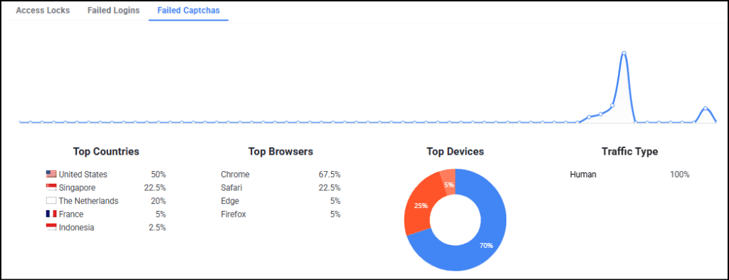
Failed CAPTCHAs, logins, and locks—all visible, with trends by country, browser, device, and traffic type. You see patterns instead of guessing. Transparency matters.
4. Security Features Beyond CAPTCHA
Login protection, firewall rules, country blocks, temporary access. The interface keeps everything organized. You can consolidate security without drowning in plugins—just don’t blindly stack overlapping tools.
5. AI Security Audit Adds Another Layer of Insight
It promises pattern analysis and recommendations instead of raw logs. I’ve enabled it on MarketingWithDave.com and am waiting for enough data. If the reports deliver actionable insight, this becomes a real differentiator.
1. Universal Form Captcha Requires More Technical Setup
Standard forms? Fine. Custom forms (like my SiteSqueeze registration via admin-post.php)? You hand-enter HTML field names with zero confirmation it matched anything.
Support confirmed it worked on my normal forms but never appeared on the custom one. We never pinned down the exact conflict. Test every non-standard form yourself.
2. A PHP Error Interrupted Troubleshooting
Creating a temporary admin account for support triggered a fatal error twice from the Universal Form Captcha handler. We got past it, but security software shouldn’t throw fatals in the admin. Worth noting.
3. AI Monitoring Could Be Easier to Activate
The plugin says “enable in the dashboard.” The actual toggle lives in the separate online license portal. Took several attempts to find.
Also: enabling AI monitoring on Tier 1 dropped my website allowance to one. Confirm the exact license rules before you buy extra codes.
WP Captcha Pricing and AppSumo Tiers
Tier 1 is the sweet spot for a single site.
Tier 2 makes sense for agencies.
Higher tiers are for volume or white-label needs. Website slots and AI monitors are not fully interchangeable—check the fine print. AppSumo’s 60-day refund window lets you test your actual forms risk-free.
Feature
Tier 1
Tier 2
Tier 3
Tier 4
Lifetime Price
$49
$98
$147
$196
Websites
3
100
Unlimited
Unlimited
AI Monitors
1
10
30
55
White Label
No
Yes
Yes
Yes
Plugin Rebranding
No
No
Yes
Yes
These figures reflect the AppSumo offer reviewed. Check the current listing for any changes.
Bottom Line
If you’re still cleaning spam by hand, buy WP Captcha.
$49 lifetime gets you six CAPTCHA methods, solid coverage for standard WordPress forms, useful activity data, and a pile of extra security tools. Turnstile has been frictionless and effective on my site.
The real caveats: Universal Form Captcha needs technical work (and may still fail on some custom setups), and AI activation is clumsier than it should be. Neither kills the core value for typical WordPress sites.
Protect all of your forms, all of the time. WP Captcha gets most owners close enough—without another subscription. Test the forms that matter to you, then decide. For a normal WordPress site, this is a strong buy.
This content is for educational purposes and reflects my hands-on experience using the product and the information publicly available at the time of writing. Always evaluate tools based on your specific business needs, goals, and workflows before making a decision.
WPSmartPay is built for WordPress sites that need to accept payments without a traditional online store, such as businesses selling software, services, subscriptions, memberships, registrations, or donations.
I needed one-time and recurring Stripe payments for a software product, with a separate WordPress system handling licensing and fulfillment. I tested that workflow through August and September 2026, entirely in Stripe’s test environment: one-time and recurring purchases, multiple-license purchases, refunds, cancellations, and the handoff to our licensing system.
Test mode lets me verify much of the workflow without charging real cards, but it doesn’t reproduce every live-payment scenario. Live card declines, authentication requirements such as 3D Secure, and actual payouts aren’t covered by the results below.
WPSmartPay Overall Score
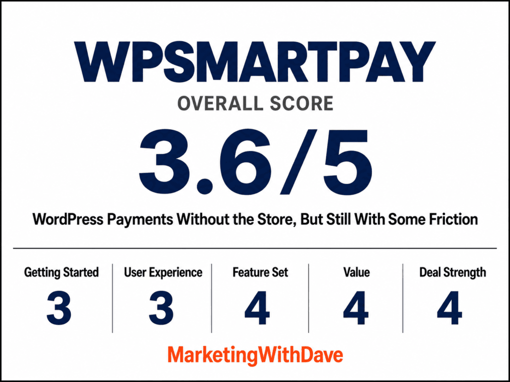
Why 3.6/5: A capable, well-priced WordPress payment solution held back by setup friction, unresolved issues, and reliability concerns that still need verification.
Affiliate disclosure: If you purchase through my link, I may earn a small commission at no additional cost to you. I only share tools I have used myself.
The 30-Second Decision
Good fit now: one-time payments and initial subscriptions that hand off to another system for fulfillment. In Stripe test mode, a three-license purchase, a monthly subscription, and a refund all worked.
Verify first: renewals, failed payments, card changes, and end-of-term cancellation are still being tested. If recurring billing is central to your business, test those during the refund window.
Update carefully: update Core and Pro together. A version mismatch once locked me out of my WordPress admin.
Not a fit: physical products that need inventory, shipping, or a complex cart.
Testing Status and Known Issues
A webhook is an automatic message one system sends another when something happens. Here, it tells our licensing system what a customer bought.
Statuses reflect the versions I tested. Items marked Needs Retest haven’t been checked on the latest release.
Test or issue
Status
Cause
What happened
One-time, three-license purchase
Passed
N/A
A $147 Stripe test payment completed and our licensing system created and emailed three separate license keys.
One-time card payment in Pro 3.4.3
Passed
N/A
A $49 one-time purchase completed successfully with Stripe’s 4242 test card after Link was disabled.
Initial monthly subscription
Passed
N/A
A $7.99 test subscription and payment were created in Stripe and the software license was provisioned.
Refund
Passed
N/A
A Stripe test refund completed and the corresponding licenses were disabled by our reconciliation process.
Billing portal cancellation
Passed
N/A
The customer portal successfully sent a cancellation to Stripe. A later test-clock simulation confirmed cancellation at the paid period end and delivery of the cancellation event to MWD Software Manager; post-expiration enforcement remains a separate check.
Webhook handoff to licensing system
Passed
N/A
Failed during earlier testing; successful purchases now reach our licensing system for fulfillment.
Duplicate subscription records
Fixed
WPSmartPay
One Stripe subscription originally created duplicate WPSmartPay records. A later update addressed the duplication; regression verification is still planned.
Stripe credential problems
Fixed
WPSmartPay integration/configuration
Earlier testing showed WPSmartPay passing or retrieving an invalid API key. After updated packages and reconfiguration, test payments succeeded.
Form name missing from confirmation
Fixed
WPSmartPay
Earlier confirmations could show a missing or generic form name. The latest successful test correctly displayed the form name.
Link payment-method mismatch
Open
WPSmartPay / Stripe integration
With Link enabled, Stripe rejected five checkout confirmations because the PaymentIntent expected card + Link while confirmation supplied card only. Disabling Link allowed the same 4242 card payment to succeed.
Failed payments remain as Pending orders
Open
WPSmartPay
Five Stripe-rejected checkout attempts remained visible in the customer dashboard as $49 Pending orders after no charge was completed.
Unexpected payment methods at checkout
Resolved
Stripe / WPSmartPay configuration
Earlier testing displayed Klarna and other unexpected payment methods despite configuration changes. Subsequent checkout testing displayed the intended card payment option; the issue is no longer reproducible.
Core/Pro version mismatch
Monitoring
WPSmartPay update process
An August mismatch locked me out of WordPress admin. The site was recovered, and Pro 3.5.0 is now installed with Core 3.3.5, but prevention of another mismatch has not been confirmed.
Payment form sometimes failed to load
Monitoring
Primarily third party
A cookie-consent script was identified as the primary source of the instability. Disabling that configuration stabilized the Stripe payment field.
Rejected Stripe webhooks
Monitoring
Unknown
Four webhooks were rejected during a September 18 test, although the payment still processed. More recent subscription renewal and cancellation events successfully reached MWD Software Manager. The original rejections have not been conclusively explained; continue monitoring.
Billing period and cancellation information missing
Needs Retest
WPSmartPay
Stripe contained subscription information that was not displayed in an earlier WPSmartPay record. More recent Stripe renewal and cancellation data reached MWD Software Manager, but this does not establish that the WPSmartPay customer-facing record now displays the missing billing details.
Valid + email address rejected
Needs Retest
WPSmartPay
A valid Gmail plus-address was rejected during checkout.
Customer name missing from some records
Fixed
WPSmartPay
Earlier records sometimes omitted the customer’s name. The latest successful payment correctly populated the customer name on the confirmation.
Webhook editor difficult to use on shorter screens
Needs Retest
WPSmartPay
Lower controls were previously clipped on shorter browser windows.
Stripe Tax
Pending Registration
N/A
Stripe Tax Basic is configured, and Utah tax registration remains pending. Enabling automatic tax caused a subscription checkout error because Stripe lacked a valid customer tax address. Checkout succeeded with automatic tax disabled; address collection and tax-enabled checkout still need verification.
Successful subscription renewal
Passed
N/A
A Stripe test-clock simulation advanced the $7.99 monthly subscription to November 8. Stripe recorded a second paid invoice and advanced the billing period through December 8. MWD Software Manager extended the existing license through December 8 without creating a duplicate key.
Failed subscription payment
Still Testing
N/A
Failed-renewal handling remains untested. A Stripe decline test card was rejected during initial checkout, which does not simulate failure of an existing subscription renewal. Retry behavior, customer notices, and eventual license access still need verification.
End-of-term cancellation
Partially Passed
N/A
Stripe test-clock simulation confirmed cancellation at the December 8 period end. MWD Software Manager received and recorded the cancellation and retained the correct paid-through date. Because Stripe’s simulated clock does not advance the WordPress server clock, actual post-expiration license enforcement remains unverified; a licensing safeguard was added in MWD Software Manager 0.6.55 and still needs integration testing.
Customer billing self-service
Limited
WPSmartPay
WPSmartPay support confirmed that its customer dashboard does not provide a front-facing link to Stripe’s Billing Portal. Customers need a separately supplied portal link or Stripe recovery emails to update billing details.
Subscription quantity and plan changes
Limited
WPSmartPay
WPSmartPay support confirmed that an existing subscription’s quantity, tier, or amount cannot be changed with automatic proration. The subscription must be canceled and the customer must complete a new checkout.
Customer email notifications
Limited
WPSmartPay
Customer emails are customizable, but the available shortcodes don’t currently expose enough purchase, subscription, or action-link information for us to replace our existing transactional emails. Support has been asked whether additional shortcodes are available or planned.
With Card fields on your page selected, the monthly subscription redirects to Stripe-hosted checkout after card details have already been entered, requiring the customer to enter them again. Vendor clarification is pending.
Fixed website quantities require separate forms
Limited
WPSmartPay
The checkout form does not provide a customer-selectable subscription quantity. Five fixed-quantity forms are needed for monthly plans and another five for lifetime purchases.
Automatic tax checkout address error
Open
WPSmartPay / Stripe Tax integration
When automatic tax was enabled for a monthly subscription, Stripe rejected checkout with customer_tax_location_invalid because the customer had no valid tax address. Disabling automatic tax allowed the subscription to complete. Support has been contacted.
Payment and license email delivery
Passed
Site SMTP configuration
After correcting FluentSMTP outgoing server settings, retries of the payment receipt and SiteSqueeze license email succeeded and both messages arrived. FluentSMTP’s separate test-email screen still produces an error.
A previous problem isn’t necessarily present in the current release, but an item marked Needs Retest isn’t assumed fixed either. I’ll update those statuses only after retesting them. The tracker confirms the September 18 webhook errors, incomplete subscription information, plus-address rejection, missing customer-name issue, and remaining subscription tests.
Customers choose what they’re buying, enter their details, and pay without a shopping-cart process. WPSmartPay handles the transaction and passes the purchase to our licensing system for fulfillment. In the $147 test, one payment produced three separate licenses and one email with all three keys. That suits businesses where payment is one step in a larger process.
A clean WordPress interface
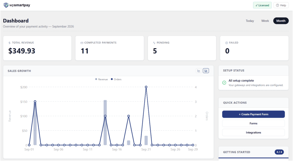
The dashboard is easy to navigate despite the plugin’s size. When troubleshooting a subscription, I could move from the payment to the customer to the subscription record without going through an order-and-inventory system. Data completeness is a separate question: some subscription records were missing the billing period and cancellation date that Stripe showed (see table).
Where WPSmartPay Is Limited
Once a subscription exists, changing it is harder than creating it.
Plan changes: you can’t change an existing subscription’s quantity, tier, or amount with automatic proration. If a customer goes from one license to three, I can’t raise the subscription from $7.99 to $23.97 per month. I have to cancel it and have the customer complete a new checkout.
Billing self-service: the customer dashboard has no button or link to Stripe’s Billing Portal, according to WPSmartPay support. A customer with an expired card needs a portal link from me, or has to rely on Stripe’s recovery emails.
Core and Pro Update Failure
WPSmartPay has two plugins: the main plugin (Core) and Pro, which adds paid features. During an August update, Pro updated but Core failed to, and the version mismatch caused a fatal WordPress error that blocked the Plugins page, even in recovery mode. I regained access through my host’s file manager and installed compatible versions. The error came from functionality tied to another payment gateway, although I only use Stripe.
It hasn’t recurred, but I haven’t confirmed that WPSmartPay now prevents mismatched versions, so I’m not marking it resolved. It’s relevant again now: WPSmartPay announced Pro 3.4.3 while the downloads available to me still provide 3.4.1. I’ve asked for clarification rather than forcing an update.
Development and Support
Development has been active. Several problems I reported, including duplicate subscription records, were fixed in later releases. On August 31, after I reported checkout, webhook, and update problems on AppSumo, a WPSmartPay founder replied that the team was investigating. Responses to other reports sometimes took several days. I judge fixes by retesting, not by release notes.
What I Haven’t Tested
The AppSumo listing also advertises invoices, donations, coupons, event registrations, additional payment gateways, and reporting. I haven’t tested those, so this review isn’t a recommendation of them.
WPSmartPay Pricing
The AppSumo offer captured for this review lists WPSmartPay at $99 for lifetime access on five websites and includes a 60-day money-back guarantee.
That window gives buyers time to test more than the initial checkout. A normal monthly subscription renewal takes a billing cycle to observe in live use. Stripe also offers testing tools that can simulate time-dependent subscription events, but I haven’t yet confirmed that my WPSmartPay-created subscriptions can use that process cleanly, so I’m not treating it as verified functionality here.
Bottom Line
WPSmartPay is a strong option to consider for businesses that want to accept payments through WordPress without operating a traditional eCommerce store. The one-time purchase, initial subscription, refund, cancellation, webhook, and fulfillment workflows I’ve tested are working in Stripe’s test environment.
Recurring-subscription lifecycle testing and Core/Pro update safety are the two areas I’m still watching most closely. If renewals and failed-payment handling are central to your business, I’d use the refund window to test those workflows against your own setup before relying on them.
I’ll continue updating the tracker as those tests are completed.
Review Updates
August 31, 2026: A Core/Pro version mismatch caused a critical WordPress error and required recovery through my hosting account. My AppSumo review at the time said I was close to ending my WPSmartPay testing and looking for another solution. The public listing confirms both the review and WPSmartPay’s response. WPSmartPay – WordPress payments…
September 18, 2026: One-time purchases, initial monthly subscriptions, multi-license fulfillment, refunds, webhook delivery, and basic cancellation were working. Several subscription lifecycle tests remained unfinished.
September 29, 2026: WPSmartPay announced Pro 3.4.3 while the download sources available to me continued providing Pro 3.4.1. I asked WPSmartPay to clarify the current release before installing anything further.
This content is for educational purposes and reflects my hands-on experience using the product and the information publicly available at the time of writing. Always evaluate tools based on your specific business needs, goals, and workflows before making a decision.
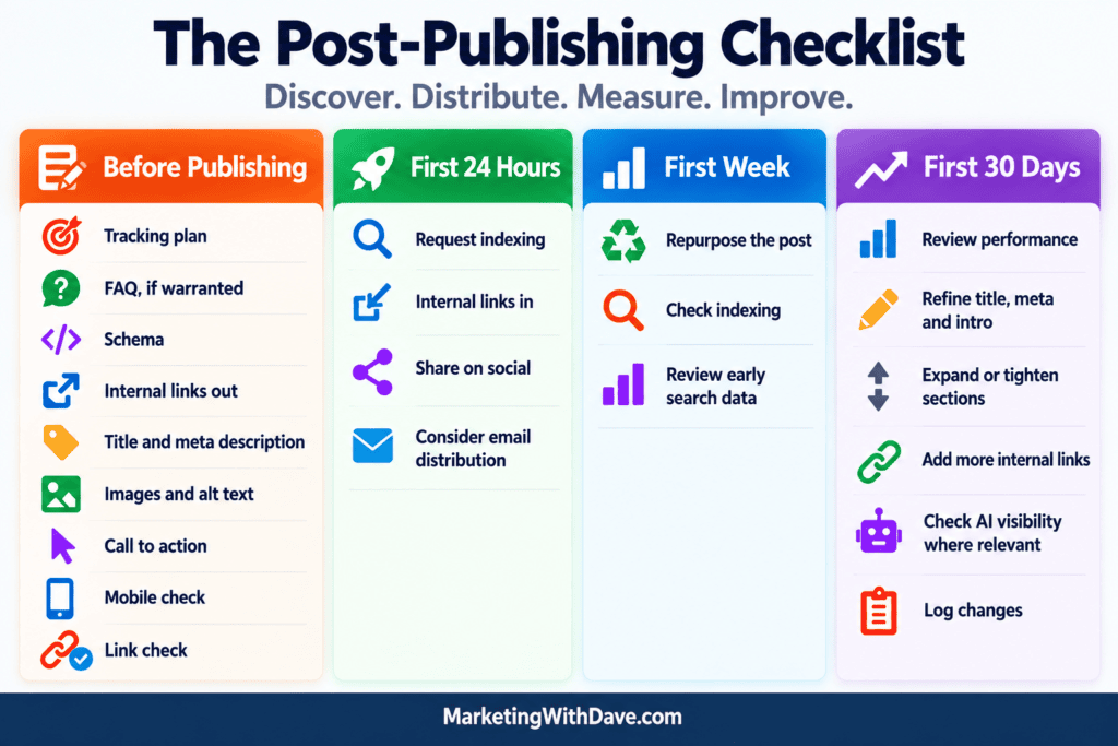
Publishing is a technical event, not the moment a piece of content is finished. It’s easy to hit publish, share the link once, and start the next article. The post then sits in the archive waiting for Google to notice it.
Distribution is where the work starts. Here is a repeatable checklist, organized by when to do each step.
Before You Hit Publish: Is the Page Actually Done?
Most of what gets forgotten happens here, and it is far cheaper to fix now than after indexing.
Tracking plan: Know what the page is supposed to accomplish and how you will measure it. Is the goal search traffic, conversions, supporting another page, or something else? If you cannot say what success looks like, you cannot evaluate it later.
FAQ section: Add one only when readers would naturally ask follow-up questions. Keep answers short and specific. Not every post needs one, and padding an FAQ with filler questions hurts more than it helps.
Schema: Check whether there is appropriate structured data for the content, such as Article, FAQ, HowTo, Review, or Product schema. Use schema only when it genuinely matches what is visible on the page.
Internal links out: Link to your own supporting content where it helps the reader.
Title and meta description: Would you click this result? Front-load the topic and make the benefit obvious.
Images and alt text: Use a visual that explains something, not just a featured image. Write alt text that describes what the image shows.
Call to action: After reading, what is the obvious next step? If there is none, the visit ends here.
Mobile check: Tables, callouts, and graphics that look great on desktop often break on a phone. Check before you promote.
Link check: Click every internal and external link.
First 24 Hours: Get It Discovered
Request indexing in Search Console and confirm the page is in your sitemap.
Internal links in. Find older, relevant articles that should point readers to the new one and add links with descriptive anchor text. This is easy to overlook because internal linking usually happens while writing the new article, but links to that article have to be added elsewhere on the site. Older posts may already be attracting search traffic and readers, making them a natural path to your new content.
Share it natively on the channels you actually use, with copy written for each platform instead of one pasted link.
Consider email distribution. If the article is relevant enough to your email audience, include it in your next newsletter or send it as a standalone message when the topic warrants it.
First Week: Extend the Reach
Repurpose the post into several pieces: one post per key point, a stat or checklist graphic, a short video or carousel. Each piece should point back to the article.
Check indexing. If the page is not indexed after several days, look for a noindex tag, canonical problems, thin content, or weak internal links.
Review early search data. Look at impressions, clicks, queries, and average position in Search Console. If the page is earning impressions but few clicks, review how its title and search snippet appear. If impressions are limited, look at the queries it is appearing for, its position, internal linking, and whether Google is interpreting the page the way you expected.
First 30 Days: Measure and Improve
Review performance: Look at impressions, clicks, average position, engagement, and CTA clicks where relevant. Compare the results with what you expected the article to accomplish.
Refine the title, meta description, and intro based on what the queries show.
Expand or tighten sections based on the questions people actually search.
Add more internal links from any new posts published since.
Keep a log of what you changed and when. Otherwise you will never know what worked.
Check AI visibility where it matters. For articles targeting questions people are likely to ask AI tools, check whether your content or brand appears in relevant responses. Treat individual results as directional rather than definitive, since results vary by platform and over time.
The Piece Most Sites Skip: Using Existing Traffic
Every step above depends on outside sources: search engines, social platforms, email. Meanwhile, the audience you already have is reading your older articles right now.
Those readers are already interested in your topics. If nothing on those pages points them to your newest content, you are relying on them to discover it by chance. Static sidebar links and buried “related posts” widgets are easy to ignore, and blindly plastering banners everywhere leads to banner blindness.
That’s one reason I built the Latest Category Article feature in SiteSqueeze. Instead of publishing a new article and hoping visitors to older content eventually find it, I can use traffic already arriving on my site to automatically promote the newest article from a relevant category. SiteSqueeze also lets me create standard promotions and measure how those promotions perform, giving existing website traffic another job beyond viewing the page it originally landed on.
Publishing puts a URL on the internet. Distribution gives the article a chance to do its job.
The goal isn’t to promote every post forever. Give it a deliberate launch, put it in front of the audiences you already have, watch what happens, and make changes when the data gives you a reason.
I spend a lot of time in Google Analytics, looking at traffic sources, landing pages, and increasingly, how AI platforms are sending visitors my way. But the way most of us use GA4 has a blind spot: it doesn’t show us everything that’s actually requesting files from our server.
That’s the gap HoneyLog is built to fill. It analyzes server and CDN logs to identify AI crawlers, search bots, malicious bots, spoofed traffic, and real human visitors.
Want a better feel for what HoneyLog actually shows you? I’ve also shared a PDF of my HoneyLog dashboard using real MarketingWithDave.com data.
HoneyLog Overall Score
Why 3.6/5: Powerful insights and strong value, held back by a rough onboarding experience and limited guidance on what to do with the data.
The easiest way to explain HoneyLog is to say what it isn’t. It’s not a replacement for Google Analytics or Search Console, and it’s not an SEO crawler like Screaming Frog. It isn’t another AI-visibility platform guessing whether ChatGPT mentions your brand for a set of prompts, either. HoneyLog sits underneath all of that, looking directly at requests hitting your server: Googlebot crawling a page, ChatGPT-User pulling a file, a bot hitting robots.txt, a request generating a 404. When I want all of that noise stripped away, I can pull a report for human visitors only.
AppSumo’s listing describes HoneyLog as connecting bot crawling with the human visits that come from the platforms behind those bots. After using it, I’d call that a fairer description than treating it as a GA4 or Screaming Frog “alternative.” They’re not competing tools. They’re different lenses on the same website.
Watching Google actually find my content
This turned into my favorite use case, and it corrected something about my own habits. I don’t routinely submit new content to Search Console. I publish frequently and have basically trusted that my sitemap updates and Google visits often enough to find new pages on its own. I’d never had an easy way to verify that assumption, so I never did.
HoneyLog gave me one. I publish frequently and have trusted that my sitemap updates and Google visits often enough to discover new content. With HoneyLog, I can actually see when Googlebot and other crawlers find my pages, turning something I’d assumed was happening into something I can observe.
The bots showed up faster than I expected
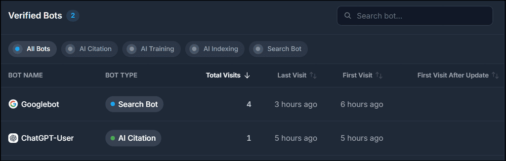
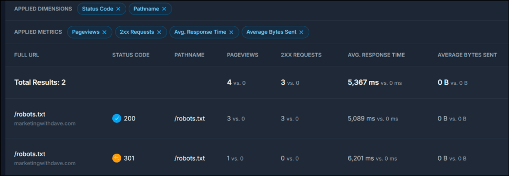
It didn’t take long for HoneyLog to start finding traffic: ChatGPT-User, OAI-SearchBot, PerplexityBot, DuckAssistBot, and Claude-User all showed up in my early data. But HoneyLog goes deeper than “OpenAI visited.” I isolated OAI-SearchBot and found four requests, then added URL and status-code dimensions. All four were for robots.txt. Three returned 200, one returned 301.
That distinction matters. Seeing “OAI-SearchBot: 4 requests” could easily lead me to assume OpenAI was crawling my content. It wasn’t, at least not in that window. HoneyLog gave me enough data to disprove the conclusion I was about to draw from HoneyLog’s own headline number, which is one of the things I like most about it.
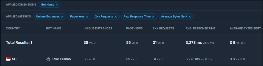
A stranger case came from Singapore. GA4 had been showing a surge of Singapore traffic, and HoneyLog showed substantial Singapore activity too. When I filtered HoneyLog’s data to Singapore, every page view in the selected period was classified as Fake Human. That doesn’t prove my GA4 Singapore sessions were bots; the two tools aren’t measuring identical populations, and I don’t want to overstate the connection. But it gave me another angle on something that already looked suspicious, and some of those requests were presenting completely normal-looking browser user agents before HoneyLog flagged them.
That raises the obvious question: how does HoneyLog know? And that’s where my biggest criticism of the product starts.
Good at showing suspicious. Not great at explaining why
HoneyLog’s classifications include Fake Human, Malicious Bot, Suspicious Bot, Generic Bot, Unknown Bot, AI Citation, AI Indexing, and more. That’s a lot of useful categorization, and it’s also a lot to ask an average marketer to understand without help. I looked through HoneyLog’s documentation for an explanation of what triggers a Fake Human classification and couldn’t find one.
If a tool tells me a request came from Googlebot, I understand exactly what that means. If it tells me traffic presenting itself as a normal Chrome browser is actually malicious, I need to understand what signals produced that conclusion before deciding what to do about it. That gap between the sophistication of the data and how well the product teaches you to use it is the biggest weakness I found.
My favorite report might be the simplest one
This is a strange thing to say about a product I bought to investigate bots, but after spending time in Googlebot, ChatGPT-User, Fake Human, Generic Bot, and everything else, the report I keep coming back to is Human Visitors. Just show me the people. In a web full of crawlers, agents, and automated requests, there’s something clarifying about a report built to strip all of that away. GA4 is still more useful for understanding what those visitors actually do once they land, but HoneyLog gives me another way to separate likely human activity from everything else hitting the server, but there’s an important caveat. HoneyLog confirmed that Human Visitors can still include bots sophisticated enough to mimic human behavior, so I wouldn’t treat this report as a definitive count of actual people.
A world of 404s I normally never see
The Status Codes report produced its own surprise: within roughly my first day of data, I saw more 404 activity than I’m used to seeing in GA4 over much longer stretches. That’s not a knock on GA4, just the difference between client-side analytics and raw server requests. A bot can hit a URL that hasn’t existed in years, guess at a WordPress path that never existed, or follow an outdated link from elsewhere on the web, and none of it becomes a meaningful analytics session.
The harder question is which 404s are worth caring about. HoneyLog’s Raw Logs feature is built for exactly that kind of investigation, letting me narrow a traffic spike by IP, country, bot, and status code. I can already picture building a standing report for 404s from verified crawlers and checking it periodically, which is far more useful than scrolling a giant list of broken requests.
The report builder is the best feature I almost missed
This didn’t jump out at first. It did once I started asking sharper questions. Instead of “Googlebot visited nine times,” I can ask which URLs it requested, what status codes came back, and how long each request took. Instead of “this article got 12 bot requests,” I can ask which bot made them. I ran into that exact case: a URL showed 12 requests that looked interesting until I filtered it and found all 12 were Fake Human. That one filter completely changed what the number meant.
HoneyLog also exports report data to CSV in parts of the app, which made it much easier to dig into Googlebot’s individual requests outside the interface. For anyone willing to dig, there’s a lot here, and that qualifier is doing real work in that sentence.
The average marketer will stall out on “now what?”
This is HoneyLog’s biggest challenge. It hands me information I haven’t had easy access to before, and then leaves me staring at it: my AI bots averaged slower response times than some other crawlers, but is that a problem? I found a Googlebot 404. Should I fix it? HoneyLog flagged something as Fake Human. Should I block it? Googlebot hasn’t crawled today’s article yet. How long is normal before that becomes a concern?
Those are the questions that turn data into action, and right now HoneyLog is much better at supplying the data than answering them. For a technical SEO or developer comfortable digging through logs, that’s probably enough. For the average marketer, HoneyLog needs more interpretation, education, and guidance before the product lives up to what it’s collecting.
After speaking with the HoneyLog team, I have a better starting point. Check error status codes, identify which bots and URLs are responsible, watch how crawlers interact with the sitemap, and create alerts for unusual traffic or error spikes. That’s exactly the kind of workflow I’d like HoneyLog to teach inside the product.
Do you even need this if you already have Cloudflare or an MCP?
Some of what HoneyLog shows may already exist in server logs, CDN platforms like Cloudflare, or other technical tools. But that’s not really the point for me. I wasn’t looking at that data before HoneyLog, and I certainly wasn’t using it to answer questions about Googlebot, AI crawlers, suspicious traffic, or 404s. HoneyLog organizes that information in a way that has already helped me find insights and potential actions I wasn’t getting from the rest of my marketing stack.
Bot Conversions is fascinating. I’d rename one metric
HoneyLog attempts to connect crawler activity to actual human referrals, attributing visits by UTM parameters first and referrer data when UTM isn’t available. The idea is compelling: if OpenAI crawls my site 14 times and ChatGPT later sends me a visitor, I want to see both halves of that story.
One thing bothers me, though. HoneyLog calls one metric Conversion Rate. In my data, Microsoft showed two bot requests and five referred human visits, for a 250% conversion rate. The math works. The label doesn’t. Those five people weren’t “converted” from two crawls; it’s a ratio between two different measurements, and I’d rather see it called something like Referral Ratio or Human Visits per Bot Request. The underlying signal is interesting. I just wouldn’t read that number as a conventional conversion rate.
Onboarding needs work
My first night with HoneyLog wasn’t impressive. After connecting it, I could see that HoneyLog was capturing data in Raw Logs, but the rest of the app still wasn’t ready. About half an hour later, I was still seeing: “Hang tight! Waiting for first aggregation, check raw logs for real-time data! This is necessary to see your aggregated insights.” The message told me what was happening, but not how long I should expect to wait. As a new user, I wasn’t sure whether I needed to wait another five minutes, another five hours, or whether something had gone wrong. I eventually contacted support and called it a night.
The next day felt like a different product. Once enough data had accumulated, HoneyLog became dramatically more interesting. That rocky start matters some context: HoneyLog was founded in June 2026, according to its AppSumo profile. This is a young product, and the onboarding experience shows it. I’d like to see a guided first-run flow that explains what’s happening, how long initial processing normally takes, and three or four useful questions a new customer can answer once the data arrives.
What I’d like to see improved
Documentation tops the list. I want a searchable data dictionary that explains every bot classification and metric, Fake Human included, and then goes a step further to suggest what to actually do about what I’m seeing. If Googlebot keeps hitting 404s, tell me why that’s worth investigating. If an AI crawler’s response times look unusually high, give me context for that. If HoneyLog flags malicious fake-human traffic, point me toward next steps, including where a CDN or security service like Cloudflare fits in.
I’d also like more consistent CSV exporting, clearer empty-result states, better sitemap discovery, and more polished field descriptions. Report templates would help a lot here too: New Content Discovery, AI Crawler Errors, Most-Crawled Content, Verified Bot 404s, AI Crawler Response Time. Don’t just hand marketers a report builder. Teach them which reports are worth building. HoneyLog told me they’re already working on better documentation, including explanations of its traffic classifications, introductory videos, and links from the dashboard to relevant help content, so this is an area I expect to improve as the product matures.
Tier 1 offers plenty of value for $49
AppSumo’s Tier 1 gives you one website, 150,000 monthly events, six months of data retention, Sitemap Intelligence, and Bot Conversions Analysis for $49. That’s enough capacity for a decent amount of traffic on a single website, while still giving you the features that made HoneyLog valuable during my testing.
For me, there’s plenty of value at that price. I’m already getting insights and identifying potential actions I wasn’t getting from the rest of my marketing stack. If you manage larger or multiple websites and HoneyLog proves equally useful for you, the higher tiers provide more events, sites, users, and retention. But Tier 1 doesn’t feel like a stripped-down entry plan. It gives you enough of HoneyLog to find out whether this kind of server-level visibility is genuinely useful for your website.
So what is HoneyLog actually good for?
I bought HoneyLog expecting to learn more about AI crawlers, and I did. The bigger discovery was realizing how much activity on my own website I normally never see at all. That’s why I’m keeping it: when I have a specific question, I now have somewhere to look. Did Google find yesterday’s article? Is ChatGPT actually crawling my content, or just checking robots.txt? Why did my 404s spike this week? Was that strange traffic real?
Those are questions I’d either struggled to answer before or never thought to ask. HoneyLog makes them observable. The next challenge for the product is making them actionable, and it’s not quite there yet.
I’m already comfortable saying I’m keeping Tier 1. HoneyLog is producing insights, and pointing me toward potential actions, that I’m not getting anywhere else in my current stack. That’s exactly the kind of product AppSumo’s 60-day return window was made for. You can’t fully judge HoneyLog on day one, because its value comes from watching your own traffic accumulate over time. Install it, let it collect real data, start asking questions of that data, and see whether it tells you something you can act on. In my case, it already has.
This content is for educational purposes and reflects my hands-on experience using the product and the information publicly available at the time of writing. Always evaluate tools based on your specific business needs, goals, and workflows before making a decision.
A/B testing sounds simple. Show half your visitors version A, the other half version B, measure what happens, pick the winner.
There’s one problem: what if your website doesn’t get enough traffic to confidently pick a winner?
That’s not just a small-site problem. Earlier in my career, I worked on a large corporate website with far more traffic than MarketingWithDave.com gets today. Even there, only a relatively small number of pages generated enough traffic to comfortably run the kind of traditional A/B tests most experimentation advice assumes you can run.
Now think about the average small-business site, consultant, blogger, or niche publisher. If you’re getting hundreds of visits instead of hundreds of thousands, waiting for textbook statistical significance can mean running a test for months, sometimes without ever collecting enough data to detect a modest improvement.
So, should you skip A/B testing? No. But you do need to be careful about what your data actually allows you to conclude.
The Real Danger Isn’t Low Traffic. It’s False Confidence.
Suppose you test two calls to action:
Impressions
Clicks
CTR
Control A
50
2
4%
Variation B
50
4
8%
Variation B doubled the click-through rate. A 100% improvement. Time to put it in the quarterly presentation?
Not so fast. That’s a difference of two clicks. If the next two visitors click A instead of B, the story flips completely. That’s the danger of percentages on small samples: the number looks enormous while the evidence behind it stays paper-thin.
Low traffic doesn’t mean your data tells you nothing. It means you have to stop asking it to tell you more than it knows.
“Just Wait for Significance” Isn’t a Satisfying Answer
The standard advice is mathematically sound: establish a baseline, decide the minimum improvement worth detecting, choose your confidence level, calculate the required sample size, and don’t decide until you’ve collected it. My A/B Test Traffic and Sample Size Calculator can estimate how much eligible traffic a traditional test would require and how long collecting that sample could take.
Nothing wrong with that math. The problem is what happens when the calculator tells a small site it needs a sample size it will never realistically hit. Optimizely itself notes that low-conversion sites simply need more time to separate small differences from noise, and other practitioners recommend testing bigger changes or leaning on qualitative research when a conventional test isn’t practical.
Those are useful workarounds. But there’s another option worth naming directly: you can still run the experiment, as long as you’re willing to accept that “we don’t know yet” might be the correct answer. That’s a very different mindset than running a test until the dashboard finally hands you a green winner badge.
Impressions Are Your Evidence. They Aren’t the Winner.
An A/B test might split visitors roughly 50/50, but that doesn’t mean both variations end up with identical impression counts:
Impressions
Clicks
CTR
Control A
1,000
20
2.0%
Variation B
950
29
3.05%
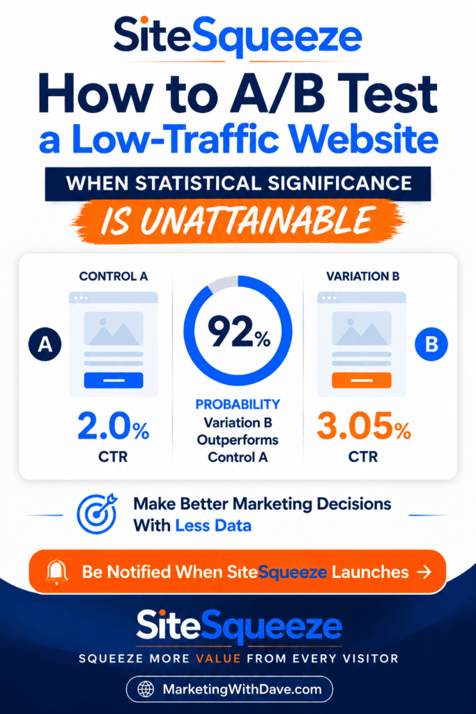
Control A got more impressions. That doesn’t make it the winner. Impressions are the opportunities each variation received; CTR (clicks ÷ impressions) is what visitors actually did with them. Here, B is performing better despite receiving fewer impressions. Whether there’s enough evidence to call B the winner is a separate question.
But impressions still matter, because they determine how much evidence you’re standing on:
10 impressions / 1 click = 10% CTR
10,000 impressions / 1,000 clicks = 10% CTR
Same rate. Wildly different confidence. Impressions supply the evidence, performance determines which variation looks better, and statistics tell you how seriously to take the gap between them.
A 50/50 Split Won’t Always Look Like 50/50
If your first seven impressions are 2 for A and 5 for B, your allocation didn’t break. Random assignment doesn’t mean taking turns (A, B, A, B); it means each visitor has roughly an equal chance of landing on either side. Small samples can look lopsided purely by chance, and totals trend toward even only as the sample grows.
Returning visitors add another wrinkle. A good experiment keeps a returning visitor on their original variation, so if people assigned to B simply come back more often, B accumulates more impressions even though the original split was fair. That’s real visitor behavior, not a broken test. If a test reaches thousands of assignments and stays dramatically skewed, that’s worth investigating, but it’s a test-integrity question, not grounds for declaring a winner.
Statistical Significance and Practical Significance Are Different Questions
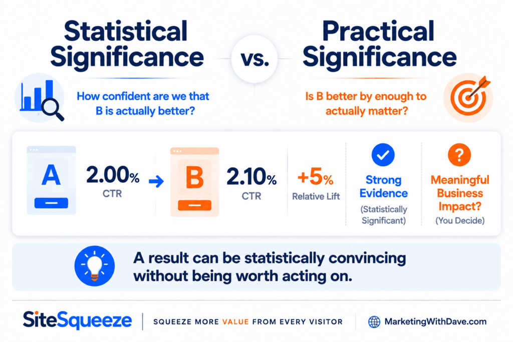
Say you eventually get enough traffic to be confident that B is better. Great. Better by how much?
A: 2.00% CTR
B: 2.10% CTR
That’s a 5% relative lift, and with enough observations you can become very confident it’s real. But does a 5% lift move your business? Maybe. Maybe not.
Every test should answer two separate questions: how confident are we that one variation performs better, and is the improvement big enough to actually matter? The first is statistical evidence. The second is practical significance, and it’s the one low-traffic sites can’t afford to skip, because you shouldn’t burn six months proving a button change is worth 2%.
Spend Scarce Traffic on Bigger Ideas
This is where conventional low-traffic advice and my own experience line up completely. High-traffic sites can afford to test “Get Started” against “Start Now.” A small site can’t, and shouldn’t try.
Test different offers. Try substantially different calls to action. Change the positioning. Pit a product promotion against an educational resource. If B is genuinely, dramatically better than A, limited traffic has a real shot at revealing that. And if two very different approaches perform about the same, that’s a useful answer too.
Don’t Call It on Day Three
Low traffic makes early results seductive. You launch Monday; by Wednesday A has 1 click and B has 5. B is crushing it, right?
Maybe Monday and Tuesday just aren’t representative. Maybe an email blast hit the site Tuesday. Maybe you’re extracting a business strategy from six clicks. That’s why SiteSqueeze treats one full seven-day cycle as a minimum guardrail, not a statistical guarantee. Seven days doesn’t make a test valid on its own, but it makes sure the test has seen every day of the week before anyone gets to call a winner.
Not Every Test Needs a Winner
Experimentation software has trained everyone to expect a trophy: 🏆 Variation B Wins! It feels satisfying. It isn’t always what the evidence supports.
For a low-traffic site, three outcomes are all perfectly legitimate:
Keep testing. B may be ahead, but not by enough to act on yet.
No meaningful difference. The two approaches perform similarly within the range you actually care about, so if the new creative took three hours to build for no real gain, there’s no reason to switch.
Inconclusive. You ran it 30 days, hit the impression budget you were willing to spend, and still don’t have enough evidence either way. That’s not a failed experiment. It’s the experiment stopping you from claiming certainty you didn’t earn.
Why SiteSqueeze Uses Bayesian Statistics
This is the problem that shaped how I built the A/B testing feature in SiteSqueeze. Instead of leaning only on a p-value, it uses a Bayesian model for CTR experiments: each variation starts with a weak, neutral prior that updates as impressions and clicks accumulate.
The math matters, but the marketer-facing payoff is simple. I’d rather tell someone “Variation B currently has a 92% probability of outperforming Control A” than hand them a p-value and hope they know what to do with it. Bayesian statistics don’t solve low traffic, though. With little data, there should still be real uncertainty. The model is built to describe that uncertainty, not paper over it.
Decide What “Better” Means Before the Test Decides for You
The other safeguard: define your minimum meaningful improvement before you get emotionally attached to whichever variation starts pulling ahead. Maybe that threshold is 10%, maybe 50%. In SiteSqueeze, I’ve set 20% as the default, adjustable per experiment. The exact number is a product decision. The principle isn’t: don’t let a statistically believable but practically irrelevant difference make your marketing decisions for you.
The Framework
Test something worth learning, not a microscopic difference.
Split traffic fairly, regardless of which side is leading.
Keep returning visitors on their original variation when possible.
Measure rates, not raw impression totals.
Give the test a full weekly cycle before considering a winner.
Define the size of improvement that would actually matter, up front.
Don’t mistake an early lead for evidence.
Use the strongest statistical evidence your traffic actually supports.
Be willing to keep testing.
Be willing to conclude you don’t know yet.
That last one might matter most.
Why I’m Building It This Way
SiteSqueeze didn’t start as “the world needs another A/B testing plugin.” I built it to promote my own content and offers across MarketingWithDave.com, and testing became the obvious next step: if I’m promoting something on my own site, I want to know which version actually works.
But my own traffic forced me to confront the exact problem this article is about. Pretending I had enterprise-scale data wasn’t an option, and a feature that just told me I needed hundreds of thousands of observations before it would say anything useful wouldn’t have been either. So SiteSqueeze’s A/B testing is built around a middle ground: rigorous about what the evidence supports, without pretending marketers operate in laboratory conditions.
In practice, that means 50/50 allocation, visitor assignments preserved across return visits, CTR as the measured outcome, Bayesian probability instead of a bare p-value, a seven-day minimum before any winner is suggested, and a user-defined minimum meaningful improvement. When the evidence isn’t strong enough, “keep testing” and “inconclusive” are both valid results.
It doesn’t solve low traffic. It’s designed to respect it.
You Don’t Need Enterprise Traffic to Learn Something
There’s a real difference between “I don’t have enough data to prove B is better” and “I learned nothing.” A responsible test might tell you a dramatic change looks promising and deserves more data. It might tell you two approaches are too close to justify caring about the difference. It might expose that the “winner” you were about to ship was really three extra clicks. Or it might just say there isn’t enough evidence yet, and I’d rather have software tell me that than confidently hand me the wrong answer.
A/B testing on a low-traffic site isn’t a statistical loophole. It’s making the best decision the evidence you actually have can support.
SiteSqueeze is coming soon.
I’m building a WordPress plugin designed to help marketers promote their own content, measure what works, and run practical A/B tests without pretending every website has enterprise-level traffic.
Opticks is a traffic quality and click fraud prevention platform that helps marketers identify invalid traffic across paid, organic, referral, direct, and emerging AI-driven sources. I tested it on MarketingWithDave.com to see how useful the data and insights were in practice.
The short version: Opticks gave me more visibility into traffic quality than I expected. The biggest value was not simply seeing a fraud percentage. It was being able to break that traffic down by source, channel, and behavior so I could better understand where my website traffic was coming from and how much of it deserved a closer look.
Affiliate disclosure: If you purchase through my link, I may earn a small commission at no additional cost to you. I only share tools I have used myself.
The 30-Second Decision
Opticks is a strong fit for marketers, agencies, and business owners who want better visibility into traffic quality. If you are spending money on paid search or paid social, it can help you identify patterns that may be wasting budget. If you care about analytics accuracy, it can also help you understand how much questionable traffic may be influencing your reporting.
Opticks adds a traffic quality layer to your analytics and advertising data, helping you better understand which visits appear legitimate, suspicious, or potentially invalid.
My Scorecard
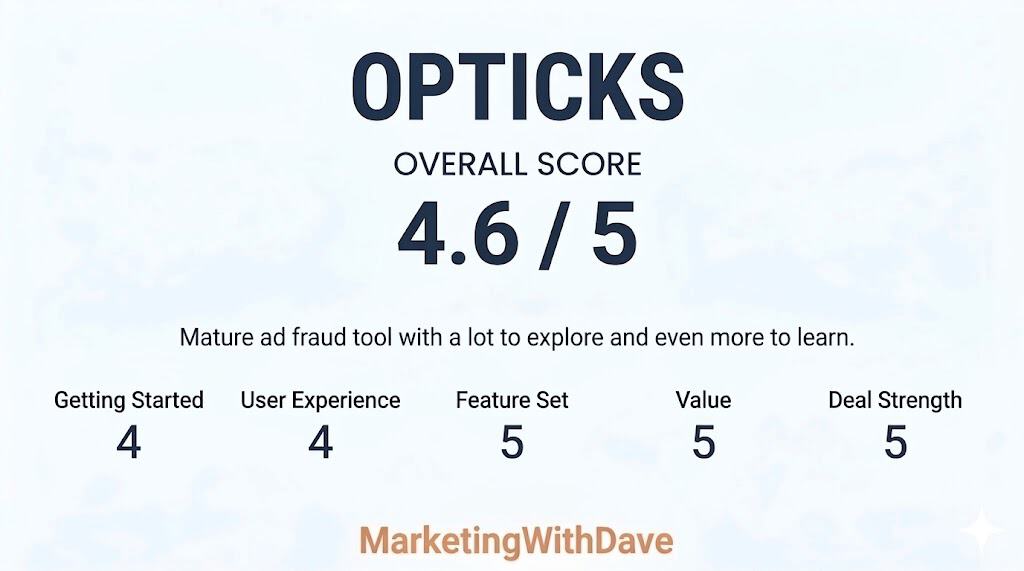
Opticks earned high marks for feature depth, value, and overall maturity. Compared to many AppSumo launches that still feel early or experimental, this felt like a substantially more developed platform with meaningful analytics and investigation capabilities already in place.
The main reason this was not a perfect score comes down to onboarding and interpretation. Some workflows, classifications, and filtering options took real effort to fully understand, and additional getting started guidance or educational resources would make the platform more approachable for new users.
I have tested fraud prevention tools before, and one of the hard questions in this category is whether the ad platforms are already handling the problem. Google, for example, has its own invalid click detection and may issue credits when it identifies invalid activity. That matters.
But that still leaves a practical gap for advertisers. Even if some invalid activity is filtered or refunded later, marketers are often left with limited visibility into what happened, which channels were affected, and whether certain traffic sources deserve closer inspection.
That is what made Opticks interesting to me. I was less interested in a scary bot story and more interested in whether the tool could help me understand my own traffic better.
My Setup Experience
Setup was straightforward. Opticks can be installed manually or through Google Tag Manager, and I used Google Tag Manager because that fits how I manage most marketing and analytics tags.
Once installed, the platform began collecting traffic data quickly. I did not feel like I had to fight the setup process before getting value from the tool. That matters because traffic quality software can easily become something people buy, install halfway, and never fully use.
Note: Screenshots were captured during different stages of testing and may represent different date ranges. They are included to illustrate platform capabilities rather than compare identical datasets.
What Surprised Me Most
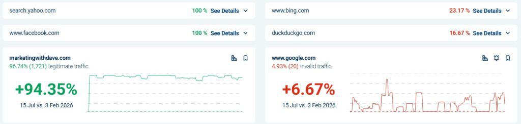
The first number that caught my attention was not tied to a paid campaign. It was the overall traffic quality view. In the screenshot I captured, Opticks showed 65.73% legitimate traffic and 31% invalid traffic.
That does not automatically mean 31% of my business opportunity was fake, and it does not mean every invalid visit requires immediate action. But it does change how you think about analytics. Even on a website that is not running large paid campaigns at the moment, there can still be a meaningful amount of traffic noise.
This is where Opticks became more useful than I expected. It was not just telling me that invalid traffic exists. It was helping me see where that traffic was showing up.
My Three Favorite Opticks Features
1. Traffic source visibility
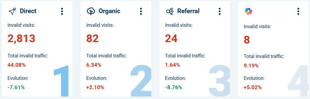
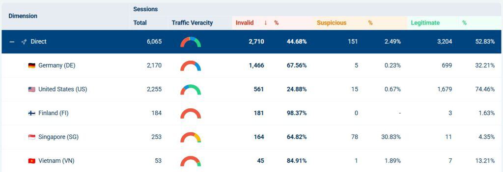
The most useful part of Opticks for me was the ability to look at invalid traffic by source and channel. In one view, I could see direct traffic, organic traffic, AI-related traffic, social sources, and other providers broken out separately.
This is also where judgment matters. A channel with one or two visits can show a dramatic percentage, but that does not mean you should immediately draw a big conclusion. A small sample size can make a number look more important than it is.
That is one of the things I appreciated about using Opticks. It gave me more visibility, but it also reminded me not to get emotional about every red number. The real value is in spotting patterns, then checking whether the volume and context support action.
2. Provider and channel filtering
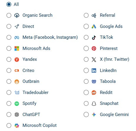
Opticks is not limited to one advertising platform. The provider filters include common paid media platforms, organic search, referral traffic, social networks, and newer AI-related sources like ChatGPT, Google Gemini, and Microsoft Copilot.
Beyond the high-level traffic summaries, Opticks also made it easy to investigate traffic patterns using a wide range of dimensions and filters. I could segment traffic by campaign, keyword, placement, traffic channel, referring source, and other variables depending on what I wanted to analyze.
That matters because traffic quality is no longer just a Google Ads problem. Marketers now get traffic from search, social, referral websites, AI tools, content platforms, and direct visits that may not be as clean as they appear in standard analytics reporting.
Seeing those sources side by side makes the platform more useful for modern traffic analysis. It helps answer a better question than “Do I have fake clicks?” The better question is, “Which sources deserve more trust, and which ones deserve a closer look?”
3. Segmentation that helps you investigate
The referral breakdown was one of the clearest examples of why Opticks is useful. I could filter into referral traffic and see sessions, invalid visits, suspicious visits, legitimate visits, and web page views in the same table.
That is much more helpful than a single invalid traffic percentage. A top-level number tells you something may be happening. Segmentation helps you understand where it is happening.
For example, if a referral source consistently sends legitimate visits, that is useful to know. If another source sends mostly invalid or suspicious activity, that deserves investigation. This is where Opticks becomes practical instead of theoretical.
Opticks helped me separate traffic volume from traffic quality. Those are not the same thing.
Standard analytics tools are good at showing traffic totals, engagement, conversions, and attribution paths. But they do not always make it obvious whether part of that traffic should be trusted in the first place.
Opticks gave me another lens. Instead of only asking which channel brought traffic, I could also ask how much of that traffic appeared legitimate, suspicious, or invalid.
That may sound simple, but it changes how you evaluate marketing performance. A source that sends a lot of traffic is not automatically valuable. A source that sends less traffic but cleaner visits may be more useful than it first appears.
Where You Still Need Judgment
Opticks gives you better visibility, but it does not remove the need to interpret the data carefully.
Small sample sizes can distort percentages. A source with one or two visits can look alarming if all of them are flagged. That does not necessarily mean the channel is bad. It means you need more context before making a decision.
Bot and invalid traffic labels can also require interpretation. Some automated traffic is clearly unwanted. Other activity may come from tools, crawlers, or systems you recognize. The platform helps surface the signal, but the marketer still needs to decide what the signal means.
That is not a criticism of Opticks as much as it is a reality of this category. Traffic quality data is useful, but it should be used with context.
What Opticks Is Not
Opticks is not a Google Analytics replacement.
It is not a magic button that fixes weak campaigns.
It is not proof that every suspicious visit is costing you money.
It is not a reason to panic every time a source shows invalid traffic.
Opticks is best viewed as a traffic quality layer. It helps you identify where questionable traffic may be affecting your reporting, your paid campaigns, and your understanding of channel performance.
Who Opticks Is Best For
Opticks makes the most sense for businesses that are actively trying to understand and improve traffic quality.
It is especially relevant for advertisers running paid search, paid social, or lead generation campaigns where invalid traffic can quietly affect cost, conversion rates, and reporting confidence.
It is also useful for agencies that need a clearer way to monitor traffic quality across multiple sources. The ability to segment traffic by channel, provider, referral source, and campaign makes it easier to investigate patterns without relying only on ad platform reporting.
For a tiny website with very little traffic and no paid campaigns, Opticks may be more interesting than necessary. But for marketers spending meaningful money to acquire traffic, the visibility can be valuable quickly.
Pros and Cons
What I Liked
What to Keep in Mind
Setup through Google Tag Manager was straightforward.
The data still needs interpretation, especially with small sample sizes.
The dashboard made traffic quality easy to understand quickly.
Not every invalid or suspicious signal should trigger immediate action.
Provider and channel filters made the tool feel broader than paid search.
Some bot or source labels may require additional context before deciding what to do.
Referral and source breakdowns made the data more actionable.
This should complement your analytics and ad platform reporting, not replace it.
The product felt mature and practical rather than experimental.
The value increases as your traffic volume and paid media spend increase.
AppSumo Pricing
Opticks is currently available on AppSumo as a lifetime deal. Since AppSumo promotions are only available for a limited time and pricing or license tiers can change, I recommend checking the current listing before making a decision.
When evaluating the different license tiers, focus on your expected traffic volume, the number of websites you plan to monitor, and whether you’ll benefit from features such as lead protection, automated Google Ads IP exclusion, or advanced reporting. If you’re investing heavily in paid advertising or managing multiple websites, choosing the right tier upfront may save you from ne.eding to upgrade later.
Bottom Line
Opticks gave me a clearer view of traffic quality than I expected. The platform was easy to set up, and the dashboards were useful without being overwhelming, and the source-level breakdowns made the data feel practical.
The biggest takeaway from my testing was that invalid traffic is not only a paid search issue. Even direct, referral, organic, and newer AI-related sources can warrant a closer look. That does not mean every red number should cause panic. It means marketers need better visibility before making decisions.
For businesses spending meaningful money on traffic acquisition, Opticks is a strong addition to the marketing stack. It helps you ask better questions about your traffic, spot patterns you might otherwise miss, and understand which sources may deserve more trust.
This content is for educational purposes and reflects my experience, review of the product, and current publicly available deal information. Always evaluate tools based on your specific business needs, goals, and workflows before making a decision.