
Last updated March 2026
Why You Rarely See LinkedIn Analytics Shared
I have never seen anyone publicly share their LinkedIn analytics.
I suspect there are two main reasons.
First, the data is surprisingly difficult to gather. LinkedIn only surfaces analytics through the mobile app. If you want monthly trends, you have to manually set the start and end date for each month and record the numbers yourself. For a platform likely worth well over $100 billion, the analytics experience feels incredibly primitive.
Second, LinkedIn is personal. The metrics can feel like a public scoreboard of how good someone is at networking, influence, or business. Most people would rather talk about success than show the full data behind it.
I have never pretended to be a great networker. I do not love the social side of business. What interests me more is the data and the insights we can learn from it.
The Three Metrics LinkedIn Actually Provides
So, I decided to track my LinkedIn analytics manually and share the results.
The platform essentially gives you three core metrics:
- impressions
- members reached
- engagements
That is not a lot to work with. Impressions in particular are often considered a vanity metric, but when that is one of the only signals available, you end up clinging to it anyway.
Limitations of LinkedIn Analytics
Before looking at the charts, there are two additional limitations worth mentioning about LinkedIn’s analytics.
First, LinkedIn only provides data for the most recent 12 months. If you want to track longer term trends, you need to capture the numbers yourself. Once the window moves forward, older data simply disappears. Even if you are not planning to analyze it immediately, it is worth recording the numbers each month so you have the history available later.
Second, LinkedIn’s built in analytics leave out several metrics that are useful for understanding growth. Because of that, I have been experimenting with tracking additional signals outside the platform.
For example, I wrote about a method for tracking monthly LinkedIn follower growth using Excel formulas. Follower growth is one of the few ways to measure whether your audience is actually expanding over time.
Another metric that may relate to these trends is LinkedIn’s Social Selling Index (SSI), which attempts to measure how effectively you build relationships, share insights, and engage with your network.
I suspect there may be interesting relationships between SSI scores, follower growth, impressions, and engagement trends, although LinkedIn does not provide an easy way to analyze them together.
With that context in mind, here are the metrics LinkedIn currently provides.
Observations From the Data
Looking at these charts, a few patterns stand out.
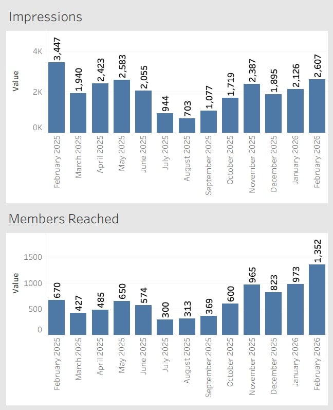
First, impressions are volatile. The numbers fluctuate significantly from month to month without an obvious pattern. Some months see more than triple the impressions of others.
Second, members reached shows a much steadier upward trend. While there are some fluctuations, the overall direction appears to be gradual growth over time.
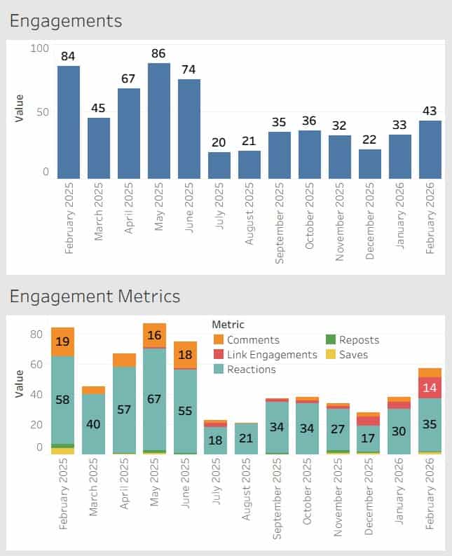
Third, engagements tend to follow impressions more closely than members reached. When impressions spike, engagement usually rises with it.
One other note for transparency. A portion of the repost activity counted in these numbers comes from my own reposts.
What This Data Does and Does Not Tell Us
With only three primary metrics available, it is difficult to draw strong conclusions.
Impressions tell us how many times content appeared in feeds, but they do not tell us whether people actually consumed the content.
Members reached provides a slightly better signal because it reflects the number of unique individuals exposed to the content.
Engagements provide the most meaningful signal of the three, but even here the data is limited. LinkedIn groups together different types of engagement without providing deeper context around why certain posts perform better than others.
In other words, the data hints at patterns but does not fully explain them.
What This Data Actually Helps You See
Trending these metrics over time does reveal some patterns, but it also highlights how limited LinkedIn analytics really are.
You can see visibility trends through impressions.
You can see how many unique people are exposed to your content through members reached.
You can see whether people interact through engagements.
What you cannot easily see is why.
LinkedIn does not tell you which topics consistently perform better, how your audience is evolving, or how your content strategy influences long-term growth. Even something as basic as exporting and trending this data requires manual work.
So while these metrics provide some direction, they rarely provide clear answers.
Why Trending the Data Still Matters
Despite those limitations, there is still value in tracking these numbers.
Most LinkedIn users never see their analytics over time. The platform shows short windows of performance, but trends only become visible when the data is captured month after month.
Over time you begin to notice patterns such as seasonal changes in activity, how impressions fluctuate, and whether your network is gradually expanding.
Even if the insights are imperfect, trending the data provides far more context than looking at a single post in isolation.
A Simple Recommendation
If you take one action from this article, it should be this.
Once a month, capture your LinkedIn metrics.
Record impressions, members reached, engagements, and follower growth in a simple spreadsheet. LinkedIn only provides a rolling twelve-month window, so historical data disappears unless you save it yourself.
You may not analyze it right away, but future you will be glad the data exists.

