Analytics

linkedin analytics impressions members reached engagements

LinkedIn Analytics Explained: Impressions, Members Reached, and Engagement Trends

Reading Time: 4 minutes

Why You Rarely See LinkedIn Analytics Shared

I have never seen anyone publicly share their LinkedIn analytics.

I suspect there are two main reasons.

First, the data is surprisingly difficult to gather. LinkedIn only surfaces analytics through the mobile app. If you want monthly trends, you have to manually set the start and end date for each month and record the numbers yourself. For a platform likely worth well over $100 billion, the analytics experience feels incredibly primitive.

Second, LinkedIn is personal. The metrics can feel like a public scoreboard of how good someone is at networking, influence, or business. Most people would rather talk about success than show the full data behind it.

I have never pretended to be a great networker. I do not love the social side of business. What interests me more is the data and the insights we can learn from it.

The Three Metrics LinkedIn Actually Provides

So, I decided to track my LinkedIn analytics manually and share the results.

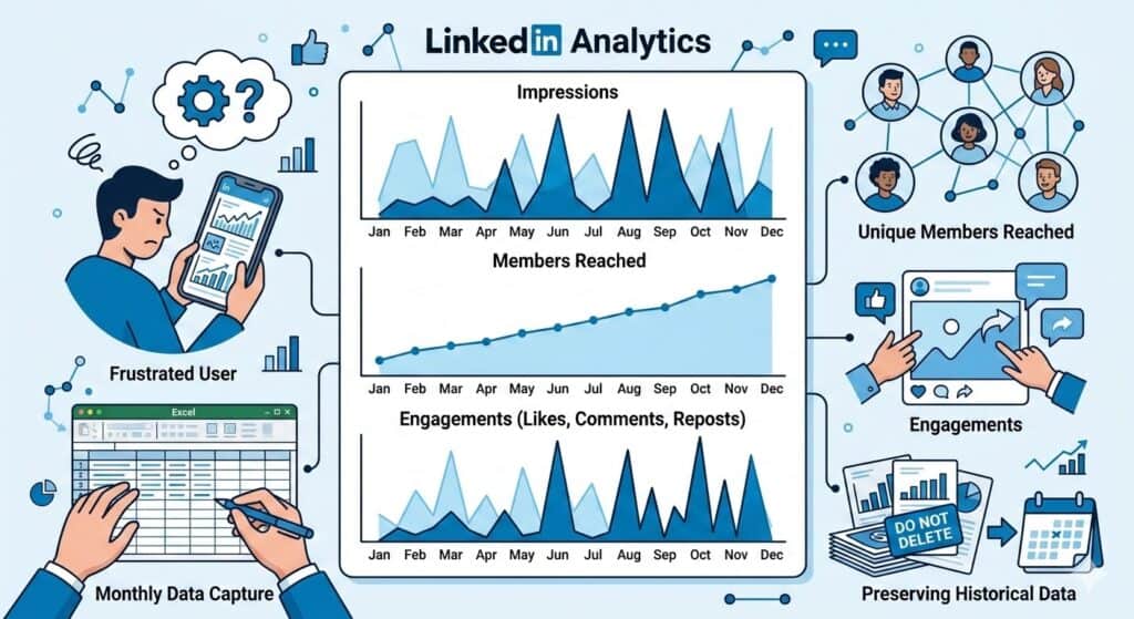
The platform essentially gives you three core metrics:

  1. impressions
  2. members reached
  3. engagements

That is not a lot to work with. Impressions in particular are often considered a vanity metric, but when that is one of the only signals available, you end up clinging to it anyway.

Limitations of LinkedIn Analytics

Before looking at the charts, there are two additional limitations worth mentioning about LinkedIn’s analytics.

First, LinkedIn only provides data for the most recent 12 months. If you want to track longer term trends, you need to capture the numbers yourself. Once the window moves forward, older data simply disappears. Even if you are not planning to analyze it immediately, it is worth recording the numbers each month so you have the history available later.

Second, LinkedIn’s built in analytics leave out several metrics that are useful for understanding growth. Because of that, I have been experimenting with tracking additional signals outside the platform.

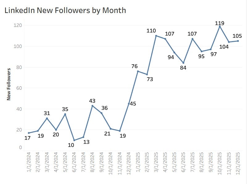
For example, I wrote about a method for tracking monthly LinkedIn follower growth using Excel formulas. Follower growth is one of the few ways to measure whether your audience is actually expanding over time.

Another metric that may relate to these trends is LinkedIn’s Social Selling Index (SSI), which attempts to measure how effectively you build relationships, share insights, and engage with your network.

I suspect there may be interesting relationships between SSI scores, follower growth, impressions, and engagement trends, although LinkedIn does not provide an easy way to analyze them together.

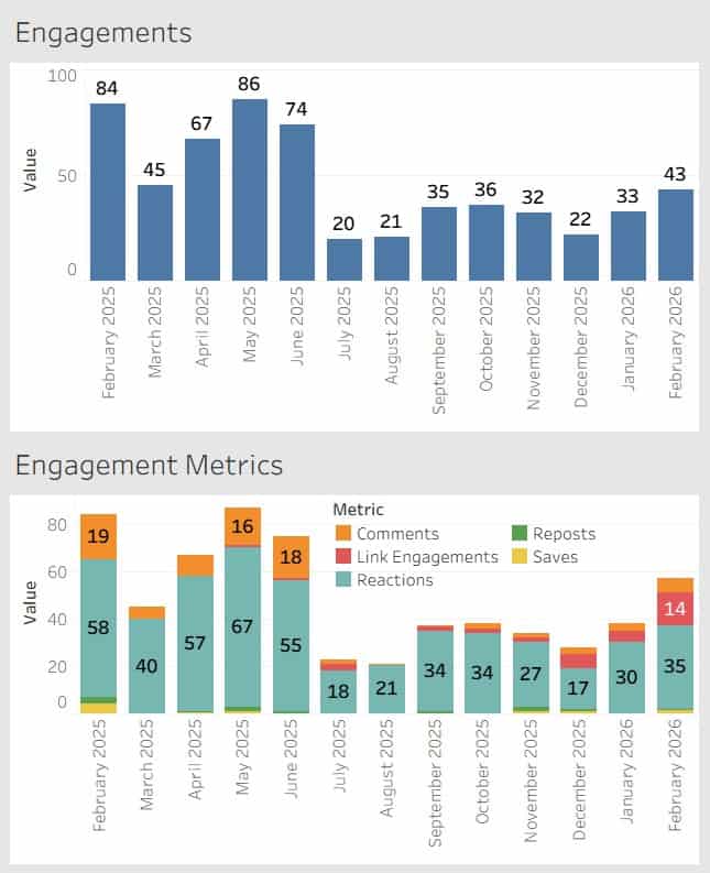
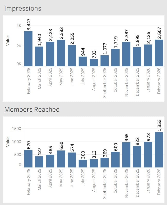
With that context in mind, here are the metrics LinkedIn currently provides.
Observations From the Data

Looking at these charts, a few patterns stand out.

First, impressions are volatile. The numbers fluctuate significantly from month to month without an obvious pattern. Some months see more than triple the impressions of others.

Second, members reached shows a much steadier upward trend. While there are some fluctuations, the overall direction appears to be gradual growth over time.

Third, engagements tend to follow impressions more closely than members reached. When impressions spike, engagement usually rises with it.

One other note for transparency. A portion of the repost activity counted in these numbers comes from my own reposts.

What This Data Does and Does Not Tell Us

With only three primary metrics available, it is difficult to draw strong conclusions.

Impressions tell us how many times content appeared in feeds, but they do not tell us whether people actually consumed the content.

Members reached provides a slightly better signal because it reflects the number of unique individuals exposed to the content.

Engagements provide the most meaningful signal of the three, but even here the data is limited. LinkedIn groups together different types of engagement without providing deeper context around why certain posts perform better than others.

In other words, the data hints at patterns but does not fully explain them.

What This Data Actually Helps You See

Trending these metrics over time does reveal some patterns, but it also highlights how limited LinkedIn analytics really are.

You can see visibility trends through impressions.
You can see how many unique people are exposed to your content through members reached.
You can see whether people interact through engagements.

What you cannot easily see is why.

LinkedIn does not tell you which topics consistently perform better, how your audience is evolving, or how your content strategy influences long-term growth. Even something as basic as exporting and trending this data requires manual work.

So while these metrics provide some direction, they rarely provide clear answers.

Why Trending the Data Still Matters

Despite those limitations, there is still value in tracking these numbers.

Most LinkedIn users never see their analytics over time. The platform shows short windows of performance, but trends only become visible when the data is captured month after month.

Over time you begin to notice patterns such as seasonal changes in activity, how impressions fluctuate, and whether your network is gradually expanding.

Even if the insights are imperfect, trending the data provides far more context than looking at a single post in isolation.

A Simple Recommendation

If you take one action from this article, it should be this.

Once a month, capture your LinkedIn metrics.

Record impressions, members reached, engagements, and follower growth in a simple spreadsheet. LinkedIn only provides a rolling twelve-month window, so historical data disappears unless you save it yourself.

You may not analyze it right away, but future you will be glad the data exists.

LinkedIn Analytics Explained: Impressions, Members Reached, and Engagement Trends Read More »
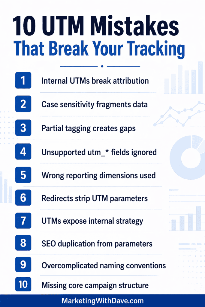
10 UTM Tracking Mistakes Most Marketers Don’t Notice

Reading Time: 4 minutes

Most marketers can build a UTM link, but far fewer remember what UTM even stands for, or why we are still so dependent on them. UTM is commonly expanded as Urchin Tracking Module, a naming holdover from the Urchin era that helped shape early Google Analytics.

And even though analytics tooling has evolved, UTMs remain the default campaign labeling system because they are simple, portable, and widely supported.

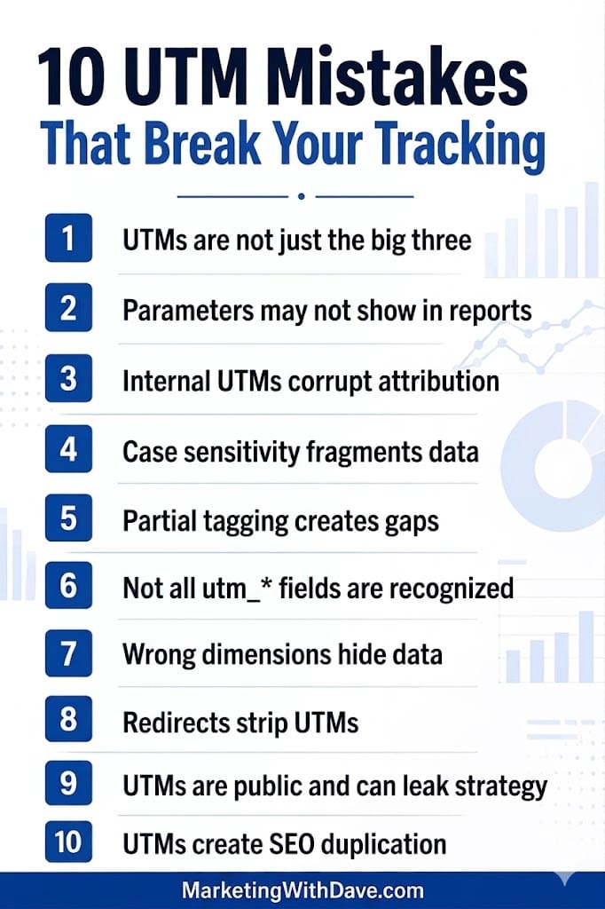
The problem is that the modern UTM landscape is broader than the classic three fields, and the common ways teams use UTMs can quietly damage attribution, fragment reporting, and create data governance debt. Here are 10 realities that are easy to miss until they hurt.

1. UTMs are not just the big three anymore

Most teams think of UTMs as just utm_source, utm_medium, and utm_campaign, with utm_content and utm_term as optional add-ons. Those five were the traditional core. However, modern implementations also support additional campaign fields such as utm_id (a unique campaign identifier), utm_source_platform (the advertising or marketing platform), utm_creative_format (the format of the creative, such as video or display), and utm_marketing_tactic (the tactic or approach being used). These expanded parameters allow for more structured taxonomy, better cross-platform consistency, and stable campaign joins across analytics tools, ad platforms, and data warehouses. If your team is still only using the original three or five, you may be leaving valuable campaign context on the table.

2. Some parameters can exist in links but not show up where you expect

A common failure mode is assuming that every parameter you append will be visible in your standard reports. Even when data is collected, reporting surfaces, default dimensions, and export paths do not always make every field obvious.

3. Internal UTMs can corrupt attribution

UTMs were designed to describe how a person arrived from an external campaign. When you add UTMs to internal links (navigation, home page promos, in-app banners, footer links), you risk overwriting or contaminating acquisition data.

In Google Analytics 4 (GA4) specifically, you can also create confusing splits where session-scoped acquisition does one thing, while event-level campaign values reflect something else. The outcome is often “clean looking” reports that are quietly wrong.

4. Case sensitivity can silently fragment your reporting

UTM values are case sensitive in many analytics workflows. That means Facebook and facebook can become separate rows, breaking rollups, dashboards, and year-over-year comparisons.

5. Partial tagging creates “not set” and messy channel classification

If you tag one field but leave others blank, you can end up with incomplete campaign rows and inconsistent grouping. The worst part is that the tracking still “works,” so teams do not notice the damage until they try to reconcile results across channels.

6. Not every utm_* key is recognized automatically

A persistent myth is that any parameter that starts with utm_ will be treated like a standard UTM. In reality, platforms tend to recognize a defined set of fields. If your team invents custom utm-style keys, you should plan to capture them intentionally (for example, through your tag manager into custom dimensions) instead of expecting automatic mapping.

7. You might be looking in the wrong dimension and think UTMs disappeared

Teams often troubleshoot the wrong place in GA4 or exports and conclude UTMs are not being captured. Sometimes the data is present but not exposed in the exact report, dimension, or UI view you are using. This is especially common when people rely on “query string” style dimensions and expect UTMs to show there.

8. Redirects and URL rewrites can strip UTMs before analytics fires

If a tagged link lands on a URL that immediately redirects (server-side or JavaScript) to a clean URL, the analytics tag may fire after the redirect and never see the original UTM parameters. This is one of the most common reasons UTMs “do not work,” even when the link was built correctly.

9. UTMs are public, persistent, and easy to leak

UTMs live in the URL, which means they can be copied, forwarded, bookmarked, logged, screenshotted, scraped, and shared. They are not hidden tracking variables. They are completely visible to anyone who clicks the link.

That is why UTMs should never contain personally identifiable information. Beyond compliance and privacy concerns, they can also unintentionally expose internal strategy.

If you embed details like internal campaign naming conventions, budget tiers, audience segments, funnel stages, product codes, partner identifiers, or experimental labels directly into UTM values, you are effectively publishing your marketing playbook in plain text. Competitors can reverse engineer campaign structure, targeting logic, promotional cadence, and even creative testing strategies simply by inspecting your links.

UTMs should describe campaigns clearly enough for reporting, but never reveal sensitive operational intelligence. Treat every UTM value as public-facing metadata, because that is exactly what it is.

10. UTMs can create SEO duplication noise if they get crawled

If UTM-tagged URLs become discoverable to search engines (especially via external links), you can end up with many parameter variations of the same web page. The fix is usually not “stop using UTMs,” it is making sure your website has a clear canonical strategy so crawlers consolidate variants correctly.

Where Adobe Analytics fits into the story

Many enterprise organizations use Adobe Analytics, which uses a different tracking structure than UTMs (for example, eVars and props, plus processing rules and classifications). Even so, it is common to see teams pass UTM values into Adobe via custom variables because UTM-style naming has become deeply entrenched across marketing teams and vendor workflows.

A concise set of UTM governance rules you can adopt

1. Use UTMs only for external inbound campaigns, not internal navigation or internal promos.

2. Standardize casing (for example, all lowercase) and enforce it in every campaign workflow.

3. Require a minimum set for every campaign link: utm_source, utm_medium, and utm_campaign.

4. Use stable IDs when needed (for example, a campaign ID field) so you can join data across platforms even if names change.

5. Treat any custom utm-style keys as custom parameters and plan explicit capture and reporting.

6. QA redirects, short links, and landing web pages to ensure UTMs survive until the analytics tag runs.

7. Never include personally identifiable information in any campaign parameters.

Closing thought

UTMs are still the building blocks of campaign labeling, but they work best as the bottom layer of a measurement stack, not the whole stack. When you pair clean UTMs with consistent taxonomy, strong QA, and platform integrations where available, you get attribution you can actually trust.

10 UTM Tracking Mistakes Most Marketers Don’t Notice Read More »

how to track linkedin monthly new followers

How to Track LinkedIn Monthly New Followers With Excel

Reading Time: 5 minutes

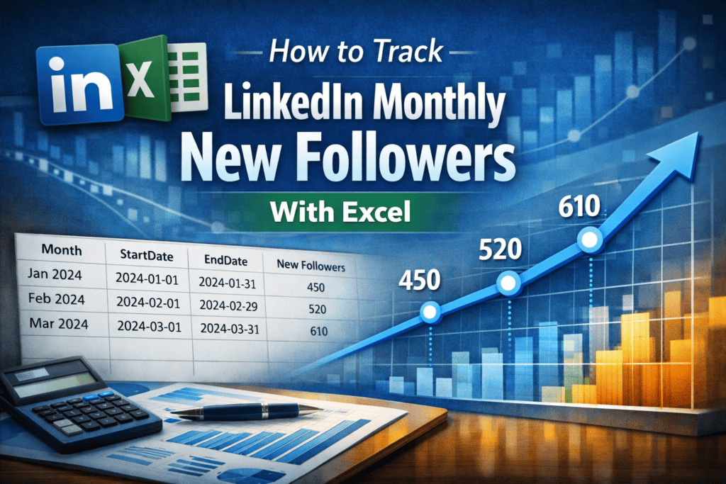
Quick summary: LinkedIn does not provide an export for personal follower analytics, but the Creator Audience analytics view supports custom date ranges. By generating monthly links with Excel formulas, you can capture cumulative new followers by month and build a trend dataset for dashboards and reporting.

LinkedIn’s Creator Audience view can show cumulative follower growth over custom date ranges, and it often provides a deeper lookback window than other profile metrics (which frequently only go back about a year). This quick Excel hack helps you generate a clickable URL for every month so you can capture monthly new followers in minutes and build a trend dataset for Tableau, Excel charts, or reporting.

In this tutorial, you will:

1. Create a simple Excel table with month start and end dates

2. Automatically generate correct month boundaries, including leap years

3. Build a monthly LinkedIn Creator Analytics link for each month

4. Capture monthly new follower totals from the cumulative chart

Important note about this method

This is not an officially documented LinkedIn export feature. It is a repeatable workflow based on how LinkedIn’s Creator Audience analytics URL parameters behave in the browser. LinkedIn can change these parameters or the analytics experience at any time. Use this as a practical workaround for building your own dataset.

What you need

1. A LinkedIn account with access to Creator Analytics

2. A desktop browser (recommended)

3. Excel or Google Sheets (Excel formulas below)

4. A place to record monthly results (a spreadsheet is perfect)

Step 1: Confirm you can access the Creator Audience analytics view

Open LinkedIn in a desktop browser while logged in, then paste this into your address bar:

https://www.linkedin.com/analytics/creator/audience

If you can see an audience analytics view, you are in the right place. If you do not have access, you may need to enable Creator Mode or you may not have this feature available in your account.

Step 2: Understand the URL pattern we will generate in Excel

LinkedIn’s Creator Audience analytics supports custom date ranges via URL parameters. The key parameters used in this workflow are:

startDate=YYYY-MM-DD

endDate=YYYY-MM-DD

timeRange=custom

lineChartType=cumulative

We will use Excel to generate a monthly link for each month so you can open the link, confirm the date range, and capture the cumulative new follower value for that month.

Step 3: Set up your Excel table

Create a new Excel sheet with these column headers:

A: Month
B: StartDate
C: EndDate
D: Link
E: New Followers (entered manually)

In cell B2, enter the first month start date you want to track. Example:

2024-01-01

Make sure columns B and C are formatted as dates.

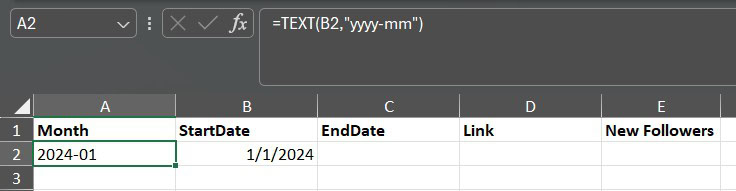
In cell A2, generate your Month label from the StartDate. This helps with sorting and makes the table easier to scan while you build it.

Option 1 (best for Tableau sorting):

=TEXT(B2,”yyyy-mm”)

Option 2 (more readable):

=TEXT(B2,”mmm yyyy”)

You can copy the Month formula down after you fill your StartDate column in the next step.

Step 4: Generate the next month StartDate automatically

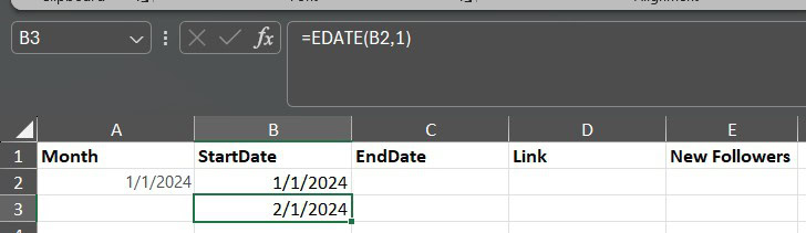
In cell B3, enter this formula:

=EDATE(B2,1)

Copy B3 down to generate future months. This advances by exactly one calendar month and handles year changes automatically.

Step 5: Generate the month EndDate automatically

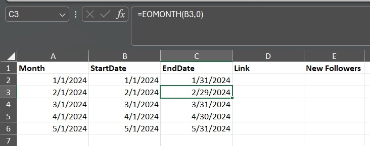
In cell C2, enter this formula:

=EOMONTH(B2,0)

Copy C2 down for all rows. This automatically returns the last day of each month, including February 29 during leap years.

Step 6: Create a clickable monthly analytics link

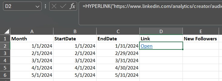
In cell D2, use this formula to generate a clean, clickable link labeled Open:

=HYPERLINK(“https://www.linkedin.com/analytics/creator/audience/?startDate=”&TEXT(B2,”yyyy-mm-dd”)&”&endDate=”&TEXT(C2,”yyyy-mm-dd”)&”&timeRange=custom&lineChartType=cumulative”,”Open”)

Copy D2 down for all rows.

Copy A2 down for all rows.

Step 7: Capture monthly new follower totals

For each month (each row):

  1. Click the Open link in column D
  2. Confirm the date range matches the month you are tracking
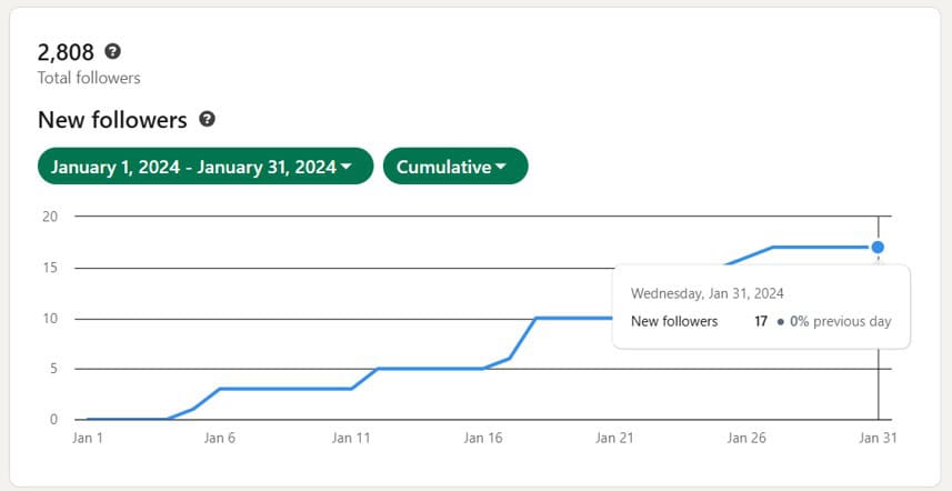
  3. Confirm the chart is in cumulative mode
  4. Hover the last point on the chart and record the cumulative new follower value
  5. Enter that value in column E (New Followers)

Recommended tracking protocol

To keep your dataset consistent, run this process on the first day of each month for the prior month. Example: capture January’s value on February 1. If you do it mid-month, your interpretation of month-to-month changes becomes less clean.

How to use the dataset

Once you have monthly values, you can:

1. Create a line chart of New Followers by Month

2. Add a rolling 3-month average to smooth spikes

3. Compare follower growth to your posting frequency (if you track it)

4. Use the dataset in Tableau for a dashboard and blog content

Common troubleshooting

1. Excel shows numbers like 45322 instead of a date

This usually means the cell is formatted as a number. Change the column format to a date (Home menu, Number format, choose Short Date or Date).

2. The link opens but the date range does not look right

Make sure your StartDate and EndDate cells are true dates, and confirm the TEXT format in the formula is exactly yyyy-mm-dd.

3. You cannot access the Creator Audience analytics view

Your account may not have Creator Analytics enabled or available. Try enabling Creator Mode and then revisit the URL.

4. You do not see cumulative mode

LinkedIn occasionally changes analytics UI elements. If the view still shows follower growth but the cumulative toggle looks different, capture the monthly total using the last visible value in the chart.

Limitations to understand up front

LinkedIn personal profile analytics are not designed for exporting and trending. This method works best for follower growth because the Creator Audience view can provide a deeper history window than other profile metrics. Other personal profile metrics may not support consistent month-by-month extraction and may only be visible for shorter windows.

If you build a dashboard from this, document your capture schedule and save occasional screenshots so you have a clear audit trail for how the dataset was created.

Frequently asked questions

Does LinkedIn provide an official export for follower analytics?

No. Personal profile analytics do not currently support any export options. This method uses the Creator Audience analytics view with custom date ranges.

Does this work for company web pages?

Company web pages have built-in analytics exports. This method is most useful for personal profiles where export is not available.

How to Track LinkedIn Monthly New Followers With Excel Read More »

case study morton thiokol o ring

Case Study: Morton Thiokol and the Data Failures Behind the Challenger Disaster

Reading Time: 6 minutes

Brief Summary

The Space Shuttle Challenger explosion in 1986 stands as a stark lesson in how ignoring critical data can lead to catastrophe.

Engineers had warned that the shuttle’s O-ring seals could fail in cold weather, but their concerns were downplayed amid pressure to launch.

The result was a tragic failure broadcast live to millions. This case highlights how data oversight and organizational bias contributed to disaster – a story that carries powerful warnings for today’s data-driven marketers about heeding evidence and managing risk.

Company Involved

NASA (National Aeronautics and Space Administration) – the U.S. space agency behind the Space Shuttle program – is at the center of this story, along with its booster contractor Morton Thiokol. NASA’s official site outlines its mission in space exploration, but the Challenger incident became one of its darkest moments.

Marketing Topic

  • Data ethics
  • Strategy
  • Crisis response

Public Reaction or Consequences

The Challenger disaster played out in front of a national audience and quickly became a defining moment of public grief and anger. As the investigation unfolded, the story shifted from “accident” to “preventable failure,” which damaged NASA’s credibility and created a long-term trust problem that required years of operational reform and public transparency to rebuild. The consequences extended beyond reputation: shuttle flights paused for an extended period, leadership and governance were scrutinized, and the program’s decision-making culture became a permanent cautionary tale.

Why It Matters Today

  1. Many marketing teams now operate inside dashboards, attribution systems, and AI outputs that can create false confidence when the data is incomplete, biased, or framed to support a preferred outcome.
  2. Modern marketing has plenty of incentives to ship: campaign calendars, quarterly targets, product launches, investor expectations, and the fear of missing the moment. These pressures can quietly encourage data cherry-picking.
  3. Visuals and reporting formats can hide risk just as easily as they reveal it: the wrong chart, the wrong grouping, or the wrong omission can mislead decision-makers without anyone intending harm.
  4. When something goes wrong, the public story becomes about trust: who knew what, when they knew it, and why action did not match the warning signs. That dynamic applies to privacy issues, safety issues, misleading claims, and brand crises.

3 Takeaways

  1. Treat data as a decision test, not a decision defense: if you only look for confirming signals, you will miss the warnings that matter most.
  2. Make risk legible: when the downside is severe, the burden is on the team presenting the data to communicate clearly, directly, and in a format that decision-makers cannot misunderstand.
  3. Pressure is not proof: urgency, schedule demands, and stakeholder expectations are not evidence. If the data is uncertain or trending the wrong way, the responsible move is to slow down, validate, and re-evaluate.

Notable Quotes and Data

  1. A widely cited line from the Rogers Commission materials summarizes the core lesson: reality will not conform to messaging when physics, risk, or constraints are ignored.
  2. A key finding from the investigation emphasized that temperature and O-ring performance were linked, and that the relationship could be seen in prior flight history if analyzed carefully.
  3. The disaster occurred 73 seconds after liftoff, which made the event both sudden and unmistakably public, intensifying the reputational consequences for NASA and its contractors.

Full Case Narrative

The Space Shuttle program operated under extreme complexity, high public visibility, and constant schedule pressure. In that environment, organizations often default to what feels safe: relying on precedent, accepting anomalies that did not yet create catastrophe, and assuming that a successful past outcome is evidence of future safety.

What Made This a Data Ethics Failure

This case is often framed as a leadership failure, but the more precise lesson is how an organization can become ethically careless with data without intending to be dishonest. The failure was not a lack of data collection. It was a failure of how data was framed, challenged, and communicated when the stakes demanded extreme clarity.

  1. Data framing failure: The information was not organized in a way that made the core risk unmistakable. When the key variable is not made visually and analytically dominant, decision-makers can walk away believing the risk is unclear even when patterns exist.
  2. Confirmation bias: Success in prior launches encouraged optimistic interpretation. Ambiguous signals were treated as reassurance instead of a reason to slow down and investigate, which is a common failure pattern in organizations that assume past success is proof of future safety.
  3. Normalization of deviance: Repeated near-misses reduced the perceived seriousness of warning signs. When abnormal outcomes do not immediately trigger catastrophe, the organization gradually treats them as acceptable, which shifts the ethical threshold for what is considered safe enough.
  4. Organizational pressure and authority gradient: Schedule pressure and hierarchy affected how evidence was weighed. When experts feel constrained in how forcefully they can present risk, and when decision-makers demand certainty before acting, the process quietly rewards minimization rather than caution.

For modern marketers, this is the core takeaway: data ethics is not only about whether numbers are true. It is also about whether uncertainty is disclosed, whether inconvenient signals are surfaced, and whether the decision process is designed to reveal risk rather than rationalize momentum.

In the lead-up to Challenger’s launch, engineers had observed O-ring erosion and joint performance issues on prior missions. The concern was straightforward: the O-rings needed to seal quickly and reliably, and cold temperatures could reduce their ability to respond as designed. The risk was not theoretical. It was rooted in observed performance and the mechanics of how the joint sealed.

The night before launch, a decision meeting evaluated whether conditions were acceptable. One of the most cited problems from later analysis was not simply that decision-makers reached the wrong conclusion, but that the information presented did not force the right question. Data was discussed in ways that diluted the central variable, temperature, and reduced the decision to an argument rather than an analysis. The format of the evidence, what was included, and what was left out contributed to uncertainty at exactly the moment clarity was required.

This is the part marketers should pay attention to: the failure was not a lack of data collection. It was a failure of data framing, data completeness, and data communication under pressure. When decision-makers are rushed, they rely heavily on what the data presentation makes obvious. If the presentation hides the real pattern, the organization can walk into a preventable crisis while still believing it is being “data-driven.”

Challenger launched in unusually cold conditions. Seventy-three seconds after liftoff, the shuttle broke apart, and seven lives were lost. The public impact was immediate, but the long-term impact came from what the investigation revealed about organizational behavior. The tragedy became evidence that repeated near-misses can normalize risk, that internal warnings can be softened by hierarchy and urgency, and that flawed presentations can make danger look like noise.

For modern marketing, the direct translation is not about rockets. It is about how organizations treat signals. A brand can ignore early indicators of customer harm, privacy violations, misleading claims, unsafe product behavior, or runaway algorithmic outcomes. The numbers might be present somewhere in the reporting stack, but if they are not surfaced correctly, they will not change decisions.

The Challenger case also shows why ethics belongs inside analytics. When the downside is severe, the standard cannot be “we did not have definitive proof.” The standard has to be “we recognized risk, we acknowledged uncertainty, and we acted responsibly before the damage became irreversible.” That is as true for consumer trust as it is for engineering safety.

Timeline

  1. 1985: Concerns about O-ring erosion and joint behavior are formally documented within contractor channels.
  2. January 27, 1986: A decision meeting reviews risk in light of cold temperatures, and the launch is approved.
  3. January 28, 1986: Challenger breaks apart 73 seconds after liftoff.
  4. June 1986: The Rogers Commission releases findings on technical causes and decision-making failures.
  5. 1988: Shuttle flights resume after redesigns and organizational reforms.

What Happened Next?

NASA paused the shuttle program, redesigned key joint components, and implemented procedural changes intended to strengthen safety and decision governance. The agency also faced a long credibility recovery, because the public narrative was no longer about ambition or innovation, but about whether leadership could be trusted to weigh evidence honestly. Over time, Challenger became embedded in training, management literature, and risk culture discussions as a warning about normalization, pressure, and the difference between reporting data and understanding it.

For marketers, the lasting lesson is that trust is slow to build and quick to lose. When a crisis is linked to ignored warnings, the reputational harm expands beyond the initial event. It becomes a story about values, responsibility, and whether leadership deserves confidence.

One Sentence Takeaway

Data cannot protect a decision if the organization only uses it to justify moving forward.

Sources and Citations

NASA: Report of the Presidential Commission on the Space Shuttle Challenger Accident (Rogers Commission) index

NASA: Rogers Commission Report, Volume 2, Appendix F (Richard Feynman)

National Archives DocTeach: Memo from R. M. Boisjoly to R. K. Lund on O-ring erosion (July 31, 1985)

NASA Safety Center: Normalization of Deviance safety message (PDF)

Edward Tufte: Visual and Statistical Thinking, displays of evidence and the Challenger launch decision (PDF)

University of Chicago Press: The Challenger Launch Decision by Diane Vaughan (overview)

Case Study: Morton Thiokol and the Data Failures Behind the Challenger Disaster Read More »

analytics the right way

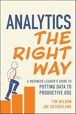
Analytics the Right Way by Tim Wilson and Tom Sutherland Book Summary

Reading Time: 5 minutes

Top Three Quotes

  • “Getting data does not mean you get insight.”
    • This line punctures the assumption that collecting more data automatically creates value.
  • “Data are not valuable in and of themselves. You have to interact with the data in a particular way to get any insight from it.”
    • The core thesis of the book: value comes from how you use data, not from its volume.
  • “A KPI without a target is just a metric.”
    • A sharp reminder that measurement must be tied to expectations and decisions, not dashboards.

Book Theme

The central theme of Analytics the Right Way is that organizations only get value from data when they use it deliberately to support decision-making and operations—through three distinct but connected uses of data: performance measurement, hypothesis validation, and operational enablement.

Why You Should Read This Book

  • If you feel “data rich but insight poor,” this book explains why that happens and gives you a concrete way out.
  • It translates rigorous causal thinking and statistical reasoning into practical language for executives, managers, and product leaders.
  • It offers a simple, memorable framework you can use to align analytics teams, business stakeholders, and technology investments around real business value instead of “big table mentality.”
  • It is grounded in real client stories and vignettes that mirror the messy situations leaders actually face.

Key Ideas and Arguments Presented

  1. More data is not the same as more insight.
    • The shift from “data desert” to “data deluge” created a belief that data itself is valuable, like oil, when in reality it is worthless without refinement and theory.
  2. Four common misconceptions about data distort how organizations invest.
    • The book challenges four beliefs: that enough data can eliminate uncertainty, that data must be comprehensive to be useful, that data are inherently objective, and that democratizing access automatically makes an organization data-driven.
  3. Decision-making is about minimizing regret under uncertainty, not finding certainty.
    • Good decisions systematically reduce regret given inevitable uncertainty, rather than pretending uncertainty can be removed.
  4. The “potential outcomes” framework clarifies causality.
    • Potential outcomes and counterfactuals help leaders think clearly about what would have happened under different choices, grounding causal claims in a simple mental model.
  5. There are three fundamentally different ways to use data.
    • Performance measurement, hypothesis validation, and operational enablement are distinct business activities that must be approached differently.
  6. Performance measurement should be driven by “two magic questions.”
    • Start with “What are we trying to achieve?” and “How will we know if we’ve done that?” before defining KPIs, targets, and dashboards.
  7. Hypotheses must be explicit, actionable, and managed as a portfolio.
    • The book uses a simple “Idea, Theory, Action” template and a hypothesis library to turn scattered ideas into an organized pipeline of tests.
  8. Not all evidence is equal: the ladder of anecdotal, descriptive, and scientific evidence.
    • Leaders should match the evidence-gathering method to the cost and importance of the decision, rather than defaulting to dashboards or experiments.
  9. Descriptive and scientific analyses have predictable pitfalls.
    • Unit of analysis errors, omitted variables, time effects, selection bias, and confounding can all mislead decisions if not handled carefully.
  10. Operational enablement turns validated hypotheses into scalable business logic and automation.
    • Trade secrets and mechanisms discovered through hypothesis validation can be encoded into rules, models, and AI systems with appropriate human oversight.

Book Outline

  • Chapter 1: Is This Book Right for You?
    • The Digital Age = The Data Age
    • What You Will Learn in This Book
    • Will This Book Deliver Value?
  • Chapter 2: How We Got Here
    • Why common misconceptions about data hurt our ability to draw insights.
    • Exploration of four major misconceptions, including the “data is the new oil” analogy.
  • Chapter 3: Making Decisions with Data – Causality and Uncertainty
    • Decision-making under uncertainty, minimizing regret, and introducing the potential outcomes framework.
  • Chapter 4: A Structured Approach to Using Data
  • Chapter 5: Making Decisions Through Performance Measurement
    • Why “What are your KPIs?” is the wrong starting question.
    • The two magic questions and methods for setting targets and using dashboards effectively.
  • Chapter 6: Making Decisions Through Hypothesis Validation
    • Framework for articulating, prioritizing, and tracking hypotheses in a hypothesis library.
  • Chapter 7: Hypothesis Validation with New Evidence
    • Introduction to the ladder of evidence: anecdotal, descriptive, and scientific.
  • Chapter 8: Descriptive Evidence – Pitfalls and Solutions
    • How to avoid common mistakes in historical and descriptive analysis.
  • Chapter 9: Pitfalls and Solutions for Scientific Evidence
    • Selection bias, confounding, and the essentials of controlled experimentation.
  • Chapter 10: Operational Enablement Using Data
    • The factory metaphor, trade secrets, automation costs, and the role of machine learning and AI.
  • Chapter 11: Bringing It All Together
    • How the three uses of data interconnect, plus guidance on communication, technology, and decision-making.

Key Takeaways

  • Collecting more data does not solve business problems; refining data with clear theory and purpose does.
  • Leaders should treat uncertainty as inevitable and focus on minimizing regret, not chasing impossible certainty.
  • Every use of data should clearly fall into one of three categories: performance measurement, hypothesis validation, or operational enablement.
  • Performance measurement must start from clearly stated goals and targets; otherwise, dashboards become expensive wallpaper.
  • Actionable insight requires explicit hypotheses, documented as a portfolio, with methods and levels of evidence appropriate to the stakes.
  • Descriptive and scientific analyses are powerful but fragile; careless design and bias can systematically mislead decisions.
  • Operational enablement is where analytics scales—turning tested mechanisms into rules and models embedded in processes and products.
  • The greatest value arises when all three uses of data operate in unison, like sections of an orchestra working from the same score.

Key Techniques

  • The Two Magic Questions (Performance Measurement)
    • 1) What are we trying to achieve? 2) How will we know if we’ve done that?
  • KPI Design with Explicit Targets
    • KPIs only become meaningful when paired with target values and timelines.
  • Hypothesis Formulation Template (Idea – Theory – Action)
    • “We believe [Idea] … because [Theory] … If we are right, we will [Action].”
  • Hypothesis Library and Life Cycle Management
    • Document, prioritize, and track hypotheses from ideation through validation and archival.
  • Evidence Ladder and Method Selection
    • Choose between anecdotal, descriptive, and scientific evidence based on decision cost and importance.
  • Bias and Pitfall Checklists
    • Use simple checks and causal diagrams to guard against unit-of-analysis errors, omitted variables, and selection and confounding bias.
  • Operational Enablement Factory Model
    • View data-driven operations as a factory with defined inputs, mechanisms, outputs, and levels of automation and human oversight.

Author’s Qualifications

  • Tim Wilson
    • Veteran analytics practitioner who built and led analytics practices at multiple agencies, consulted with Fortune 500 firms, co-founded the consultancy facts & feelings, and co-hosts the Analytics Power Hour podcast.
    • Holds a BS from MIT and an MBA from the University of Texas at Austin.
  • Dr. Joe Sutherland
    • Director of the Emory Center for AI Learning and principal investigator in the US AI Safety Institute Consortium.
    • Former executive at Amazon and Cisco, founder of two AI/fintech startups, and published researcher in machine learning and AI.
    • Holds a PhD, MPhil, and MA from Columbia University.

Comparison to Similar Books

  • Analytics the Right Way is less about algorithms than Data Science for Business and more about how leaders should structure decisions and analytics work.
  • Compared with books like Naked Statistics or The Signal and the Noise, it focuses on operational frameworks rather than statistical intuition alone.
  • Relative to Analytics at Work or Competing on Analytics, it dives deeper into causal reasoning, experimentation, and the distinction between measurement, testing, and operationalization.
  • Versus typical “AI for business” titles, it is more skeptical of hype and more explicit about costs, governance, and when simple approaches beat complex models.

Target Audience

  • Senior business leaders and executives who sponsor analytics, AI, or data initiatives.
  • Marketing, product, and digital leaders overwhelmed by dashboards but underwhelmed by insight.
  • Analytics, data science, and BI leaders seeking a shared language with business stakeholders.
  • Operations and customer-experience leaders embedding data into processes and automation.
  • Strategy and innovation teams building AI-first or data-first offerings.
  • Consultants and agency partners looking for a clearer playbook for delivering value, not just reporting.
  • Non-technical managers who want to become better consumers of analytics and experimentation.

Critical Response to the Book

Analytics the Right Way is a very recent book, so broad external critical reception is still emerging, but it reflects the authors’ well-established perspectives in the analytics and AI community and even “measures” its own impact by asking readers to rate each chapter against clear performance goals.

One Sentence Takeaway

Real business value from data comes not from hoarding it, but from using a clear framework to measure performance, validate hypotheses, and embed proven mechanisms into operations so leaders can make better decisions under uncertainty.

Analytics the Right Way by Tim Wilson and Tom Sutherland Book Summary Read More »

google adsense balance

Making Sense and Cents from Google AdSense

Reading Time: 3 minutes

When I first added Google AdSense to my website, it wasn’t about chasing ad revenue. I wanted to understand how it really worked—how websites earn money from ads, what trade-offs exist, and whether it’s even realistic to make enough to cover basic website costs.

This post comes from more than a year of experimenting, learning, and slowly improving my website to see what’s possible.

It actually took me three tries to get approved for Google AdSense. After each rejection, I devoted more time to creating meaningful content that was better organized and implementing more SEO best practices. Google doesn’t provide much detail for why you’re not approved, but looking back, I knew I didn’t yet have the quality or depth required. That process turned out to be one of the most valuable parts of the journey.

How AdSense Earnings Are Calculated

Google AdSense earnings are primarily based on two components: clicks and impressions.

Clicks × CPC (Cost Per Click): You earn money every time a visitor clicks on an ad, and the amount depends on what advertisers in your niche are willing to pay.

Impressions × CPM (Cost Per Thousand Impressions): Even if no one clicks, you can still earn a small amount for each ad displayed on your pages.

The estimated earnings formula looks like this:

Estimated Earnings = (Clicks × CPC) + ((Impressions / 1000) × CPM)
  

For most new websites, the majority of revenue comes from clicks, with a much smaller portion coming from impressions. AdSense reports this automatically, but breaking it down helps you understand what really drives your income. However, even if you do earn consistently, Google will not send payment until your account balance reaches the payout threshold—$100 USD in most countries. That means you must accumulate at least $100 in total earnings before receiving your first payment.

My AdSense Journey in Numbers

Here’s a look at my own performance over several months. These figures include estimated earnings, page views, and the resulting Page RPM (revenue per thousand page views).

MonthEstimated EarningsPage ViewsPage RPM
July 2025$0.12157$0.76
August 2025$0.90685$1.31
September 2025$1.67979$1.71
October 2025$2.111,213$1.74

Across these months, my website averaged roughly $1.40–$1.70 per thousand page views. That’s typical for a newer website without heavy ad optimization or niche targeting.

The Math Behind $100 a Month

One of the biggest questions I had early on was: how much traffic would I need to earn just $100 in a month?

The formula is simple:

Required Page Views = (100 / RPM) * 1000
  

Using my average RPM of about $1.70, here’s what that looks like:

RPMPage Views Needed for $100
$1.50≈ 66,667
$5.00≈ 20,000
$10.00≈ 10,000
$25.00≈ 4,000

At my current rate, I’d need nearly 59,000 monthly page views to reach $100. That’s a humbling but eye-opening number. It shows that while AdSense can generate passive income, it takes serious traffic to make it meaningful.

The Trade-Off: Ads vs. Audience Experience

Of course, there’s a trade-off. I could increase my RPM by adding more ad placements or using more aggressive formats, but every extra ad makes the user experience worse. Pop-ups, sticky banners, or excessive in-content ads may boost short-term revenue but risk annoying visitors and reducing trust.

For me, it’s a balance. I want to understand ad performance and potential, but not at the cost of driving readers away. Knowing that I’d need tens of thousands of page views to make even $100 a month helps keep expectations realistic—and priorities focused on building value first, not clutter.

Lessons Learned After a Year with AdSense

1. Getting approved requires patience and quality content. Google doesn’t want thin or incomplete websites.

2. Most small sites earn only a few dollars a month at first. RPM varies by niche, region, and ad type.

3. The biggest factor you control is your content. More useful, searchable, and shareable content means more qualified traffic—and that’s the foundation for every other monetization option.

4. AdSense can teach you a lot about digital advertising economics, even if you never make much money from it. For me, the insights have been the real value


After a year of experimentation, I’ve come to see Google AdSense as a learning tool rather than a paycheck. It’s shown me exactly what’s possible—and what it really takes—to turn traffic into income without compromising the experience for readers.

Making Sense and Cents from Google AdSense Read More »