navigating the customer journey a framework comparison guide

Navigating the Customer Journey: A Framework Comparison Guide

Reading Time: 2 minutes

Marketing is most effective when it’s aligned with how people make decisions. That’s where customer journey frameworks come in. These models provide structured ways to understand, design, and optimize interactions across the entire path a customer takes — from awareness to loyalty. In this post, we compare the most popular customer journey marketing frameworks: AIDA, See-Think-Do-Care (STDC), Flywheel, Buyer’s Journey, 5A, Messy Middle, and Feel-Think-Do-Care.

Why Compare Customer Journey Frameworks?

Different frameworks serve different purposes. Some are better for content planning, others for measurement or product messaging. Understanding the strengths and limitations of each helps marketers select the right model for their goals, channels, and audience behavior.

Overview of Frameworks

AIDA

  • Stages: Attention → Interest → Desire → Action
  • Origin: Elmo Lewis, 1898
  • Use Case: Traditional advertising, copywriting, sales funnels
  • Strength: Clear linear path with actionable focus
  • Limitation: Ignores post-purchase stages like loyalty and advocacy

See-Think-Do-Care (STDC)

  • Stages: See → Think → Do → Care
  • Origin: Avinash Kaushik
  • Use Case: Content marketing, digital strategy
  • Strength: Audience-first and intent-based
  • Limitation: Less emphasis on emotion or competitive influence

Flywheel

  • Stages: Attract → Engage → Delight (repeatable)
  • Origin: Popularized by HubSpot
  • Use Case: Inbound marketing, customer success
  • Strength: Focuses on momentum and customer retention
  • Limitation: Abstract without clear tactical stages

Buyer’s Journey

  • Stages: Awareness → Consideration → Decision
  • Origin: Common B2B framework
  • Use Case: Lead nurturing, sales alignment
  • Strength: Simple and intuitive
  • Limitation: Linear and assumes rational behavior

5A Model

  • Stages: Aware → Appeal → Ask → Act → Advocate
  • Origin: Kotler, Kartajaya, and Setiawan
  • Use Case: Modern omni-channel marketing
  • Strength: Incorporates social influence and loyalty
  • Limitation: Less commonly adopted, harder to operationalize

Messy Middle

  • Stages: Trigger → Explore ↔ Evaluate → Purchase
  • Origin: Google Research
  • Use Case: Search behavior, ecommerce, content
  • Strength: Reflects modern digital decision-making
  • Limitation: Harder to model in traditional funnels

Feel-Think-Do-Care

  • Stages: Feel → Think → Do → Care
  • Origin: Evolution of STDC
  • Use Case: Emotional branding, content strategy
  • Strength: Accounts for emotional triggers
  • Limitation: Less standardized, still emerging

Visual Comparison of Stages

  • AIDA: Attention → Interest → Desire → Action
  • STDC: See → Think → Do → Care
  • Flywheel: Attract → Engage → Delight → (repeat)
  • Buyer’s Journey: Awareness → Consideration → Decision
  • 5A Model: Aware → Appeal → Ask → Act → Advocate
  • Messy Middle: Trigger → Explore ↔ Evaluate → Purchase
  • Feel-Think-Do-Care: Feel → Think → Do → Care

Comparison Table

FrameworkOriginUse CaseStrengthWeaknessKey Metric(s)
AIDAElmo LewisAdvertising, SalesSimple and action-drivenStops at conversionConversion Rate
STDCAvinash KaushikContent, StrategyCustomer-first, intent-basedLacks emotional layerEngagement Rate
FlywheelHubSpotInbound, CXFocuses on retentionAbstract stagesCustomer Retention Rate
Buyer’s JourneyB2B MarketingLead nurturingWidely usedToo linearLead Conversion Rate
5AKotler et al.OmnichannelIncludes loyaltyLess knownAdvocacy Rate
Messy MiddleGoogleSearch, EcommerceReflects real behaviorHarder to mapPath-to-Purchase Metrics
Feel-Think-Do-CareModern AdaptationEmotional brandingBlends logic + emotionStill emergingEmotional Engagement

How to Choose the Right Framework

Choosing the right model depends on your marketing goals, team structure, and where your audience spends time. For content planning, STDC or Feel-Think-Do-Care may be ideal. For lead nurturing, the Buyer’s Journey or 5A model offers more depth. Ecommerce marketers may benefit from the Messy Middle. And for loyalty-driven growth, the Flywheel framework shines.

Final Thoughts

Each customer journey framework brings a different lens to how people discover, evaluate, and engage with brands. Rather than choosing just one, marketers should understand each model’s strengths and apply them where they fit best. Hybrid approaches are not only valid—they’re often necessary in today’s fragmented, cross-channel world.

Navigating the Customer Journey: A Framework Comparison Guide Read More »
the five number summary

Beyond Averages: How the Five-Number Summary Reveals What Your Marketing Data Is Hiding

Reading Time: 3 minutes

Marketers are flooded with metrics: campaign performance, customer data, A/B test results, and more.

But what happens when you dig beyond averages?

The five-number summary is a statistical tool that gives you a deeper view of your data’s distribution—allowing you to spot outliers, skew, and hidden patterns that averages alone miss. I covered having these five metrics on a box plot chart if interested.

In this post, we’ll break down the five-number summary, walk through a marketing-focused example, and show you exactly how to use it to improve decision-making and communication with stakeholders.

What Is the Five-Number Summary?

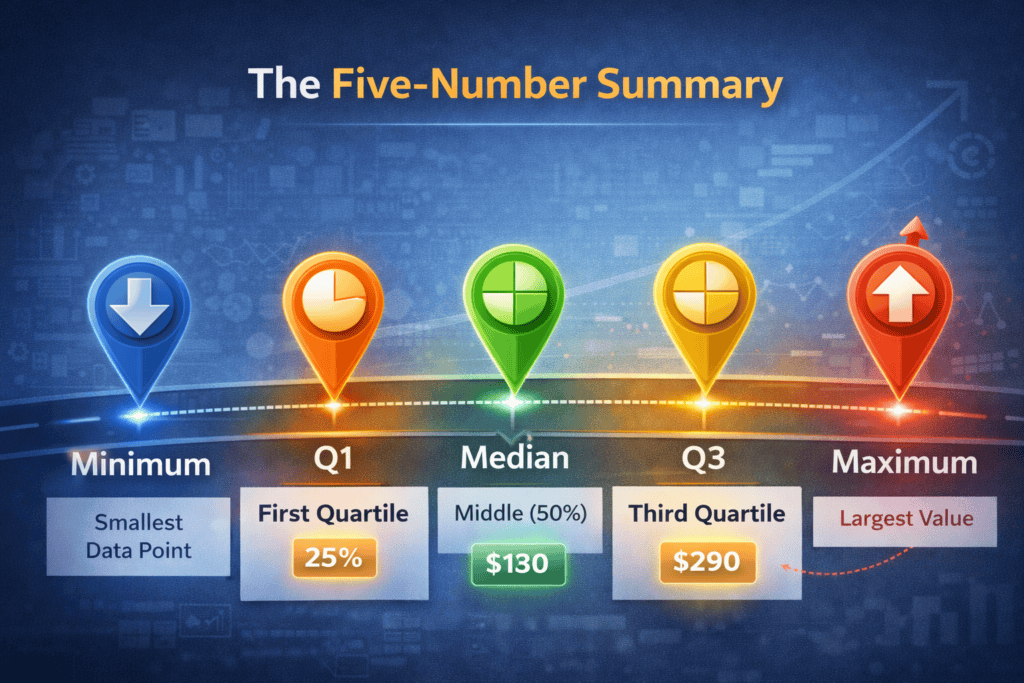
The five-number summary consists of:

  • Minimum – The smallest data point
  • Q1 (First Quartile) – 25% of the data falls below this point
  • Median (Q2) – The midpoint (50th percentile)
  • Q3 (Third Quartile) – 75% of the data falls below this point
  • Maximum – The largest data point

This summary is the basis for box plots, a visualization method that marketers can use to compare campaign performance, user behavior, or segment-specific metrics.

Why Marketers Should Care

1. Averages Lie

If you report an average email open rate of 23%, is that good? Not necessarily.

  • What if 80% of your emails perform at 15% or lower, but one high-performing campaign skews the average?
  • The five-number summary exposes this variability by showing how spread out the data really is.

2. Spotting Segmentation Opportunities

Let’s say you’re analyzing customer lifetime value (CLV) across a dataset of 1,000 customers. A five-number summary might look like:

  • Min: $35
  • Q1: $120
  • Median: $180
  • Q3: $290
  • Max: $1,850

That range between Q3 and Max suggests a high-value segment that’s well outside the norm. These aren’t just “top spenders”—they may require their own marketing strategy, loyalty program, or targeted messaging.

3. Diagnosing Performance Spread in A/B Tests

Suppose you ran 20 variations of a Facebook ad. Instead of reporting the average cost per click (CPC), you calculate a five-number summary:

  • Min: $0.42
  • Q1: $0.63
  • Median: $0.78
  • Q3: $0.94
  • Max: $1.53

Insight:

  • Ads in the Q1 range ($0.63 or below) could be scaled.
  • Ads above Q3 may need optimization or retirement.
  • Outliers (Max = $1.53) deserve investigation—was the targeting wrong? Did the creative flop?

This approach helps you move beyond binary “winner/loser” language and think in gradients of performance.

How to Calculate It

If you’re dealing with a spreadsheet:

  1. Sort your data in ascending order.
  2. Identify:
    • Minimum = first value
    • Maximum = last value
    • Median = middle value
    • Q1 = median of the lower half
    • Q3 = median of the upper half

Using tools:

  • Python (pandas): df['metric'].describe()
  • Excel: Use MIN(), QUARTILE.INC(range,1), MEDIAN(), etc.

Example: Email Campaign Click Rates

CampaignClick Rate (%)
A1.8
B2.1
C2.4
D3.2
E3.6
F3.9
G4.0
H4.1
I4.3
J4.7

Sorted Click Rates: 1.8, 2.1, 2.4, 3.2, 3.6, 3.9, 4.0, 4.1, 4.3, 4.7

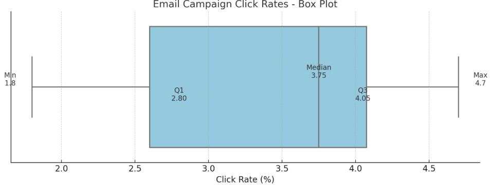
  • Min = 1.8
  • Q1 = (2.4 + 3.2)/2 = 2.8 (Q1 is the median of the lower half of data: 1.8, 2.1, 2.4, 3.2, 3.6)
  • Median = (3.6 + 3.9)/2 = 3.75
  • Q3 = (4.0 + 4.1)/2 = 4.05 (Q3 is the median of the upper half of data: 3.9, 4.0, 4.1, 4.3, 4.7)
  • Max = 4.7

Insight: Most campaigns cluster between 2.8% and 4.05%. Campaign A is clearly underperforming. Campaign J might be worth studying to replicate success.

Going Further: Box Plots

You can visualize the five-number summary using a box plot, a compact chart that quickly communicates the spread and shape of your data.

  • The box spans from Q1 to Q3, covering the middle 50% of the data (the interquartile range).
  • A line inside the box shows the median, highlighting the central tendency.
  • Whiskers extend to the minimum and maximum values within 1.5x the interquartile range.
  • Outliers beyond the whiskers are plotted as individual points, making them easy to spot.

Why it matters: Box plots convey spread, skew, and outliers far more efficiently than bar or line charts. For marketers, they’re ideal for comparing campaign results, ad performance, or audience segments across multiple datasets.

Tools to create them:

  • Excel (with custom chart types)
  • Tableau
  • Python (matplotlib or seaborn)
  • Google Sheets (with add-ons or workarounds)

Who Came Up With It?

The five-number summary was introduced by statistician John Tukey in the 1970s as part of his foundational work in exploratory data analysis (EDA).

Final Thoughts

The five-number summary isn’t just for statisticians. It’s a practical, underused tool for marketers who want to:

  • Evaluate performance distributions
  • Identify segmentation insights
  • Optimize creative or media buys
  • Communicate data nuance to non-technical stakeholders

Don’t just look at averages—look at the spread. You’ll find better strategies hiding in your data.

Beyond Averages: How the Five-Number Summary Reveals What Your Marketing Data Is Hiding Read More »

bff do i know you animated

Stranger Danger: When Your Business Has Amnesia

Reading Time: 3 minutes

Six common scenarios where your flawed processes and data silos are letting you down

Like most of us, my expectations for a seamless online experience are way higher than what I usually get. Maybe that’s because I’m a marketer—and I see the cracks. But one thing that consistently drives me nuts? Being asked for information I’ve already shared.

It’s like talking to someone who flips between being your BFF and acting like they’ve never met you—sometimes in the same conversation. Two sides of the same coin. And with every interaction, you’re left wondering which side you’ll get.

I experience this most often with forms—digital or paper—but it’s not just about forms. One recent experience got me thinking: how often do businesses unintentionally treat people like strangers, simply because of flawed processes or (data) immaturity?

Scenario #1: The Internal Transfer

A customer has identified themselves and explained what they need — but you have to transfer them to another department.

  • How much of what they shared needs to be repeated?
  • Does the next person know anything about their previous interaction?

Scenario #2: Promoting What They Already Bought

You email or advertise a product to someone who already purchased it or worse, for a better price.

  • Are you showing customers content that’s irrelevant based on their purchase history?
  • Is your marketing team siloed from your sales or product data?

Scenario #3: Asking for Info You Already Have

Your job application form asks the same question twice like about race and being a veteran, or the customer needs to provide their date of birth twice during the prescription pickup process.

  • Do your employees feel confident — and supported — in flagging broken experiences to leadership?
  • Are the cracks in your process starting to leak into the customer experience?

Scenario #4: Stuck in a Shallow Relationship

A repeat customer shows up again — online or in-person — but your team has no context or record of the last interaction.

  • Are you logging key touchpoints across channels?
  • Can your front-line team easily access recent activity or notes?

Scenario #5: The Stranger Danger Re-Targeting

You run retargeting ads or emails that completely ignore someone’s previous actions (e.g., completing a form, talking to sales, booking a demo).

  • Are your campaigns personalized to reflect where someone is in the funnel?
  • Or does every contact get treated like a cold lead and receive the same offering?

Scenario #6: Event Registration Déjà Vu

You ask someone to fill out a long form for an event they’ve attended historically, or you make them re-enter info despite being logged in.

  • Are you recognizing returning attendees?
  • Can you auto-fill or skip unnecessary steps for known contacts?

Final Thoughts

These moments create friction. They subtly erode trust. And they’re often symptoms of data silos, disconnected systems, or outdated processes. Companies dealing with these amnesia moments usually have deeper data struggles beneath the surface.

Bottom line? You need to start somewhere. Tackling a few easy wins can build momentum, earn internal support, and show customers you’re serious about creating a better experience. Then, take on the issues that are the most annoying — and the most costly — because of the experience they deliver.

The good news? These are fixable. But you can’t fix what you don’t notice. Try walking through your own customer journeys like a secret shopper. Review form flows, transfers, and outreach campaigns with fresh eyes. Ask your team: “Would I be frustrated here?”

So how does your company do? Are you staying on the BFF side of the coin — or leaving customers feeling like strangers?

Stranger Danger: When Your Business Has Amnesia Read More »

SEO Vendor Positioning Map showing ahrefs.com and semrush.com with traffic and keyword rankings for SEO analysis.

SEO Success: Use a Positioning Map to Combine Traffic and Rankings

Reading Time: 2 minutes

What are the two most important metrics for measuring SEO success?

The #1 answer is likely organic traffic. When reviewing your month-over-month channel sessions report, it’s essential to see how much of your traffic is organic and how it’s trending compared to other channels.

The #2 answer would closely following #1, would be keyword rankings. Despite the disruption AI has brought (and will continue to bring), ranking on the first page—ideally in the top three positions—of Google and other search engines remains a top priority.

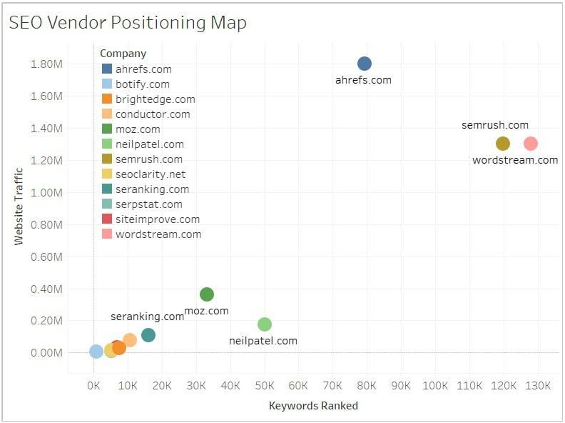
When you combine these two metrics, you get what I believe is the most powerful SEO report: a positioning map.

In the example below, I’ve plotted top SEO vendors with website traffic on the X-axis and keyword rankings on the Y-axis. Normally, I would reverse these axes, but visually, this layout works better.

You’re probably already thinking of ways this report could benefit your business. Here are a few specific examples:

Competitor Benchmarking

Compare one of your products to its top competitors, focusing on your most important keywords. You can do this at different levels—company, solution, or individual product—to get actionable insights.

Branded Performance

Internally, evaluate how your top solutions or products are ranking for branded keywords, alongside the monthly traffic they drive. Ideally, you should own the #1 spot for your branded terms, but depending on the term’s competitiveness or the solution’s newness, that may not yet be the case.

Content Strategy Prioritization

Use this report to spot opportunities in your content strategy. Identify keywords where you’re close to top rankings but not quite there, and prioritize content updates or new creation to boost visibility and traffic.

SEO Success: Use a Positioning Map to Combine Traffic and Rankings Read More »

add to calendar

10 Online Event Planning Mistakes to Avoid in the Final Stretch

Reading Time: 5 minutes

Most of my blog posts come from ideas and observations around what’s possible or doing better, but this one is a culmination of seeing too many examples of doing it wrong where it felt worthy of a topic to address, especially since doing it right isn’t much more work than doing it wrong and the impact and results would be significant.

Rarely does an event come together just by presenters showing up and “winging it.” Behind the scenes, there are typically weeks of planning, finding the right speakers, writing scripts, creating graphics, syncing with marketing and sales teams, and much more. It’s frustrating to watch all that hard work unravel because of sloppy execution at the final stages.

I sign up for a lot of events (probably more than most), and I always hope I can catch them live or watch on-demand later. But I’m genuinely surprised by how often simple things are overlooked, even with all the tools and technology we have today. Perhaps some better awareness along with documenting a repeatable process could turn these events from forgettable to flawless.

1. Include a Calendar Link

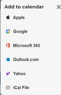
Ideally, include a calendar link both on the confirmation page after registration and in the follow-up confirmation email. I’ve often reached out to organizers when this is missing, and they’re usually surprised I even ask — but it’s crucial. Most people rely on their calendars to remind them and prevent double-booking. Without this step, attendance will suffer. This is one of those details that feels obvious in hindsight, but it’s too important to leave unsaid.

2. Authenticate Using Registration

The registration process should double as authentication, so when it’s time for the event, attendees simply click the link and join seamlessly. Too often, organizers make people go through the same registration steps again just to attend. Even for on-demand access, you already know who I am and that I registered — so skip the unnecessary hurdles. Make it easy and respect your attendees’ time.

3. All-Inclusive Calendar Support

Providing attendees with seamless options to add your event to their calendars is crucial. While many organizers default to supporting only iCal (.ics files), it’s essential to cater to a broader audience by including direct links for Google Calendar, Outlook, Yahoo, and others. Regularly assess and update the calendar platforms you support to align with the preferences of your audience. This proactive approach ensures inclusivity and enhances the likelihood of increased attendance.​

4. Respectfully and Personally Remind

No one needs 5+ reminder emails before an event. While this might be an attempt to cover missed opportunities from earlier stages, it’s often overkill and can annoy your attendees. Instead, use your technology to streamline communications. Send reminders only to those who haven’t already registered or joined the event, rather than bombarding everyone. Modern tools allow for personalized, targeted messages, making batch-and-blast tactics obsolete. Remember, you’re not rewarded for how many emails you send. Attendees likely have other meetings before and after your event so please make sure you start and end on time.

5. Get the Calendar Details Correct

Even if you’ve covered all the bases with tip #3 on calendar support, have you checked how your event actually appears on those calendars? For example, I’ve seen multiple 60-minute events mistakenly show up as 30 minutes on Google Calendar, possibly due to default settings not being adjusted. Worse, for multi-day events, some show up without a specific time, leaving attendees confused. Google Calendar, in particular, can make this process more cumbersome than necessary, but it’s still crucial to test and verify that your event displays correctly on the calendars you support. Always check your event from the attendee’s perspective to ensure accuracy.

6. Always Send a Post Event Email

Don’t let the conversation end when the event does. Even if you’re not providing an on-demand recording, sending a post-event email is essential. This is your opportunity to capture valuable feedback, whether through a short survey or other methods. Additionally, use this email to promote your next event, share additional marketing materials, or provide resources that build on the event’s topics. By keeping the conversation going, you maintain engagement and keep a pulse on each prospects journey as you continue to personalize recommendations based on their interests.

7. Promote On-Demand Availability

What’s the #1 question asked during the housekeeping portion for any online event? Yep, is this being recorded? Many interested participants may have scheduling conflicts preventing them from attending live. To accommodate them and maximize your event’s reach, prominently promote the availability of on-demand recordings. Include this information in your registration emails and on the event web page, encouraging registrations even from those unable to attend in real-time. Clarifying this upfront sets expectations and reassures potential attendees they won’t miss out, thereby increasing overall engagement.

8. Leverage the Calendar Description Field

Too often, the Description field in calendar invites is left blank, missing a prime opportunity to engage attendees. At the very least, ensure the link to attend the event is included in this field. Many people are jumping from meeting to meeting, and if they can’t quickly find the event link, they may not take the time to dig through their inbox to locate it. Beyond just the link, the Description field is a great place to provide additional details such as the event topic, presenter names, and key agenda points. During a busy day with overlapping meetings, the content in this field could be the deciding factor for whether they attend your event.

9. Require Only What You Need for Registration

As marketers, it’s tempting to treat the registration form like a Santa wish list, thinking we need to collect everything. But when it comes to form fields, less is often more. The real challenge is balancing what’s necessary with what’s not. While it’s smart to ask for information that helps with lead generation or personalizes the webinar experience, avoid asking for unnecessary details just because “that’s how it’s always been done.” For example, requesting a phone number may be more of an inconvenience than a necessity at this stage. Instead, focus on what truly helps your sales and marketing teams. Consider including questions that help segment hot leads—like whether they’d like a demo—so your form can do some of the heavy lifting for you.

10. I Only Need to Be Sold Once

One of the most frustrating experiences for attendees is receiving repeated promotional emails for an event they’ve already registered for. As someone with a busy calendar, I often find myself getting promotions for events I’ve already signed up for, only to realize it’s already on my calendar. It should be easy for event organizers to track who has registered and stop sending “please register” emails to those people. That said, it’s perfectly fine to continue communicating valuable updates, such as event details, speaker highlights, or reminders about exclusive content. Just avoid bombarding registrants with repetitive messages about registering when they’ve already done so.

By applying these tips, you can ensure your event finishes strong, avoiding common pitfalls that can trip you up at the finish line.

10 Online Event Planning Mistakes to Avoid in the Final Stretch Read More »

google analytics data display events

How to Review and Improve Your Google Analytics Data Display Events

Reading Time: 3 minutes

The Data Display Events page within the Settings > Property Settings of Google Analytics is a powerful feature often overlooked. It’s essential to review it regularly, ideally every six months, to ensure your data is accurate and comprehensive.

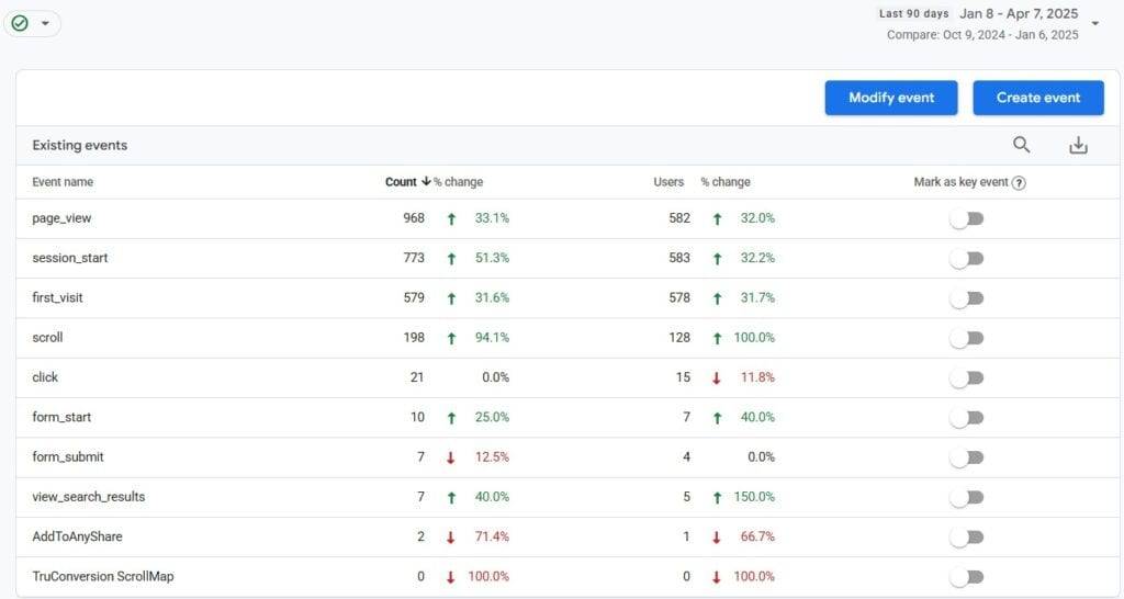
Below is an example of the events setup on my Google Analytics account, which are largely default events. I’ve used a 90-day comparison, sorting them in descending order by event count for clarity. It’s important to note that Google Analytics does not allow you to rename or delete events once they’ve been created, so setting them up correctly from the beginning is critical.

Why Event Tracking Setup is Crucial

Since Google Analytics event tracking is not retroactive, the sooner you get it right, the better. While BigQuery offers more control over data modification, it’s not ideal to be repeatedly answering management’s questions about misspelled events or improperly tracked data. You want a clean, well-organized event setup right from the start.

5 Questions to Ask When Reviewing Your Events Page

Here are the key questions to ask when reviewing the events page in Google Analytics:

1. Are all event names following the proper naming convention?

Event names should be lowercase with underscores separating words for readability. Consistency is crucial—although dashes are also used by some, underscores are generally preferred for compatibility.

Tip: Use a naming convention checklist and stick to it across your entire event tracking setup. For example, you can establish a format and progression tracking for custom events using vip_insiders_ask, vip_insiders_consider, and vip_insiders_transact.

2. Are there any duplicate events that should be removed?

It’s easy to end up with duplicate events if naming conventions aren’t followed. For example, you might have both a custom “Click” event and the default “click” event, leading to confusion and data inconsistencies.

Tip: Regularly audit your event list for duplicates and remove or merge them as needed to prevent clutter and confusion in your reports.

3. Are there events not getting any data?

Events that aren’t receiving data could be a sign of broken tracking or that the event is no longer relevant (e.g., tied to an expired marketing campaign). Removing outdated or broken events helps keep your setup clean and efficient.

Tip: Set up periodic checks to ensure events are firing correctly. Google Tag Assistant and GA Debugger are helpful tools for testing.

4. What are we not tracking?

As your website evolves, your analytics setup may lag behind. Review the customer journey and consider new interactions that need tracking. Whether it’s a new form submission, video play, or specific CTA, ensure your tracking is aligned with the most important actions on your site.

Tip: List key actions users take on your site and make sure you’re tracking them. New product launches or feature updates are great opportunities to reassess your tracking strategy.

5. What are our trends telling us?

Not all events are of equal value. Look at trends in event data, such as spikes or drops, and investigate any outliers. These trends can provide valuable insights into user behavior, helping you identify areas for optimization.

Tip: Analyze the relationship between event trends and conversion data. For example, if increased video views correlate with higher conversions, consider optimizing video content.

Additional Considerations:

  • Event Categorization: Group your events logically (e.g., “Clicks,” “Form Submissions,” “Video Plays”) to make reporting easier.
  • Custom Dimensions and Metrics: If you need deeper insights, use custom dimensions and metrics in your event tracking to capture additional data points.
  • Custom Alerts: Set up custom alerts in Google Analytics to notify you when specific events trigger, especially for critical actions.

Conclusion

Regularly auditing and optimizing your Google Analytics events is key to ensuring your tracking is accurate and aligned with your business goals. By addressing these questions, you can streamline your event setup, avoid common pitfalls, and make sure your data tells a meaningful story.

How to Review and Improve Your Google Analytics Data Display Events Read More »