Last updated March 2026
Top Three Quotes
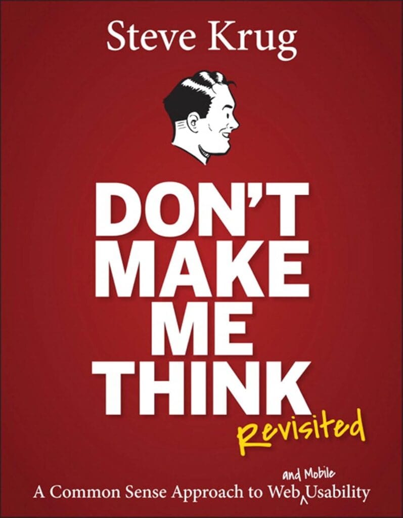
- “Don’t make me think!” – Steve Krug’s core mantra, meaning a website should be obvious and self-explanatory.
- “It doesn’t matter how many times I have to click, as long as each click is a mindless, unambiguous choice.” – Emphasizes that clarity of each action matters more than minimizing the number of clicks (Krug’s second law of usability).
- “Get rid of half the words on each page, then get rid of half of what’s left.” – Krug’s third law, urging the elimination of unnecessary content to reduce clutter and cognitive load.
Book Theme
Don’t Make Me Think focuses on web usability and intuitive design. Its central message is that websites (and apps) should be built so that users can navigate and accomplish tasks without having to consciously figure out how to use them. The book emphasizes simplicity, clarity, and common-sense design principles to make the user experience effortless.
Why You Should Read This Book
This book is a highly accessible introduction to usability, packed with practical advice and humor. It distills complex user-experience ideas into simple, memorable principles. Anyone involved in designing or building websites – from UX/UI designers and developers to product managers and entrepreneurs – will learn how to avoid common pitfalls, streamline their designs, and create more user-friendly sites. Even non-technical readers can grasp its concepts quickly, making it a valuable resource for anyone who wants to improve the usability of their digital products.
Key Ideas and Arguments Presented
- Don’t Make Me Think: A website should be self-evident. Every page and element should be obvious, requiring minimal conscious thought from the user.
- Users Scan and Satisfice: People tend to glance at web pages for relevant information and will pick the first acceptable option (rather than the “best” one). Design should accommodate this behavior.
- Design for Scanning: Since users scan rather than read, use familiar layouts (logo links home, menus on top/left), clear visual hierarchies, headings, bullets, and short paragraphs to make content easy to find at a glance.
- Mindless Clicks Rule: The number of clicks matters less than the ease of each click. Every link or button should be an obvious, unambiguous choice, giving users confidence they are on the right path (Krug’s second law of usability).
- Kill Unnecessary Words: Most people don’t read everything. Eliminate filler text (“happy talk”) and long instructions, writing only what is essential (Krug’s third law: cut half the words on a page, then half of what’s left).
- Clear Navigation is Vital: Treat navigation as the backbone of your site. Include persistent menus, a clickable logo/Home link, page titles, breadcrumbs, and a search box so users always know where they are and how to get to key sections.
- Home Page Clarity: The home page must quickly answer what the site is and what users can do there. First impressions matter (Krug’s “Big Bang Theory of Web Design”), so clearly state the site’s purpose and primary entry points.
- Test, Don’t Guess: Team debates about design often go nowhere. Usability testing with real users (even a few at a time) provides objective evidence of what works and what doesn’t, replacing endless arguments.
- Usability is Courtesy: Good design is considerate design. Avoid frustrating users with hidden info or poor organization; every hiccup (broken link, cryptic label, unexpected behavior) wastes their time and erodes trust.
- Mobile and Accessibility: Recognize mobile screens as “itty-bitty living spaces” that require ruthless prioritization, and treat accessibility as a moral imperative. Make sites usable for everyone, not just on desktops.
Book Outline
- Chapter 1: Don’t Make Me Think
- Chapter 2: How We Really Use the Web
- Chapter 3: Billboard Design 101
- Chapter 4: Animal, Vegetable, or Mineral?
- Chapter 5: Omit Needless Words
- Chapter 6: Street Signs and Breadcrumbs
- Chapter 7: The Big Bang Theory of Web Design
- Chapter 8: “The Farmer and the Cowman Should Be Friends”
- Chapter 9: Usability Testing on 10 Cents a Day
- Chapter 10: Mobile: It’s Not Just a City in Alabama Anymore
- Chapter 11: Usability as Common Courtesy
- Chapter 12: Accessibility and You
- Chapter 13: Guide for the Perplexed
Key Takeaways
- Websites should be obvious and intuitive, allowing users to accomplish their tasks without extra effort or thought.
- Users are goal-oriented and impatient: they scan pages, click quickly, and avoid reading large blocks of text.
- Clarity and simplicity are paramount. Remove distractions and unnecessary content so users can focus on their objectives.
- Familiar conventions and clear structure help users navigate quickly (e.g., placing the logo as a home link, organizing menus logically).
- Every design decision should be validated by testing with real users. Observing users in action reveals problems far more effectively than theoretical debate.
- Good usability is a form of courtesy: respecting users’ time and intelligence builds trust and satisfaction.
- Usability principles apply to all contexts, including mobile interfaces and accessibility for people with disabilities.
Key Techniques
- Billboard Design: Format pages like billboards. Use clear headings, bullet points, and visual cues so users can instantly grasp the page’s purpose without reading everything.
- Trunk Test: A quick navigation check. Imagine landing on a page blindfolded; can a user immediately identify where they are and how to navigate to main sections?
- Discount Usability Testing: Conduct simple, regular tests on a small budget. Test with just 3 users (taking one morning per month) to identify major usability issues quickly.
- Think-Aloud Protocol: During testing, ask users to verbalize their thoughts. This reveals where they get confused or frustrated and why.
- Content Pruning: Systematically eliminate half the words on a page, then half again. This forces you to cut fluff (especially “happy talk” and long instructions) and highlight only essential information.
- Conventions vs. Clarity: Follow common UI conventions (standard navigation, link styles, icons) unless you have a clearly better alternative. If breaking a convention, ensure the replacement is unmistakably clear to users.
Author’s Qualifications
Steve Krug is a veteran usability consultant and author. Based in Massachusetts, he has advised and taught web usability practices for decades. Don’t Make Me Think is his most famous work (now in its third edition with hundreds of thousands of copies sold worldwide), and he also wrote Rocket Surgery Made Easy, a companion guide to usability testing. Krug runs the consultancy Advanced Common Sense and conducts workshops on practical UX techniques. His extensive real-world experience and straightforward writing style make him a respected authority on web design usability.
Comparison to Similar Books
- The Design of Everyday Things (Don Norman) is a classic on general design psychology and affordances for everyday objects; by contrast, Don’t Make Me Think applies common-sense usability specifically to websites in an easy-to-digest format.
- Rocket Surgery Made Easy (Steve Krug) is essentially a follow-up focusing entirely on conducting DIY usability tests. Together, these two books cover both design principles (Don’t Make Me Think) and testing methods.
- Usability Engineering (Jakob Nielsen) and related Nielsen books provide research-based guidelines and heuristics. Krug’s book is more anecdotal and conversational, trading academic detail for a practical, engaging approach.
- About Face (Alan Cooper) and *The Elements of User Experience* (Jesse James Garrett) offer comprehensive theories and frameworks for interaction design; Don’t Make Me Think zeroes in on the core goal of making the interface obvious and easy to use, with much less technical depth.
- Thanks to its concise style and humor, Don’t Make Me Think is often used as an introductory read, whereas many other UX books (like Lean UX or 100 Things Every Designer Should Know) may delve deeper into processes or psychology. However, all of these works share the goal of improving user experience, and readers often pair Krug’s book with more detailed texts as their understanding grows.
Target Audience
- Web designers and user-interface (UI) professionals
- UX practitioners and user experience researchers
- Front-end developers and software engineers working on web products
- Product managers and startup founders overseeing digital products
- Content strategists and information architects
- Digital marketers and e-commerce managers responsible for website usability
- Students and beginners learning about web and UX design principles
Critical Response to the Book
Don’t Make Me Think has been widely praised in the tech and design communities as an engaging, no-nonsense introduction to web usability. It consistently appears on lists of top UX books and is often taught in design courses. Reviewers and readers applaud Krug’s clear, humorous writing and the book’s practical focus. It has sold hundreds of thousands of copies and been translated into multiple languages, evidencing its popularity. Critics note that while the book’s advice may seem like “common sense” in hindsight, its real value lies in highlighting principles that many designers overlook. There are few negative critiques; even years after publication its ideas remain relevant, especially after updates for mobile. In short, it’s regarded as a classic and essential resource for anyone interested in usability.
One Sentence Takeaway
Design your website or app so that users can accomplish their goals effortlessly – it should never make them stop and think about how to use it.