I have purchased more than 130 AppSumo deals since December 2016. So, when I say AppSumo Plus is one of the few subscriptions I actually keep, that is based on years of buying, testing, refunding, and keeping software through the platform.
I test, review, and recommend lifetime software deals for small businesses. Not subscriptions. So when I tell you a subscription is worth it, I hope that means something.
The simple version: AppSumo Plus costs $99 per year and gives you back $100 in quarterly coupons. If you already buy AppSumo deals, the coupons cover the membership cost before you factor in a single discount. Everything else is upside.
The Math Is the Main Reason AppSumo Plus Works
The membership is $99 per year. Plus members receive $25 in coupons every quarter.
Item
Value
Why It Matters
Annual Plus Membership
$99/year
This is the cost you need to justify.
Quarterly Coupons
$25 x 4 = $100/year
Use all four and they offset the membership cost entirely.
Net Difference
+$1
Before counting the 10% discount, Sumo Day savings, Plus exclusives, or the 60-day refund window.
The coupons make the membership easy to justify. The discounts, refund policy, and member perks are what keep me renewing.
Five Reasons I Keep AppSumo Plus
1. $100 in Annual Coupons
$25 per quarter, automatically. Use all four and you have effectively received $1 for the membership before buying anything at a discount.
2. 10% Off Eligible Products
Automatic discount on eligible AppSumo products every time you buy. No coupon code. No expiration. It stacks on top of the quarterly credits.
3. Bigger Sumo Day Savings
Sumo Day is AppSumo’s annual sales event. Plus members can stack their normal 10% member discount with the event discount, creating some of the best pricing opportunities of the year.
4. The 60-Day Refund Window
This is the one that separates AppSumo from every competitor I have tried. I have had to follow up with other platforms to get a refund. In a few cases I have had to dispute the charge through my bank because the vendor would not honor it. AppSumo has never been that vendor. Sixty days, no friction, no follow-up required. That policy alone is why I do almost all of my software evaluation through AppSumo.
5. Plus Exclusives and Free Member Tools
Plus members get access to exclusive offers, extended shopping windows, and early access to new deals before they open to the general public. On a marketplace where new tools drop every Monday and popular tiers sell out fast, early access is a practical advantage, not a marketing bullet point.
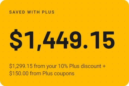
Screenshot from AppSumo account
Free Plus Exclusives Worth Noting
The Plus Exclusives catalog changes, so I would not join only for one specific item. But the current free tools and resources include genuinely useful options beyond the coupon math.
Free Plus Exclusive
What It Does
SendFox
Email marketing software for scheduling and automating email growth.
KingSumo
Viral giveaway tool for growing leads and building an email audience.
The Sauce
Private business community for tech-savvy entrepreneurs.
Focusmate Private Group Access
Online coworking platform for getting focused work done.
Ali Abdaal’s Part-Time YouTuber Academy PDFs
13 templates for organizing, growing, and automating a YouTube channel.
AppSumo Masterclass Series
On-demand business and entrepreneurship training from AppSumo’s content library.
Tool Demos with AppSumo Partners
Live and recorded walkthroughs showing how operators actually use the tools before you buy.
The tool demos are underrated. Seeing a real use case before you commit is exactly the kind of pre-purchase research that speeds up your evaluation.
Who AppSumo Plus Is Really For
If you are the kind of person who regularly evaluates software, AppSumo Plus was built for you. New deals are announced every Monday, most run for a limited time measured in weeks or months, and tools frequently sell out their lower-tier plans before the deal closes. The $25 quarterly credit and 10% discount are not a one-time benefit. They are constant incentive to stay engaged with a marketplace that is genuinely active every week.
My Bottom Line
I have bought more than 130 AppSumo deals since 2016 and I keep Plus active every year. The math covers itself. The 10% discount lowers the cost of tools I was already considering. New deals come in every Monday and most run on a limited clock, so the discount is not a dormant perk sitting in an account I rarely visit. It gets used. And the 60-day refund policy makes testing software feel genuinely low-risk in a way that no other platform I have used comes close to matching.
Check Out AppSumo Plus
Review the current AppSumo Plus benefits, pricing, coupons, discounts, and member perks before deciding whether it fits your software-buying habits.
Affiliate disclosure: This page contains affiliate links. If you purchase through my links, I may earn a small commission at no additional cost to you.
Disclaimer: AppSumo Plus benefits, pricing, coupons, discounts, exclusives, refund terms, and purchase protection may change. Always verify the current offer directly before purchasing.
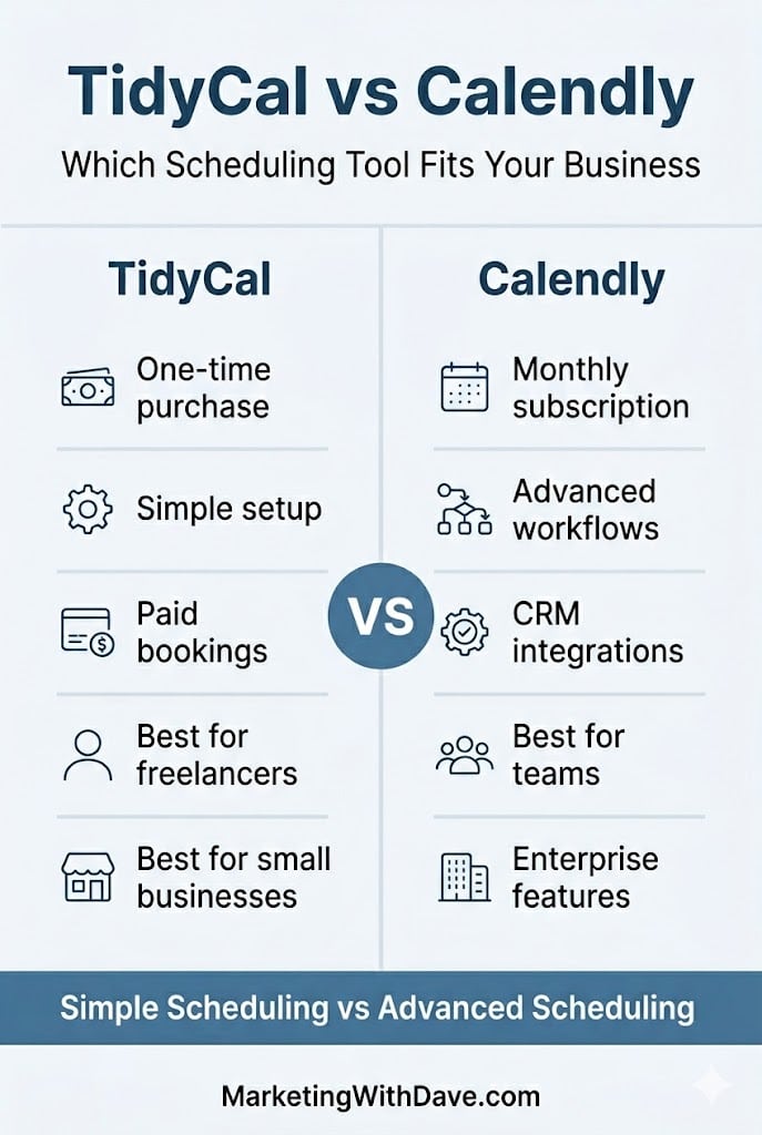
Calendly and TidyCal are appointment scheduling and calendar booking tools designed to eliminate the back-and-forth of finding meeting times. Both allow you to share booking links, manage availability, connect calendars, and schedule meetings online, but they target very different audiences.
Calendly has evolved into a scheduling platform built for teams, CRM workflows, and enterprise-scale operations. TidyCal takes a different approach: simpler setup, fewer moving parts, and a one-time purchase instead of an ongoing subscription.
The question is not which tool is better. It is which tool fits your workflow.
If you are…
Choose
Freelancer or solo business owner
TidyCal
Coach accepting paid bookings
TidyCal
Small agency managing client scheduling
TidyCal Agency ($79 one-time)
Sales team using Salesforce or HubSpot
Calendly
Recruiting team tracking candidates
Calendly
Enterprise organization with compliance requirements
Calendly
Why I Personally Chose TidyCal
I did not want another monthly subscription.
Paid bookings and reliable calendar scheduling mostly covered what I wanted. I didn’t need CRM integration and other enterprise functionality.
My workflow is using my desktop. If you live in your phone and need to edit bookings on the go, TidyCal does not have a mobile app. That matters and you should know it before you buy.
At $29 one-time with a 60-day refund window, the risk was low enough to test against my real workflow first.
What Each Tool Actually Does
TidyCal is built around a simple premise: set your availability, create booking types, connect your calendar, share a link, and get paid. It handles one-on-one, group, and recurring bookings, accepts payments through Stripe or PayPal, and integrates with Google Calendar, Apple iCal, Zoom, Google Meet, and Zapier. Setup is fast. The interface stays out of your way. It has processed over 3.7 million bookings since launching in 2021.
Calendly has grown well beyond booking links. It connects up to six calendars simultaneously, supports round-robin and collective scheduling, includes a native meeting notetaker, offers a contacts and relationship management layer, and connects to 100+ tools including Salesforce, HubSpot, and LinkedIn. Its pricing reflects that scope.
TidyCal gets you booked and paid. Calendly orchestrates scheduling across teams, workflows, and CRM systems.
Pricing and Plan Differences
For most buyers, this is where the decision starts. TidyCal’s biggest advantage is its one-time pricing model, while Calendly relies on recurring subscriptions. If you are a solo operator or small business owner trying to keep software costs under control, the differences here may matter more than any individual feature.
Feature
TidyCal
Calendly
Pricing model
Lifetime deal $29–$79 (AppSumo)
Free tier; $10–$16/seat/mo (paid plans)
Free tier
🔴 60-day refund window
🟢 Permanently free basic plan
Team members
0 (Individual) / Unlimited (Agency)
Unlimited (seat-based)
Custom branding / booking page
🟢 Reduced TidyCal branding
🟢 Paid plans
Custom domain
🔴 LTD plans
🟢 Paid plans
Core Scheduling Features
Both tools handle the fundamentals well. You can create booking pages, connect calendars, schedule meetings, and automate reminders. The differences are less about capability and more about depth, integrations, and flexibility.
Feature
TidyCal
Calendly
Booking types (1:1, group, recurring)
🟢 Unlimited
🟢 Unlimited
Date polls
🟢
🟢 Meeting polls
Calendar integrations
Up to 10 (Individual) / 25 (Agency)
Up to 6 calendars
Google Calendar
🟢
🟢
Microsoft 365 / Outlook
🟢 Intermittent sync delays reported
🟢
Apple iCal
🟢
🟢
Invite questions / intake forms
🟢
🟢
Automated reminders
🟢
🟢
SMS reminders
🟢 U.S. & Canada
🟢 Paid plans
Import existing bookings from Calendly
🟢
N/A
Team Scheduling and Meeting Management
This is where Calendly begins to separate itself. TidyCal works well for individuals and small teams, but Calendly was built with larger organizations, routing workflows, and multi-user scheduling in mind.
Feature
TidyCal
Calendly
Zoom / Google Meet
🟢
🟢
Microsoft Teams
Agency plan only
🟢
Round-robin scheduling
Agency plan only
🟢
Collective (multi-host) meetings
Agency plan only
🟢
Routing & conditional logic
🔴
🟢 Teams and above
Mobile app
🔴 Mobile website only
🟢 iOS and Android
Browser extension
🔴
🟢 Chrome, Edge, Firefox
Integrations, Analytics, and Enterprise Features
If your scheduling tool needs to connect with CRM systems, support compliance requirements, or provide deeper reporting and automation, Calendly has a clear advantage. These features are often unnecessary for freelancers and small businesses but become increasingly important as organizations grow.
Feature
TidyCal
Calendly
Accept payments (Stripe & PayPal)
🟢
🟢 Stripe on paid plans
Salesforce / HubSpot / CRM
🔴
🟢 Paid plans
Meeting notetaker
🔴
🟢 Native feature
Contacts / relationship management
🔴
🟢
Zapier integration
🟢
🟢
REST API access
🟢
🟢
Analytics / reporting
Basic (CSV export)
🟢 Dedicated analytics
Translation / locales
30+ locales
🟢
SOC 2 / GDPR / enterprise compliance
🔴
🟢
Looking across all four categories, the pattern is clear. TidyCal focuses on affordability and core scheduling functionality, while Calendly adds team management, CRM integration, analytics, mobile apps, and enterprise capabilities. The best choice depends less on features and more on whether you will actually use those advanced capabilities.
Affiliate disclosure: If you purchase through my link, I may earn a small commission at no additional cost to you. I only share tools I have used myself.
Where the Meaningful Differences Live
No mobile app. This is TidyCal’s biggest practical limitation. Calendly has iOS and Android apps. TidyCal has a mobile-responsive website. If you edit availability, respond to reschedule requests, or check upcoming bookings from your phone throughout the day, TidyCal creates real friction. The team is working on mobile improvements, but there is no app today. Know that going in.
Microsoft 365 sync. Google Calendar sync works well. Microsoft 365 and Outlook integration is supported, but intermittent sync delays have been a recurring issue. If your operation runs on Microsoft infrastructure, test this carefully during the 60-day refund window before committing. Calendly’s Microsoft integrations are more mature.
Pricing. TidyCal is $29 once. Calendly’s paid plans start at $10/seat/month. For solo operators, that gap compounds quickly.
For freelancers, coaches, consultants, and small businesses that need scheduling and payment collection without a monthly subscription, TidyCal is the stronger value. Calendly is better suited for teams, CRM workflows, advanced routing, and enterprise requirements.
Does TidyCal have a free plan?
No. TidyCal is a one-time purchase starting at $29 with a 60-day money-back guarantee. Calendly offers a permanently free plan limited to one event type and basic scheduling.
Does TidyCal integrate with Google Calendar?
Yes, and it is TidyCal’s most reliable integration. Google Calendar sync works consistently and is the setup the majority of users run without issues.
Does TidyCal work with Outlook and Microsoft 365?
Yes, but Microsoft 365 sync has produced intermittent delays for some users. If your workflow depends heavily on Microsoft tools, test it carefully during the 60-day refund window before committing.
Can TidyCal replace Calendly?
For most solo operators and small businesses, yes. TidyCal handles scheduling, payment collection, reminders, calendar sync, and intake forms. It is not the right replacement for teams that need CRM integrations, routing logic, or enterprise compliance.
Is TidyCal worth it?
At $29 one-time, the 60-day refund window lets you test it against your actual workflow before the decision is final. The only reasons to choose Calendly instead are a mobile app requirement, Microsoft 365 dependency, or team and CRM features TidyCal does not have.
Bottom Line
TidyCal is the right tool for solo operators and small service businesses that need booking pages, paid appointments, and no monthly bill. Calendly earns its pricing when team coordination, CRM integration, or enterprise compliance are real requirements. At $29 lifetime with a 60-day refund window, TidyCal is low-risk enough to test before you commit.
If you’ve ever wondered why a perfectly good piece of content falls flat, the answer is usually not the writing. It’s not the design, the headline, or the offer either. The real problem is a mismatch between what you’re saying and where your reader actually is.
That’s where the five awareness stages come in.
The framework traces back to Eugene M. Schwartz, whose 1966 book Breakthrough Advertising laid out a model for understanding your prospect’s state of awareness and then writing to that specific state. Schwartz was writing about direct-response advertising, but the logic applies just as well to blog content, email sequences, website pages, and social media today.
In this post, we’ll walk through each of the five stages, show you how to identify which stage your audience is in, connect the framework to modern SEO and search intent, and give you a practical content map for applying all of it across your website, email sequences, and content calendar, including a step-by-step process for auditing the content you already have. We’ll also bring in ideas from some of the best marketing thinkers of the past few decades, because Schwartz wasn’t writing alone into a vacuum. His framework holds up in part because smart marketers keep arriving at the same insight from different directions.
Where the Five Awareness Stages Actually Come From
Schwartz outlined his awareness framework in Chapter 2 of Breakthrough Advertising, under the heading “Your Prospect’s State of Awareness — How to Capitalize on It When You Write Your Headline.” The chapter begins on page 13 of the original Prentice-Hall edition.
His original section titles read differently from the shorthand most marketers use today. He wrote about “The Most Aware,” “The Customer Knows of the Product But Doesn’t Yet Want It,” “How to Introduce New Products,” “How to Introduce Products That Solve Needs,” and “How to Open Up a Completely Unaware Market.” The modern labels — Most Aware, Product Aware, Solution Aware, Problem Aware, Unaware — came later as practitioners simplified and popularized the framework.
It’s worth knowing that Schwartz wasn’t the only person thinking in stages. Philip Kotler taught buyer-readiness stages in his marketing textbooks. Robert Lavidge and Gary Steiner published a hierarchy-of-effects model in 1961. Russell Colley introduced the DAGMAR framework around the same time. These models all share the insight that buyers move through distinct mental states before purchase, and your message needs to meet them in the right state.
What makes Schwartz’s version especially useful for content marketers and copywriters is that it anchors each stage to a specific question: what does this person already know, and what does my message need to do first?
The Five Stages Explained
Stage 1: Unaware
The unaware prospect is not thinking about your product, your category, or even their own problem. They may have a latent need they haven’t consciously connected to yet. They’re not browsing for a solution because they don’t know they need one.
Schwartz’s instruction here is to lead with identity, aspiration, or hidden tension before you say anything about what you sell. You have to get the person to see themselves in your content before they’ll ever care about your offer.
Anne Handley has articulated this as well as anyone working in modern content marketing. Her core principle is to focus on your audience “relentlessly and with pathological empathy” to make the customer the hero of the story rather than your product. That’s the right posture for reaching unaware audiences. They’re not looking for you. You have to find them through content they actually want to consume.
Joe Pulizzi pushes the same idea from a content strategy angle. Before you create anything aimed at an unaware audience, he argues, you need a clear content mission, a statement of who you serve, what you publish, and why it matters beyond making a sale. Without that, content aimed at the unaware stage becomes noise.
What works at this stage:
Story-driven blog posts that don’t lead with a product
Editorial pieces on trends, ideas, or perspectives your audience cares about
Pinterest content and social posts that answer questions or spark curiosity
Email newsletter issues that read like a letter, not a promotion
Quizzes and assessments that surface a need the reader hadn’t named
Best CTA at this stage: Subscribe, save, or read more. A low-commitment conversion like a quiz or newsletter signup can absolutely work here. The key is not asking for too much too early.
Stage 2: Problem Aware
The problem-aware prospect knows something is off. They feel the friction, the inefficiency, the frustration. But they may not yet know that a solution exists or what category of product or service could help them.
Content at this stage earns trust by diagnosing well. Seth Godin’s contribution here is useful: he consistently argues that effective marketing means finding the smallest viable audience that is genuinely open and eager, and then delivering messages that feel relevant rather than broadcast. At the problem-aware stage, that means going deep on one specific pain cluster rather than trying to address every possible problem in the same piece.
Kotler described this stage as moving an audience from awareness to knowledge. The job of your content is not to pitch your solution yet. It’s to name the problem clearly, explain why it happens, and show the prospect that someone understands exactly what they’re going through. That builds the credibility you’ll need later.
What works at this stage:
Symptom checklists and self-assessment tools
Diagnostic blog posts that explain “why this happens”
Calculators that quantify the cost of the problem
Lead magnets built around a single, high-intent pain point
Educational webinars that focus on the problem space, not the solution
Best CTA at this stage: Download the checklist, take the assessment, watch the explainer. Free tools and calculators convert well here because they deliver immediate value without requiring a purchase commitment.
Stage 3: Solution Aware
The solution-aware prospect knows the kind of result they want and roughly what kind of tool or approach might get them there. They’re researching. They’re comparing. They don’t know your specific product yet, but they’re in the right category.
This is where David Ogilvy’s emphasis on research and substance becomes most relevant. Ogilvy’s argument was that advertising that sells starts with understanding the product and the prospect deeply, and then making a case grounded in specifics rather than creative flair. Solution-aware prospects are evaluating their options, and vague content won’t hold their attention.
Claude Hopkins’ Scientific Advertising is the older direct-response companion to this idea: give people reasons why. Explain the mechanism. Make measurable claims and back them up. Test what works.
Robert Cialdini’s research is especially applicable here. Solution-aware prospects are uncertain, and in conditions of uncertainty, social proof and authority carry disproportionate weight. Showing that credible people or organizations trust your approach can shift a prospect from passive research mode to genuine consideration.
What works at this stage:
Buyer’s guides and option comparisons
Category explainer pages (“How does X work?”)
Benchmark reports and methodology explainers
Expert-led webinars that orient the prospect in a solution space
FAQ pages that address the questions an informed buyer asks
Best CTA at this stage: Compare your options, see how it works, download the guide.
Stage 4: Product Aware
The product-aware prospect knows your brand or product. They’ve been to your site. They may be on your list. But they haven’t converted yet. Something is holding them back — a doubt, a competing option, or simply not enough proof that your offer is the right fit for their situation.
Kotler described this phase as moving from liking to preference to conviction. The job of your content and messaging here is not to educate from scratch. It’s to close the gap between “this seems interesting” and “I’m ready to move forward.”
Handley’s customer-hero perspective keeps this from becoming self-centered brand copy. The prospect still wants to see themselves in the outcome, not just a list of your features. Ogilvy adds the demand for specificity: proof needs to be concrete, not vague. Cialdini contributes the mechanics: case studies activate social proof, testimonials activate liking, limited availability activates scarcity. Godin’s “anticipated, personal, and relevant” standard also applies — product-aware audiences have already opted in at some level, so generic follow-up emails are a waste of that permission.
What works at this stage:
Case studies with specific, measurable results
Comparison pages (your product vs. alternatives)
Product demos and walkthroughs
Objection-handling email sequences
Migration or onboarding guides that reduce perceived switching costs
Testimonials organized by customer type or use case
Best CTA at this stage: Watch the demo, see customer results, book a consultation.
Stage 5: Most Aware
The most-aware prospect is ready. They know your product, they want it, and the only thing between them and conversion is friction or a final nudge. Schwartz’s instruction here is almost blunt: don’t overcomplicate the close. Give them a clear path, a compelling reason to act now, and remove anything that slows them down.
Cialdini’s scarcity and consistency principles are strongest at this stage because the person is already convinced. What they need is permission to act and a reason not to wait. Kotler’s later “5 A’s” model is a useful reminder that once someone converts, your job shifts toward advocacy, making the experience good enough that they refer others and return themselves.
Godin’s permission marketing logic also applies: an audience that is enrolled and eager wants direct, expected messages. That’s when a straightforward email with a clear offer outperforms a content piece designed to educate.
What works at this stage:
Pricing pages with clear, simple paths to purchase
“Start now” or deadline-driven offer emails
Retargeting ads for people who visited your pricing or checkout page
Cart abandonment or demo follow-up sequences
Live sales enablement for higher-ticket offers
Onboarding sequences immediately after purchase
Best CTA at this stage: Start now, claim the offer, book your call.
How to Identify Which Awareness Stage Your Audience Is In
Understanding the five stages is one thing. Knowing which stage a specific visitor, subscriber, or prospect is in is what makes this framework operational. Here are three reliable signals to read.
What They Search
Your website search queries are one of the clearest indicators of awareness level, because people tell you exactly what they know and what they’re looking for. You can use this to inform your keyword targeting, your content prioritization, and how you structure your site.
What They Search
Awareness Stage
“Why is my website traffic dropping?”
Problem Aware
“How to increase organic traffic”
Problem Aware / Solution Aware
“SEO vs PPC which is better”
Solution Aware
“Best SEO tools for small business”
Solution Aware
“Semrush review”
Product Aware
“Semrush vs Ahrefs”
Product Aware
“Semrush coupon” or “Semrush free trial”
Most Aware
Notice that the query gets more specific as the awareness level rises. Vague, problem-oriented searches signal early-stage awareness. Brand-specific or transactional searches signal late-stage awareness. When you look at which keywords are sending traffic to a page, you’re essentially reading the awareness level of the audience that page is attracting.
Where They Came From
Traffic source is a strong proxy for awareness stage. A visitor arriving from a Pinterest pin on a general marketing topic is almost certainly in the unaware or problem-aware category. A visitor arriving from a Google search for your brand name is already product aware. A visitor clicking through from a retargeting ad they saw after visiting your pricing page is most aware. If your analytics platform lets you segment by traffic source, you can use that to match your follow-up messaging to the likely awareness level of each segment.
What They Do on Your Site
Behavioral signals inside your site are the third indicator. Someone who reads three blog posts and bounces is likely unaware or problem aware — they’re in research and discovery mode. Someone who visits your pricing page multiple times without converting is product aware and has a specific hesitation worth addressing. Someone who starts a free trial and abandons midway through onboarding is most aware but has hit a friction point. Each behavioral pattern points to a different intervention.
The Five Awareness Stages and Search Intent
One of the most underused applications of Schwartz’s framework is mapping it to SEO and search intent. Most SEO guides talk about informational, navigational, commercial, and transactional intent. Those categories are useful, but they don’t connect as cleanly to messaging strategy as the awareness stages do.
When you map awareness to search intent, you get a more actionable picture of what kind of content to create and what job that content needs to do.
Stage / Search Intent
What the Searcher Wants
Content That Fits
Unaware Informational curiosity
Ideas, entertainment, perspective — not answers to a specific question yet
Trend pieces, editorial essays, “why X matters” posts, story-led content
Problem Aware Problem investigation
Understanding why something is happening and whether it’s a real concern
Diagnostic posts, symptom lists, “signs you have X” content, explainers
Solution Aware Comparative research
Options, categories, trade-offs — trying to understand the landscape
Buyer’s guides, comparison posts, category overviews, “best X for Y” lists
Product Aware Brand evaluation
Proof, specifics, credibility — trying to decide if this particular option is right
Reviews, case studies, demo content, testimonial pages, “vs.” articles
The practical implication for your content strategy is that you should be intentional about which stages you’re creating content for. Many sites accidentally create a lot of solution-aware content (comparison articles, best-of lists) while neglecting unaware and problem-aware content that builds an audience over time. Others publish plenty of top-of-funnel content but have no middle-of-funnel content to carry interested readers toward a decision.
Auditing your existing content against this table is a useful exercise. Group your posts by which awareness stage they’re addressing, and you’ll quickly see where you have gaps.
This also connects directly to topical authority. A site that has content at every awareness stage for a given topic signals depth and comprehensiveness to both readers and search engines. Your problem-aware diagnostic posts support your solution-aware comparison posts, which support your product-aware review content — and internal links between those layers make each one stronger.
Mapping the Five Stages to Your Website
The most immediate place to apply this framework is your website. Most small business sites are organized around what the owner wants to say rather than where the visitor is mentally. That mismatch shows up as high bounce rates, low engagement, and CTAs that don’t convert.
A better approach is to treat your website as a content map — a deliberate system where each asset serves a specific stage and passes visitors toward the next one. Many marketers create content without ever asking where it fits in the buyer journey. The result is a site that’s heavy in one or two stages and nearly empty in others. A content map built around awareness stages fixes that. It forces you to look at your full library as a progression rather than a pile of individual pieces.
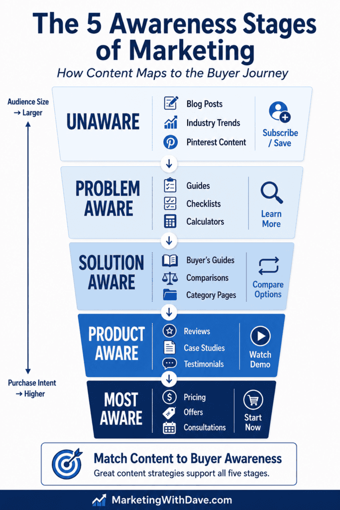
Here’s how the main content types on a typical marketing site map to the five stages:
Visually, this looks like a funnel where each stage narrows toward a conversion but also feeds back into content clusters that build topical authority across the full topic area:
A clean site architecture built around this framework typically groups into four zones:
Learn or Resources hub (unaware and problem-aware content)
Solutions section (solution-aware category pages)
Why Us or Proof section (product-aware evidence)
Pricing or consultation page (most-aware close)
The key discipline is matching your calls-to-action to the stage of the page, not the stage you wish the visitor was in. The real issue isn’t whether you use a conversion-oriented CTA on early-stage content — newsletter signups, free trials, calculators, and assessments can all convert well even on problem-aware pages. The issue is asking for too much commitment too early. A blog post on diagnosing a marketing problem can absolutely end with a free assessment CTA. It should not end with “Book a $500 strategy session.” The ask needs to match the readiness level of the audience.
Save the high-commitment CTAs for pages where the visitor’s behavior signals they’re already evaluating. Someone on your pricing page or comparison page isn’t in an educational mindset. Don’t slow them down with more content when what they need is a clear path forward.
How to Audit Your Existing Content Using the Five Stages
You don’t have to start from scratch to apply this framework. If you have an existing blog or content library, the most useful first step is a content audit. Assign each piece to an awareness stage and then look at the distribution.
Here’s a simple process you can run today:
Export all your blog URLs. Pull a list from your CMS, Google Search Console, or a site crawler. You just need URL and title to start.
Assign each article an awareness stage. Read the title and ask: who is this written for, and what do they already know when they arrive? A post titled “Why Your Traffic Dropped After a Google Update” is problem aware. A post titled “Semrush vs Ahrefs” is product aware. A post titled “How to Get Started With SEO” is solution aware. Work through your list and tag each one.
Count articles per stage. Tally up how many pieces you have at each level. Most sites discover they’re heavily weighted toward one or two stages and nearly empty in others. Solution-aware content (comparison posts, best-of lists) is the most common over-investment. Unaware and problem-aware content is the most common gap.
Identify the gaps. If you have very little unaware-stage content, you have limited ability to build a new audience through organic discovery. If you have very little product-aware content, you’re likely losing people who were close to a decision. The gaps are your content calendar for the next quarter.
Create internal links between adjacent stages. Once you’ve mapped your content, look for natural linking opportunities between pieces at neighboring stages. A problem-aware diagnostic post should link to your solution-aware buyer’s guide. Your buyer’s guide should link to your product-aware review or case study page. These links create a path through the funnel and strengthen topical authority across your content cluster — which is a signal search engines reward.
This exercise also surfaces content cannibalization risks — cases where you have multiple pieces competing for the same awareness-stage keyword without a clear hierarchy. If two posts are both targeting solution-aware searchers asking the same question, they’re splitting authority rather than building it. Identifying those overlaps is as valuable as finding the gaps.
The audit doesn’t have to be exhaustive to be useful. Even a quick pass through your top 20 or 30 posts by traffic will give you a clear picture of where your content is concentrated and where prospects are likely falling out of your funnel.
How to Structure an Email Nurture Sequence Around the Stages
Email is one of the best channels for walking prospects through all five stages over time, because you control the sequence and the pacing. Here’s a seven-email framework that covers the full ladder:
#
Stage
Purpose
Example Topic
1
Unaware
Open with identity or tension
“Why good content still fails to convert”
2
Problem Aware
Name and diagnose the problem
“Five signs your messaging is mismatched to where your buyer actually is”
3
Problem Aware
Deepen consequences and stakes
“What awareness mismatch costs in traffic, leads, and conversion friction”
4
Solution Aware
Introduce the solution category
“What changes when you build content around buyer awareness”
5
Product Aware
Show your specific approach
“How we map your website and email to the right awareness stage”
6
Product Aware
Add proof and specifics
“Case study: what happened when we matched content to stage”
7
Most Aware
Close with a clear offer
“Ready to map your funnel to the five stages? Here’s how to get started.”
One important nuance: not every subscriber enters your list at the same stage. Someone who found you through a broad editorial post is probably unaware or problem aware. Someone who found you through a product comparison article is already solution or product aware. If your email platform allows segmentation by entry source, route higher-intent subscribers into a shorter, more direct sequence rather than starting them at the beginning of an education track they’ve already passed through.
A Four-Week Content Campaign That Covers All Five Stages
If you want to move an audience through the full ladder with a focused campaign, you don’t need a massive volume of content. You need one strong anchor asset per week, remixed across formats and channels.
#
Stages Targeted
Anchor Asset
Supporting Assets
Primary CTA
1
Unaware + Problem Aware
Blog post on why messaging mismatch kills conversions
Pinterest pins, newsletter, self-check quiz, short social posts
Subscribe / take the quiz
2
Problem Aware + Solution Aware
Webinar or guide on awareness-based content strategy
Companion blog post, downloadable worksheet, resource hub page
Register / download
3
Solution Aware + Product Aware
Comparison article or framework overview page
Demo clip, FAQ email, case study excerpt, testimonial block
The One-Sentence Test for Any Piece of Content You Create
Before you publish anything, try this: write down, in one sentence, who this piece is for and what they already know when they arrive.
If you can’t answer that clearly, the content probably isn’t ready. The five awareness stages give you a simple vocabulary for making that call. You don’t need to label every piece formally — you just need to make a deliberate decision about where your reader is starting from, and then write to that starting point.
Schwartz’s core insight from 1966 still holds: the most important thing you can know about your prospect is what they already believe. Every other decision in your marketing — the headline, the CTA, the offer, the format — flows from that.
Key Takeaways
The five awareness stages trace back to Eugene Schwartz’s Breakthrough Advertising (1966). The modern labels are simplifications of his original section titles, added by later practitioners.
Each stage requires a different message. Blunt “buy now” language fails at the unaware and problem-aware stages. Educational content underperforms at the most-aware stage.
Search queries are one of the clearest signals of awareness level. Vague, problem-oriented queries signal early-stage awareness. Brand-specific or transactional queries signal late-stage awareness.
The awareness stages map directly to SEO search intent: informational curiosity, problem investigation, comparative research, brand evaluation, and transactional.
Treat your website as a content map, not a collection of random posts. Each asset should serve a specific stage and pass visitors toward the next one.
The issue with CTAs on early-stage content isn’t conversion — it’s asking for too much commitment too early. Low-friction offers like assessments, calculators, and newsletter signups can convert well at any stage.
A content audit is the fastest way to apply this framework to what you already have. Export your URLs, assign each a stage, count by stage, find the gaps, and add internal links between adjacent stages.
The audit also surfaces content cannibalization: pieces competing for the same awareness-stage keyword that are splitting authority rather than building it.
Web accessibility compliance is one of those topics most small business website owners know they should be dealing with, but it is easy to push down the list.
The legal risk is real. The standards can feel technical. And most solutions either require ongoing monthly fees, developer support, or a level of accessibility expertise many website owners do not have.
WebAbility.io is an AppSumo lifetime deal that positions itself as AI-powered accessibility software for website compliance. It includes an accessibility widget, website scanning, audit reports, accessibility profiles, transcription tools, and an automatically generated accessibility statement.
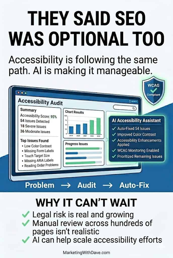
I purchased WebAbility for MarketingWithDave.com because I believe accessibility is becoming similar to SEO. There are too many potential issues for most website owners to manage manually, and automation will likely become an increasingly important part of keeping websites usable, inclusive, and lower risk.
I do not have the budget to hire an accessibility team, and I do not have the time to manually review accessibility issues across hundreds of web pages. A tool that can identify issues, explain them, and potentially help with safe one-click fixes has obvious appeal.
After using WebAbility, I still believe the product has real potential. I am keeping it. But I am also not ready to pretend it is perfect or that I have fully validated every fix it recommends.
Affiliate disclosure: If you purchase through my link, I may earn a small commission at no additional cost to you. I only share tools I have used myself.
WebAbility is a promising accessibility solution for website owners who want a practical way to identify accessibility issues, add an accessibility widget, generate an accessibility statement, and begin working toward a more accessible website.
The platform has identified more than 1,000 potential accessibility-related fixes, but those changes still need review. Since the workflow is handled web page by web page and there is no easy bulk export, I do not yet have the confidence to approve changes in bulk.
My current read: WebAbility is useful today, but it is still maturing. I am willing to grow with the product because accessibility matters, the technology should continue improving, and one-click accessibility improvements could become extremely valuable for website owners like me.
Is WebAbility Right for You?
WebAbility is most relevant for solopreneurs, bloggers, small business owners, affiliate marketers, and website owners who know accessibility matters but do not have the budget or expertise to manage everything manually.
It is also relevant for people who want an accessibility widget, a compliance statement, website scans, audit reports, and a more structured way to understand accessibility issues across their website.
It may be less ideal for agencies managing many client websites, at least through the standard AppSumo tiers. The public deal structure is based entirely on website count, which works well for small portfolios but becomes limiting quickly for larger client rosters.
Best Fit
Use Caution If
Small business websites
You manage dozens of client websites.
Bloggers and affiliate marketers
You need enterprise accessibility governance.
WordPress website owners
You need bulk export and developer handoff workflows.
Solopreneurs with limited technical support
You expect every issue to be fixed automatically without review.
Website owners who want to improve accessibility over time
You need a formal manual audit or VPAT right now.
Why I Bought WebAbility
I originally purchased WebAbility because accessibility is becoming too important to ignore.
In some ways, it reminds me of SEO. Years ago, many website owners treated SEO as optional. Over time, it became a normal part of maintaining a healthy website. Accessibility feels like it is moving in a similar direction.
The challenge is that accessibility can become overwhelming quickly. One website can have hundreds of web pages, repeated templates, navigation elements, images, forms, buttons, color contrast issues, keyboard navigation concerns, and screen reader considerations.
There is no realistic way I can manually manage all of that on my own. There is also no realistic way I can hire an accessibility team to audit and fix everything right now.
That is why WebAbility interested me. Even if the product is not as mature as I wish today, a tool that helps identify accessibility issues, documents them, and gives me a path toward safer one-click improvements is worth watching.
What WebAbility Actually Does
Feature
What It Does
Accessibility widget
Adds user-facing accessibility controls to your website.
Website scanning
Identifies accessibility issues across your website.
Accessibility statement
Generates a publishable statement for your domain.
Audit reports
Provides issue details, categories, and recommended fixes.
WordPress integration
Allows setup through a WordPress plugin instead of manually adding code.
Audio and video transcription
Creates plain text transcripts from uploaded media files.
Accessibility profiles
Gives visitors tools to adjust the experience based on their needs.
My Experience With WebAbility
The setup process was straightforward. I used the WordPress integration, which made it easy to connect the tool to MarketingWithDave.com without manually editing code.
Once connected, WebAbility began identifying accessibility-related issues and showing reports inside the platform. It also generated an accessibility statement for my website, which is a useful document to have in place.
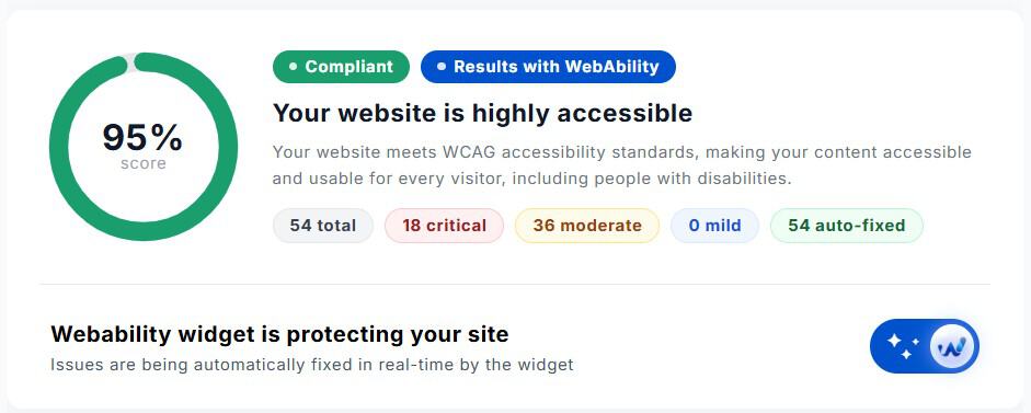
I want to be careful about attribution. WebAbility shows scores, issue counts, and auto-fix information inside its own platform. I have not independently verified those fixes through a separate accessibility audit, and I have not approved changes at scale.
Because of that, I am not giving the tool full credit for making my website accessible. I am giving it credit for helping me understand accessibility issues and giving me a path to improve them.
The Biggest Limitation: Approving Fixes
The current workflow makes that harder than it should be. Fixes need to be reviewed web page by web page. I have more than 300 web pages on my website, and many of the issues likely come from templates or repeatable website patterns. In that situation, I do not want to review the same type of issue hundreds of times.
What I would really like is an export option. A CSV, Excel file, or structured export would let me review issues outside the platform, send them to a developer, or run them through an LLM for a second opinion before approving changes.
Without that, WebAbility is much stronger for discovery than it currently is for confident large-scale remediation.
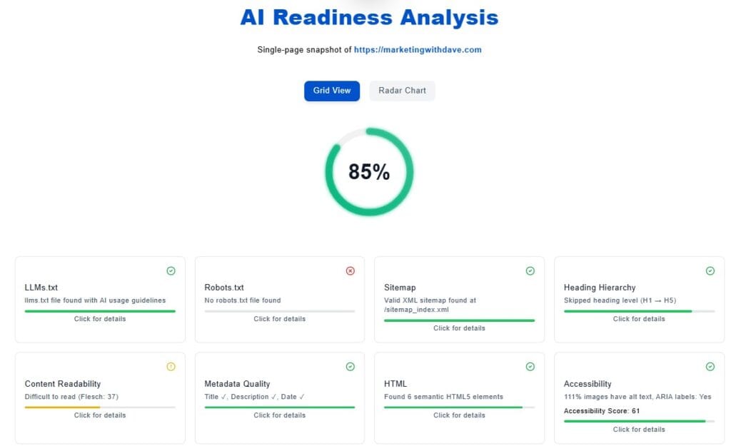
One feature I wasn’t expecting was the AI Readiness Analysis. Think of it as a lightweight technical website audit focused on areas that may influence AI crawlers, search engines, and accessibility tools.
The analysis reviewed elements such as llms.txt, robots.txt, metadata quality, semantic HTML, sitemap availability, heading structure, and accessibility signals. While I wouldn’t replace a dedicated SEO crawler with it, I appreciated having these checks surfaced inside the same platform.
This is useful information. It helps translate accessibility from a vague concern into specific items that can be reviewed and addressed.
The report is not something I would send directly to management without cleanup. The formatting is functional, but it feels more like a raw technical export than a polished stakeholder report. For internal review or developer investigation, it is helpful. For executive reporting, it needs presentation improvements.
The monthly audit report includes issue details, categories, severity levels, and recommended fixes.
The Audio and Video Transcription Tool Was Surprisingly Useful
WebAbility lets you upload an audio or video file and generate a plain text transcript. At first, that felt like an odd feature to include inside an accessibility platform. After using it, I actually found it handy. The output was easier to work with than some of the free transcription tools I typically use.
There are two workflow limitations. First, you need to stay on the web page while the transcription runs. Second, the transcript is not saved for later when you come back, so you need to download what you need before leaving.
Accessibility Visualizer Chrome Extension
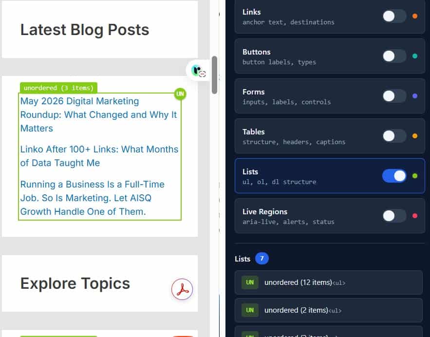
WebAbility also includes an Accessibility Visualizer Chrome extension. In theory, it allows you to highlight headings, forms, links, landmarks, tables, and other accessibility elements directly on a web page.
What I Liked and What Needs Work
What I Liked
What Needs Work
Easy WordPress setup.
Fix review is handled web page by web page.
Useful accessibility scans and issue visibility.
No easy bulk export for developer review or LLM analysis.
Automatically generated accessibility statement.
Website selection is not consistently remembered between screens.
Helpful audit report with issue details and HTML context.
Audit report formatting needs polish before sharing with management.
Transcript tool was more useful than expected.
Transcripts are not saved after leaving the web page.
Strong lifetime deal value for small website owners.
Pricing tier limitations don’t support agency needs.
I can see how one-click fixes could become very valuable over time.
Product still feels like it is maturing.
Overlay vs. Enhancer: A Fair Framing
The accessibility overlay category has a mixed reputation, with some tools like AccessiBe facing regulatory scrutiny and criticism from the disability community for interfering with screen readers. WebAbility distinguishes its approach by calling the product an enhancer rather than an overlay, and the founder explains the distinction in detail in the AppSumo Q&A.
The key differences as described: every fix is visible in the dashboard with an explanation, fixes can be disabled individually, the widget can be set to hidden mode while fixes continue running, and it is designed to detect when a visitor is already using a screen reader and step back rather than compete. The widget runs inside an isolated Shadow DOM so it cannot break the site’s existing styles or scripts. Whether this fully addresses the concerns raised about overlay tools is worth users researching for themselves, but the product approach is meaningfully more transparent than what critics describe about other tools in this space.
Pricing and Plans
Plan
Price
Websites Covered
Tier 1
$59
1 website
Tier 2
$106
2 websites
Tier 3
$159
3 websites
I purchased Tier 2 for $106 because I wanted coverage for two websites. For my use case, that was an easy decision. Even if I only use WebAbility for scanning, reporting, the accessibility statement, the widget, and gradual improvements over time, the product does not need to do much to justify that cost.
Where the pricing is less compelling is for agencies. If you manage a large portfolio of client websites, the public AppSumo tiers may not scale well. WebAbility has discussed agency options and white-label functionality in AppSumo responses, but that appears to be a separate conversation with the team rather than a simple self-serve upgrade inside the deal.
Compliance Coverage
The WebAbility product page references ADA, WCAG 2.1, WCAG 2.2, Section 508, AODA, EN 301 549, and IS 5568. For most small businesses, that covers the accessibility standards they are most likely to encounter.
One area worth calling out separately is the EU Accessibility Act (EAA), which took effect in June 2025. If you serve customers in the European Union, accessibility requirements may extend beyond what any widget alone can provide. To the founder’s credit, WebAbility does not market itself as a complete EAA compliance solution. In the AppSumo Q&A, he has been clear that full compliance may also require accessible underlying code, manual audits, documentation, and in some cases a VPAT (Voluntary Product Accessibility Template).
In other words, WebAbility helps automate part of the accessibility process, but it should not be viewed as a substitute for broader accessibility efforts when stricter compliance requirements apply.
If you operate internationally or work with government, education, healthcare, or enterprise organizations, here are some additional accessibility frameworks that may be relevant:
Standard
Jurisdiction / Context
EU Accessibility Act (EAA)
European Union. Effective June 2025. Applies to many digital products and services sold in the EU. The WebAbility founder is explicit that a widget alone does not constitute full EAA compliance.
CVAA (Communications and Video Accessibility Act)
United States. Applies specifically to advanced communications services and video programming.
ADA Title III
United States. Increasingly applied to websites through litigation even without explicit statutory language. WCAG 2.1 AA is commonly treated as the compliance benchmark.
BITV 2.0
Germany. Based on WCAG and applied specifically to German public sector websites.
RGAA
France. French government accessibility framework aligned with EN 301 549.
Australian DDA / WCAG
Australia. The Disability Discrimination Act effectively makes WCAG the expected accessibility standard for many public-facing websites.
Ontario AODA
Canada (Ontario). Already covered by WebAbility. Federal accessibility requirements under the Accessible Canada Act extend similar obligations to federal entities.
The important caveat is that no widget alone should be treated as a guarantee of full legal compliance. Accessibility is more than a toolbar or automated scanner. A stronger compliance stack may include accessible underlying code, manual review, developer fixes, documentation, and in some cases a formal VPAT or accessibility conformance report.
That is one reason I appreciated the founder’s AppSumo responses. The product is not being framed as magic. The more realistic promise is that WebAbility can automate the parts that are safe to automate, flag issues that need review, and help website owners move in the right direction.
Bottom Line
I bought WebAbility, and I am keeping it.
The compliance infrastructure it puts in place, the auto-fixes running silently in the background, the published accessibility statement, the monthly audit report, and the AI Readiness Analysis all add up to a meaningful package.
The limitations that surfaced are real but not deal-killers for most buyers. The page-by-page review workflow is the most significant friction point for anyone managing a content-heavy site. If that is your situation, test it carefully before committing to heavy use.
Use AppSumo’s 60-day refund window as your safety net. Install it, run the scan, review what it finds, and judge for yourself whether the auto-fix quality and compliance output meet your standards.
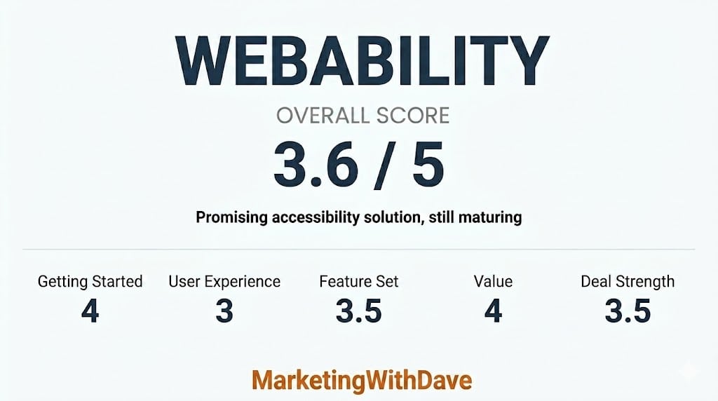
If WebAbility eventually adds template-level remediation, bulk exports, and a more scalable review workflow, I could easily see this becoming a 4.5-star product.
This content is for educational purposes and reflects my experience, review of the product, and current publicly available deal information. Always evaluate tools based on your specific business needs, goals, and workflows before making a decision.
What changed across platforms, AI, ads, measurement, and regulation and why it matters.
1. Google pushed ads deeper into AI Search
What happened: At Google Marketing Live, Google announced new AI-powered ad formats for Search, including ads in AI Mode, AI Brief, Business Agent for Leads, and expanded Direct Offers.
Why it matters: Google is turning search ads into generated answers, guided recommendations, and interactive lead experiences. Keywords still matter, but campaign inputs, website content, feeds, and brand guidance now shape how ads appear inside AI-driven journeys.
Second order effects: Advertisers with stronger product data, clearer offers, and cleaner landing web pages gain an advantage. Teams that treat AI campaigns as black boxes will lose control over how their brands are represented.
What to do next: Audit product feeds, landing web pages, and conversion tracking before scaling AI-powered Search campaigns. Document brand claims, exclusions, and offer rules so automation has better inputs.
What happened: Google Ads will begin enforcing reporting data retention limits in June, with hourly, daily, and weekly reporting data available for 37 months.
Why it matters: This directly affects long-term reporting, forecasting, modeling, and year-over-year analysis. Advertisers that rely on old granular data inside Google Ads or the API may lose access unless they export it.
Second order effects: More teams will need their own data warehouses, not just platform dashboards. Agencies managing mature accounts may face reporting gaps if older benchmark data disappears.
What to do next: Export historical granular data now. Prioritize daily and weekly data used in dashboards, forecasting models, seasonality analysis, and client reporting.
3. AI Overviews and AI Mode showed different user behavior
What happened: Clickstream analysis found that users behave differently in AI Overviews compared with AI Mode. AI Mode users are more likely to accept the AI shortlist, while AI Overview users spend more time comparing results.
Why it matters: AI search is not one behavior pattern. AI Mode acts more like a guided answer environment, while AI Overviews still create comparison behavior inside the search results.
Second order effects: Title tags, snippets, brand recognition, and visible credibility signals still influence clicks where comparison behavior remains. In AI Mode, inclusion and recommendation logic may matter more than traditional ranking position.
What to do next: Separate AI Overview tracking from AI Mode visibility. Improve snippets, structured sections, and brand mentions, while also monitoring where your brand appears in AI-generated shortlists.
4. Google extended Preferred Sources into AI answers
What happened: Google expanded Preferred Sources into AI Overviews and AI Mode, giving selected publishers more visibility inside AI-powered search experiences.
Why it matters: Audience loyalty now has a direct search visibility connection. Publishers and brands that build repeat engagement may gain more presence inside AI results when users select them as preferred sources.
Second order effects: SEO becomes more connected to audience development. Newsletters, social followings, direct traffic, and brand trust can influence how often a publisher is chosen and seen inside AI surfaces.
What to do next: Give loyal readers clear reasons to choose your brand as a preferred source. Strengthen newsletter capture, recurring content formats, and direct relationship channels.
5. OpenAI moved ChatGPT ads toward performance marketing
What happened: OpenAI is preparing conversion-focused ChatGPT ads, including conversion tracking, optimization tools, and pay-for-results pricing models.
Why it matters: ChatGPT advertising is moving beyond awareness. If conversion tracking matures, advertisers will compare ChatGPT against Google, Meta, and retail media using performance metrics.
Second order effects: Budget testing will accelerate once advertisers can measure outcomes. ChatGPT may become a new demand capture layer, especially for recommendation, comparison, software, travel, and shopping queries.
What to do next: Prepare tracking, landing web pages, offer tests, and query-level reporting frameworks before larger budgets move into ChatGPT ads. Treat this as an emerging channel, not a finished platform.
What happened: YouTube announced more visible AI disclosure labels and began rolling out automatic detection for significant photorealistic AI use.
Why it matters: AI-generated video is moving from creative workflow issue to platform compliance issue. Marketers using synthetic spokespeople, product demos, or realistic AI scenes need clearer disclosure processes.
Second order effects: AI labels may affect trust, creative testing, influencer partnerships, and brand safety reviews. Platforms are shifting more responsibility onto automated detection when creators fail to disclose.
What to do next: Add AI disclosure checks to video production and upload workflows. Document which assets use AI, especially photorealistic visuals, synthetic people, voice cloning, or altered real-world scenes.
7. Google Search, Gemini, and agents moved closer together
What happened: Google CEO Sundar Pichai said Search, Gemini, and Google’s agent tools will increasingly converge into one task-running system.
Why it matters: Search is becoming less about sending users to links and more about helping users complete tasks. That changes the role of web pages, content, and product data in the customer journey.
Second order effects: Brands may lose traffic even when they influence decisions. Visibility inside AI agents, summaries, comparison tools, and automated workflows becomes a new layer of discoverability.
What to do next: Optimize for decision inclusion, not just rankings. Make product details, pricing, policies, reviews, and differentiators easy for AI systems to extract and verify.
What happened: W3Techs data analyzed by Search Engine Journal showed WordPress market share declining for six straight months, from 43.2% of all websites to 41.9%.
Why it matters: WordPress remains dominant, but sustained decline matters for agencies, developers, plugin companies, and website strategy. Platform defaults are no longer as stable as they once felt.
Second order effects: Website recommendations may shift as Wix, Shopify, Squarespace, and other platforms improve performance and ease of use. Plugin-dependent business models could feel pressure if the ecosystem contracts.
What to do next: Evaluate website platforms based on business needs, performance, ownership, extensibility, and operational burden. Do not assume WordPress is automatically the best answer for every project.
9. EU pressure on Google under the DMA intensified
What happened: Reuters reported that the European Union was preparing a large Digital Markets Act fine against Google tied to alleged self-preferencing in search results.
Why it matters: Platform regulation is now a live channel strategy variable. Search layout, comparison units, shopping visibility, and default placements may change as regulators push gatekeepers to alter behavior.
Second order effects: Europe may become a testing ground for different search and advertising mechanics. Brands operating across regions could see different visibility patterns, measurement issues, and competitive dynamics.
What to do next: Monitor EU search performance separately from global reporting. Segment paid and organic analysis by region so regulatory impact does not get buried in blended dashboards.
10. State privacy regulators kept targeting ad opt-outs
What happened: U.S. state privacy regulators continued focusing on consumer rights to opt out of the sale of personal information and targeted advertising.
Why it matters: Targeted advertising compliance is becoming more operationally complex across states. Consent, opt-out signals, data sharing, and audience activation can no longer be treated as one-time legal setup.
Second order effects: Marketing teams may lose audience scale or targeting precision if opt-out workflows are incomplete or inconsistent. Privacy compliance now affects spend efficiency, attribution quality, and retargeting reliability.
What to do next: Audit opt-out language, consent tools, tag behavior, and data flows across analytics and ad platforms. Confirm that privacy signals are honored before audience data enters activation tools.
Most software reviews are written after a few hours of testing. This isn’t one of those reviews.
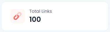
Since publishing my original Linko review that was followed up with a Linko vs. Switchy comparison, I’ve created more than 100 links, submitted nearly 20 support tickets, migrated to a branded domain, and accumulated enough data to see which features matter in real-world use.
Here is what I’ve learned.
I Submitted 20 Support Tickets. Most Were Implemented.
I submitted nearly 20 support tickets between bugs and feature requests. Most were implemented, and most of those within a day or two. Some took longer, which is expected when something needs to get worked into a development schedule. But more was implemented quickly than I expected, and that matters.
There is a practical side to this beyond just getting fixes. When you see your feedback turned into product changes, the relationship shifts. You feel like a participant in where the tool is going rather than a customer waiting on the sidelines. That strengthens loyalty and, honestly, it motivates me to keep sharing feedback and wanting the product to succeed.
Why Campaign and Channel Data Gets More Useful the Longer You Use It
Campaigns and Channels are Linko’s primary ways to categorize your links. They are fully customizable, and I thought they were useful features from the start. What I did not anticipate was how much more useful they would become once real data started accumulating.
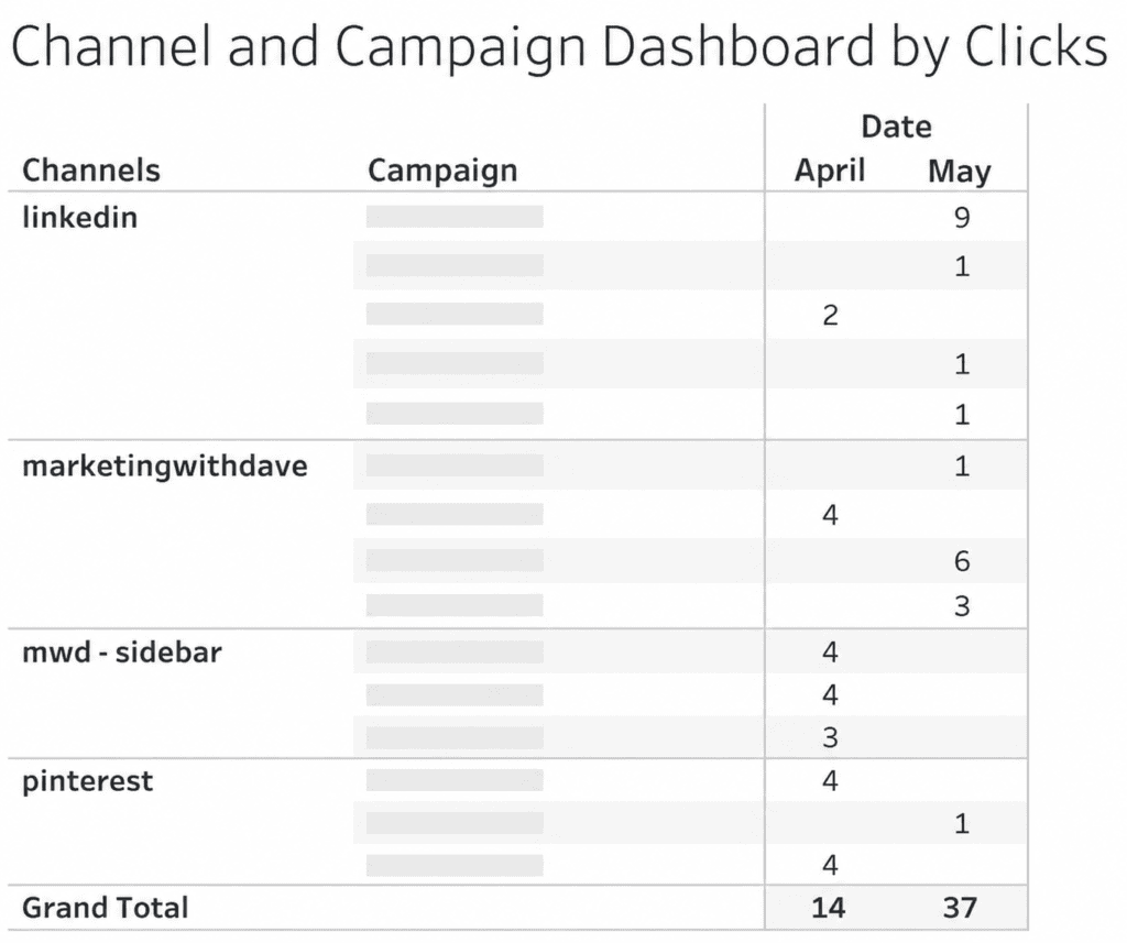
I export data from platforms and use Tableau to control my own visualization, so having clean, categorized data coming out of Linko makes that workflow significantly more useful. The chart I built from Linko’s exported campaign and channel data showed me things I would not have seen otherwise. These are not novelty features. Once you have data behind them, they become the reason you are glad you set them up properly from the beginning.
In April I recorded 14 tracked clicks. In May that grew to 37. More importantly, I could see exactly which channels and campaigns were driving those clicks.
The Domain Change I Resisted and Don’t Regret
When I first started using Linko, I used their pg.is domain. It was short, which I liked. Linko eventually retired that domain, which frustrated me initially.
Looking back, I am glad it happened. I am now on my own branded subdomain (go.marketingwithdave.com), and the setup was not nearly as much work as I expected. The Linko process for getting a custom subdomain configured was smooth. The links now reinforce my brand with every click, which the shared domain never did. The short-link convenience of pg.is was real, but it was not worth trading brand consistency for.
My Two Favorite Features Are Still My Two Favorite Features
When I was first evaluating Linko, two features stood out: the ability to filter out your own internal traffic and broken link detection.
Both are still at the top of my list.
Filtering internal traffic matters more than it sounds. If I do not want to collect test data every time I click my own links, I need to know those clicks are excluded. Without that, you are either introducing noise into your data or you are avoiding testing your links to keep the data clean. Linko removes that tradeoff.
Broken link detection is a feature I was excited about and still appreciate, though it took me a while to understand how it actually works. Linko runs automatic checks every five minutes, but with a priority system based on click volume. Links with fewer than 100 clicks are checked once every seven days. Links with more than 1,000 clicks are checked every 24 hours. The frequency scales with traffic in between.
Beyond Link Management
Most of my focus has been on link creation, which is the core function. But Linko includes bio pages, QR codes, and file hosting, and I have not done much with any of those yet.
For me, link tracking is the priority. The additional capabilities are there if I need them, and they are part of what makes this a broader platform than a pure link shortener. Whether that breadth justifies the price compared to something more narrowly focused is something I covered in the Linko vs. Switchy comparison. The short version: if link management plus bio pages, QR codes, and file hosting under one roof sounds useful, Linko is the stronger fit. If you mainly want retargeting pixels and you want to keep costs lower, that is where the tradeoffs start to show.
Bottom Line
After 100+ links, Linko has moved from “interesting AppSumo purchase” to part of my marketing stack. The link management is solid, the campaign tracking becomes more valuable as data accumulates, and the team has been unusually responsive to feedback. Not every feature is perfect, but very few lifetime deals earn a permanent place in my workflow. Linko has.
The team is responsive in a way that is rare. The campaign and channel data proved more valuable once real usage built up behind it. A couple of features have limits worth knowing before you buy, but neither is a deal-breaker.
This content is for educational purposes and reflects my experience, review of the product, and current publicly available deal information. Always evaluate tools based on your specific business needs, goals, and workflows before making a decision.