toastmasters david nelson best speaker ribbon e1766878186503

Toastmasters Purpose Speech: Still Showing Up

Reading Time: 4 minutes

After my Toastmasters icebreaker speech, the next project in the Pathways program is Write a Speech with Purpose. That is the speech you will find below. While the formal purpose of this project is to inform, the talk also reflects my ongoing effort to become more comfortable speaking when I do not have everything perfectly planned or memorized.

One of my biggest public speaking challenges is poor working memory. I often pause while searching for the right word or thought, which makes speaking without notes especially difficult. For this speech, I allowed myself to use my phone as a reference rather than forcing full memorization. During the writing and practice process, I also experimented with using AI-generated images and a grid-style layout to break the speech into visual cues. This structure helped prompt my memory, reduce cognitive load, and ultimately reduce a bit of my nervousness.

I have also included a link to the PDF version showing the table-style layout I used while practicing and delivering this Toastmasters speech.

Introduction
With reckless abandon for self-preservation, Dave made a pinky promise that somehow turned into today’s purposeful Toastmasters speech.
He brings decades of digital-marketing experience, and he’s currently navigating unemployment and the unexpected plot twists that followed a major heart attack.
Dave is powered by an amazing, supportive wife, the three best daughters a dad could ask for, and—this year—his favorite title ever: Grandpa.

It was April 19, 2023. My mom’s birthday, and about a year and a half since she passed away from a heart attack.

I had just climbed two flights of stairs and was getting ready for bed when I felt pressure and uneasiness in my chest. My thought was that it might be difficult to fall asleep. My wife’s thought was that we should go to the ER.

She convinced me when she said that if I started feeling better on the way there, we could come back.

So, a quick ER tip. If you want immediate help and avoid waiting in lines, mention that you think you’re having a heart attack. A medical NASCAR pit crew is immediately in action.

I learned that there is an enzyme protein called troponin that is released into the bloodstream when there’s a cardiac event. Less than 0.04 is normal, meaning no heart attack. My troponin levels were 337. Several doctors commented that they had never seen levels that high.

I also learned that what I had is called a widow maker heart attack. Only 12% of people who experience this type of heart attack outside of a hospital survive. I didn’t know it at the time, but I was also about to pay $250 for my ambulance ride from American Fork to Provo.

After being wheeled out of the ambulance, the next thing I remember is being barely awake in a spacious operating room. I could hear doctors talking, and one of them mentioned four stents. I looked down my shirt and didn’t see anything, which confused me. I could feel that my right arm was in some kind of clamp, and I couldn’t move it.

Overall, for something that seemed like such a big deal, it didn’t feel like it. There was nearly no pain, nothing like what you see on TV, and I can no longer even find the tiny incision that was on my wrist.

But wait — there’s more.

That year, I went to the ER four more times. Twice because I was convinced I was having another heart attack. It turned out my troponin levels were still coming down from the original event.

The other two visits were because of nosebleeds.

Let me explain that adventure.

After the heart attack, I was on two blood thinners. The nosebleeds would start out of nowhere and just gush.

I might be the only guy who has sent his wife to the store for tampons, has a size preference, and knows the frustration of bleeding through one. I had these stashed everywhere. And yes, I cut the string off to salvage what little dignity I had left.

Eventually, they put a rhino rocket in one nostril, which is a special kind of hell I have vowed to never experience again. A rhino rocket is what happens when a tampon and a torpedo have a baby.

Then came cauterization.

One nostril didn’t hurt at all, which completely blindsided me. When I later had the other nostril cauterized, it was the worst pain I’ve ever felt. Not all cauterizations are created equal.

Somewhere in the middle of all this, I also had three cellulitis flare-ups. Warm to the touch, swollen, and potentially dangerous if not treated quickly. These burning skin infections can flare up from even tiny injuries. It was one of many reminders that although the heart attack hit one organ, my entire body was impacted.

As the months passed, I learned that a quarter of my heart was dead. Not two sizes too small like the Grinch. Dead. That explained my decreased energy and increased sensitivity to stress.

I’m still very much in the middle of this story. And while I’ve received small moments of clarity along the way, I’m still trying to answer the bigger questions. What comes next? How do I support my family now? And what am I supposed to do with this second chance?

There’s no happily-ever-after I can give you yet. But as I pause here, there are two lessons worth sharing.

Lesson One: Share Your Experience

My mother-in-law started retaining water, and because of what I’d gone through, we recognized it as a cardiac warning before her doctor did. It likely saved her life. Sometimes the experience you’d never choose becomes the knowledge someone else desperately needs.

Lesson Two: Let Your Body Vote

After losing the job I’d held for 27 years, and with my new health limits, I wasn’t sure what to do next. I’d always felt like I should continue my education, but at 50, an MBA felt too late and not particularly helpful.

My therapist asked, “When you think about that decision, does your body lean forward or backward?”

I leaned forward. It’s been a life hack ever since.

During 2023, I even started writing my own version of the Twelve Days of Christmas. I lived through:

  1. one widow maker heart attack
  2. two nose cauterizations
  3. three bouts of cellulitis
  4. four stents
  5. five trips to the ER

And I still didn’t find clarity — at least not the big kind I keep hoping for.

But here’s what I did find.

You don’t wait for clarity to show up.
You show up, and clarity meets you along the way.

Toastmasters Purpose Speech: Still Showing Up Read More »
top 10 site search tracking capabilities every website should measure

Top 10 Site Search Tracking Capabilities Every Website Should Measure

Reading Time: 6 minutes

Internal site search is one of the clearest signals of customer intent you can collect on a website. It is a moment where someone stops browsing and tells you, in their own words, what they want.

That makes site search data valuable for three different teams at once: analytics, marketing, and website optimization. Analytics uses it to measure success and friction. Marketing uses it to learn language, demand, and intent. Optimization teams use it to improve findability, navigation, and conversion paths.

When you add a third party martech integration to track site search, the goal should not be “we track searches.” The goal should be “we can connect searches to journeys and outcomes, then act on what we learn.”

Why site search tracking deserves special attention

Site search does not behave like typical web events. The same user can run multiple searches in one session, refine terms quickly, apply filters, click multiple results, and then convert later after leaving and returning.

If your tracking only records a generic “search happened” event, you lose the most valuable parts: what they searched, whether they found anything useful, and what happened next.

A strong site search tracking setup captures the full story: query, context, result quality, engagement, and downstream impact.

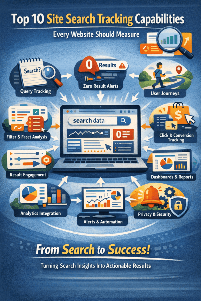
The Top 10 must have capabilities for site search tracking

1. Core search event and query capture

This is the foundation. You need reliable, structured capture of the search term a user entered, plus the context around it.

At a minimum, capture the query text, the timestamp, the web page where the search was initiated, and a session identifier. If your website supports multiple search experiences such as header search, in page search, instant search, or voice search, distinguish them so you can compare performance.

If a vendor cannot prove that their capture is complete and consistent across devices, browsers, and privacy settings, everything built on top of it becomes untrustworthy.

2. Analytics platform integration and clean data model alignment

Your website analytics platform is still your source of truth for cross site behavior. A third party tool should enhance search tracking, not isolate it.

Look for a solution that can send well structured search events into your analytics platform with consistent naming, stable parameters, and clear definitions. You should be able to join search activity to other events in the session, like product views, content reads, signups, add to cart, form starts, and purchases.

This is also where you protect reporting quality. A clean schema helps prevent duplicate events, missing parameters, and confusion about what a metric truly represents.

3. Zero results and search failure detection

Zero results are a direct signal of unmet demand. They also highlight content gaps, catalog gaps, and taxonomy problems.

Track when a search returns zero results, and treat it as a first class event tied to the query. Also track other failure signals such as immediate exits after searching, repeated searches with slight variations, or rapid refinements. These patterns often indicate that results are technically present but functionally unhelpful.

This capability alone can drive meaningful improvements to content planning, product availability, and user experience.

4. Search result interaction tracking and relevance measurement

Knowing the query is not enough. You need to know whether the results worked.

Track clicks on search results, including which item was clicked and the position it appeared in. Track time to first interaction after results load. Track low engagement results where people search but do not click anything.

These signals help you answer a crucial question: are your search results relevant for the terms people use, and are top ranked results earning clicks?

Whether your search results include images, pricing, badges, or promoted items, your tracking should allow you to measure how those elements influence engagement and conversion. The goal is not just to know what was shown, but to understand which result attributes drive clicks and successful outcomes.

5. Conversion and downstream outcome attribution

Search tracking becomes strategic when it connects to outcomes.

Measure which queries lead to purchases, leads, signups, demo requests, subscriptions, downloads, or any key action on your site. In many cases, search assists conversions rather than directly causing them, so your reporting should support viewing search as part of a path, not just a last click moment.

This helps you identify high intent queries, prioritize optimization work, and justify investment in improving search relevance.

6. Facet, filter, and refinement behavior tracking

Filters and facets are a window into user intent. They show how people narrow choices when a query is broad or ambiguous.

Track which filters are applied after a search, the order of application, and whether filter usage correlates with higher conversion rates. If your site supports sorting, track sort changes as well.

This information often reveals gaps in taxonomy, missing facet options, and opportunities to adjust default sorting to better match what people want.

7. User journey and cross session search behavior

Many journeys span multiple sessions. A user might search on day one, browse more on day two, then convert later.

Choose a solution that can support journey level analysis while respecting privacy requirements. You want to understand returning search patterns, repeated terms, and topic progression across visits. Even for anonymous users, aggregated journey patterns are valuable.

This is especially important for SaaS and content sites where research behavior can unfold over time.

8. Reporting, dashboards, and data access for deeper analysis

Built in dashboards are helpful for quick insights, but long term value depends on data access.

Look for strong reporting on top queries, trending queries, zero results terms, click through rates, conversions by query, and filter usage. Then confirm you can export raw logs or access them via API so analysts can run deeper segmentation, clustering, and trend analysis in BI tools or data warehouses.

Without accessible data, you will eventually hit a ceiling where the tool shows you what it wants to show, not what you need to answer.

9. Alerts, workflows, and operational triggers

Insights should create action.

Strong solutions support alerts for spikes in zero results, sudden surges in particular queries, drops in result engagement, or outages. Better solutions also support rule based workflows, such as notifying a content owner when a topic is trending, alerting merchandising when a product category spikes in searches, or flagging terms that indicate confusion.

This turns search tracking into an operational advantage instead of a weekly report.

10. Governance, privacy, and scalability controls

Search terms can contain sensitive information. Your tracking must handle privacy correctly.

Look for controls that help you avoid collecting personal data in search logs, respect consent, manage retention, and support anonymization where needed. Confirm the solution can scale to your traffic levels without sampling away the very events you care about.

Governance is not a nice to have. It is what makes search tracking safe, stable, and usable at scale.

How these capabilities map to the customer journey

Site search appears at multiple points in the journey.

In discovery, people search to learn and compare. In evaluation, they refine and filter. In conversion, they search to confirm details, find a product, locate pricing, or look for support. After conversion, they search for onboarding, documentation, troubleshooting, or account tasks.

That is why a good tracking approach connects search to what happens next. When you can see which searches lead to success, which searches signal friction, and which searches indicate new demand, you can make improvements across content, product, and experience.

Common mistakes that limit the value of site search tracking

One common mistake is tracking only a single generic event, without capturing the query and result quality signals. Another is ignoring zero results and refinement patterns, which are often the most actionable insights.

A third mistake is leaving search data trapped inside a third party dashboard without integrating it into your broader analytics and customer journey reporting.

Finally, many teams forget to operationalize insights. If no one owns responding to the data, you will learn interesting things but not improve outcomes.

How to evaluate vendors without getting lost in feature claims

When comparing tools, focus on proof rather than promises. Ask vendors to demonstrate real data capture, including edge cases like searches with filters, searches with no clicks, and searches that lead to conversion later in the session.

Ask how the data is structured, how it integrates with your analytics platform, and how easily you can export raw logs. Ask what privacy controls exist for handling sensitive search terms.

Then ask how the tool helps you act. Alerts, workflows, and clear ownership pathways are often the difference between a tool you admire and a tool that creates measurable improvement.

Closing thought

If you want to understand customer intent, site search is one of the most direct signals you can capture. The best third party integrations do more than log queries. They connect intent to outcomes, reveal friction in the journey, and help teams take action quickly.

If your site search tracking can do the ten capability areas above, you are not just measuring behavior. You are building a feedback loop that improves the website experience and business results over time.

Top 10 Site Search Tracking Capabilities Every Website Should Measure Read More »

case study brain on drugs

Case Study: This Is Your Brain on Drugs and the Power and Limits of Fear-Based Marketing

Reading Time: 6 minutes

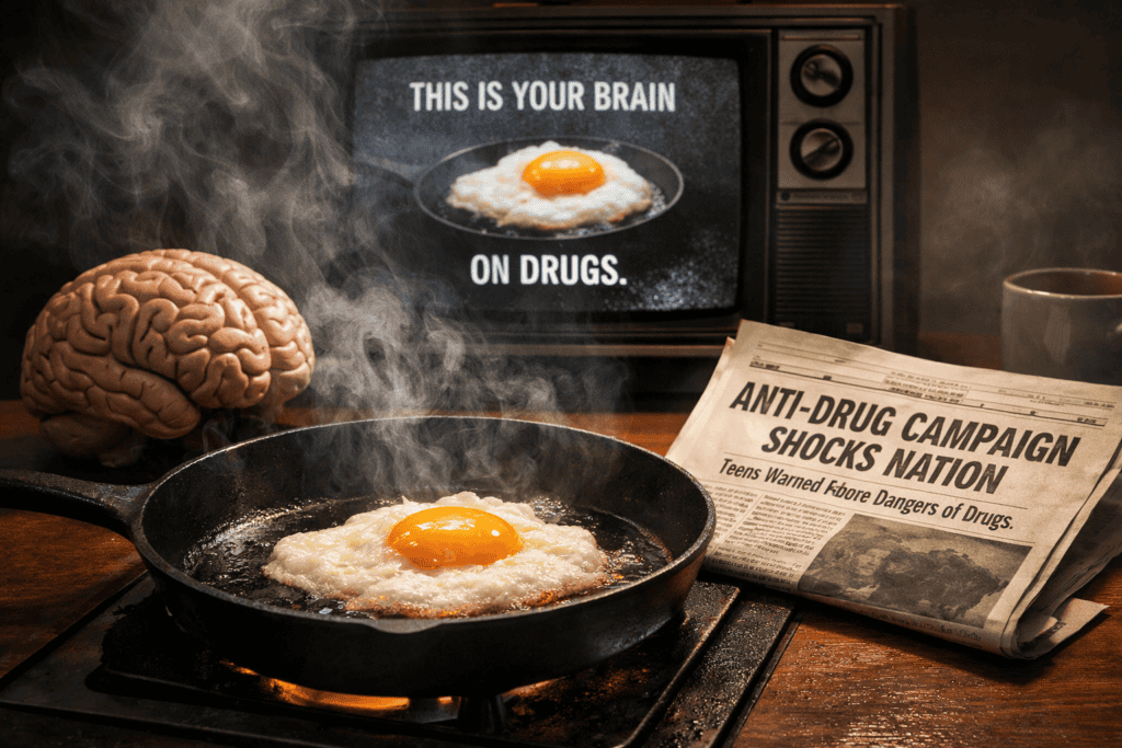
The 1987 PSA “This Is Your Brain on Drugs” (Partnership for a Drug-Free America) became an iconic anti-drug image. It was credited with raising teens’ perception of cocaine risk (from 78% to 88%), but later research found fear-based youth campaigns had little beneficial effect, and in some cases correlated with increased drug use.

The slogan and frying-egg imagery went viral in pop culture (even drawing an Egg Board protest, but experts (and Syracuse professor Robert Thompson) argue it was too “preachy” and may have backfired.

The concept was later updated in 1997 (a heroin-themed spot with Rachael Leigh Cook and 2017 (Cook again, this time condemning the “war on drugs”. Modern analyses suggest marketers today should balance emotional impact with audience research and relevance, learning both from the campaign’s iconic strengths and its shortcomings.

Background: Partnership for a Drug-Free America

Founded in 1986 by advertising and public health leaders (with $300,000 seed funding from the American Association of Advertising Agencies, the Partnership for a Drug-Free America (PDFA) was a nonprofit social-marketing coalition. Its strategy was to “treat [illicit drugs] like any other purchasing choice” – using marketing tactics to “un-sell” drugs rather than sell them. In practice, volunteer agencies created hard-hitting PSAs and donated airtime, aiming to influence teens as if they were consumers. The organization (now renamed the Partnership to End Addiction) applies research-backed tools to prevent youth substance abuse. In short, PDFA pioneered social marketing and public service advertising, applying commercial creativity to a public health cause.

Marketing Categories

  • Social Marketing / Public Service Advertising: The campaign is a classic PSA – no paid media, high-profile creative aimed at social good. It targeted youth with a stark visual metaphor, akin to marketing a product (but with a negative message).
  • Cause Branding / Coalition Marketing: PDFA became a brand. Dozens of big agencies (Saatchi & Saatchi, J. Walter Thompson, etc.) volunteered creative work, giving PDFA an industry gloss. The partnership leveraged celebrity culture (“Liken potential addicts to consumers… by celebrity endorsements…Then use those tricks not to sell the product, but to un-sell it” and claimed ~$1 million/day in donated media (over $2 billion total) to saturate TV and print.
  • Behavior Change Communication: It falls under health promotion campaigns. Its use of fear appeals (making the brain look fried) and repetition was designed to change teen attitudes and norms, following PDFA’s strategy of using “the best ad minds to denormalize drug use”.

The Original 1987 PSA (“Brain on Drugs”)

In 1987 PDFA aired a 30-second spot featuring actor John Roselius cracking an egg into a hot frying pan, declaring: “This is your brain… [sizzle] …This is drugs. This is your brain on drugs. Any questions?”. The simple, graphic metaphor and tagline made it instantly memorable. Paul Keye – a creative director involved – recalls the campaign was born from the ad industry’s eagerness to “un-sell” hard drugs during Nancy Reagan’s “Just Say No” era. Agencies convinced networks to donate airtime; Keye estimates over $300 million worth of free spots were aired. The PSA ran heavily for months. Audience research later claimed ~92% of teens saw it, and 88% reported believing even occasional cocaine use was dangerous (up from 78% before the ads). Dealers allegedly joked “Let’s go fry an egg” to mean using drugs, showing the line’s penetration into youth slang.

Timeline of Key Events

  • 1987: Original “Brain on Drugs” PSA airs nationwide.
  • 1989–90: PDFA continues high-profile anti-drug campaigns; by 1990 the Fried-Egg spot was ranked No. 11 on TV Guide’s Top 50 commercials.
  • 1997: A new “Brain on Drugs” PSA debuts featuring Rachael Leigh Cook; in this spot her character smashes eggs and even a kitchen to dramatize heroin’s ravages.
  • 2016: A third “Brain on Drugs” PSA (without Cook) is released, targeting teens.
  • 2017: Cook stars in a remade PSA (released on 4/20/2017) with a twist: it critiques U.S. drug policy, noting that white users are unlikely to be arrested vs. people of color, and condemning the “war on drugs” as costly and ineffective.
  • 2010s: PDFA rebrands (first as Partnership at DrugFree.org, then Partnership for Drug-Free Kids) and shifts to digital/parent-focused campaigns (e.g. the “Time to Talk” prescription-drug prevention initiative).

Public and Media Response

The Fried-Egg PSA struck a chord. It was widely cited as *“iconic”* in advertising lore (Time called it iconic in a top-10 PSA list and spawned countless parodies on TV, T-shirts, and the Web. Medill News notes it became “one of the most well-recognized… health campaign ads of all time, evoking parodies and drawing the ire of comedians and musicians”. The tagline “Any questions?” became a catchphrase. Even the American Egg Board complained that the ad unfairly linked their product with drugs. Over time, the image became a cultural shorthand: teen slang picked it up (“fry an egg” for using), and comedians joked about it. Critics, however, called it heavy-handed. Some students reported it felt more like a dare than a deterrent, while others said it truly scared them. Syracuse professor Robert Thompson quipped that he’d “ready to go score some cocaine… to spite the commercial… It was so irritatingly preachy and not effective”. In short, the spot was unforgettable, but it polarized audiences.

Effectiveness: What Really Happened?

Positive Indicators: PDFA cited surveys showing increased risk perception. For example, after the ads 88% of teenagers said even occasional cocaine was dangerous, up from 78% before. The campaign achieved enormous reach, and some analyses (like PDFA’s own press and a 1994 Johns Hopkins commentary) claimed it contributed to youth drug-use deterrence.

Critical Findings: Independent research painted a more nuanced picture. A 2008 *American Journal of Public Health* analysis found that, overall, the National Youth Anti-Drug Media Campaign (which included these PSAs) had no positive effect on teens, and in some cases higher exposure predicted *earlier* drug initiation. A Lancet review concluded drug prevention ads generally showed **“little effect”** on substance use (unlike anti-tobacco campaigns). Notably, a study cited by Prevention specialists observed that youths who saw the campaign were actually *more* likely to use drugs later. Qualitative feedback supports this skepticism: one teen said the ad “stirred my curiosity” and called it a dare, while another said it had genuinely scared her. These findings suggest that despite its fame, the PSA’s actual influence on behavior was limited or mixed. As analysts warn, a campaign that isn’t aligned with audience perceptions can even “move [the] target audience away” from desired change.

Relevance Today

For today’s audiences, the original PSA’s approach feels dated. Media consumption is fragmented (social media, streaming), and many young people distrust blunt scare tactics. Neuroscientific research implies that the best health ads are those that combine emotional engagement with clear rationale. For instance, one study found the most persuasive anti-drug PSAs evoked strong emotional brain responses while using *“less yelling”* – meaning they conveyed consequences in a compelling, nuanced way. This suggests modern campaigns should avoid just shouting warnings; they need narrative hooks or real stories. Cultural shifts also matter.

With increasing acceptance of marijuana and criticism of the War on Drugs, an ad showing a frying brain might lack credibility. The 2017 remake reflects current values: instead of scaring viewers, it used the egg to critique systemic injustice (“the war on drugs is ruining lives… it doesn’t work”. This aligns with today’s trend of addressing social context (racial disparity, policy) and health equity. Marketers now often blend digital outreach and peer-based messaging rather than relying solely on TV PSAs.

Finally, experts emphasize combining ads with broader measures: Wakefield’s Lancet review noted health campaigns work best when paired with policies or education (anti-tobacco ads succeeded when governments taxed and banned smoking). In short, the “brain on drugs” ad remains a powerful symbol, but effective drug prevention today requires data-driven, multi-channel strategies that fit modern culture and media.

3 Actionable Marketing Takeaways

  • Use audience research to target messaging: Don’t assume scare tactics work for all groups. Studies warned that a misalignment between the ad’s tone and teens’ own experiences can backfire, even “moving [them] away” from the goal. Test ads with focus groups and be ready to adjust your framing to what resonates with your audience’s knowledge and values.
  • Balance emotion with clarity: Impactful ads do not have to be preachy. A neuroscience-informed study found the most effective anti-drug ads triggered emotional engagement while still being understandable (they were “less yelling, but more compelling”. Aim for storytelling that connects with viewers emotionally but clearly illustrates consequences or solutions. Avoid oversimplification or heavy-handedness that might cause resistance.
  • Adapt to context and culture: Modern campaigns should incorporate current trends and media. For example, the 2017 PSA smartly re-used a classic image to address today’s issues. Similarly, align your message with popular platforms (social media, influencers) and broader initiatives (education programs, policy changes). Remember, combining marketing with systemic support (like in tobacco control) boosts effectiveness.

Single-Sentence Takeaway

An arresting slogan like “This Is Your Brain on Drugs” can build awareness, but truly effective campaigns require evidence-based, culturally relevant messaging tailored to the audience’s context.

References

Partnership to End Addiction: Official website

Partnership at drugfree.org: Name change announcement (2010)

Hornik et al. (2008) Effects of the National Youth Anti Drug Media Campaign on youths (American Journal of Public Health) via PubMed

Wakefield, Loken, and Hornik (2010) Use of mass media campaigns to change health behaviour (The Lancet) via PubMed

Adweek: Campbell Ewald and Allison Janney bring back the egg that was your brain on drugs (2016)

Case Study: This Is Your Brain on Drugs and the Power and Limits of Fear-Based Marketing Read More »

dont make me think

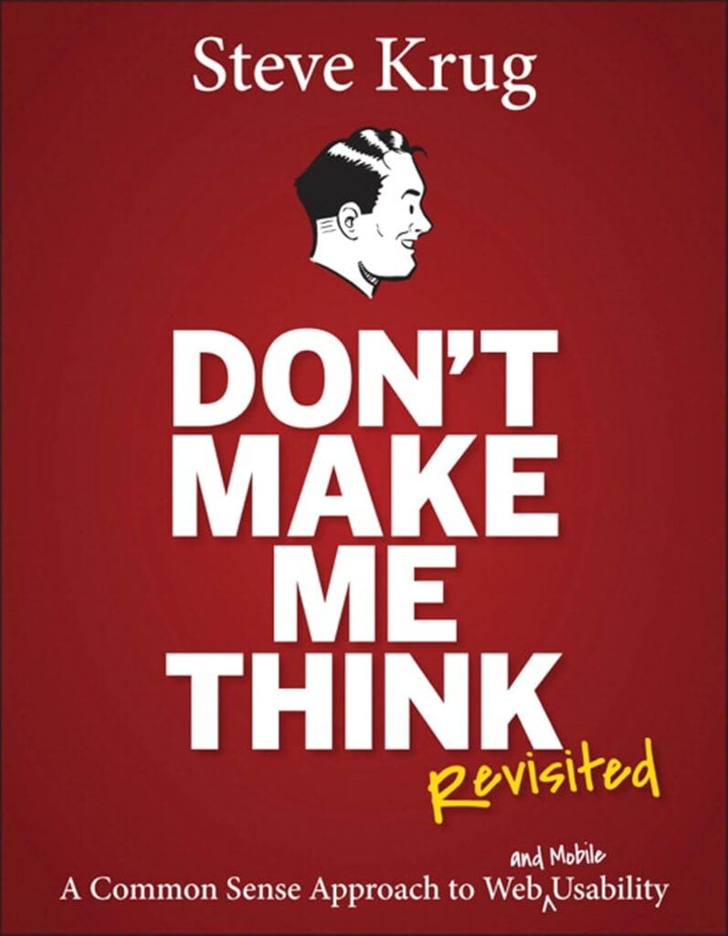
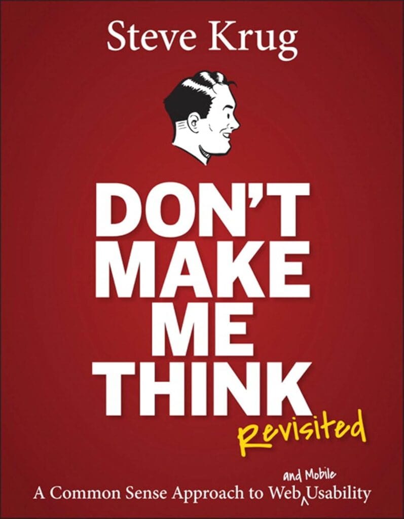
Don’t Make Me Think by Steve Krug Book Summary

Reading Time: 6 minutes

Top Three Quotes

  • “Don’t make me think!” – Steve Krug’s core mantra, meaning a website should be obvious and self-explanatory.
  • “It doesn’t matter how many times I have to click, as long as each click is a mindless, unambiguous choice.” – Emphasizes that clarity of each action matters more than minimizing the number of clicks (Krug’s second law of usability).
  • “Get rid of half the words on each page, then get rid of half of what’s left.” – Krug’s third law, urging the elimination of unnecessary content to reduce clutter and cognitive load.

Book Theme

Don’t Make Me Think focuses on web usability and intuitive design. Its central message is that websites (and apps) should be built so that users can navigate and accomplish tasks without having to consciously figure out how to use them. The book emphasizes simplicity, clarity, and common-sense design principles to make the user experience effortless.

Why You Should Read This Book

This book is a highly accessible introduction to usability, packed with practical advice and humor. It distills complex user-experience ideas into simple, memorable principles. Anyone involved in designing or building websites – from UX/UI designers and developers to product managers and entrepreneurs – will learn how to avoid common pitfalls, streamline their designs, and create more user-friendly sites. Even non-technical readers can grasp its concepts quickly, making it a valuable resource for anyone who wants to improve the usability of their digital products.

Key Ideas and Arguments Presented

  • Don’t Make Me Think: A website should be self-evident. Every page and element should be obvious, requiring minimal conscious thought from the user.
  • Users Scan and Satisfice: People tend to glance at web pages for relevant information and will pick the first acceptable option (rather than the “best” one). Design should accommodate this behavior.
  • Design for Scanning: Since users scan rather than read, use familiar layouts (logo links home, menus on top/left), clear visual hierarchies, headings, bullets, and short paragraphs to make content easy to find at a glance.
  • Mindless Clicks Rule: The number of clicks matters less than the ease of each click. Every link or button should be an obvious, unambiguous choice, giving users confidence they are on the right path (Krug’s second law of usability).
  • Kill Unnecessary Words: Most people don’t read everything. Eliminate filler text (“happy talk”) and long instructions, writing only what is essential (Krug’s third law: cut half the words on a page, then half of what’s left).
  • Clear Navigation is Vital: Treat navigation as the backbone of your site. Include persistent menus, a clickable logo/Home link, page titles, breadcrumbs, and a search box so users always know where they are and how to get to key sections.
  • Home Page Clarity: The home page must quickly answer what the site is and what users can do there. First impressions matter (Krug’s “Big Bang Theory of Web Design”), so clearly state the site’s purpose and primary entry points.
  • Test, Don’t Guess: Team debates about design often go nowhere. Usability testing with real users (even a few at a time) provides objective evidence of what works and what doesn’t, replacing endless arguments.
  • Usability is Courtesy: Good design is considerate design. Avoid frustrating users with hidden info or poor organization; every hiccup (broken link, cryptic label, unexpected behavior) wastes their time and erodes trust.
  • Mobile and Accessibility: Recognize mobile screens as “itty-bitty living spaces” that require ruthless prioritization, and treat accessibility as a moral imperative. Make sites usable for everyone, not just on desktops.

Book Outline

  • Chapter 1: Don’t Make Me Think
  • Chapter 2: How We Really Use the Web
  • Chapter 3: Billboard Design 101
  • Chapter 4: Animal, Vegetable, or Mineral?
  • Chapter 5: Omit Needless Words
  • Chapter 6: Street Signs and Breadcrumbs
  • Chapter 7: The Big Bang Theory of Web Design
  • Chapter 8: “The Farmer and the Cowman Should Be Friends”
  • Chapter 9: Usability Testing on 10 Cents a Day
  • Chapter 10: Mobile: It’s Not Just a City in Alabama Anymore
  • Chapter 11: Usability as Common Courtesy
  • Chapter 12: Accessibility and You
  • Chapter 13: Guide for the Perplexed

Key Takeaways

  • Websites should be obvious and intuitive, allowing users to accomplish their tasks without extra effort or thought.
  • Users are goal-oriented and impatient: they scan pages, click quickly, and avoid reading large blocks of text.
  • Clarity and simplicity are paramount. Remove distractions and unnecessary content so users can focus on their objectives.
  • Familiar conventions and clear structure help users navigate quickly (e.g., placing the logo as a home link, organizing menus logically).
  • Every design decision should be validated by testing with real users. Observing users in action reveals problems far more effectively than theoretical debate.
  • Good usability is a form of courtesy: respecting users’ time and intelligence builds trust and satisfaction.
  • Usability principles apply to all contexts, including mobile interfaces and accessibility for people with disabilities.

Key Techniques

  • Billboard Design: Format pages like billboards. Use clear headings, bullet points, and visual cues so users can instantly grasp the page’s purpose without reading everything.
  • Trunk Test: A quick navigation check. Imagine landing on a page blindfolded; can a user immediately identify where they are and how to navigate to main sections?
  • Discount Usability Testing: Conduct simple, regular tests on a small budget. Test with just 3 users (taking one morning per month) to identify major usability issues quickly.
  • Think-Aloud Protocol: During testing, ask users to verbalize their thoughts. This reveals where they get confused or frustrated and why.
  • Content Pruning: Systematically eliminate half the words on a page, then half again. This forces you to cut fluff (especially “happy talk” and long instructions) and highlight only essential information.
  • Conventions vs. Clarity: Follow common UI conventions (standard navigation, link styles, icons) unless you have a clearly better alternative. If breaking a convention, ensure the replacement is unmistakably clear to users.

Author’s Qualifications

Steve Krug is a veteran usability consultant and author. Based in Massachusetts, he has advised and taught web usability practices for decades. Don’t Make Me Think is his most famous work (now in its third edition with hundreds of thousands of copies sold worldwide), and he also wrote Rocket Surgery Made Easy, a companion guide to usability testing. Krug runs the consultancy Advanced Common Sense and conducts workshops on practical UX techniques. His extensive real-world experience and straightforward writing style make him a respected authority on web design usability.

Comparison to Similar Books

  • The Design of Everyday Things (Don Norman) is a classic on general design psychology and affordances for everyday objects; by contrast, Don’t Make Me Think applies common-sense usability specifically to websites in an easy-to-digest format.
  • Rocket Surgery Made Easy (Steve Krug) is essentially a follow-up focusing entirely on conducting DIY usability tests. Together, these two books cover both design principles (Don’t Make Me Think) and testing methods.
  • Usability Engineering (Jakob Nielsen) and related Nielsen books provide research-based guidelines and heuristics. Krug’s book is more anecdotal and conversational, trading academic detail for a practical, engaging approach.
  • About Face (Alan Cooper) and *The Elements of User Experience* (Jesse James Garrett) offer comprehensive theories and frameworks for interaction design; Don’t Make Me Think zeroes in on the core goal of making the interface obvious and easy to use, with much less technical depth.
  • Thanks to its concise style and humor, Don’t Make Me Think is often used as an introductory read, whereas many other UX books (like Lean UX or 100 Things Every Designer Should Know) may delve deeper into processes or psychology. However, all of these works share the goal of improving user experience, and readers often pair Krug’s book with more detailed texts as their understanding grows.

Target Audience

  • Web designers and user-interface (UI) professionals
  • UX practitioners and user experience researchers
  • Front-end developers and software engineers working on web products
  • Product managers and startup founders overseeing digital products
  • Content strategists and information architects
  • Digital marketers and e-commerce managers responsible for website usability
  • Students and beginners learning about web and UX design principles

Critical Response to the Book

Don’t Make Me Think has been widely praised in the tech and design communities as an engaging, no-nonsense introduction to web usability. It consistently appears on lists of top UX books and is often taught in design courses. Reviewers and readers applaud Krug’s clear, humorous writing and the book’s practical focus. It has sold hundreds of thousands of copies and been translated into multiple languages, evidencing its popularity. Critics note that while the book’s advice may seem like “common sense” in hindsight, its real value lies in highlighting principles that many designers overlook. There are few negative critiques; even years after publication its ideas remain relevant, especially after updates for mobile. In short, it’s regarded as a classic and essential resource for anyone interested in usability.

One Sentence Takeaway

Design your website or app so that users can accomplish their goals effortlessly – it should never make them stop and think about how to use it.

Don’t Make Me Think by Steve Krug Book Summary Read More »

making websites win

Making Websites Win by Karl Blanks and Ben Jesson Book Summary

Reading Time: 3 minutes

Top Three Quotes

• “Most websites lose. Almost all of them.”

• “Design that ignores customers is not design at all.”

• “Conversion rate optimization is web design done right.”

Book Theme

Making Websites Win focuses on conversion rate optimization as a customer-centric, research-driven discipline for designing websites that consistently increase sales, leads, and long-term business value. It argues that most web design fails because it prioritizes aesthetics, opinions, or trends instead of measurable customer behavior.

Why You Should Read This Book

• You should read this book if you want to increase website performance in a measurable, repeatable way rather than relying on guesswork.

• It provides a proven framework for diagnosing why websites fail and shows how to fix those failures using research, testing, and customer insight.

• The book is especially valuable if your website is already getting traffic but not converting at the level it should.

Key Ideas and Arguments Presented

• Most websites underperform because they are designed for internal opinions rather than customer needs.

• Conversion rate optimization has a disproportionate impact on profit, not just revenue.

• Small improvements across multiple steps in a funnel compound into dramatic gains.

• Testing removes opinion-driven decision making and replaces it with evidence.

• A/B testing measures success but does not generate good ideas on its own.

• Customer understanding must come before design changes.

• Large, insight-driven changes outperform small cosmetic tweaks.

• High-performing websites prioritize function over visual novelty.

• Lifetime customer value is a critical metric that is often ignored.

• CRO creates a virtuous cycle that enables growth in advertising, SEO, and competitive advantage.

Book Outline

• Section 1: Why Most Web Design Is Done Wrong and How to Do It Right

• Section 2: Diagnosis Tools and Techniques to Understand Visitors

• Section 3: Common Conversion Problems and Proven Solutions

• Section 4: A Detailed Case Study Demonstrating CRO in Action

Key Takeaways

• Customer-centric design consistently outperforms design driven by trends or aesthetics.

• Diagnosis must always come before solution.

• CRO is one of the fastest ways to improve profitability.

• Large improvements usually come from fixing fundamental issues, not polishing details.

• Testing protects businesses from costly mistakes.

• CRO skills are transferable across industries, platforms, and career paths.

Key Techniques

• DiPS framework: Diagnose, identify the Problem, then apply the Solution.

• A/B testing and multivariate testing to validate changes.

• Visitor research through analytics, surveys, user testing, and session recordings.

• Functional copywriting focused on clarity and persuasion.

• Funnel optimization for both early-stage and late-stage buyers.

• Risk reduction through guarantees, proof, and trust signals.

• Managing complexity in high-consideration purchase journeys.

Author’s Qualifications

• Dr. Karl Blanks holds a PhD from Cambridge and applies scientific methodology to marketing optimization.

• Ben Jesson is a conversion expert with extensive hands-on experience scaling online businesses.

• Together they founded Conversion Rate Experts, a global CRO consultancy.

• Their firm has worked across more than 80 industries, multiple languages, and dozens of countries.

• Conversion Rate Experts has generated billions in additional revenue for clients and received the UK Queen’s Award for Enterprise in Innovation.

Comparison to Similar Books

• Unlike general marketing books, this book focuses narrowly on conversion outcomes rather than broad strategy.

• Compared to analytics books, it emphasizes customer psychology and usability over dashboards and reports.

• Compared to design books, it rejects aesthetics as a primary goal unless supported by evidence.

• It complements books like Web Analytics 2.0 by focusing on action rather than measurement alone.

Target Audience

• Digital marketers responsible for website performance

• Conversion rate optimization practitioners

• Founders and startup teams

• Product managers and growth teams

• UX designers seeking measurable impact

• Executives overseeing digital strategy

Critical Response to the Book

• The book is widely praised for its practical, experience-based approach.

• Industry leaders highlight its focus on real results rather than theory.

• It is frequently cited as a foundational text for CRO professionals.

• Readers value its depth, though some note it requires commitment to fully apply.

One Sentence Takeaway

Making Websites Win shows that deeply understanding customers and rigorously testing solutions is the most reliable way to build websites that grow profitably and sustainably.

Making Websites Win by Karl Blanks and Ben Jesson Book Summary Read More »

adobe observepoint game theory

The Martech Partner Dilemma: How Adobe and ObservePoint Reveal the Rules of Platform Strategy

Reading Time: 5 minutes

If you work in digital analytics or martech long enough in Utah County, you start to see the same names show up again and again: Omniture, Adobe, Domo, ObservePoint. What looks like a list of separate companies is really a connected story about how platforms evolve, how partners emerge, and how cooperation and competition often happen at the same time.

Let’s use the relationship between Adobe and ObservePoint as a simple case study in “coopetition” and game theory. The goal is not to predict their exact strategies, but to give marketers a clearer way to think about platform decisions, integrations, and why your favorite tools sometimes get embraced and other times get quietly replaced.

The Utah analytics lineage: Omniture → Adobe, Domo, ObservePoint

Omniture was one of the foundational companies in the web analytics space, and its acquisition by Adobe helped anchor a major analytics and marketing technology presence in Utah County. After the acquisition, talent and leadership from Omniture spread into new ventures, including Domo and ObservePoint.

Adobe became the home for enterprise analytics and experience tools like Adobe Analytics, Adobe Launch, and Customer Journey Analytics. ObservePoint, built by leaders with deep Omniture roots, focused on a complementary problem: making sure data collection actually works. That means automated tag auditing, data quality checks, and ongoing monitoring so that the numbers inside Adobe Analytics are trustworthy.

On paper, this looks like a classic complementary relationship. Adobe helps brands collect, analyze, and activate data. ObservePoint helps brands make sure that data is accurate. But under the surface, there is always a strategic question. This isn’t a story of conflict—platforms and partners often create enormous value together even while navigating natural tensions.

Should a platform like Adobe:

1. Stay open and lean on partners like ObservePoint
2. Or build more of those capabilities internally over time

Cooperation and competition in a simple game

We can describe this tension with a very simple two player game.

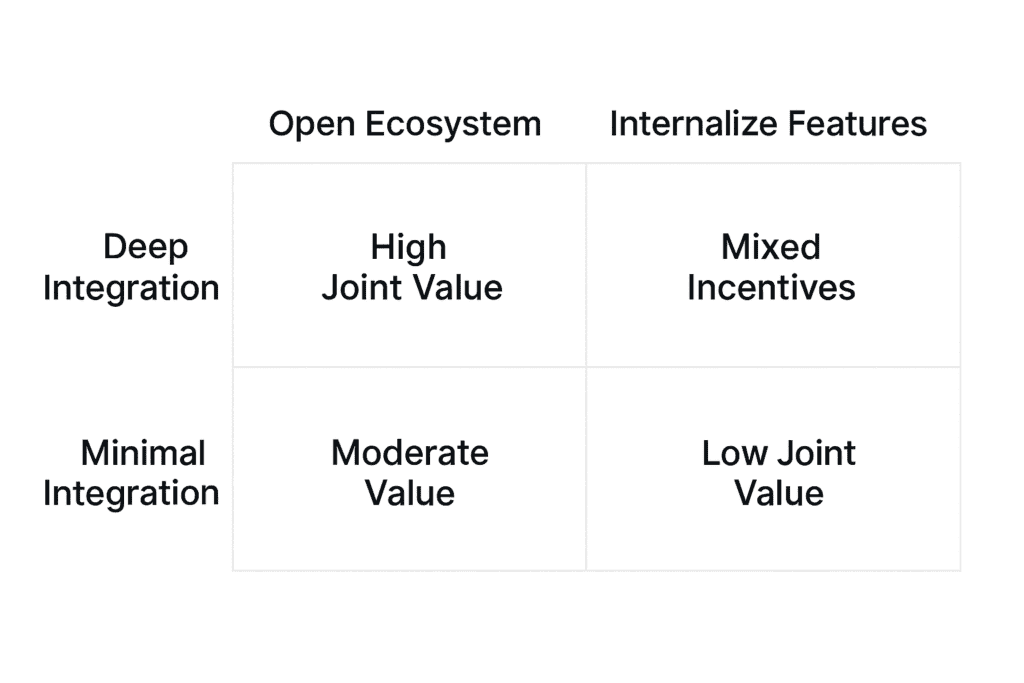
Player one is ObservePoint. Its main decision in this context is how much to invest in deep integration with Adobe. That includes building robust APIs, advanced auditing for Adobe tags, and tight workflows around Adobe Analytics and Customer Journey Analytics.

Player two is Adobe. Its main decision is how open to be as a platform partner. Adobe can keep APIs open, promote partners, and design its roadmap around an ecosystem. Or it can build more internal data quality and tag auditing features that compete with partners over time.

Here is a simple way to think about their choices.

Adobe stays open to partnersAdobe builds more internal tools
ObservePoint invests deeply in Adobe integrations(high value for both)(great for Adobe, risky for ObservePoint)
ObservePoint keeps integrations more minimal(good but not great for both)(lower value for both)

When both sides lean into partnership, marketers get strong integration, better data quality, and a healthier ecosystem. When Adobe internalizes too much or ObservePoint under invests in integration, the value to marketers is lower, even if it feels safer in the short term to each company.

What this means for marketers

It is easy to assume platform decisions happen in a vacuum, but they rarely do. Companies like Adobe and ObservePoint are constantly weighing:

1. How much value a partner adds to the platform
2. How difficult that functionality would be to build in house
3. How much customers associate the benefit with the platform versus the partner
4. How much revenue and retention is at stake if the partnership grows or shrinks

For marketers and analytics leaders, this has a few practical implications.

First, deep integrations are not just technical conveniences. They are signals that incentives are aligned. When a platform and a partner make it easier to work together, they are often saying that they see long term mutual value in the relationship.

Second, you can often feel when the relationship is shifting. Fewer joint webinars, less co marketing, slower integration updates, or a sudden new native feature that looks a lot like a partner product are all signs that the game behind the scenes has changed.

Third, it is smart to design your measurement stack with these dynamics in mind. If a critical capability is provided only by a partner that feels strategically fragile, you should at least be aware of that risk and have a plan B over a multi year horizon.

Game theory without the jargon

In formal game theory language, platforms and partners are often stuck between what is called a Nash equilibrium and a socially optimal outcome.

The Nash equilibrium is the combination of strategies where neither side has an incentive to unilaterally change its decision. It is stable, but not always ideal for customers.

The socially optimal outcome is the combination of strategies that create the most total value for everyone involved, including the end customer. It is often more collaborative and more integrated, but it can be fragile if the incentives are not well aligned.

In the Adobe and ObservePoint story, the socially optimal outcome is the world where Adobe stays open and supportive of partners, and ObservePoint invests deeply in making Adobe data more accurate, actionable, and reliable. That is also the world where marketers get the strongest combined solution.

The strategic question is whether the incentives on both sides are strong enough to keep them there.

How platforms can keep cooperation sustainable

For cooperation to last in a relationship like Adobe and ObservePoint, both sides need to see more upside from partnering than from going their own way.

That usually means things like:

1. Clear revenue impact that can be tied back to the partnership
2. Integration depth that would be expensive to rebuild internally
3. Joint marketing and sales motions that benefit both companies
4. A customer story that is stronger together than either product alone

The more these conditions hold, the more the ecosystem behaves like a collaborative, high value game rather than a short term competition.

Why this matters for your own stack

You do not need to be Adobe or ObservePoint to apply this thinking. Any time you are building a marketing or analytics stack, you can ask a few simple questions.

1. Which tools are true platforms, and which are plug in partners
2. Where are incentives strongly aligned, and where are they more fragile
3. If one partner disappeared or got acquired, what breaks in your stack
4. Where can you lean into deep integrations that are likely to be supported for years

Thinking this way will not predict every roadmap change or acquisition, but it will help you design a more resilient measurement strategy and avoid being surprised when platform relationships evolve.

For me, the Adobe and ObservePoint story is a great example of how local Utah County companies can shape global martech while still reflecting very human, understandable trade-offs. Underneath all the platform terminology and economics, it is really just about two companies deciding when to cooperate, when to compete, and how much they believe they can win together.

The Martech Partner Dilemma: How Adobe and ObservePoint Reveal the Rules of Platform Strategy Read More »