A new article doesn’t announce itself. Someone landing on an older post from search, social, or email may never see something you published last week on the same topic.
Latest Category Article fixes that. When a visitor reads eligible content, SiteSqueeze finds the relevant category and promotes the newest eligible article in it, skipping whatever the visitor is already reading.
Example: your Analytics category has Google Analytics (GA4) Reporting Tips (Sep 1), Understanding Attribution Models (Aug 20), and Marketing Dashboard Mistakes (Jul 30). A visitor on the July post gets promoted the September one. A visitor already on the September post gets the August one instead.
That’s the key difference from a Standard Promotion: with Standard Promotion, you pick the destination. With Latest Category Article, SiteSqueeze does — and the destination shifts as you publish. A promotion set up once can point to a different article three months later without you touching it.
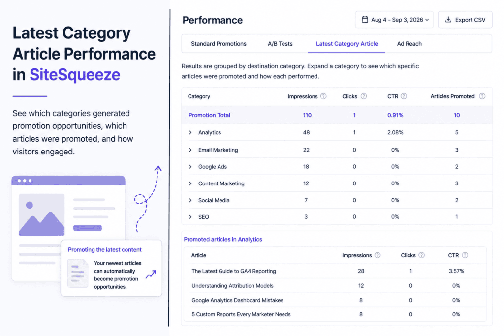
The Latest Category Article Performance report shows which categories generated promotion opportunities, which articles actually got promoted, and whether visitors clicked.
Reading the Report
Results are grouped by destination category. For each category:
Impressions — times an article from that category was promoted
Clicks — times visitors clicked
CTR — clicks ÷ impressions
Articles Promoted — count of distinct articles promoted from that category in the period
That last number matters because it’s not the same as impressions. A category with 100 impressions and 3 Articles Promoted means three different articles split that total between them — because the “newest eligible article” changed as you published, and because SiteSqueeze won’t promote the article a visitor is already on.
Individual Articles
Expand a category to see which specific articles got promoted and how each performed. This is where you can trace the path: an older article pulling in traffic while Latest Category Article routes those visitors to something newer.
Interpreting the Numbers
There’s no benchmark CTR — traffic, library size, publishing frequency, and placement all move the baseline. Look for patterns instead: a category receiving plenty of impressions but relatively few clicks is worth inspecting article-by-article; one article that keeps getting clicks whenever it’s promoted is a signal that topic resonates with readers already in that content area.
Two cautions:
Small samples can mislead. One click out of ten impressions is a 10% CTR — that doesn’t necessarily outperform an article with 500 impressions and a 6% CTR.
CTR measures the click, not the content. It tells you whether the promotion got clicked, not whether the destination article was any good once they got there. And because promotions are dynamic, different articles in the same slot weren’t necessarily competing under the same conditions — different times, different source content, different opportunity counts.
Use the report to spot what’s worth investigating, not to declare winners.
Date Filtering and Export
Set the report’s date range to the period you care about, and export the data if you want to analyze it outside the plugin.
SiteSqueeze is coming soon.
I’m building a WordPress plugin designed to help marketers promote their own content, measure what works, and run practical A/B tests without pretending every website has enterprise-level traffic.
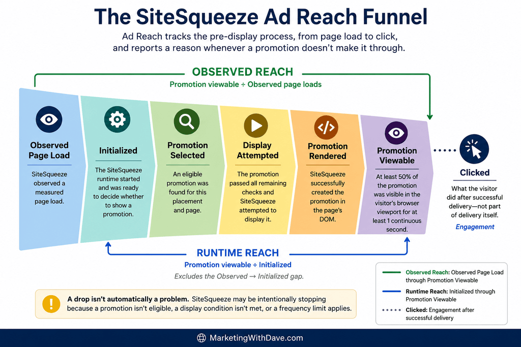
Views, clicks, and clickthrough rate (CTR) describe what happened after a promotion displayed. They say nothing about the page loads where nothing displayed, or why. Ad Reach tracks the delivery process, from page load to click, and reports a reason when SiteSqueeze has enough evidence to identify why a promotion didn’t make it through.
Ad Reach isn’t a score to maximize. Many “misses” are settings doing exactly what you configured them to do, protecting the visitor experience. Treat it as a diagnostic: how much of your traffic actually sees your promotions, where opportunities are lost or intentionally suppressed, and what deserves a closer look.
Each percentage compares a stage to the one before it, so drop-off is visible stage by stage. A decrease isn’t automatically a problem. SiteSqueeze may be intentionally stopping because a promotion isn’t eligible, a display condition isn’t met, or a frequency limit applies.
Observed page load — SiteSqueeze received a beacon (lightweight browser signal) confirming a measured page loaded. This does not mean SiteSqueeze initialized, selected, or displayed anything, and it isn’t meant to match Google Analytics (GA4) or other analytics. Browser privacy protections, JavaScript behavior, consent controls, content blocking, caching, and navigation timing all affect what’s observed. It’s the funnel’s starting point, not a page view count.
Initialized — the SiteSqueeze runtime started and was ready to decide whether to show a promotion. A gap here, such as 1,000 observed → 920 initialized, shows that 80 loads didn’t initialize, not necessarily why. Possible causes include privacy protections, JavaScript failures, timing, or blocking, but SiteSqueeze won’t name a cause it can’t support with evidence.
Promotion selected — an eligible promotion was found, which requires resolving the right placement and confirming it can supply something eligible. Status, scheduling, licensing, and assignment all factor in. Initialized means SiteSqueeze was ready to decide. Selected means it found something to proceed with.
Display attempted — the promotion passed remaining conditions to begin display. A selected promotion may never reach this stage because of a frequency limit, an unmet minimum-time-on-page requirement, or an exit-intent trigger that never fired. That’s intentional suppression, not failure.
Promotion rendered — SiteSqueeze successfully created the promotion on the page. This is a technical milestone, not proof the visitor could see it.
Promotion viewable — the promotion was verified as viewable in the visitor’s viewport. A meaningful Rendered → Viewable gap is worth investigating. Viewable, not Rendered, feeds the Reach calculations.
Clicked — what the visitor did after successful delivery, not part of delivery itself. A low Viewable → Clicked rate isn’t a delivery failure. It’s a question about the offer, creative, message, CTA, or relevance.
Reading drop-offs:
Observed → Initialized: a gap between these measurements may indicate that initialization wasn’t observed for some measured loads; the specific cause may be unidentifiable.
Initialized → Selected: no eligible promotion was found; check placement and eligibility diagnostics.
Selected → Attempted: check frequency limits, minimum time, and triggers.
Attempted → Rendered: a rendering problem; worth investigating.
Rendered → Viewable: worth investigating if the gap is significant.
Viewable → Clicked: a promotion-performance question, not a reach problem.
Two Reach Metrics
Observed Reach = Promotion viewable ÷ Observed page loads. This is the broadest measure: of everything SiteSqueeze observed, how much resulted in a viewable promotion? It includes losses from failed initialization plus everything downstream.
Runtime Reach = Promotion viewable ÷ Initialized. This is narrower: of loads where the SiteSqueeze runtime actually started, how many resulted in a viewable promotion? It excludes the Observed → Initialized gap.
Comparing both helps prevent wrong conclusions. Low Observed Reach, such as 8%, combined with a meaningfully higher Runtime Reach, such as 16%, suggests the initialization gap may be a major source of lost observed reach rather than eligibility, frequency limits, or rendering. If both are low and close together, initialization is less likely to be the main issue; look farther down the funnel.
Neither number is a target score. A 50% Runtime Reach might simply mean a frequency cap is doing its job. The useful question isn’t “How high is my reach?” but “Why is it this number, and does that match my intent?”
Why Promotions Don’t Display
No Promotion Available
No matching placement — no placement applies to this page. This may be intentional. If it’s unexpectedly high, check your Placements.
Matched placement has no assigned promotion — a placement applied, but nothing was assigned.
Assigned promotion could not be found — the placement points to a promotion that no longer exists. This is worth investigating because it’s a configuration reference issue, not a display rule.
Assigned promotion is disabled — the promotion was found but isn’t enabled.
Assigned promotion has not started yet — the promotion is scheduled for the future.
Assigned promotion has ended — the scheduled end has passed.
Assigned promotion is inactive — the promotion was found and enabled, but required promotion content is missing, so it cannot be displayed.
Assigned promotion is license-limited — the promotion exists, but it exceeds the number of active promotions allowed by the current SiteSqueeze license.
Matched placement has no eligible promotion — something is assigned, but scheduling, status, licensing, or another eligibility condition prevents it from being selected.
All Other Content fallback — if a specific placement matches but can’t supply an eligible promotion, SiteSqueeze can fall back to a promotion assigned to All Other Content. Placement Resolution shows what was ultimately used.
Latest Category Article — Not applicable to this page — the feature doesn’t apply in this context.
Latest Category Article — No eligible article found — the feature applies, but no qualifying article was available.
Display Rules Suppressing an Otherwise-Eligible Promotion
Frequency limited — the visitor saw the promotion recently enough that showing it again would breach your configured frequency setting. This is intentional. A very high count may indicate the setting is restrictive, while a very low count may mean repeat exposure isn’t a significant issue.
Frequency limits rely on browser-side storage that the visitor and browser ultimately control. Private browsing, cleared data, consent changes, or browser storage restrictions can erase that history. A frequency limit therefore means SiteSqueeze will avoid showing the promotion more often than it can determine from the available browser history. It isn’t an absolute guarantee.
Trigger not reached — a required trigger, such as exit-intent behavior, never occurred. This isn’t a failed promotion; the display condition simply wasn’t met. Triggered promotions may naturally have lower reach.
Minimum time not reached — the visitor didn’t remain on the page long enough to satisfy the configured minimum time. This is intentional, but a high count may indicate that the delay doesn’t fit how visitors actually use the site.
Things That May Indicate a Real Problem
Context failed — SiteSqueeze couldn’t obtain information needed about the page or promotion context. Occasional occurrences may happen, but recurring or high counts warrant investigation.
Asset failed — a required promotion asset failed to load. An image promotion was selected for display, but its image could not be loaded successfully.
Render not viewable — the promotion rendered but wasn’t confirmed as viewable. A persistent gap deserves attention.
Display tracking failed — the promotion reached the display stage, but recording that display failed. This should be investigated rather than treated as intentional suppression because it affects measurement reliability.
Unknown — SiteSqueeze doesn’t have enough evidence to confidently identify the cause. Rather than guessing, it reports the outcome as Unknown. A small number may occur naturally; a large or sudden increase deserves investigation.
Runtime not observed = Observed page loads − Initialized. SiteSqueeze knows initialization wasn’t observed but, without specific evidence, doesn’t assume why. For example, it won’t automatically attribute the gap to an ad blocker.
Automation Signal (Bots)
Modern browsers can expose navigator.webdriver, which can indicate that the browser is under automated control. When SiteSqueeze detects that signal, it records an Automation Signal.
This is not a complete bot count. Reliably classifying all automation isn’t realistic. Some automation won’t expose the signal, while sophisticated bots may behave like normal visitors.
SiteSqueeze reports only the evidence it actually observes and does not remove Automation Signal traffic from the funnel. The page load happened, so it remains in the data.
Think of Automation Signal as a minimum indication of identifiable automated activity, not an estimate of total bot traffic.
For example, 250 Automation Signals out of 10,000 observed loads means 250 loads exposed the indicator. It does not mean the other 9,750 were definitely human.
Automated traffic can also affect funnel patterns. It may not remain on a page long enough to meet timing thresholds, trigger exit intent, or execute JavaScript the same way a normal visitor would. Treat Automation Signal as one piece of evidence, not a mechanism for blaming unusual results on bots.
Ad Blockers and Privacy Tools
Ad blockers, privacy protections, script blockers, consent tools, and other browser technologies can affect what SiteSqueeze can load, execute, store, or measure.
However, a gap between Observed page load and Initialized doesn’t identify the cause. It could result from a blocker, JavaScript error, navigation timing, another script, or some other interruption.
SiteSqueeze reports only what it knows: the page load was observed, but initialization wasn’t. It doesn’t automatically label this as “Ad Blocked.”
Browser privacy also affects frequency-cap reliability because SiteSqueeze relies on browser storage to remember previous promotion views. That storage isn’t guaranteed to persist, especially over longer frequency windows.
Underlying principle: measure first, infer carefully. SiteSqueeze reports an automation signal without claiming to have found every bot, reports missing initialization without blaming ad blockers, enforces a frequency limit without assuming permanent storage, and reports Unknown instead of inventing a cause.
Breakdown Reports
All Ad Reach breakdown reports use the same core measurements — Observed → Initialized → Selected → Attempted → Rendered → Viewable → Clicked — along with Observed Reach and Runtime Reach. The difference is how that traffic is grouped.
Page Context
Groups Ad Reach results by content type. Look for unexpected differences rather than expecting identical numbers across every type of content.
Placement Resolution
Groups results according to which placement actually supplied the promotion. This is different from Page Context, which describes the type of page being viewed.
Placement Resolution also makes the All Other Content fallback visible and can help troubleshoot an unexpected or missing promotion.
Browser
Compare funnel behavior across browsers. One browser with an unusually large Observed → Initialized or Rendered → Viewable gap could point toward a compatibility issue. Patterns matter more than isolated occurrences.
Device
Device type can affect viewport size, visitor behavior, timing, and interaction-based triggers. This breakdown helps reveal whether promotion delivery behaves differently across device categories.
Operating System
Operating System is often most useful when combined with Browser and Device. Together, the breakdowns can help narrow a compatibility issue to a particular combination.
Promotion Type
Standard Promotions, A/B Tests, and Latest Category Article promotions don’t necessarily share identical selection and delivery logic. Comparing Promotion Types can help determine whether an unusual pattern is happening across SiteSqueeze or is concentrated in one type.
A/B Variants
The A/B Variants breakdown compares Control (A) and Variation (B) throughout the delivery funnel, not just by clicks or conversions.
This can expose situations where both variants are selected at similar rates but one experiences an unusual Rendered → Viewable drop. That’s a delivery difference, not simply a promotion-performance difference.
A/B New Assignments
A/B New Assignments tracks only new Control and Variation assignments rather than repeatedly counting page loads from visitors who have already been assigned to a variant.
This provides a cleaner way to evaluate whether the intended approximately 50/50 random allocation is holding. Small samples can appear uneven; the proportions should become more representative as additional assignments accumulate.
Frequency-Cap Suppression Timing
This report groups frequency-limited suppressions according to the elapsed time since the visitor’s previous promotion view.
Suppression concentrated among visitors returning quickly may indicate the cap is doing exactly what you intended. Suppression occurring much later may lead you to consider whether the current frequency is more restrictive than necessary.
There isn’t one universally correct frequency. It depends on the promotion, website, visitor behavior, and how intrusive repetition would feel. The report provides evidence for evaluating the setting rather than forcing you to rely entirely on intuition.
As with other frequency measurements, the data reflects only the browser history SiteSqueeze was able to observe.
Date Filtering and Export
Ad Reach can be viewed across all dates or filtered to a specific date.
A daily view can help correlate unusual SiteSqueeze behavior with patterns in another analytics platform or isolate a specific period rather than allowing it to disappear inside weeks or months of accumulated data.
When comparing SiteSqueeze with another analytics platform, don’t expect totals to match exactly. The systems may define and observe traffic differently. Comparing patterns is often more useful than trying to reconcile every page load.
Ad Reach data can also be exported as a CSV file.
The export includes funnel measurements, reach calculations, diagnostic reasons, and Automation Signal data. This can be useful for cross-referencing another analytics source, tracking changes over time, or performing analysis that isn’t available directly inside the SiteSqueeze interface.
The export isn’t intended to turn SiteSqueeze into a replacement for a dedicated analytics platform. It provides access to the underlying promotion-delivery measurements when you need deeper analysis.
How to Analyze Your Ad Reach Data
Find the biggest unexpected drop. Match the stage to the likely area of investigation: initialization, eligibility, display rules, rendering, or viewability.
Ask whether the lost reach was intentional. Frequency limits, minimum-time requirements, and exit-intent triggers can reduce reach because your settings are working exactly as configured. The question is whether those rules create the visitor experience you intended.
Look for patterns rather than one-offs. Watch for a sudden rise in Runtime Not Observed, recurring Context or Asset failures, a persistent Rendered → Viewable gap, repeated Display Tracking failures, a growing Unknown count, or differences concentrated in one browser, device, operating system, page context, placement, or promotion type.
Don’t optimize Ad Reach in isolation.
Higher reach isn’t automatically better. Cutting a minimum display time from 15 seconds to 5 seconds might increase reach while hurting clicks, increasing dismissals, or creating a worse visitor experience.
The goal isn’t to show a promotion as often as technically possible. It’s to give the right promotion a reasonable opportunity to be seen without unnecessarily disrupting visitors.
What Ad Reach Can’t Tell You
Automation Signal isn’t a complete bot count. It represents only loads where SiteSqueeze detected the automation indicator.
Runtime Not Observed doesn’t prove an ad blocker was responsible.
Frequency limits aren’t permanent visitor identity. They rely on browser history that can be deleted or restricted.
Unknown doesn’t secretly mean failure. It means SiteSqueeze doesn’t have enough evidence to confidently identify the cause.
Observed page loads aren’t a replacement for GA4 or another analytics platform. The systems serve different purposes and may report different totals.
Bottom line: Ad Reach turns “Why didn’t my promotion get more views?” into more answerable questions: where opportunities are lost, which losses were intentional, whether your display settings match your intent, whether a technical pattern needs investigation, and, once visitors do see the promotion, whether the promotion itself works.
SiteSqueeze is coming soon.
I’m building a WordPress plugin designed to help marketers promote their own content, measure what works, and run practical A/B tests without pretending every website has enterprise-level traffic.
1. Google rolled out its third spam update of 2026, now covering AI-answer manipulation
What happened: On August 18, 2026, Google began the August 2026 spam update, a global ranking change applying to all languages, which finished rolling out on August 21 after two days and sixteen hours, the longest of the three spam updates Google shipped this year.
Why it matters: This is the first spam update since Google formally extended its spam policies to cover manipulation of AI Overviews and AI Mode responses, so enforcement now reaches tactics built purely to get cited in AI answers.
Implications:
Marketers and SEO teams should audit for both legacy spam tactics and AI-citation manipulation, since one update now covers both categories.
Researchers tracking ranking volatility should note that several unconfirmed traffic swings in late July and early August preceded the announced update and may not share the same cause.
Sites with unexplained August traffic or ranking losses should isolate pre-August 18 changes from the spam update itself before attributing cause, since Google confirmed no new policy categories accompanied the rollout.
2. Apple launched ads on Apple Maps
What happened: On August 21, 2026, Apple began letting businesses run ads on Apple Maps to drive calls and visits, offering new advertisers a $150 credit to start.
Why it matters: It extends Apple’s ad business beyond the App Store and Apple News into local intent moments, giving small and local businesses a new paid placement tied directly to navigation and search behavior.
Implications:
Local and multi-location businesses should evaluate Apple Maps ads as a lower-cost test given the initial credit, alongside existing Google Business Profile and Google Ads local campaigns.
Marketers should expect reporting gaps at launch, since a new ad surface typically starts with limited attribution and benchmarking data compared to mature channels.
Startup operators building local marketing tools should expect Apple to keep expanding ad inventory across Maps, News, and the App Store into a connected local advertising stack.
3. AdRoll opened a ChatGPT advertising pilot for small and mid-market advertisers
What happened: On August 11, 2026, AdRoll launched a pilot letting a select group of AdRoll and AdRoll ABM customers test sponsored placements inside ChatGPT, six months after OpenAI began selling ads in the assistant.
Why it matters: It gives small, mid-market, and B2B advertisers, who typically lack the resources to test a brand-new channel independently, guided access to conversational AI advertising instead of leaving early access to enterprise buyers only.
Implications:
Marketers without in-house AI advertising expertise should treat this as a lower-risk way to test ChatGPT placements before committing standalone budget.
Startup operators building attribution or ad tech tools should watch how AdRoll measures ChatGPT performance, since cookie-independent measurement is central to its pitch.
Researchers tracking AI-referred traffic should note this pilot remains gated to select customers, so early performance data will not yet represent typical results across the wider advertiser base.
4. Instacart’s advertising revenue kept outpacing its overall growth
What happened: On August 6, 2026, Instacart reported second quarter 2026 advertising and other revenue of $297 million, up 16 percent year over year and equal to 2.9 percent of gross transaction value, again outpacing its 14 percent overall transaction growth.
Why it matters: It confirms that mid-tier retail media networks beyond Amazon and Walmart can sustain advertising growth that outpaces transaction volume, reinforcing retail media as a durable revenue line rather than a pandemic-era spike.
Implications:
Marketers running grocery or CPG campaigns should expect continued pressure on Instacart ad inventory pricing as advertising demand keeps outgrowing order volume.
Investors evaluating retail media exposure should compare ad revenue as a share of gross transaction value across networks, since Instacart’s 2.9 percent ratio gives a disclosed benchmark few competitors publish.
Startup operators building retail media tooling should note that grocery and delivery verticals are proving non-Amazon retail media can scale profitably, widening the addressable market for ad tech vendors.
5. Nielsen quietly rewrote the numbers behind TV and CTV measurement
What happened: On August 19, 2026, Nielsen announced seven simultaneous methodology changes to its Big Data and Panel measurement, effective August 31, including updated universe estimates it says had been based on outdated 2024 survey data.
Why it matters: With seven changes landing at once and no published breakdown separating their individual effects, buyers and programmers lose the ability to tell whether a post-August ratings shift reflects real audience behavior or a methodology adjustment.
Implications:
Marketers and agencies negotiating CTV and linear buys should flag any comparisons spanning August 31 as not directly comparable until Nielsen publishes more detail.
Researchers and analysts building longitudinal audience trends should treat late August 2026 as a break point in the data series, similar to a rebasing event.
Media planners relying on Nielsen currency for upfront negotiations should ask sellers directly which of the seven changes affected their reported numbers, since no single cause is identifiable from the announcement alone.
6. Meta disclosed removing over 750,000 underage accounts under Australia’s social media ban
What happened: Meta reported in August 2026 that it removed more than 750,000 Facebook and Instagram accounts in Australia it assessed as belonging to users under 16, as part of ongoing enforcement of the country’s minimum age law that took effect in December 2025.
Why it matters: It is the clearest public data point yet on the real-world scale of a minimum age social media law, and Australia’s government is separately moving to double penalties for non-compliance, giving other jurisdictions a concrete enforcement precedent to reference.
Implications:
Marketers targeting Australian audiences should expect continued shrinkage of under-16 reach across Facebook, Instagram, TikTok, YouTube, Snapchat, and other covered platforms as enforcement continues.
Policymakers in other countries, including the UK, which has proposed similar restrictions, gain real enforcement data to cite when drafting comparable legislation.
Researchers studying platform demographics should treat Australian audience data from December 2025 onward as structurally different from prior periods, given the scale of account removal.
7. IAB released the first standardized framework for measuring AI visibility
What happened: On August 3, 2026, the Interactive Advertising Bureau published standardized guidelines for measuring brand and publisher visibility on AI platforms, after identifying more than 20 vendors offering AI visibility tools with little consistency in methodology or results.
Why it matters: It is the first attempt at a shared measurement language for AI search visibility, an area that previously left marketers unable to compare vendor scores with any confidence.
Implications:
Marketers evaluating AI visibility vendors should check whether a tool aligns with IAB’s presence, prominence, and portrayal framework before comparing scores across platforms.
Researchers and agencies building AI visibility benchmarks should expect vendor consolidation around this framework over time, similar to how MRC standards shaped attention measurement.
The IAB has scoped this first framework to organic visibility only, so marketers should not yet expect standardized measurement for paid placements or AI-driven commerce attribution.
8. Consumer use of agentic shopping is outrunning brand readiness
What happened: An August 2026 survey of 80 brands, retailers, and agencies by Swap and Glossy found 70 percent are testing or deploying an agentic storefront, while more than a fifth of respondents reported declines in both upper and lower funnel search traffic they attribute to AI.
Why it matters: The survey suggests brand-side adoption of agentic commerce is following consumer behavior rather than leading it, and that gap does not typically close in the brand’s favor.
Implications:
Marketers should treat agentic storefront readiness as a discovery and full-funnel investment, not just a conversion play, since brands cited discovery ahead of conversion as their top objective.
Startup operators building commerce infrastructure should note that data requirements and ROI measurement, not data quality, are the top cited barriers among the 30 percent of brands not yet adopting.
Researchers should be cautious generalizing from this survey’s 80-respondent sample size, even though its direction aligns with broader market forecasts from Bain and McKinsey on agentic commerce growth.
AI Search visibility tools give marketers wonderfully precise-looking numbers: 67% visibility, 90% visibility, position #1, 100% share of voice.
How much confidence should you put in those numbers?
I had an unusual opportunity to find out. I currently have access to several AI Search visibility platforms, so I tracked the exact same prompt for the exact same brand across six tools. All the results below were collected within less than one week.
The tools often agreed that Marketing With Dave was visible. They did not agree on how visible it was, where it ranked, or even whether it appeared at all on a given AI platform. One tool gave me a 90% visibility score while the underlying AI response got my name wrong.
How I Ran the Test
I used one of the 10 prompts I benchmark AI Search visibility platforms with:
Who is Marketing With Dave?
This is intentionally a branded prompt. It isn’t a difficult query for Marketing With Dave to appear for, which is exactly what makes it useful for comparing how different tools measure the same basic outcome.
I pulled results from Nuwtonic, SnowSEO, Subsig, Visby, ZeroRank, and iGEO. iGEO is included because it was part of the test, although it never returned any results during the testing period.
This isn’t a scientific study. The tools may query different model versions, run prompts at different times, and use different sampling methods, locations, or scoring formulas. AI responses themselves are also non-deterministic. That’s not a weakness in the experiment. Those differences are part of the measurement problem. I also didn’t repeatedly rerun every tool to determine how much these results would change from one run to the next. That’s an important limitation, but also part of the larger problem: a single visibility measurement may not be particularly repeatable.
That uncertainty isn’t theoretical. SparkToro and Gumshoe recently ran nearly 3,000 AI responses and found substantial inconsistency in brand recommendations even when prompts were repeated. Their research tested the stability of the AI responses themselves. My test looks at another layer of the problem: whether the commercial tools measuring those responses agree on what the measurement means.
The Same Prompt, Four Different Scores
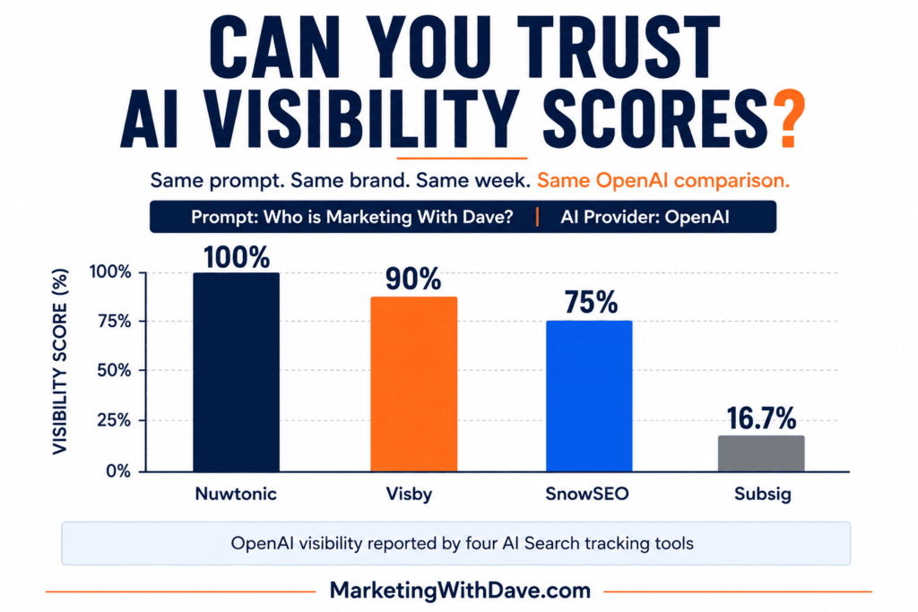
Here’s what the tools reported for the same prompt on OpenAI alone:
One platform, one prompt, one week. Four visibility numbers: 100%, 90%, 75%, 16.7%. That doesn’t mean three of the four tools are wrong. It means a number labeled “Visibility” isn’t automatically measuring the same thing from one product to another.
Semrush, one of the largest companies in the SEO space, defines AI Visibility in its Visibility Overview as a 0-100 benchmark comparing how often a brand appears against competitors, but defines visibility differently inside Prompt Tracking, where it reflects a site’s standing within the top citations for specific tracked prompts. Related concepts, not identical measurements. Semrush also warns that AI responses are fast-changing and personalized, so no platform can produce exact visibility numbers, only directional signals. Semrush explains where its AI visibility data comes from here.
That’s also why I question the precision implied by some of these dashboards. A visibility score reported as 16.7% looks remarkably exact for a measurement built on AI responses that may change the next time the prompt runs.
That context matters when a dashboard hands you a 96% or a 67% without making its methodology equally visible.
100% Visible in Gemini. Or 0%. Or, Actually, It Depends What You Mean By Gemini.
The most dramatic disagreement in the data isn’t about scoring formulas. It’s about whether Marketing With Dave appeared at all, and it gets stranger the closer you look.
Nuwtonic reported the Gemini result as mentioned, position #1, visibility 100. Visby reported the same prompt on Gemini less than a day later as not mentioned, visibility 0%.
That’s not a rounding error.
But Visby’s own dashboard adds a wrinkle worth sitting with: alongside that 0% Gemini score, Visby separately tracks Google’s AI Overview, and there it reports Marketing With Dave at 100% visibility with 7 citations. Same brand, same week, same company (Google), two different surfaces, opposite results, from a single tool that at least has the honesty to report them separately.
Gemini the chatbot and AI Overview the search feature are genuinely different products built on related but distinct retrieval behavior. A visibility score that doesn’t specify which one it’s measuring, or that quietly folds both into “Google,” isn’t just imprecise. It’s answering a different question than the one you think you’re asking.
A 90% Visibility Score Can Still Be Wrong
Visby gave Marketing With Dave a 90% OpenAI visibility score. The answer cited MarketingWithDave.com and correctly connected the site to digital marketing, A/B testing, martech, measurement, and SiteSqueeze.
It also said Marketing With Dave was run by Dave Harrell.
It isn’t.
So I could check off every box that usually signals success: brand mentioned, high visibility score, website cited, relevant topics identified. And the answer still contained a material entity error. What good is a visibility score if the AI doesn’t accurately understand the entity it’s making visible?
Marketing With Dave probably makes this problem easier to spot than most brands would. Dave is a common name, “marketing” is a common word, and there’s no shortage of marketers and agencies using similar language. A highly distinctive SaaS brand may resolve more cleanly. But that’s exactly why the ambiguity doesn’t invalidate the test: real companies share names, terminology, and categories constantly. Entity resolution is part of AI visibility, and a high score can hide a wrong answer.
Even One Tool Isn’t Internally Consistent
You don’t need to compare across vendors to find volatility. Nuwtonic’s own results for this single prompt run remarkably tight across five platforms: 95 to 100 visibility and position #1 on Perplexity, OpenAI, Gemini, Grok, and Meta. Then Anthropic drops to 80 and position #5.
Same tool, same prompt, same week, same methodology. The one variable that changed is the model being queried. If a single vendor’s own numbers can swing that much platform to platform, treating any one visibility score as a stable fact about your brand, rather than a snapshot of one model on one day, is asking more of the number than it can deliver.
The Tools Don’t Even Report the Same Things
The differences go beyond how visibility gets calculated. The six products vary considerably in what they expose to the user at all:
Tool
Visibility
Position
Share of Voice
Sentiment
Citation Count
Cited Pages
Nuwtonic
✓
✓
–
–
✓
✓
SnowSEO
✓
✓
✓
✓
✓
⚠
Subsig
✓
✓
✓
✓
✓
✓
Visby
✓
–
–
–
✓
✓
ZeroRank
✓
✓
–
✓
✓
✓
iGEO
–
–
–
–
–
–
✓ Available
– Not available in testing
⚠ Unknown / not verified
More metrics isn’t automatically better; it can just mean more numbers to misread. But the gaps matter once you start comparing products or trying to build a repeatable process.
Mentions, Citations, Accuracy: Three Different Questions
A brand can appear in an AI answer without its website being used as a source, and a page can get cited without the brand being prominently recommended. Semrush draws the same line: mentions are appearances of the brand in AI answers, citations are linked references to the content behind them. Semrush’s AI Share of Voice guide explains that distinction.
I’d add a third category: accuracy. Did the AI get the brand, the person, and the positioning right? That may matter more than whether your visibility score moved from 67 to 72, and Visby’s citation counts for this one prompt ranged from 0 (Gemini) to 7 (AI Overview) without any change in whether the brand was “visible” by the tool’s own definition. Citation volume and visibility score aren’t the same thing either.
Platform-Level Data Beats a Blended Score, and I Have Proof
ZeroRank reports an “Overall, 3 models” figure alongside its per-platform numbers: 67% visibility, position #1.5. It’s a real, sensible-looking average. It also sits neatly between the individual platform numbers and, in doing so, erases the exact volatility this entire test was built to surface: a #1 on Perplexity, a #2 on OpenAI, and no mention at all on Google/Gemini, blended into one tidy 67.
Semrush reaches a similar conclusion in its own methodology, reporting AI platforms separately for cross-platform comparisons rather than combining them into a single weighted score, because aggregation can hide insights. See Semrush’s AI Visibility Index methodology. After watching one tool’s blended score paper over a #1-to-absent spread within its own data, that conclusion doesn’t need much convincing.
What I Actually Trust
Not any single visibility score. Before I’d act on one, especially a low one, I want to know:
Do I already have a page that genuinely answers this prompt, or is this a content gap rather than a visibility problem?
Does the result hold up if I check again next week?
Does the brand show up on more than one platform, or is this one model’s quirk?
Do multiple tools tell a broadly similar story?
Which specific pages are actually getting cited?
Are competitors consistently showing up where I’m absent?
Is the AI’s description of my brand actually correct?
I’d apply a similar standard when choosing the software itself. If a platform won’t let me see the underlying AI response, platform-level results, and citations behind its score, I’m much less interested in the score. I want enough raw evidence to question the metric, not just a dashboard asking me to trust it.
That first question turned out to be the most useful one in this whole exercise. Some of the prompts I want Marketing With Dave to appear for don’t yet have an obvious page on the site that deserves to be cited. That’s not an AI visibility problem. That’s a content gap, and it calls for a different response than chasing a better score.
Bottom Line
AI Search visibility measurement is useful, and I’m going to keep using it. But the problem isn’t that these tools are wrong. It’s that their precise-looking scores can imply a level of standardization and certainty the underlying measurements don’t support yet, whether that’s one vendor’s 0% sitting next to another vendor’s 100% for the same platform, or one vendor’s own results shifting from position #1 to #5 depending on the model.
The question isn’t simply “What’s my AI visibility score?” It’s “What decisions does this measurement actually justify?”
Treat AI visibility scores as directional evidence, not ground truth. The real work isn’t chasing a perfect number. It’s using repeated measurements, actual AI responses, citations, competitor patterns, and content gaps together to figure out where your brand is genuinely becoming part of the answer, and right now the industry is much better at producing these scores than at explaining how much confidence you should put in them.
Most AI Search visibility tools follow a similar playbook: enter prompts, run them through AI models, and see if your brand shows up. Subsig does that too, but prompt tracking isn’t the most interesting part of the platform.
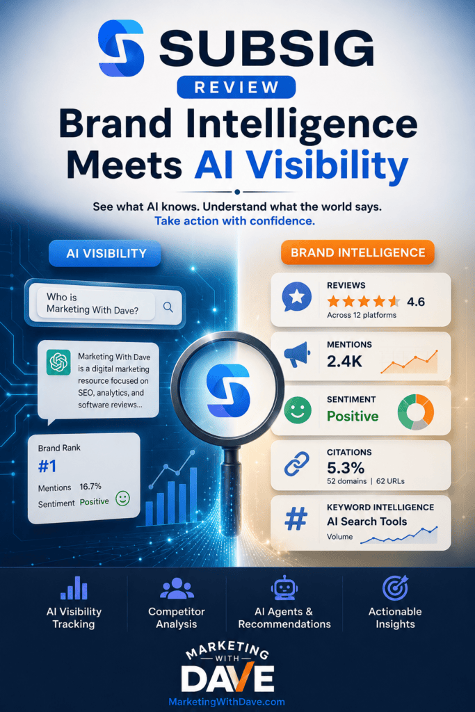
Subsig combines AI visibility with citations, competitors, reviews, brand mentions, sentiment, keyword intelligence, and AI Agents designed to turn that data into recommendations. It’s less a dedicated AI Search tool than a broader brand-intelligence platform that includes AI visibility.
That makes Subsig one of the more unusual platforms I’ve tested, and also harder to evaluate. Some features were genuinely impressive, others need more explanation, and several make far more sense for an established brand generating regular reviews and online conversations than they do for Marketing With Dave.
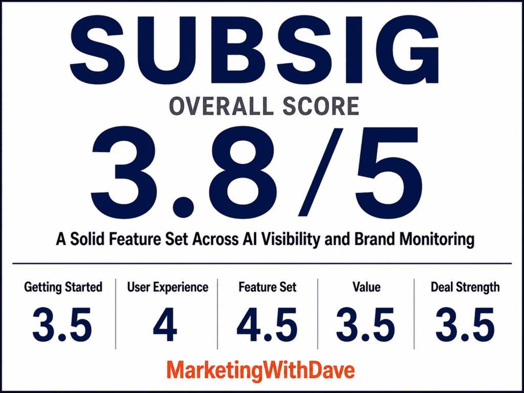
Subsig Overall Score
Why 3.8/5: Subsig combines strong AI Search reporting with unusually broad brand intelligence, but confusing UX, opaque data processing, and restrictive Tier 1 limits hold it back.
Affiliate disclosure: If you purchase through my link, I may earn a small commission at no additional cost to you. I only share tools I have used myself.
The 30-Second Decision
Buy Subsig if: You run a SaaS company or established brand with products people actively review, mention, and discuss online. It makes the most sense when you have recognizable brand or product names to track and want AI visibility, citations, competitors, reviews, mentions, sentiment, and keyword conversations in one platform.
Skip it if: Your brand is still too small to generate meaningful reviews or online discussion, or you primarily want high-volume prompt tracking across multiple AI models. Tier 1 limits you to 10 prompts, 5 keywords, and ChatGPT, making a dedicated AI Search tool a better fit for that use case.
The bottom line: Subsig gets more compelling as your brand gets more visible. Its advantage isn’t simply tracking whether AI mentions you. It’s connecting AI visibility with what customers, review sites, competitors, and the broader web are saying about your brand.
What Subsig Actually Does
Subsig splits into several connected areas:
AI Visibility tracks whether your brand appears in AI answers, how often, where it ranks, share of voice against competitors, citations used, and sentiment.
Review Monitoring pulls in reviews from supported platforms for reputation and feedback analysis.
Brand Mentions tracks conversations about your brand across supported online and social sources.
Keyword Intelligence tracks conversations around topics you care about, even without a brand mention.
Agents analyze the collected data and turn it into recommendations instead of leaving you with more dashboards.
That combination separates Subsig from tools focused entirely on AI Search Visibility. It’s part AI Search visibility platform, part reputation manager, part brand monitor. Whether those pieces add up to more than the sum of their parts is still an open question, but the idea is compelling.
The Wait for Data Needs to Be Clearer
Setup itself wasn’t hard. Not knowing what was happening after setup was the problem.
I added Marketing With Dave, configured what to monitor, added prompts and competitors, then waited. Some sections populated hours later, with almost no indication of how long that should take. That’s a UX problem, not a performance one.
If Subsig told me “we’re analyzing your brand, initial results typically take 2-4 hours,” I’d close the browser and come back later. Without it, an empty dashboard just leaves you guessing whether it’s processing, misconfigured, or broken. Subsig needs better processing indicators and a real estimated timeframe.
Once data started arriving, the product got a lot more interesting.
What I Liked
1. The AI Visibility Reporting Is Surprisingly Complete
I ran the same set of 10 prompts I use to benchmark every AI Search platform I test. Marketing With Dave appeared in only one of them, which is my visibility problem, not Subsig’s.
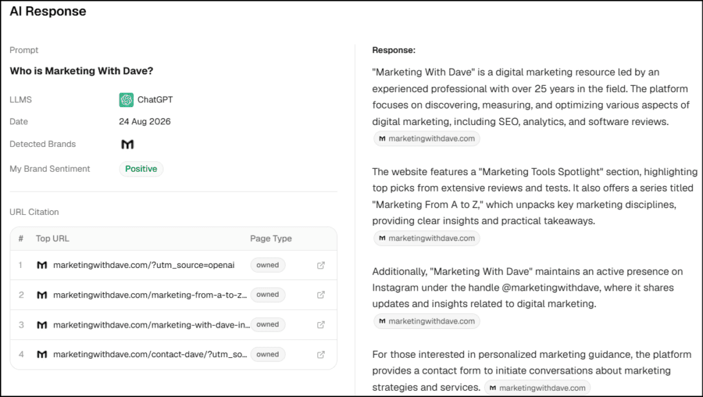
For “Who is Marketing With Dave?”:
Brand rank: #1
Brand mentions: 16.7%
Brand sentiment: Positive
Multiple MarketingWithDave.com URLs retrieved as sources
Subsig also preserved the actual AI response, not just an aggregate score. ChatGPT described Marketing With Dave as a digital marketing resource led by an experienced professional with 25+ years in the field, focused on SEO, analytics, and software reviews. A fair representation.
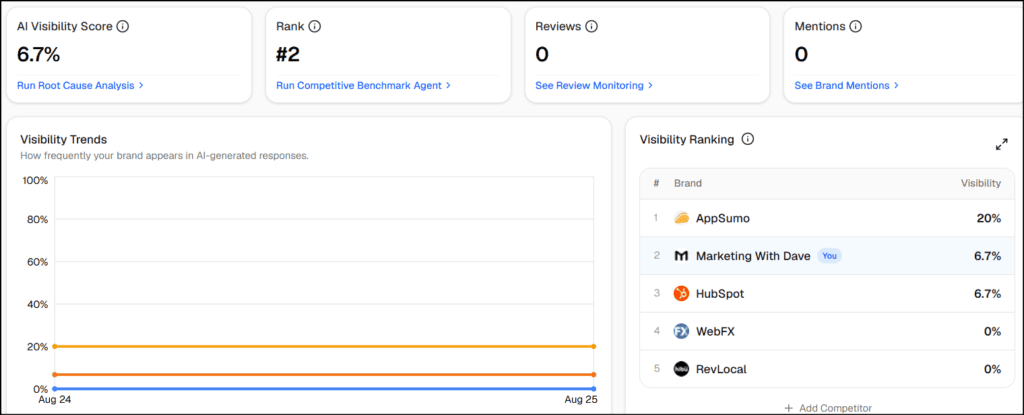
More importantly, that result exposed the real gap. ChatGPT recognizes Marketing With Dave, retrieves the site directly, and understands what the brand is about. I’m just not yet showing up for broader category questions around AI Search resources, marketing software reviews, or measuring AI traffic. That’s more actionable than simply knowing my visibility score is 6.7%.
The sentiment score was 80/100, entirely positive, but based on a single response. Subsig does display the response count, so you can weigh the number appropriately, but an 80/100 built on one data point isn’t something to make decisions around yet.
2. Citation Analysis Goes Deeper Than a List of Links
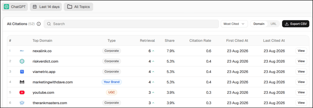
Across tracked responses, Subsig identified 52 domains and 62 URLs, with MarketingWithDave.com contributing 5.3% of both. It categorizes citation sources by type (corporate, UGC, editorial, owned, institutional, and other), and corporate sources dominated my early dataset at 72.4% of retrievals.
That surfaces a useful question: if AI systems keep retrieving certain sites to answer the questions I care about, what can I learn from those sources? One Subsig recommendation pointed toward getting Marketing With Dave included on a site that was already being retrieved frequently. Whether every recommendation holds up remains to be seen, but the underlying citation intelligence is genuinely useful.
3. Competitor Reporting Gives the Numbers Context
A 6.7% visibility score means little on its own. Adding competitors (AppSumo, HubSpot, RevLocal, Search Engine Journal, Search Engine Land, WebFX) changed that:
Brand
Visibility
Share of Voice
Avg. Position
AppSumo
20%
60%
2.1
Marketing With Dave
6.7%
20%
2.0
HubSpot
6.7%
20%
2.5
RevLocal
0%
0%
—
Search Engine Journal
0%
0%
—
Search Engine Land
0%
0%
—
WebFX
0%
0%
—
Ten prompts and one AI model is too small a sample to treat this as real competitive intelligence, but it shows the reporting’s value: Marketing With Dave trailed AppSumo on visibility but had the best average position of any brand that appeared. That’s a far more useful signal than a bare visibility percentage. Subsig also suggests additional competitors worth monitoring.
4. The Prompt-Level Drilldown Is Where the Real Story Lives
The dashboard reported a 6.7% AI Visibility Score, #2 visibility rank, 20% share of voice, and #2 share-of-voice rank. Useful for tracking change over time, but not for optimization decisions on their own.
That distinction matters more than I initially realized. I tested the same prompt across six AI Search tools, including Subsig, and found dramatically different visibility scores depending on the platform measuring it. The experiment reinforced why I put more weight on the underlying responses, citations, and prompt-level data than any single visibility score.
The real value is in the individual prompts. Nine told me I have a visibility problem. One told me something better: when someone directly asks who Marketing With Dave is, ChatGPT knows the brand, describes it accurately, ranks it first, and pulls pages straight from the site. That’s a starting point. The real opportunity isn’t “raise 6.7%,” it’s figuring out why the site has strong entity recognition on a branded query but isn’t surfacing for the broader category questions I actually want it associated with. That’s exactly what I want AI Search software to help me investigate.
5. The Agents Are One of Subsig’s Most Interesting Features
Subsig doesn’t stop at dashboards. Its Agents turn your visibility data into standalone reports: root-cause analysis, prompt discovery, competitive benchmarking, even a 180-day AI visibility roadmap.
The Root Cause Analysis Agent was the standout. It examined where Marketing With Dave was and wasn’t appearing, dug into citation sources, and prioritized actions. The Prompts Discovery Agent suggested new questions to track, organized by buyer intent, which matters because deciding what to track is half the battle. The reports are polished, too: my 180-day roadmap broke recommendations into phases with separate tactics for ChatGPT, Perplexity, and Gemini.
I hadn’t added competitors to this project. The Competitive Benchmark Agent correctly flagged that it couldn’t run a true comparison, then speculated that the absence of tracked competitors might mean Marketing With Dave operates in a niche without real rivals. Another report skipped the caveat entirely and invented generic “Competitor A,” “Competitor B,” and “Competitor C” profiles. Neither conclusion is supported by my data.
Treat the Agents as AI-assisted analysis, not a finished analyst’s report. Read it, question it, and verify before acting on it.
Several more Agents are marked “coming soon”: Social Mentions Plan, Reputation Playbook, Review and Listings Plan, Keyword Strategy, Authority Building, Review Response, and a Custom Agent for building your own workflows. If those deliver, the Agents could become the platform’s biggest differentiator.
6. Review Monitoring Could Be Valuable for the Right Business
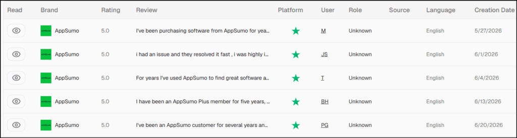
Marketing With Dave showed zero review data at first, unsurprising for a site that doesn’t generate hundreds of customer reviews. I added AppSumo as a second brand specifically to see what Subsig does when review data exists. A local business, SaaS company, eCommerce brand, or established product with real review volume will get far more out of this feature than I can demonstrate here, which is part of why I wouldn’t judge Subsig purely against dedicated AI visibility platforms.
7. Keyword Intelligence Has Potential, but I Couldn’t Properly Test It
Keyword Intelligence is one of Subsig’s more interesting features because it can track conversations around topics even when your brand isn’t mentioned. I configured all five keywords available on Tier 1, including “AI Search Visibility,” “SiteSqueeze,” and “Marketing With Dave,” but Subsig had not returned any results by the time I completed this review.
That leaves a significant part of the platform I can’t fairly evaluate yet. The setup also needs clearer guidance around how keyword matching works, particularly the distinction between “All of these keywords” and “Any of these keywords.” I’ll revisit this feature once I have enough data to judge what it actually finds.
Tier 1 gives you 10 tracked prompts, ChatGPT as the only AI provider, 5 keywords, 5 brands, 2,000 reviews, and 1,000 mentions. Ten prompts were enough to run my standard benchmark, but not much more, and meaningful cross-platform AI visibility requires moving up to Tier 3.
Some limits also aren’t obvious until you hit them. Review and mention capacities don’t reset, and deleting records doesn’t restore capacity. Subsig also limits monitoring to its supported platforms rather than letting you add any source. None of these are dealbreakers, but buyers should understand them before choosing a tier or configuring broad monitoring.
2. Data Processing Needs Much Better Communication
Data taking time is fine; making users guess whether the system is processing, broken, or misconfigured is not. During my testing, some data took hours to appear with little indication of what was happening. Something as simple as “7 of 10 prompts processed” or “next mention scan scheduled for…” would solve much of the problem.
3. The Product Needs More Explanation and Guidance
Subsig has a lot going on, and it sometimes assumes you understand how everything works together. Metrics such as Citation Rate, Retrieval, and Contribution need better explanation. Keyword Intelligence’s All/Any matching wasn’t clear. The distinction between competitors configured in different parts of the platform can also be confusing.
The same applies to the Agents. They’re promising, but I’d like to see more context showing which underlying data produced a recommendation, especially after seeing some reports make conclusions the data didn’t support.
Pricing and Tier 1
Subsig is currently on AppSumo across four lifetime tiers, all with unlimited users and all Agents included:
Tier 1
Tier 2
Tier 3
Tier 4
Price
$49
$119
$269
$499
Workspaces
2
3
10
20
Tracked prompts
10
25
50
100
Lifetime AI credits
240
450
900
1,500
Review capacity
2,000
3,500
7,000
13,000
Mention capacity
1,000
3,000
5,500
12,000
Keywords
5
15
25
50
Brands
5
15
25
50
Trackable review platforms
12
18
32
64
Supported review platforms
4
6
10
15
Social platforms
5
7
7
7
AI providers
OpenAI
OpenAI
OpenAI, Perplexity, Google AI Overview
OpenAI, Perplexity, Google AI Overview
Notifications
Email & Slack
Email & Slack
Email & Slack
Email & Slack
Tier 3 is where the biggest unlock happens. It’s the first tier to add Perplexity and Google AI Overview alongside OpenAI, while increasing prompt capacity to 50. If cross-platform AI visibility is a priority, that’s the tier I’d look at.
Tier 1 makes more sense if you’re interested in Subsig’s broader brand-intelligence capabilities and can live with ChatGPT-only visibility and 10 tracked prompts. That’s an important distinction: the value looks considerably different depending on whether you’re buying Subsig as an AI Search tracker or as a broader brand-monitoring platform.
Bottom Line
Subsig is hard to put in a neat category, and that’s what makes it interesting. As a pure AI Search visibility tracker, its reporting, citation analysis, competitor tracking, and prompt-level data hold their own, but Tier 1’s 10-prompt limit and ChatGPT-only access are restrictive.
The bigger story is the combination of AI visibility with reviews, brand mentions, sentiment, keywords, citations, competitors, and Agents designed to turn that data into recommendations. Not every part was a natural fit for Marketing With Dave today, and the platform still needs better guidance and transparency around data processing.
Most AI visibility platforms essentially ask, “Does AI mention my brand?” Subsig is aiming at a bigger question: “What does the digital world know and say about my brand, and what should I do about it?” If that’s the problem you’re trying to solve, Subsig is considerably more interesting than another AI visibility dashboard.
This content is for educational purposes and reflects my hands-on experience using the product and the information publicly available at the time of writing. Always evaluate tools based on your specific business needs, goals, and workflows before making a decision.
Pinterest automation sounds great in theory. Create the image, generate the description, schedule the pin, move on with your life.
But while working with Pinterest automation tools, I noticed something that doesn’t get talked about nearly enough: automating a Pin can mean giving up functionality available when you publish directly through Pinterest.
And sometimes the limitation isn’t the tool. It’s Pinterest’s API.
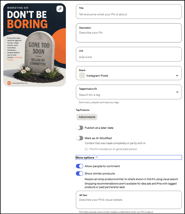
The two AI disclosure checkboxes are new
Two fields in that screen are recent additions: “Mark as AI-Modified” and “This Pin includes an AI-generated person.” Pinterest’s AI labeling system launched globally on April 30, 2025. I’ve used Pinterest daily long enough to know these two checkboxes didn’t show up together though. They rolled out separately, just days apart.
This fits a broader pattern. Meta started applying “Made with AI” labels to Facebook and Instagram content in May 2024. More recently, New York became the first state to legally require AI disclosure in ads: its synthetic performer law took effect in June 2026, mandating a clear label any time an ad uses an AI-generated person. Whether it’s platform policy or now state law, the direction is the same. Flagging AI involvement is becoming standard, not optional.
And that’s where automation becomes more complicated: as Pinterest adds new native publishing controls, third-party tools may not immediately, or ever, have access to them.
What’s missing when you’re not using Pinterest directly
Tagged Topics. Pinterest’s native pin creation flow lets you attach up to 10 predefined categories to help classify your pin. This field isn’t part of Pinterest’s documented API for creating pins, and multiple users have reported in Pinterest’s own community forums that tagged topics only work through Pinterest’s native scheduler, not third-party tools. I couldn’t find an official Pinterest statement confirming this outright, but I’ve never been able to set it through anything but Pinterest’s own interface either. My most-used categories tend to be Marketing, Business Marketing, Small Business Marketing, and Marketing Tools and while I don’t have proof that choosing topics helps your pin perform better, I feel better doing it.
Allow comments and Show similar products toggles. Same story. These two switches don’t appear anywhere in Pinterest’s documented API fields, so there’s no way for a third-party tool to set them on your behalf.
Product tagging. If you’re an Amazon affiliate or run any kind of shopping content, this one can matter. Pinterest’s Create Pin API doesn’t expose a field for attaching product tags to a standard pin. That functionality seems to live inside Pinterest’s Shopping/Catalog features rather than the basic pin creation endpoint.
Alt text is a different story. I want to correct something I initially assumed: alt text actually is part of Pinterest’s official API. Whether a specific tool lets you set it comes down to whether that tool’s developers built the field into their product, not a Pinterest restriction. So don’t assume every third-party tool is missing this. Check the specific tool.
Why this matters for your workflow
With over 500 billion Pins already on the platform, you need every edge you can get. Depending on your business, these gaps range from trivial to a genuine roadblock. If you rely on Amazon affiliate links, losing product tagging in your automated workflow is a real problem. If you don’t run comments on purpose anyway, that toggle won’t bother you.
There’s also a scale question worth knowing before you build your workflow around automation. Pinterest’s API caps you at 1,000 write operations per day and 300 requests per minute per account, there’s no bulk endpoint so every pin is its own API call, and you can’t schedule more than 30 days out. If you’re pinning at a normal pace, none of that touches you. If you’re trying to batch-schedule a season’s worth of content in one sitting, it will.
There are constant trade-offs among speed, quality, and effectiveness, and figuring out what’s worth automating on Pinterest is no different. I use a product called Pin Generator, and here’s specifically where it’s helped:
Saves time on pin creation by handling a chunk of the repetitive design work for me
Fills in alt text with AI wherever it’s missing, closing a gap most people never notice until it’s pointed out
Audits my Pinterest account so I can track whether I’m actually making progress cleaning it up month over month
Flagged that board categories need a description, something I had no idea about and that Pinterest doesn’t even show you when you’re first creating a board
These are just a few of the most actionable benefits I have enjoyed using this platform. If interested, you can read my full Pin Generator review.
The takeaway isn’t that you shouldn’t automate Pinterest. I do. It’s that automation isn’t a perfect substitute for publishing natively. Know which features matter to your workflow, know which ones your tool supports, and decide where the time savings are worth the trade-off.